


Braille Institute by Sarah Hass
The assignment was to choose a non-profit organization located in Los Angeles, re-design its identity system, and deliver it in the form of a style guide.

Otis College of Art and Design
Los Angeles, CA
Identity & Systems Design
Volker Durre
Approach
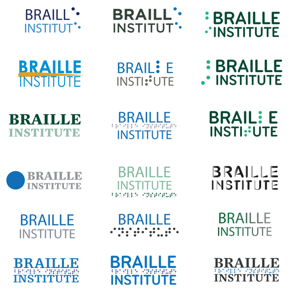
First, I made word lists. I had a list of brand attributes, brand essence, and analogies, like if Braille Institute were an animal or an ice cream flavor what would it be? (Dog & Rocky Road). I then began sketching using a matrix chart to try to bring together different elements of the brand/organization. From here, I was able to see what was communicating well and what wasn’t. I then chose a direction and refined the colors and typeface and overall feel until it felt right. From the beginning, the goal was to create a logo and identity system that would speak to the community of the organization and I feel that I have successfully done so.
Sketches and Process
Solution
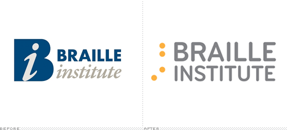
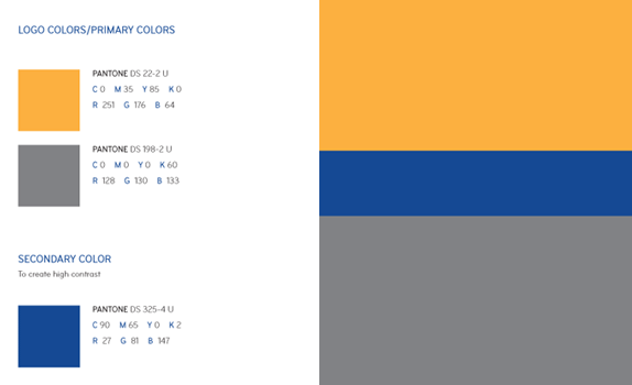
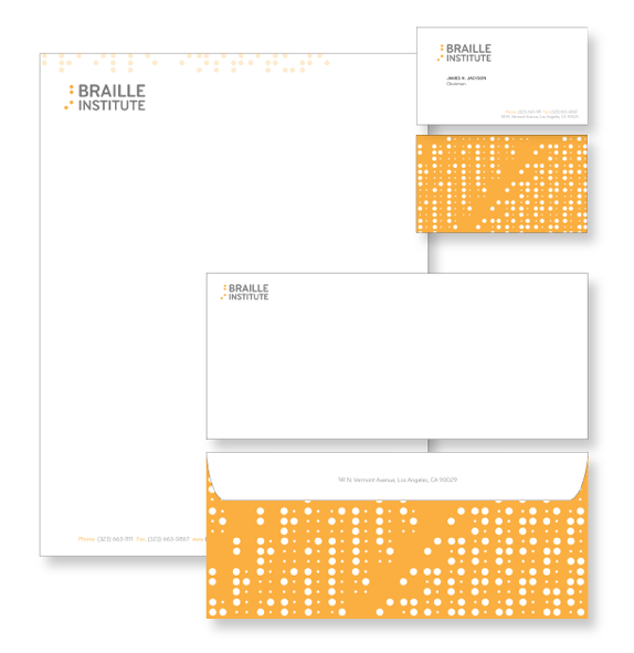
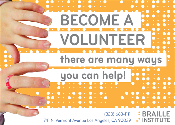
The Logo represents community. It is strong in that it gets its name out into the public, while staying true to the organization. The dots next to “Braille Institute” are the letters “B” and “I” in the original Braille font.
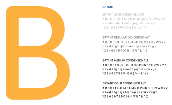
I chose to use the typeface Bryant (available through Process Type Foundry) because it shares Braille’s round, utilitarian quality.
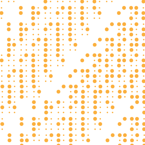
This pattern was created using the original Braille font to spell out Braille Institute over and over again. It is an element that can be applied to the organization’s promotional pieces and ephemera.
Sarah Hass’s Website


DATE: Jun.23.2010 POSTED BY: ArminCATEGORY: Non-Profit COMMENTS:

TAGS: braille institute, pattern, wordmark,


Celebrating the reality that print is not dead by showcasing the most compelling printed projects.

Corraling the most relevant and creative on- and off-line bits that pertain to the design community — and said community is openly invited and encouraged to add their hard-earned links.

Describing, tracking and explaining culture, commerce, politics, media, sports, brands — everything possible, really — through design.

Discussing, and looking for, what is relevant in, and the relevance of, graphic design. [Archives Only]

Encouraging creative diversity in the community through monthly, one-word challenges. [Archives Only]

Designing corporate and brand identities and full development of printed and digital matter for clients and us.