


Borderline by Tom Huveners
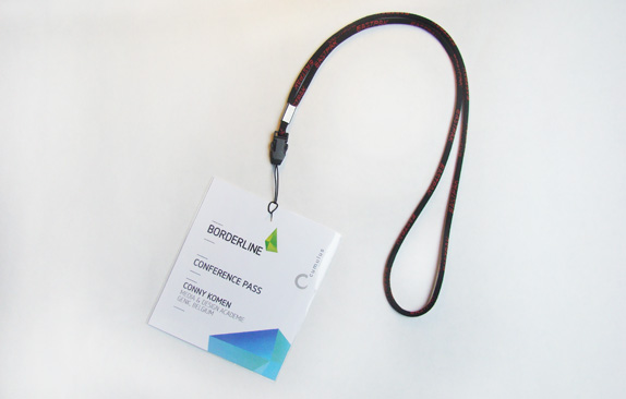
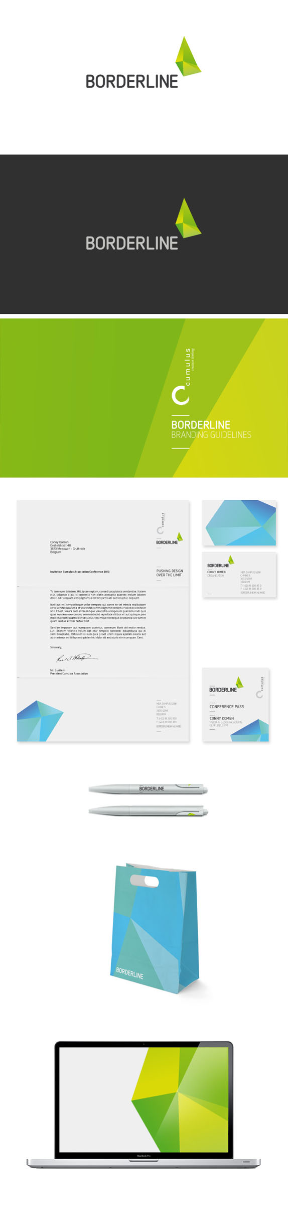
As a final assignment we were asked to brand the new Cumulus design event so they had about 17 ideas to choose from. Cumulus Association organizes a design conference each year at a different school in a different country. This year's name was "Borderline — Pushing design over the limit" and was organized by our school. The assignment consisted of a complete branding exercise: logo(type), stationery, bag, pen, branding guidelines, and an extra item.

Media & Design Academie
Genk, Belgium
Functional Graphic
W. de Buck
Approach
Genk is near a few other design schools in the Belgium / Netherlands / Germany region. Despite this, it was clear that the school was unique. The school’s building is very modern and uncompromising on its own terms. It stands out in the environment which oddly enough includes a mine shaft. Incorporating the school’s physical and conceptual essence into the brand would be a fresh approach.
Sketches and Process
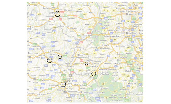
In the animated image above you can see a quick summary of how I came up with my end result. I started with a map of the area and searched for the different cities which had a design school. My next step was to remove the map and to connect the cities, since all schools are in some way connected and will attend Borderline. In the last step I created an abstract form which stands for the new and modern school.
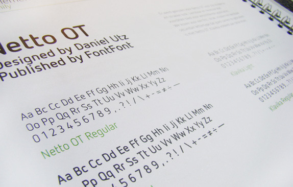
After the logomark was pretty much done, I started to look for a nice typeface wich would work well with the abstract logo. I used Netto for the logotype and as secondary typeface I used Klavika, a clean and readable face.
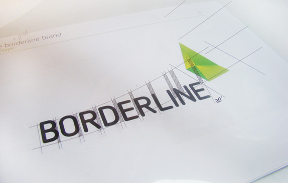
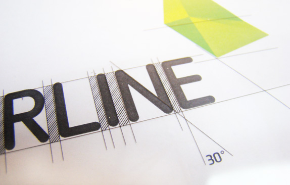
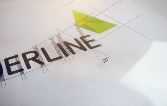
Here is the logo and a small grid on top of it (transparant plastic) in the branding guidelines.
Solution
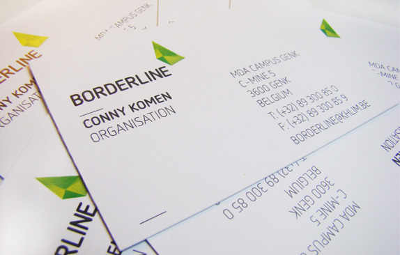
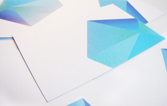
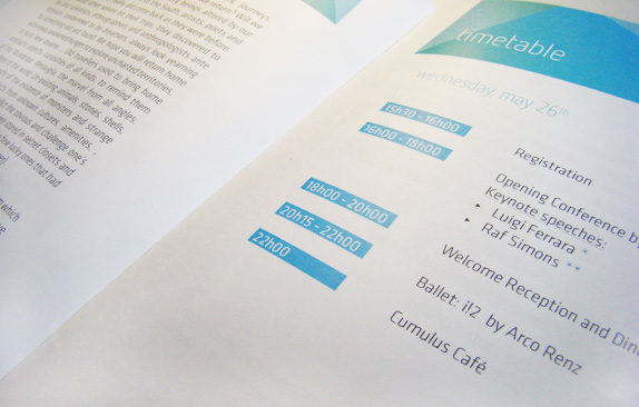
As graphical element I used an alternated version of the logo. Colour and form-wise this is an alteration on the original green logo. This graphical element is used on branding materials such as stationery and the programme guide.
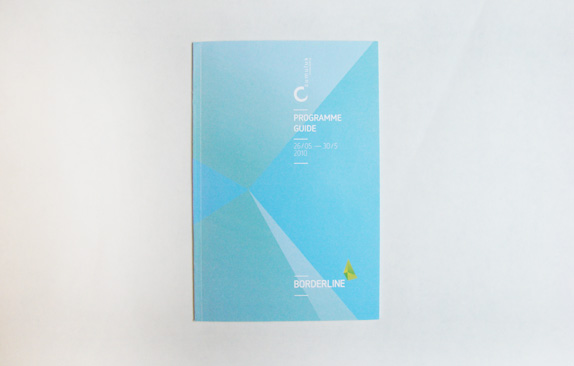
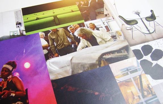
The programme guide cover, above, with some close ups from the inner pages, below.

Tom Huveners’s Website


DATE: Jun.17.2010 POSTED BY: ArminCATEGORY: Culture COMMENTS:

TAGS: borderline, cumulus, guidelines, icon, stationery, website,


Celebrating the reality that print is not dead by showcasing the most compelling printed projects.

Corraling the most relevant and creative on- and off-line bits that pertain to the design community — and said community is openly invited and encouraged to add their hard-earned links.

Describing, tracking and explaining culture, commerce, politics, media, sports, brands — everything possible, really — through design.

Discussing, and looking for, what is relevant in, and the relevance of, graphic design. [Archives Only]

Encouraging creative diversity in the community through monthly, one-word challenges. [Archives Only]

Designing corporate and brand identities and full development of printed and digital matter for clients and us.