Big Lots by Tymn Armstrong
ASSIGNMENT
The assignments was to choose a national company logo and redesign it using only type.


The assignments was to choose a national company logo and redesign it using only type.

SCHOOL
Rasmussen
Rasmussen
COURSE
Advanced Typography
Advanced Typography
INSTRUCTOR
Kip Williams
Kip Williams

Approach
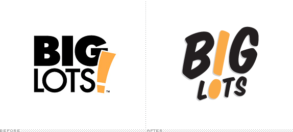
I chose a company that I felt actually needed a redesign, BigLots. BigLots has never been a brand that I felt had a clear message or a focused target market. In fact, I had never been inside a BigLots until researching for this project. For me, their identity had always felt dismissive and cheap, like a dollar store brand. I found that while they are inexpensive, they are no dollar store. I had hoped in the beginning that I would redesign the logo from scratch. Later, I decided that the current design already contained specific elements that set it apart from it’s competitors and had established brand equity. It just needed an fresh update.

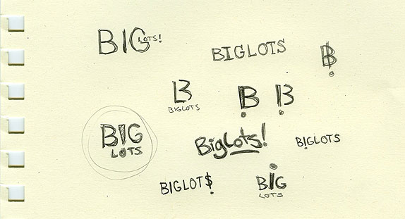
Sketches and Process

Solution



Tymn Armstrong’s Website


DATE: May.07.2010 POSTED BY: Bryony
 CATEGORY: Retail
 COMMENTS:

TAGS: Big Lots, business card, logo,

Comments › Jump to Most Recent


