Aurora Film Festival by Steve Zimmerman

To design a well rounded corporate identity consisting of a logo, stationery set, comprehensive package and style manual. We were restricted to brands named after gods and goddesses (as a jumping off point for concepts and visuals).

Savannah College of Art & Design
Savannah, GA
Print Studio 1 - GRDS 715
Merrick Henry

Approach
The modern day short film festival has become a place for experimentation, a venue for filmmakers to express personal as well as global opinions and an opportunity for a breakout career to spawn. Short film festivals often feature movies at an elementary stage, or concepts at the ground floor. Large budget and feature films are not often found in such scenarios, but many do evolve from it. The world of short films allows filmmakers high levels of experimentation because of the relatively low cost of production and a naturally under developed story line. These story lines allow for directors as well as filmmakers to try new camera techniques and post production models that are often adapted to mainstream film at a later date.
I chose to work under the Aurora Film Festival brand because I felt that the medium of film festivals were under constant evolution. As with much of the arts, the film industry goes through trends in aesthetics and subject matter. I think the symbolism with the goddess Aurora, who reinvented herself everyday, works well as a parallel to how film festivals change and start anew from year to year. Also I think there is an interesting discussion as to the way the aurora borealis shines light and projects various colors into the sky in much the same way that a projector shines light through film to project color and picture in a movie theater. By taking the Aurora Film Festival brand and altering its location and restricting submissions to short films I have allowed for the brand to reinvent itself in a new environment.
The aesthetics of my Aurora Film Festival identity were developed through research involving the interests of contemporary filmmakers. Much the same as the field of design, the film industry went through a whirlwind after the implementation of computers and a digital workflow. There is an argument going on between filmmakers that are not happy with the quality of current digital film making and the ones that prefer the accessibility and cost reductions that are associated with digital filming. This argument spans all demographics of the filmmaking industry with a push from the younger generation to try new things and a sort of renaissance from an older generation to respect the way things have been done for a long time. I wanted my logo to abstractly show how this argument of analog versus digital could exist together.
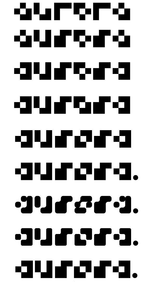
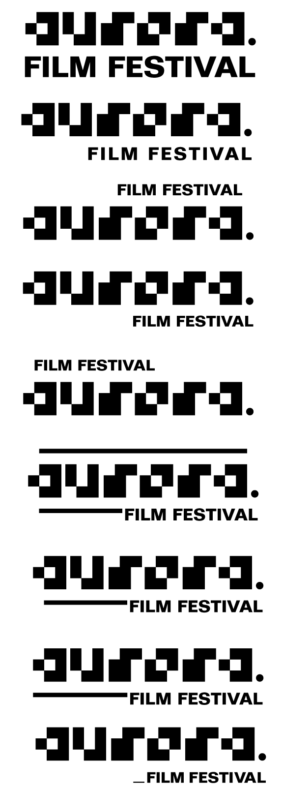
The logotype I developed was built on a modular system of nine squares per character. Using this grid I created a typeface that has an extremely pixelated look to it. This aesthetic of anti-aliased type speaks to the digital side of filmmaking. The modular system represents the pixels on a screen or in a digital file. A contrasting shape of a period circle displays the analogue side of print or film. Because a screen can only display the illusion of curves, a circular shape could only be created by traditional techniques. These two contrasting shapes successfully display the two sides of the current filmmaking argument together as one. The words, film festival, are displayed in the typeface folio. This face is a realist sans serif similar to the likes of Helvetica and Univers. This face speaks to the international typographic style, which works with the ideas of universal communication and clarity. These ideals also resonate in filmmaking as a medium to communicate in an extremely accessible way.

Sketches and Process


Solution
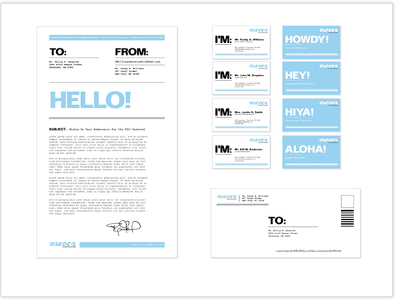
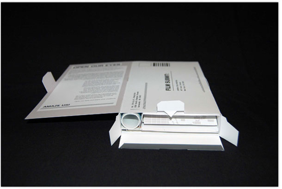
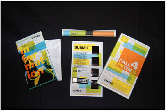
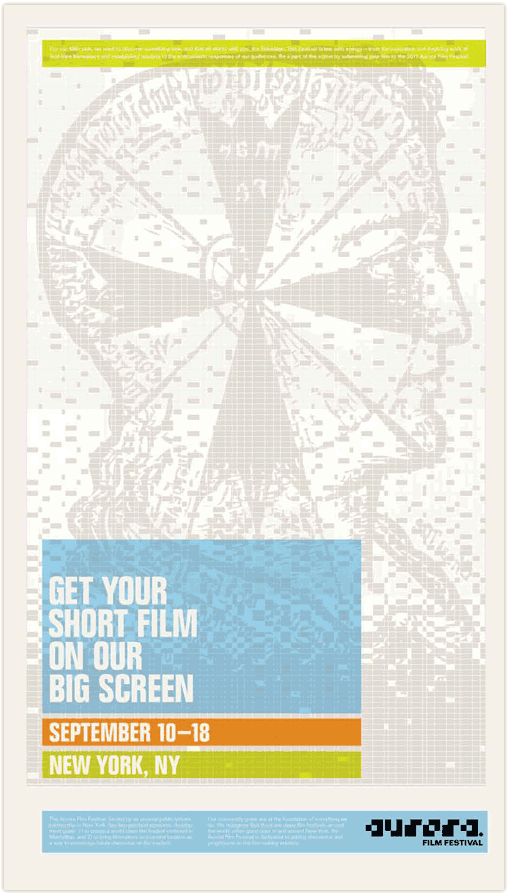
A Call For Entries Kit was designed as a way for film makers to submit their films to the festival. The kit consisted of a shipping box, sized similar to that of a VHS box, which doubled as a return container for film submissions. Also included in the kit was a schedule of events, a poster to raise awareness about the festival, a short information booklet on the history and prestige of the festival, a flash drive to submit your film (if digital media) and a submission directions card.

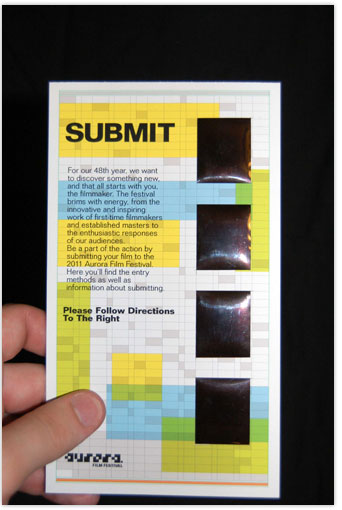
The directions to submit were created digitally then photographed with a 35mm camera. The film negatives (on the right) will reveal step by step directions for submission when held up to light.
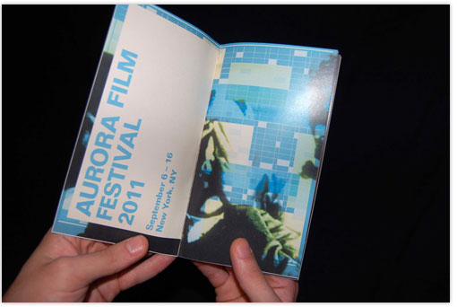
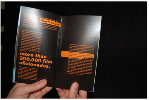
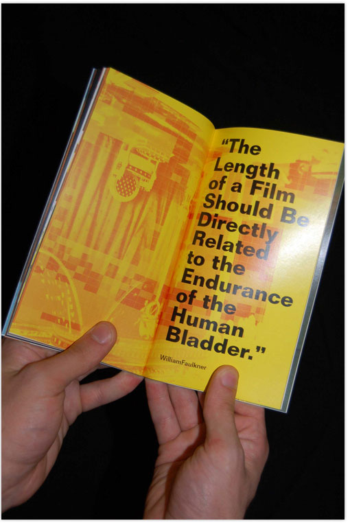
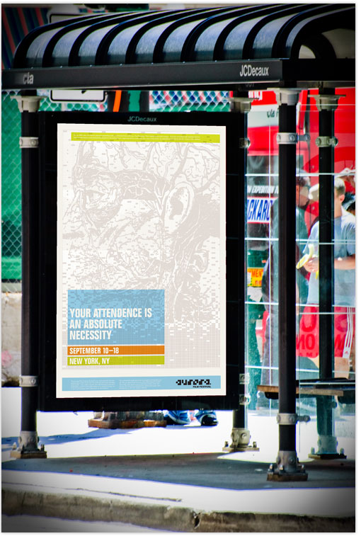
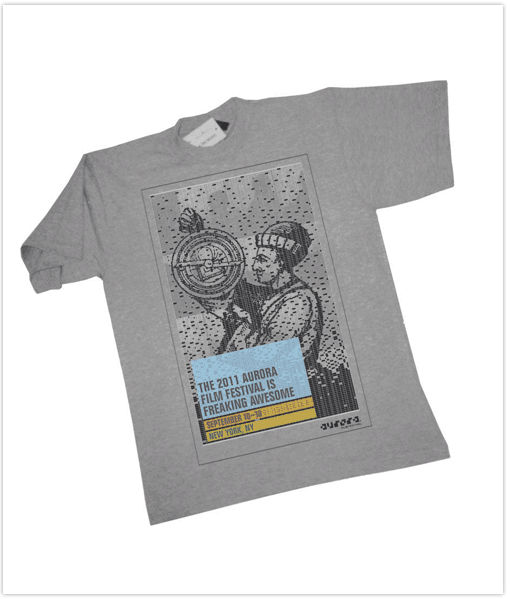
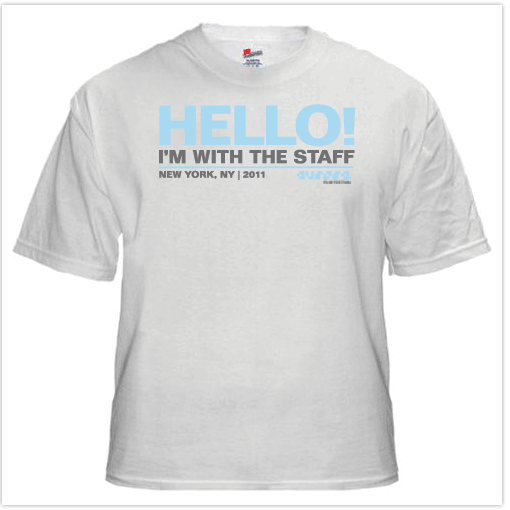
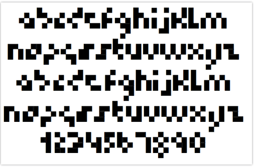
The Aurora Film Festival logotype was expanded to a complete lowercase alphabet and number set allowing for increased brand recognition ability.
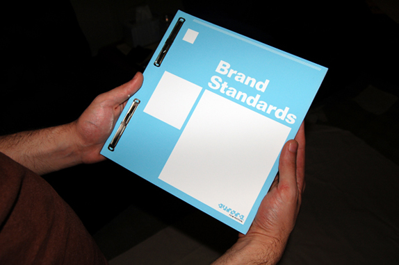
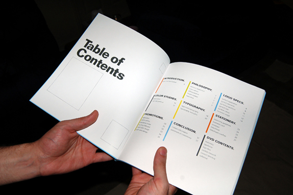
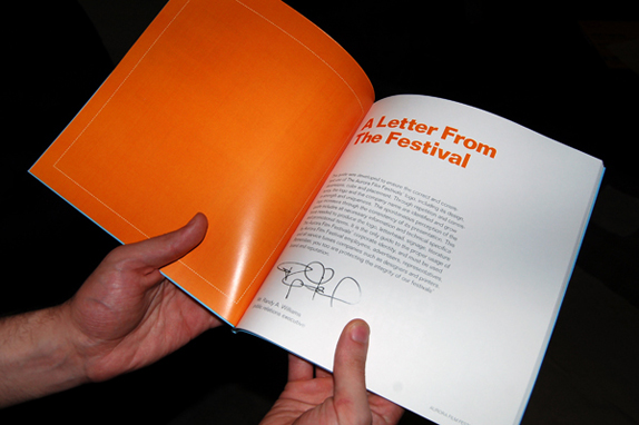
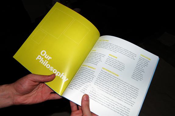
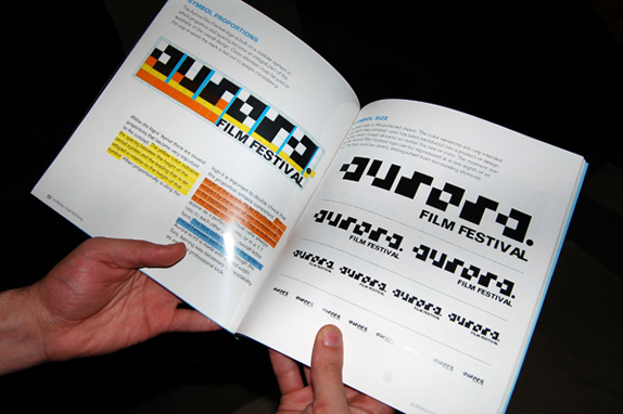
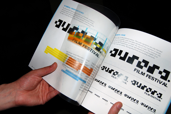
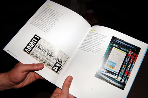
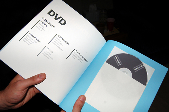
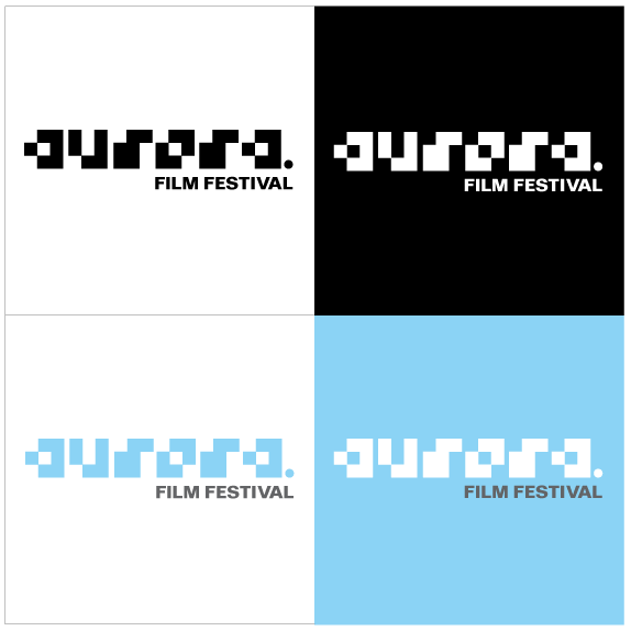
Brand standards.

Steven Zimmerman’s Website


DATE: Jul.07.2010 POSTED BY: Bryony
 CATEGORY: Entertainment
 COMMENTS:

TAGS:


