Argenta by Kevin Wittevrongel
ASSIGNMENT
For our final year project we were asked to redesign an existing identity/branding of choice.


For our final year project we were asked to redesign an existing identity/branding of choice.

SCHOOL
Syntra West
Bruges, Belgium
Syntra West
Bruges, Belgium
COURSE
Graphic Designer/Desktop Publisher
Graphic Designer/Desktop Publisher
INSTRUCTOR
Ann Vermaercke, Wim Huyser
Ann Vermaercke, Wim Huyser

Approach
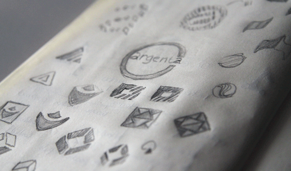
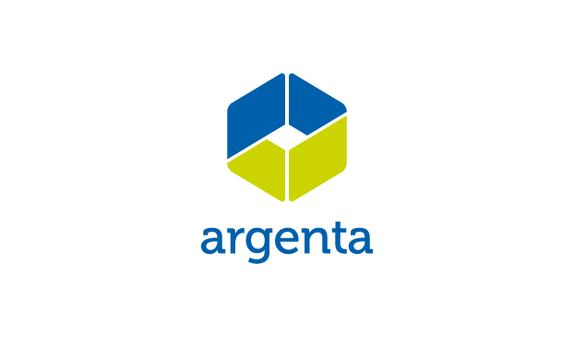
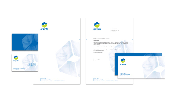
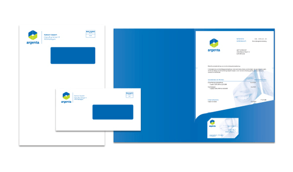
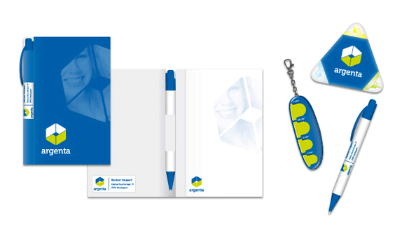
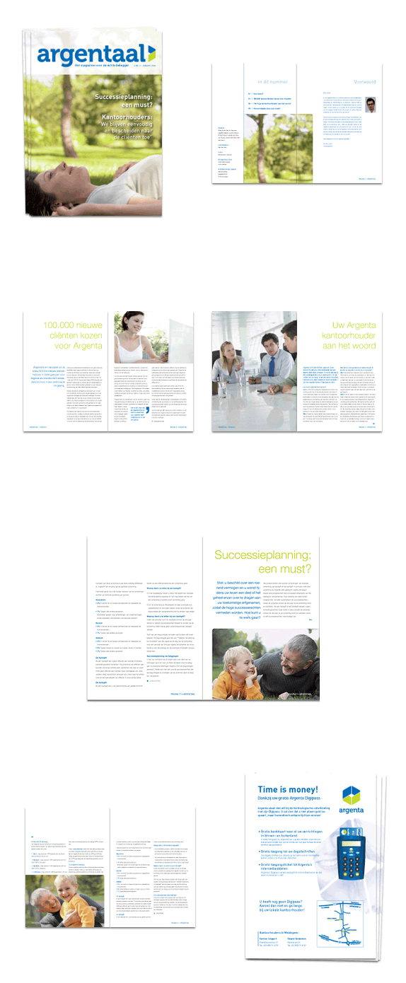
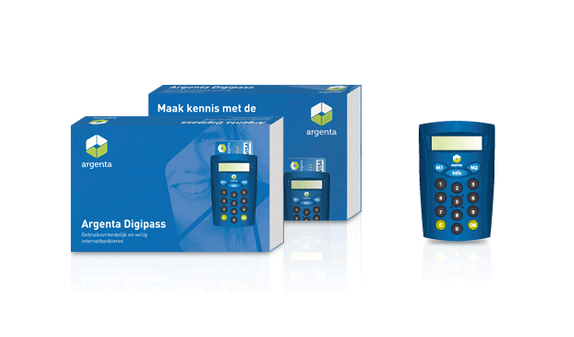
I chose to redesign Argenta; one of largest banks in Belgium. The redesign includes a new logo, stationery, a custom magazine, packaging and a variety of gadgets. Branding a financial institution is not an easy task; there’s a lot to keep in mind. First I came up with a few important keywords: trustworthy, personal and secure; that’s what people are looking for in a bank. With these in mind I began sketching.
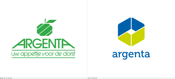
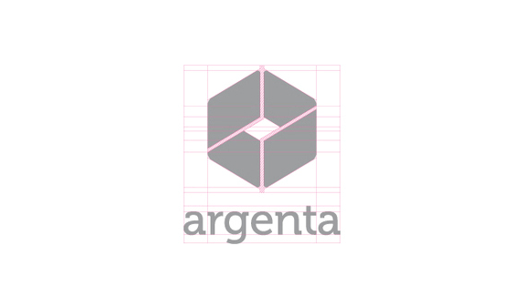
I wanted Argenta to get a modern and professional look as the current logo looked very cheap and outdated. To achieve this I decided to lose the apple metaphor and replace it with something new yet familiar.

Sketches and Process

Solution


Kevin Wittevrongel’s Website


DATE: Jun.28.2010 POSTED BY: Bryony
 CATEGORY: Financial
 COMMENTS:

TAGS: argenta, brochure, folder, icon, logo, office supplies, packaging, stationery,

Comments › Jump to Most Recent


