
![]()
![]()
CLIENT
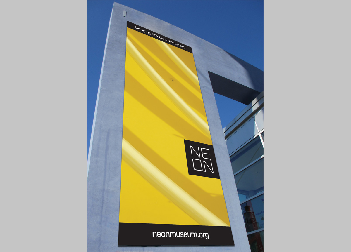
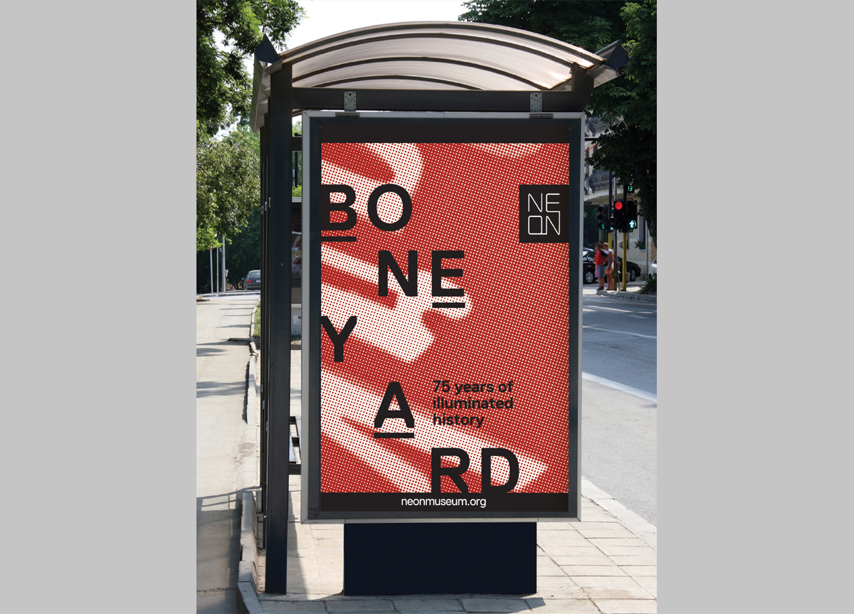
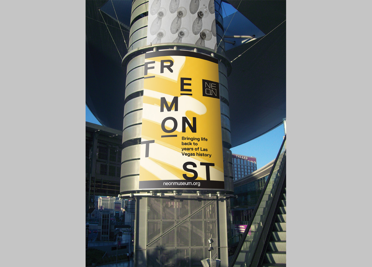
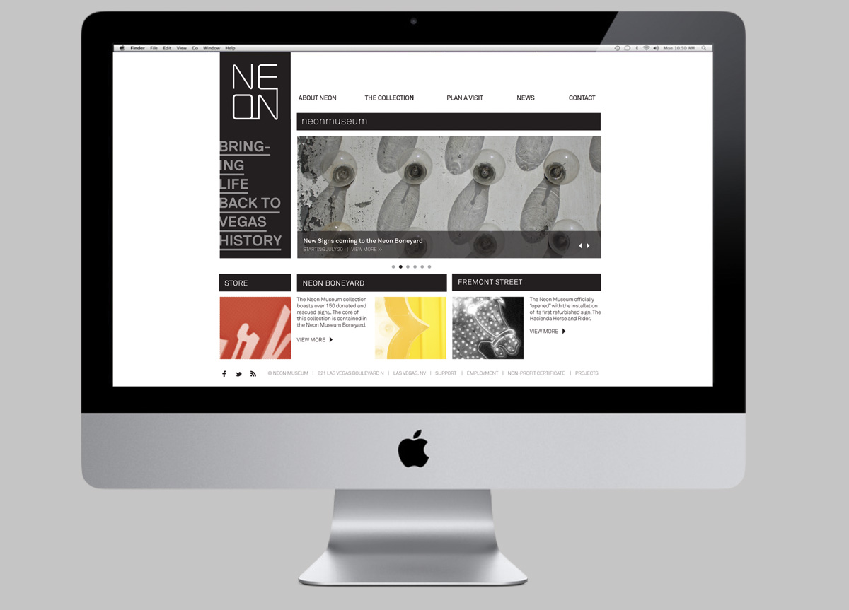
Located in Las Vegas, NV, the museum features vintage signs from old casinos, hotels, and restaurants dating back to the early 1900s. Their largest display area is called the “Boneyard” with more than 150 neon signs. The Museum is a nonprofit organization that was founded in 1996.
BRIEF
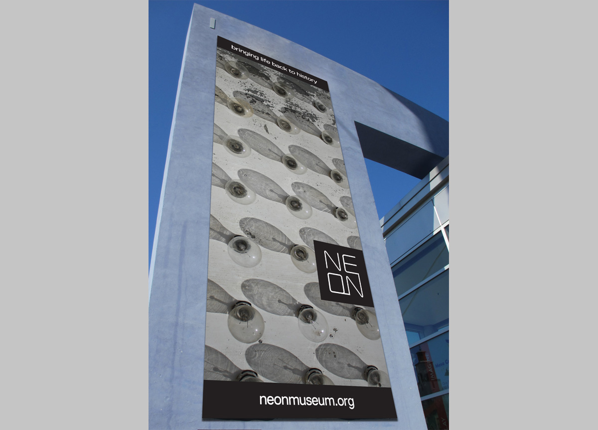
Market the company as a long-standing, successful museum, centered around the unique experience it has to offer guests. Their current audience consists of locals and enthusiasts, but not always the average Vegas tourist. After researching competitors, it was decided the company needed a stronger presence around the strip along with a more modern identity and marketing approach. Achieving this through billboards, banner ads, and an interactive tour app were a few of the initial proposals.
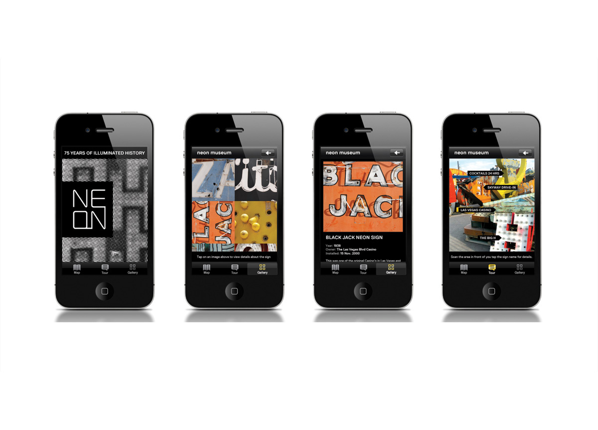
APPROACH
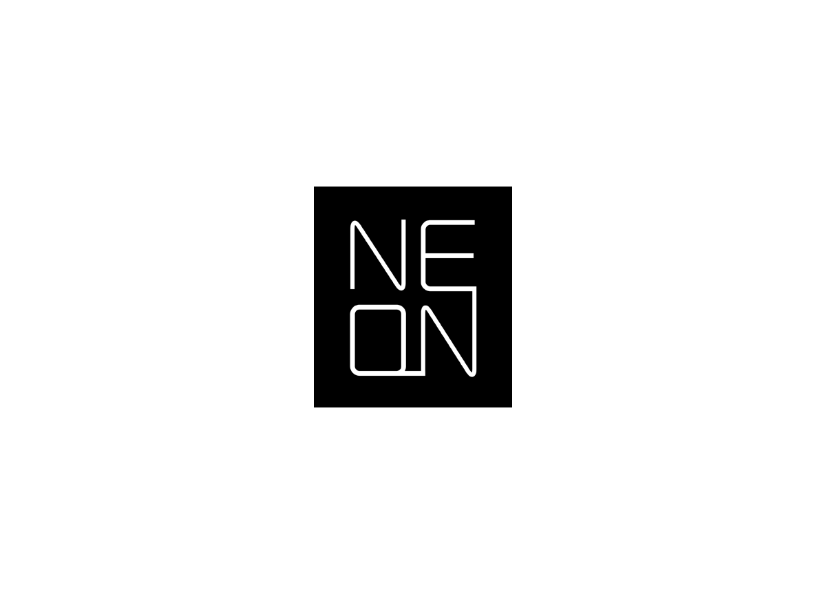
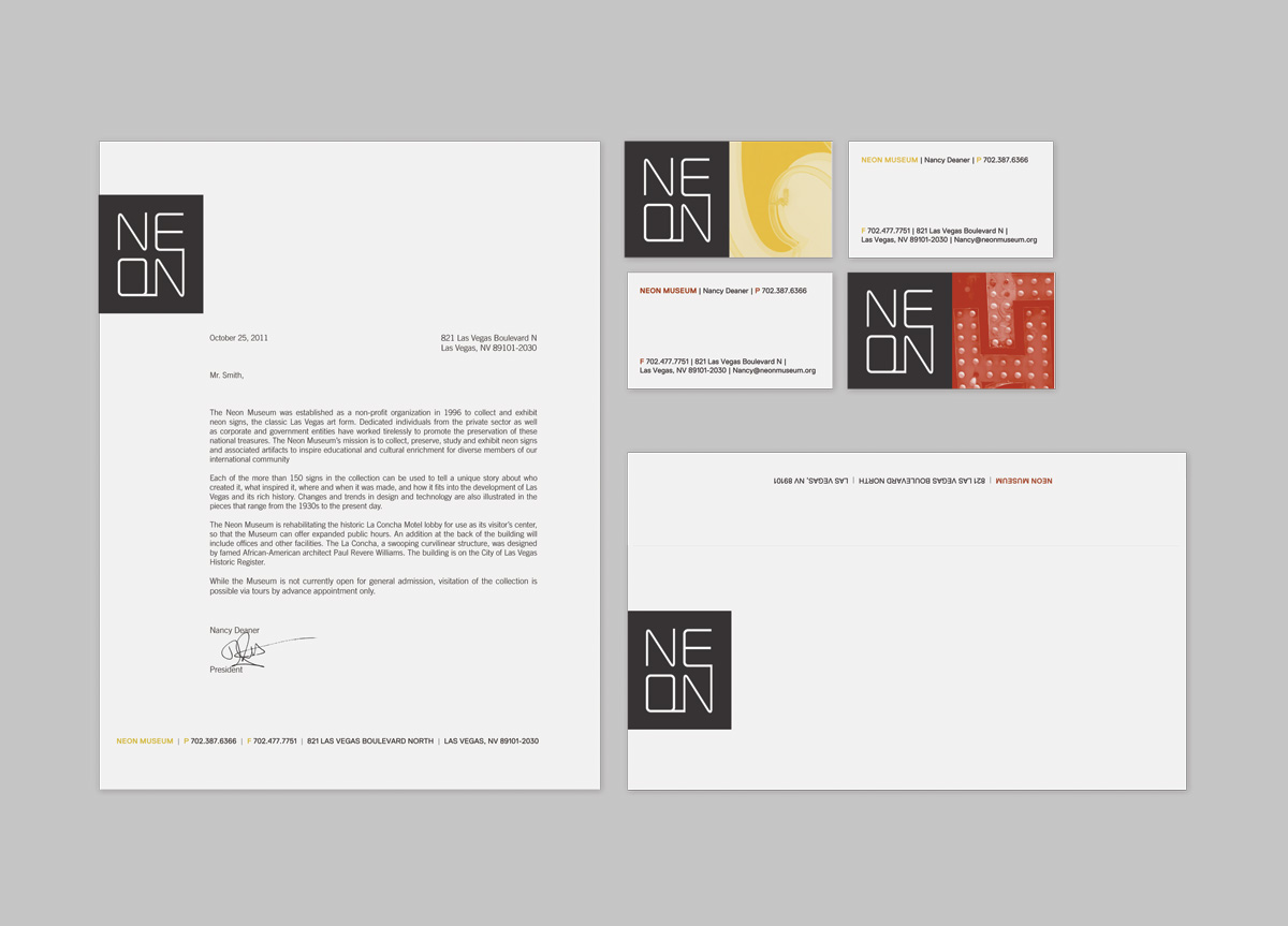
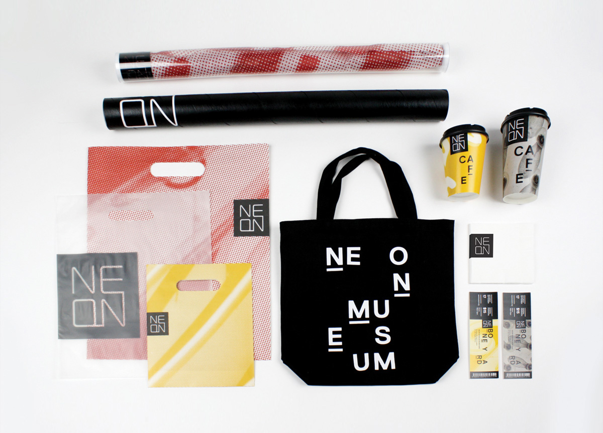
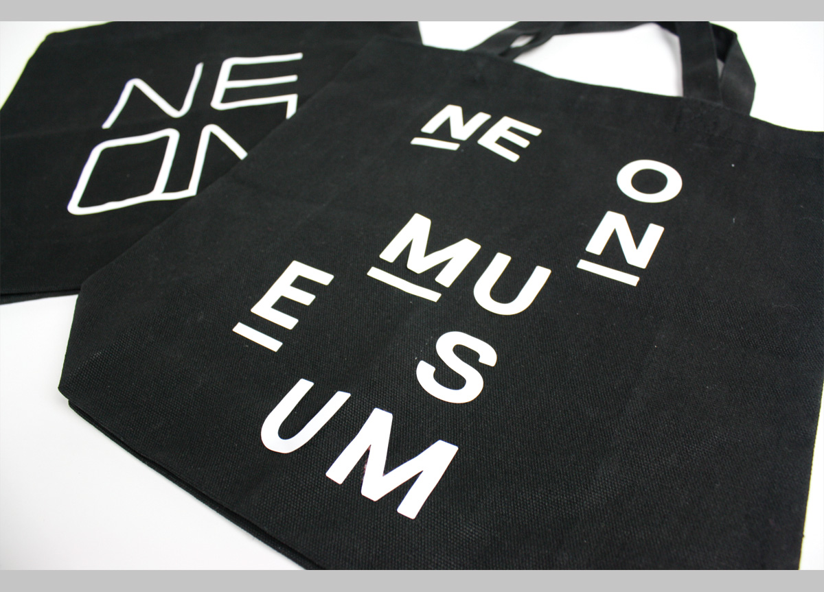
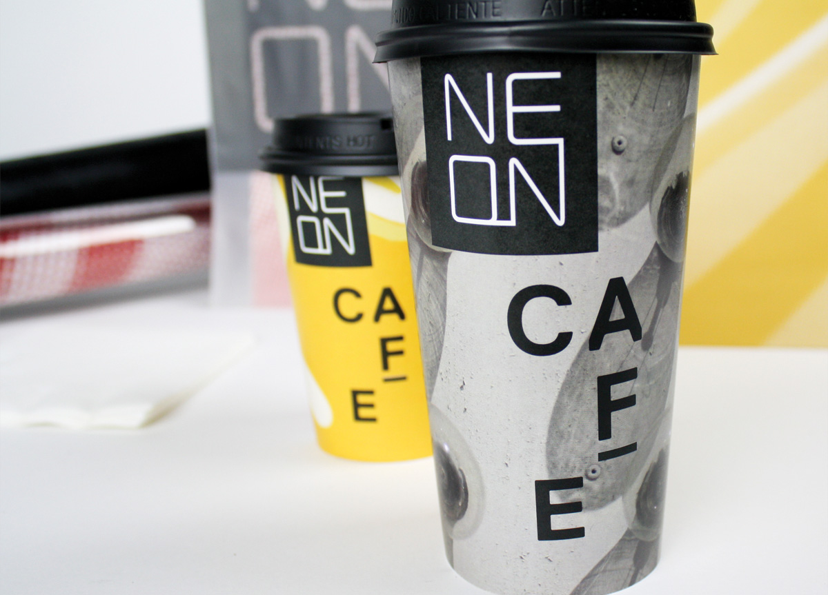
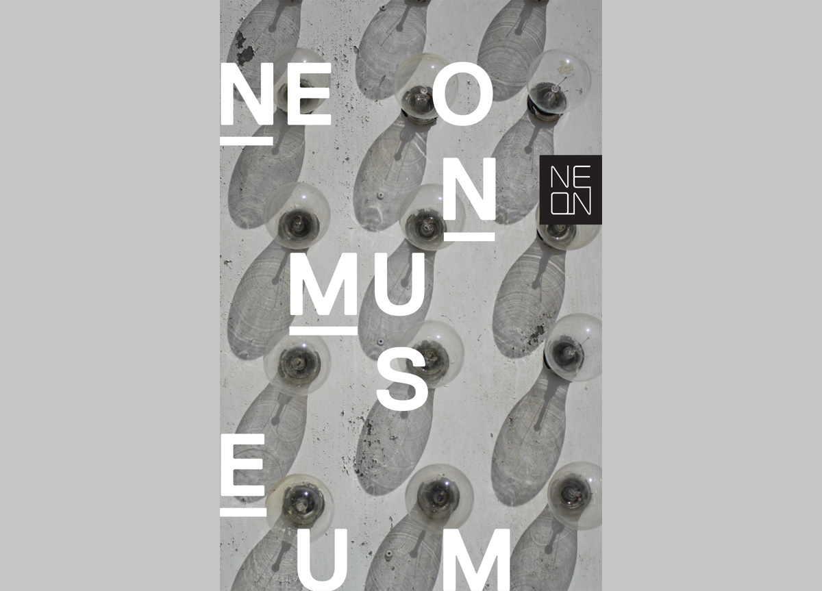
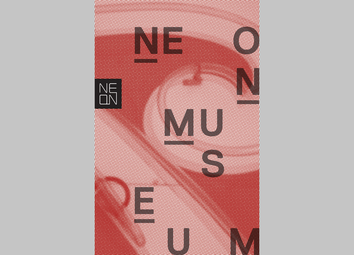
The logo as a stacked neon sign symbolizes connecting the old with the new. It’s consistently attached to an edge to also support its identity as a sign. Imagery is cropped to show a micro view of their collections and acts as a teaser for what the neon experience is all about. The scattered typography treatments found in most applications are based on the presentation of the signs in the Boneyard. The smart phone app was also designed to inform guests during their tour. All executions point back to the unique experience Neon Museum offers.


