CATEGORY

Comprehensive Identity Programs

LEVEL

Professional

RANK


DESIGN CREDITS

Creative Directors, Designers

David Heasty
Stefanie Weigler


TAGS

, , , , ,


LINKS

triborodesign.com
shrinestyle.com

SHRINE by Triboro
SHRINE by Triboro
SHRINE by Triboro
SHRINE by Triboro
SHRINE by Triboro
SHRINE by Triboro
SHRINE by Triboro
SHRINE by Triboro
SHRINE by Triboro


CLIENT

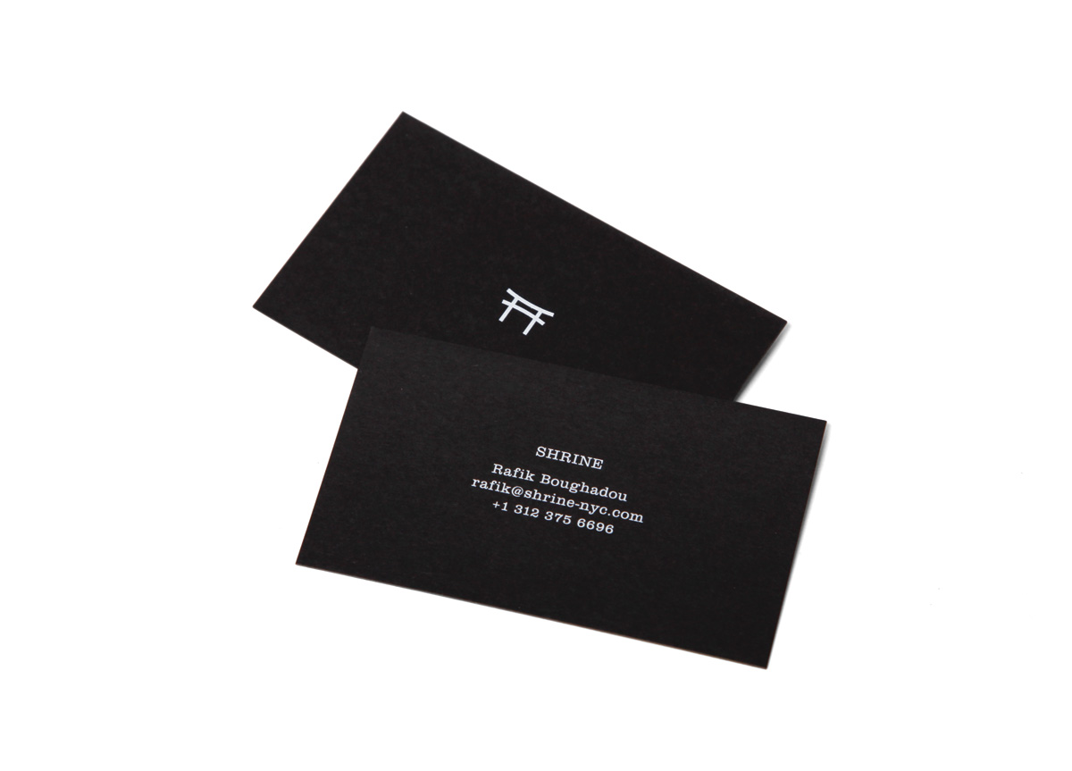
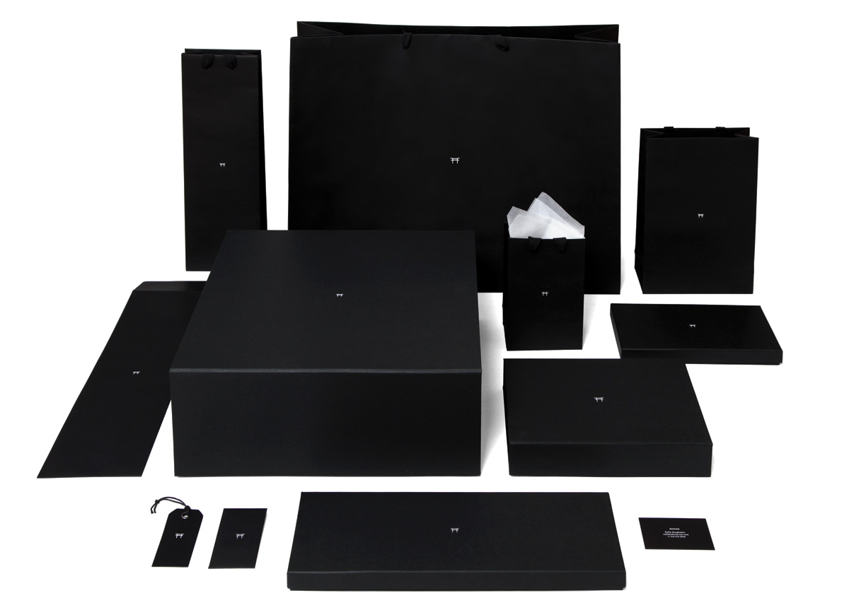
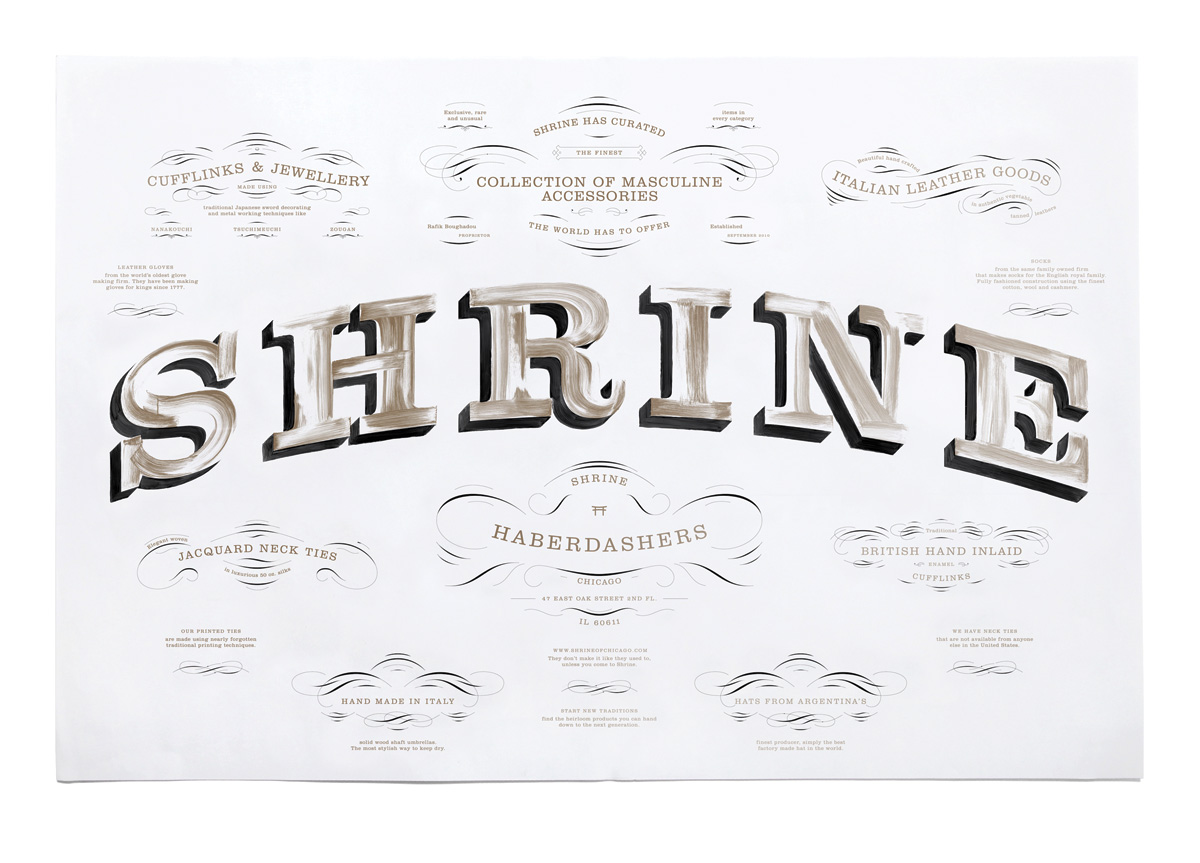
A new men’s haberdashery based in Chicago, IL. SHRINE offers high-quality men’s accessories that were made using traditional techniques by artisans with centuries of experience. The store sells products from both the far east and Europe.


BRIEF

Establish the identity and packaging for the store.


APPROACH

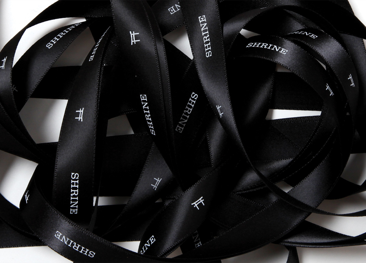
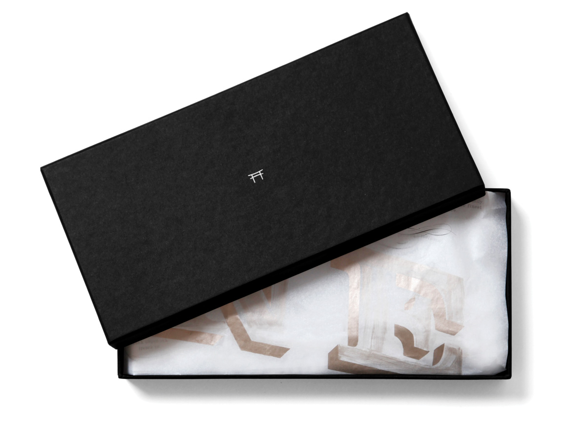
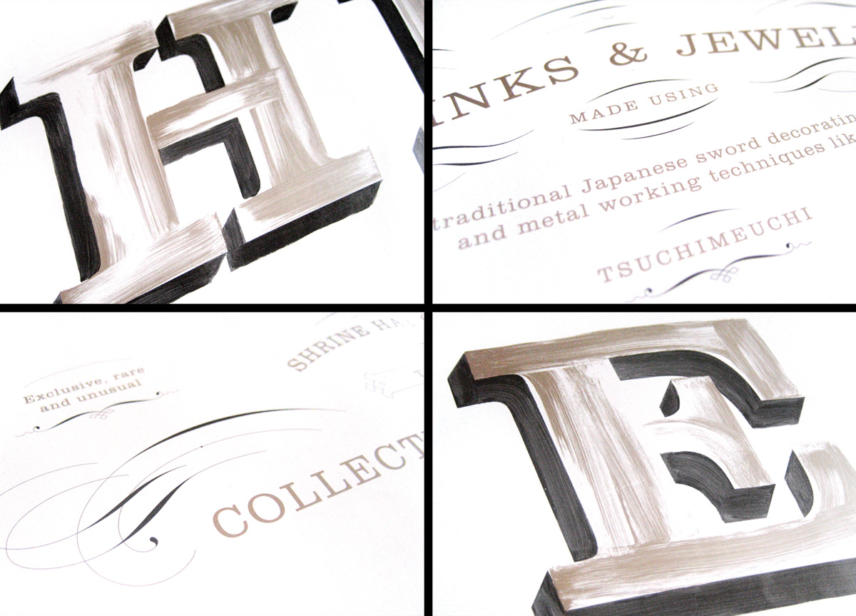
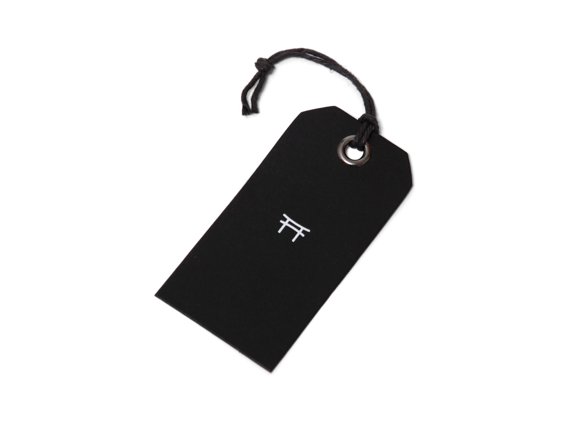
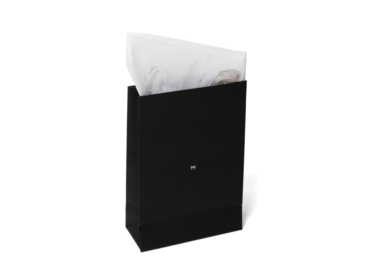
Because of the sources’ polarity we came up with an identity composed of two separate sub-identities that would contrast and complement each other like a yin and yang. Half of the identity is a small white Shrine symbol centered on all-black materials. To contrast this minimal system we then created a very dense ornamental poster graphic printed in black and gold. The poster communicates some of the unique production techniques and exotic origins of the products in the store. The idea was that this one piece should serve a lot of different needs, so it is used as gift wrapping and tissue paper, or as a poster promotion.

Communicating our store’s commitment to quality in design and manufacturing is hard to do verbally, but once we put our business card in people’s hands they understand exactly what SHRINE is about. The design of the card catches people off guard because every detail feels considered, from font and white engraving to the quality and heft of the black paper. The rest of the packaging and brand imagery seals the deal in many cases. Yesterday a client came in and said that she was blown away by the packaging and that inspired her to come shop with us again. Traffic to our website has increased and we have seen a jump in sales. — Rafik Boughadou, owner of SHRINE

Browse entries