CATEGORY

Comprehensive Identity Programs

LEVEL

Student

RANK


DESIGN CREDITS

Designer

Dave Whitley

Instructor

Jude Landry


TAGS

, , , ,


LINKS

davewhitley.com

Shipley Donuts by Dave Whitley


CLIENT

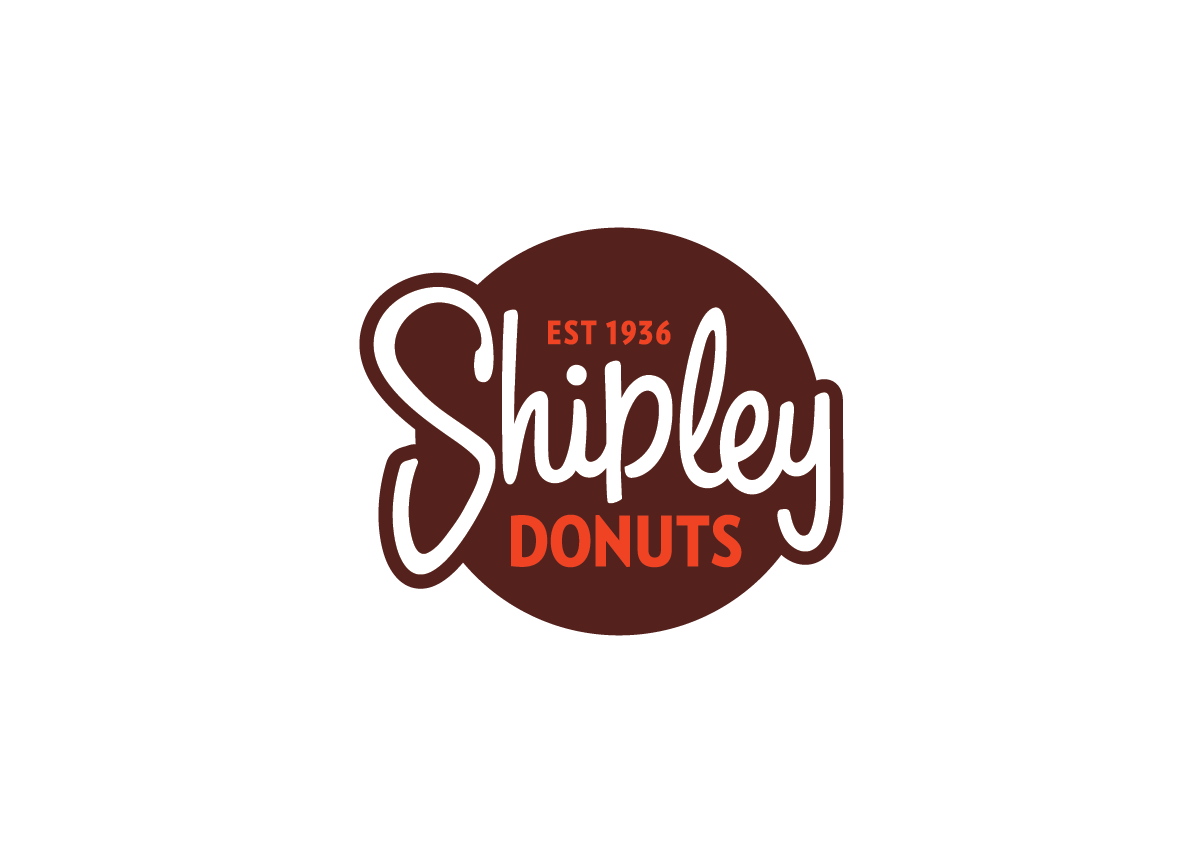
Since 1936, Shipley has been serving donuts in their home-style restaurants all over the South. “Make Life Delicious!”


BRIEF

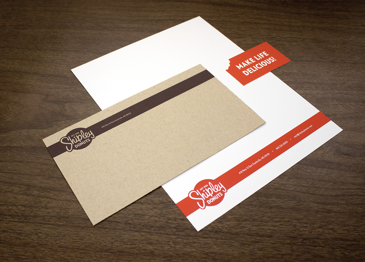
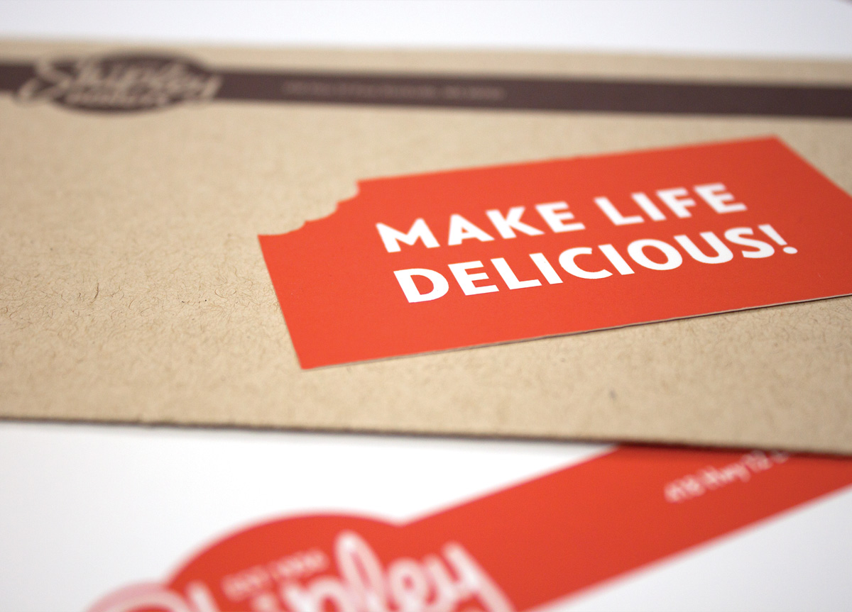
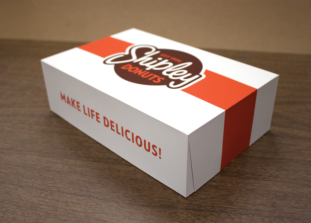
Rebrand Shipley Donuts. Start with the logo and continue with colors, typeface choices, a letterhead package and business card. After that, cups, boxes and icons were made.


APPROACH

Shipley restaurants are very friendly, down-to-earth, and welcoming. Above all, I needed to convey those characteristics in the rebrand. I decided that the original “Shipley” lettering had to be retained. This part of the logo has been around for a long time, and it would be a shame to lose it. The lettering was in terrible condition, so it was cleaned up and subtly changed. Their previous branding consisted of two very different logos, and both were used on everything from signage to donut boxes. I took aspects from both and brought them together in one mark that could work in multiple applications.

In redesigning Shipley Donuts, we looked at the existing brand and tried to determine what was worth keeping and what needed to be changed. I am proud of Dave’s assessment and solution. He kept and polished the existing script and color palette, which were valuable components of the existing identity. Everything else was redesigned around those basic visuals, and his final result is on a professional level rarely seen in students. He even designed a series of icons for the restaurant that were not required for the project. This regional donut chain would greatly benefit from Dave’s redesign. — Jude Landry, instructor at Mississippi State University

Browse entries