
![]()
![]()
CLIENT
A global pharmaceutical company based in New York, NY, and the world’s largest research-based pharmaceuticals firm.
BRIEF
After 150 years in business, Pfizer was the global leader in pharmaceutical sales, but the trajectory to the top had come at a cost. Mergers, acquisitions and shifts in priorities over the years had saddled Pfizer with a hodgepodge of disparate visual systems and messages, resulting in a fragmented brand identity. As a result, the Pfizer brand mark—the center of its market presence—had begun to lose value and meaning.
APPROACH
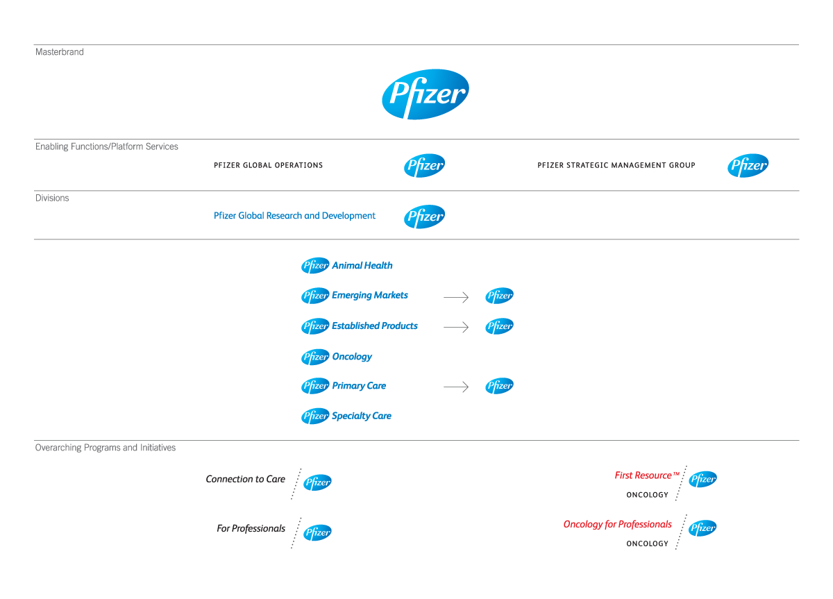
In the fall of 2008 Siegel+Gale audited Pfizer’s brand architecture and communications practices. Our findings revealed internal confusion about who Pfizer was, exacerbated by absence of a clear, internal brand architecture or hierarchical visual system linked to a single identity. We then refreshed the well-known oval logo into a more modern mark with more contemporary color and typeface, backed up by a strong new visual system and supported by Brand Voice attributes and comprehensive guidelines promoting cohesive brand architecture, visual identity and messaging.


