CLIENT
Manufacturer of cutting-edge power tools for both amateurs and professionals.
BRIEF
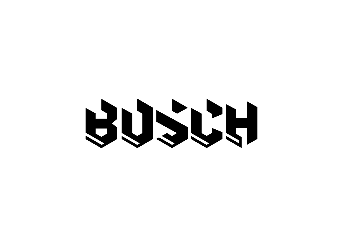
Bosch has had almost the same logo since its founding in 1886: plain red sans serif type. They needed something edgier and more powerful to match the look and feel of their advanced tools.
APPROACH
The wordmark is based on an underlying isometric grid that forms hexagonal shapes for the letterforms. It is meant to convey the concept of precision cutting and strength and to evoke the power tool visual language. The repeated notches cut out of the top of the letters also form the serrated edge of a saw blade. Originally a symbol was created to accompany the wordmark, but because power tools are known by their name (written on the tool itself as well its accessories), it was ultimately decided that the wordmark had enough strength to stand on its own.
Stephen went through several iterations and revisions of this mark, including sketches of force connected symbols, but I believe this final one to be the most effective. He worked hard to make the letters consistent and mesh together, overcoming some initial problems with the shape of the H. Overall the solution works very well, especially when integrated with the other identity materials. — Jacob Ristau, instructor at University of North Texas
Judge’s Comments
The execution of the Bosch logo is carried out perfectly. The drawing is of very great quality and the cut on the letters brings modernity to an old mark. — Claudine Félix-Janneau
The Bosch logo is intriguing because it uses the vernacular of Fraktur typefaces (broken type) but rendered in a more contemporary way. It implies the “German” engineering of Bosch products and has more character than the rather bland logo Bosch is using at present. — Steff Geissbuhler