

NOTE: This is an archived version of the first incarnation of Brand New. All posts have been closed to comments. Please visit underconsideration.com/brandnew for the latest version. If you would like to see this specific post, simply delete _v1 from the URL.
![]()
I have always been disgustingly fascinated by the name “Fifth Third Bank”. Specially since I had no idea where it came from. I wondered, how stupid can a bank be that divides anything into two times more than it mathematically could? Having never had to satisfy that curiosity until today — since I bank at Pentagram-designed banks only — I finally learned that the name comes from the merger of Fifth National Bank and Third National Bank almost one hundred years ago, in 1908, forming Fifth Third Bank. In the same vein, the old logo has consistently struck me as both repelling and fascinating, with its ultra thickness, italicism and super curves. Luckily, with a redesign by Cincinnati-based branding agency Deskey, I have now come to peace with my paradoxical feelings: I just find it repelling, nothing else.
Officially launched back in February, but only publicly viewable earlier this month (and 18 months in the making) Fifth Third Bank’s logo carries the hope of a new internal brand promise — “We will relentlessly meet today’s needs while working hard to deliver a better tomorrow for our customers and ourselves” — combined with a new mission — “Fifth Third Bank will become the bank people choose over others, because customers seek clarity in making their financial decisions” — and some heavy press releasing:
The new identity symbolizes a horizon, with an update of the distinctive Fifth Third shield serving as a foundation for the visual. The shield has been a part of the Fifth Third identity for more than 50 years. Its central focus in the new identity represents the rich heritage of Fifth Third Bank, while the intersecting horizon line is a metaphor for the bright future it seeks for its customers, employees, communities and shareholders.
“The new color palette reinforces the horizon metaphor with the addition of an invigorating green, designed to evoke growth and possibilities. By incorporating a brighter shade of blue, the identity remains true to the Bank’s legacy while evolving into the new positioning.”
— Miki Reilly-Howe, vice president of Strategy Development for Deskey
Unfortunately, there is no explanation for what the horrendous new typeface means. I’m rarely offended by typographic choices, but this one is utterly inappropriate for anything designed in 2007, topped off by an equally old-fashioned small cap treatment and close kerning that barely begins to take attention away from the XL swoosh. Deskey also managed to remove one of the few inspired bits in the old logo, by de-italicizing the numbers and the holding shape; a trait that at least implied minimal dynamism but now creates a clash between the slash and the rest of the mark. This logo is now five thirds worse than it used to be.


Jump to Most Recent Comment
Conor’s comment is:
By incorporating a brighter shade of blue, the identity remains true to the Bank's legacy while evolving into the new positioning.
Mmm… what seems like Reflex Blue (i.e. cheap as chips and dries quickly). They could have retained the established blue and gone for a brighter green.
On May.28.2007 at 11:34 AM
Christian Palino’s comment is:
A truly lost opportunity with this logo redesign. I agree that the italicized numerals, with their extreme stroke weight, were interesting and a missed opportunity with the new logomark. Instead, the numerals lose legibility (especially the 5) and thus only serve to disturb a slightly disturbed name.
The typeface, the swoosh, the double stroking of the holding shape and the stagnation of removing the slant to the form makes this a tragic redesign.
The name is intriguing, and I'm a fan of having numerals to work with – again, lost opportunity.
On May.28.2007 at 11:58 AM
Kemper’s comment is:
Commentary is hilarious! I was surprised to see no mention in their press release of the umbrella protection metaphor created by the swoosh. That would have added another layer of cheesiness.
On May.28.2007 at 12:29 PM
Larry’s comment is:
I was hoping you would tackle this one.
Ugh. It is interesting to go to their web site and see how this new mark is carried forward into the rest of their design. While banks seem to be trending toward cleaner/simpler site designs, this one seems like it is lagging a few years behind everyone else.
On May.28.2007 at 02:19 PM
Dan-o’s comment is:
Couldn't believe this wasn't some sort of joke... it's like a 'before & after' the wrong way round.
There's too much going on, the type is a throwback to everything that was bad about design in the late 80's/early 90's, and the new 'shield' reminds me of the retro Vancouver Canucks hockey-stick logo. Whilst the old muted blue was far too 'serious financial services' for a progressive, customer-focused back, the new colours are pretty shocking. The whole thing shows zero imagination.
But then, looking at Deskey's work, did you expect anything more? They've done a packaging job on it, and it doesn't work. I always liked the kooky name, personally, so I'm glad they didn't change that.
This has set them back 20 years. How totally underwhelming...
On May.28.2007 at 03:03 PM
dane Benton’s comment is:
The first time I saw this I was in the broad-ripple village of downtown Indianapolis, In. I couldn't believe how freaking awful it was. I agree - the type is completely off, and they have sent themselves away from a more modern look. I originally thought that maybe this was a identity created for that branch alone, but it's sad to see that it's going to have a nation-wide roll-out. Let's hope they didn't pay too much for it, as I think most university students could've developed something better than this.
On May.28.2007 at 04:11 PM
richard’s comment is:
This logo is absolutely CRAPTASTIC! I wish I could have written the review, from the name right down to the design. A horizon?! How so very future thinking! They are geniuses!
CRAPTASTIC!
On May.28.2007 at 04:25 PM
Calvin Ross Carl’s comment is:
This logo is absolutely atrocious. Deskey has always made horrible work, but this is an all new low.
On May.28.2007 at 05:49 PM
Robert Spangler’s comment is:
The concept reminds me a bit of the Citi logo actually, the whole umbrella over the company deal...just not nearly as inventive. I really don't hate it though, maybe not the right direction but we've seen worst to say the least.
On May.28.2007 at 11:01 PM
marko’s comment is:
"What's that font on money?"
"Oh, I dunno... it looks like Copperplate."
"Yeah, let's use that."
Terrible.
On May.29.2007 at 12:42 AM
Gene’s comment is:
Ugh. They kept the worst part of the old logotype -- the cheesy 1970s typeface. I would have jettisoned the 5/3 element not only because of the typeface, but because it imparted the wrong message, the fraction that causes so much confusion and discomfort. The name of the bank is not a fraction, but some clueless designer in the past glommed onto that misconception and immortalized it in the logo.
On May.29.2007 at 01:19 AM
Steve Woodruff’s comment is:
Apart from maintaining an awful name, keeping most of a really dumb-looking logo, adding further elements to increase the ugly factor, and bringing forth meaningless brand promise and mission statements...I think it's pretty good. A case study in how to go from bad to worse.
I can just picture the focus groups now, conducted among the employees..."each day, I think about the bright future we want to offer our customers"..."I feel that we're reaching toward new horizons of green"..."whenever I see our logo, I feel like I need to down a fifth"
On May.29.2007 at 01:45 AM
Danny Tanner’s comment is:
bad logo. bad. sit. stay.
On May.29.2007 at 01:45 AM
AL’s comment is:
That's really ugly.
On May.29.2007 at 06:15 AM
Xavez’s comment is:
My god, these guys need to take some lessons in typography. This is hideous! Even worse: it's plain cheap! Even I, ... No, ... Anyone would have done a better job choosing the colours and the typeface!
On May.29.2007 at 06:55 AM
Captain Design’s comment is:
Simply shocking! Design (term used very broadly in this case) as bad as this gives the entire design/creative industry a bad name - does anyone at Deskey even know how to set or design type? Umbrella theme is predictable and has already used by Citi (smell a take over anyone?) and that could be the only rationale to use that lame idea. Other than that I've wasted too much of my precious time thinking about this terrible design. 1/10, the one was for Deskey getting out of bed that morning which they obviously did not need to do! I would love to know the reaction from the client and how it will impact their business?
On May.29.2007 at 08:13 AM
Dylster’s comment is:
Yup. Fugly. Shame on Deskey. I've been recoiling at this logo for years, hoping someone at Fifth Third would wake up.
Guess not.
On May.29.2007 at 09:03 AM
Patrick Senecal’s comment is:
Never give a project this big to an intern.
On May.29.2007 at 10:45 AM
Jon Dascola’s comment is:
My faith in this business resides in the thought that some marketing manager thought they knew best and gave their art direction to the folks at Deskey. I sure hope Deskey didn't have endless creative horizions to explore. Or maybe they did and thats where the fancy visual metaphor came from.
On May.29.2007 at 10:51 AM
Mark’s comment is:
Tic Tacs, anyone?
http://www.metanoiac.com/images/tic_tac.jpg
WTF? Whats with adding the green? I don't get it.
How is this logo any "better"?
couldn't they at least modified the the typeface of the "5/3" ?
Theres no explanation for the logotype of the name at the bottom,it makes no sense.
I thought the goal of logo design was to simplify the logo,not add more stuff on to it!
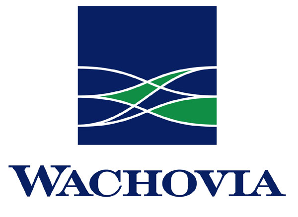
Looks like it's signifying a merger (ala Wachovia) rather than an update.
hmmm......wait a minute it seems the designers are copycatting Wachovia's design...the odd curved shapes, the green and blue color scheme, the squarish blue symbol centered over the name,even the old styled typeface is similar!
http://www.flatrock.org.nz/topics/money_politics_law/assets/wachovia_logo.jpg
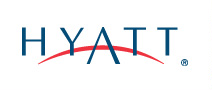
it seems they got that horizon idea from the Hyatt logo (a bit colored differently)
http://www.hotel-online.com/News/PR2006_2nd/HyattLogo2006.gif
Isn't a wonder that the designers gave very little attention to the logo itself?
On May.29.2007 at 11:53 AM
Mark’s comment is:
You could say goodbye to this simple signage:
http://localareawatch.typepad.com/photos/uncategorized/fifth_third_hq_gr_2.jpg
http://weblog.live.advance.net/mtlogs/mlive_flintjournalextra/images/0602bank01.jpg
http://www.4points.net/images/rph5th3rdlg.jpg
http://world.std.com/~eva/florida/5th_3rd_bank.jpg
http://img.travidia.com/ss-ad/682499
http://www.clevelandskyscrapers.com/cleveland/fifththirdtop.jpg
sigh.
I'd hate to think what their new signs would look like,but they will be garish looking.
Why did this bank hire a firm that mostly does packaging design?
Take a look at their website,most of the examples of their work is for products that you would find on store shelves.
Luv's,Prilosec OTC,Crest,Post It notes,Bush's Baked Beans,Jack Links,Downy,De Walt Power Tools,Children's Pepto,Etc.
On May.29.2007 at 12:16 PM
Nicole’s comment is:
Ugh! Serifs... running... into... each other... So fuzzy... on computer screen...
And is it just me, or does the typeface in the symbol look like the sails of a ship? That's what I first thought it was, glancing at it quickly.
Horrible. I have no idea what to look at first on the new logo. There is no order to it. And it doesn't seem very adaptable to different applications. How will it look on letterheads? signage? The old logo wasn't good either, but the elements seem easier to rearrange without losing the identity.
On May.29.2007 at 12:54 PM
disgruntled designer’s comment is:
what the hell kind of bastardized copperplate/mutant serif wannabe type is that? as truly ugly as the 5/3 mark was before it isn't any better now. that's a difficult challenge there, to take something that is really fugly and make it even fuglier. kudos for the unnecessary green as well. unnecessary color and unnecessary swhooshy and outline.
On May.29.2007 at 01:06 PM
Paul Riehle’s comment is:
strike one was keeping the same typeface for "5/3" and strike two and three was using that very ugly typeface for the word mark
On May.29.2007 at 01:15 PM
Scale’s comment is:
Fifth Third is fairly new to our area. I'm glad the hideous red, white and black color scheme is finally gone, but sadly, the name and the uninspiring logo will keep me from ever taking them seriously. That name makes my brain hurt!
On May.29.2007 at 01:33 PM
C-Lo’s comment is:
There is not an ounce of professional thought in this logo. I would think customers start thinking that this isn't a real bank the logo is so bad. Heck you can't even read the word "bank" from 20 paces so they won't go near it. I would not allow this logo for a bank on the set of a television series. All I needed to read was the explanation of the colors from a VP Desk Jockey and know it was headed toward trouble. Leave the designing to the designers, less you want me to be the Vice President.
On May.29.2007 at 01:33 PM
Mark’s comment is:
I actually don't think this bank needed a symbol,I think it could have been more effective as just a wordmark.
It meets one of the criteria for a wordmark below:
http://www.identityworks.com/issues/issues3.htm
It's name is indeed unique and distinctive, but as of yet not every one is familiar with Fifth Third Bank.
(I've never even heard of this company until now.)
Identityworks is a pretty good website in determining what objectives go into the making of a successful logo.
On May.29.2007 at 03:36 PM
fatknuckle’s comment is:
Being in this fine state of Ohio, I have noticed the creep of this new mark. When I first moved here, one thing that stood out to me was a. the name, b. the red/black color scheme (not blue, never seen it that way) Every time I pulled up to the ATM I would think, wow, for a bank that is one of the most financially sound independents, this was in some dire need of some TLC.
Be careful what you wish for I suppose.
First off, they should have dealt with that name. While they have built certain amount of equity in that 5/3 nomenclature, I would venture to guess that equity is primarily found only in Ohio. Lately they have been expanding their operations to markets outside of Ohio, and this would have been the perfect time to, well, begin at the beginning.
I understand that this was probably off of the table from the get go due to a fair amount of institutional narcissim but it certainly would have been the right decision in the long term.
On May.29.2007 at 03:49 PM
brian’s comment is:
'F' for Effort.
There was better work at the bottom of the crit pile in design school. Bleh...
At least they kept it boring and ugly: perfect for a nostalgic bank.
On a side note: at least they didn't use gradients. Was hoping somebody at Brand New would comment on the new Chevron logo update. ![]()
Von Glitschka’s comment is:
When I saw this I thought of a large fat bird. This seemed appropriate in that it'll never get off the ground and soar.

Splashman’s comment is:
Heh, Von, you've got too much time on your hands. But it's still hilarious -- thanks!
Out here in the wild, wild west, I've never even heard of this bank. Honestly, when I first saw it in the blog entry, I had to squint to make sure I was reading the company name correctly. Unique? Yes. Guaranteed to provoke a great big WTF from those who haven't heard of it? Yes. And that's just the company name.
Re: the logo, You've all said it better than I could. Lame before; atrocious now. Deskey should be ashamed.
On May.29.2007 at 07:04 PM
Joe’s comment is:
At the root, it's bad name with infinitely bad associations. 1.666666666667
(pun intended)
Joe’s comment is:
And for dyslexics / civil liberties buffs, 5/3 carries an even worse association:
Three-Fifths Compromise.
hobbster’s comment is:
Living in Colorado, my first exposure to 5/3 was via a few spam emails I received a year or so ago. They were of course encouraging me to sign on and "update my account info." I did not have an account with them and my thought was "that's not even a real bank -- who in the world would fall for this with a dumb name like that?" Oh, and "what a nasty logo!"
Imagine my surprise seeing 5/3 banks all over the place a few months later while visiting Lexington KY. Much to my chagrin, no one among my friends there could explain to me the origin of the name. Knowing it now really doesn't make me feel any better. It's weird. But it is memorable.
Oh yeah, the new logo. If it had been in the spam emails I received, I would've had the very same reaction.
On May.29.2007 at 09:42 PM
Brad’s comment is:
Hey why HASN'T there been talk of the new Chevron identity? I know everyone is still a little torn and twisted by gradients, but I have to admit that it is one of the most successful 'gradient' identities I have seen in some time. Perhaps I am just a sucker for the depth that it implies or the clean type…
Anyone else?
On May.30.2007 at 01:24 AM
Splashman’s comment is:
Brad, does it make any difference to you that the chevrons (i.e., the shapes) aren't chevrons any more? (Now it's folded satin ribbon. Definitely something for Chevron employees to be proud of. /sarc)
No offense intended, but yes, you are are a sucker for gradients.
There are times and places to "fancy up" one's logo -- a video, for instance -- but to force gradients into the basic identity, for no other reason than to "fancy it up", is lame, lame, lame. And in this particular case, the shapes now completely overpower the type, thanks to the gradients.
Blech.
On May.30.2007 at 04:19 AM
L.Vazquez’s comment is:
THIS was 18 months in the making?
On May.30.2007 at 08:13 AM
Brad’s comment is:
Splashman,
I would argue that, historically speaking, a chevron made of folded ribbon is STILL a chevron. Certainly you can't think that the overall shape of the mark is no longer apparent. If you were to nitpick even more you would also notice that perhaps the company should be called Chevrons–plural–as they are using 2 of the same shapes.
I am not crazy about some of the detail of the mark, but I am nonetheless impressed by the implementation of the Chevron identity at the local fuel stations. Perhaps that is because all the OLD Chevrons were literally falling apart and somewhat unsafe.
I wouldn't consider myself a sucker for the gradient. I rarely find myself using them due the fact I think the best marks are still the single color marks. I even advise my students to make every attempt to resist the gradient-for-gradient-sake urge.
Enter Devil's Advocate
However, to play devil's advocate, I do think that the graphic design world needs to come to grips with the fact that our justification for gradient hating is being rapidly eroded. We are living in a more visually and technologically sophisticated society than ever before. Printers can easily reproduce fine gradients at small sizes—a fact that buries an age old concern of reproduction. Also the read/cognition time on a subtle gradient is, I would imagine, not any more than a single color mark.
Gradients and drop shadows have for years been the whipping boys of the design world. I am as guilty as anyone on this matter. We have even gone as far as to draw these rough lines regarding where these things are acceptable; they are ok to use on screen but not in print? Perhaps we need to start evaluating the result rather than the technique—balancing things like consistency, implementation, and formal strengths/weaknesses.
Exit Devil's Advocate
Regardless, this 5/3bank mark is still terrible.
On May.30.2007 at 12:08 PM
Anonymous’s comment is:
I would have guessed the first issue would be to make the 5 and 3 more legible, and it seems untouched except for being more upright ???
On May.30.2007 at 01:25 PM
Neil’s comment is:
Pretty much agree all around with the negative feedback on the new logo - from bad-and-dated to new-and-not-at-all-improved. My comment mostly concerns the name Fifth Thirds...
Years ago when my little independent bank was being bought out by Fifth Thirds, I asked the teller when this transition would take place.
Teller: "Sometime in the first quarter."
Me: "So... Fifth Third in the first quarter..."
The odd numerical joke didn't seem to register with the teller, but I enjoyed it then as I do now.
On May.30.2007 at 11:31 PM
Tony Goff’s comment is:
That’s a pretty bad logo. I assumed the green arcs were representing the world or some other marketing wank. Then I read that the horizon was a metaphor for a bright future...
I would like to meet the person who associates a lime green horizon with a bright future, polluted perhaps but certainly not bright.
I won’t repeat what’s been said about the typography, not the greatest redesign to grace this fair earth. Then again with a company called Fifth Third Bank the cynic in me is thinking it was doomed from the start...
On May.31.2007 at 07:13 AM
Splashman’s comment is:
Brad, my concerns regarding gradients have nothing to do with the challenges of reproduction, and everything to do with design philosophy. What's the mantra of the skilled logo designer? "Add as much detail and make it as photorealistic as possible!" Right? Oh, wait.
And I'd kindly suggest you be more careful with your choice of pronouns.
On May.31.2007 at 12:43 PM
christy’s comment is:
Deskey, in the moment I knew you existed, you became dead to me. DEAD!
On May.31.2007 at 02:20 PM
Brad’s comment is:
Splashman,
Wow. Such hostility and sarcasm all rolled into one :D
What I originally said was that the Chevron mark was one of the most successful GRADIENT identities I have seen in some time. Would I, personally, rather have seen it retain the flat colors it had before? Sure. But in the world of gradient marks and symbols I think it works comparatively well.
Also you mention 'design philosophy' and mantra as if they are universal constants. The philosophies and mantras of Malcolm Grear and Gert Dumbar are quite different. Their work is, as a result, very different.I wouldn't be able to pick whose is better. Horses for courses.
And which pronouns do you find careless?
On May.31.2007 at 02:34 PM
tonepoems’s comment is:
To Patrick,
Wasn't the Nike Swoosh done by an intern?
Armin’s comment is:
Nike's swoosh was designed by Carolyn Davidson, a design student, for $35.
On May.31.2007 at 05:36 PM
thebouch’s comment is:
Teller: "Sometime in the first quarter."
Me: "So... Fifth Third in the first quarter..."
I love the second half of that story.
On May.31.2007 at 08:34 PM
Bjorn’s comment is:
Its so bad.. my eyes are bleeding.. This coming from a company, who, from its site, seems to have worked with some major clients is just plain unfortunate. I do not see this making into their portfolio anytime soon. :D Maybe its just bad bad clients...
On Jun.02.2007 at 12:39 PM
Corey Buckner’s comment is:
Sometimes I look at a logo and ask, "What the heck did the designer get paid for?" This is one of those times.
On Jun.03.2007 at 04:17 PM
TC’s comment is:
The worst student in our class interned at Deskey about 10 years ago. It doesn't surprise me that this came out of Deskey, nor would it surprise me if it was actually designed by a similar intern at Deskey (who shouldn't be receiving passing grades in their studio classes, yet somehow does...)
On Jun.04.2007 at 04:45 PM
DesignMaven’s comment is:
Mark:
"Why did this bank hire a firm that mostly does packaging design"?
Donald Desky Associates an Industrial Design Consultancy founded in the 1940s was one of the Founding Fathers of Identity Practice.
Lippincott & Margulies, Landor, Soyster & Ohrenschall, Raymond Loewy, Henry Dreyfuss Associates were all Industrial Design Consultancies that Developed and Designed Products.
Corporate Identity was given birth to by Industrial Designers not Graphic Designers.
The aforementioned Consultancies Developed and Designed Products and also Developed and Designed the Clients Identities to Identify said products.
Not a lot of Press was given to Industrial Designers Practice of Identity.
Both SAUL BASS and PAUL RAND made Corporate Identity a Household word. More than half of their annual billing was Identity and Packaging
an Industrial Design Activity.
Sad none of the First Tier Identity Consultancies could've done much better.
Appears to me this Identity was driven by the Client. In lieu of that statement, not much a consultancy can do when Identity Consultancies are Managed by their Client's Purse Strings.
Who said Corporate Identity had to be Pretty or knock us off our Feet???!!!
There are a lot of UGLY Identities that do a very good job because of the way they're marketed, managed and communication disseminated.
Brian:
Chevron is over one year old.
Neither Arm or myself thought Chevron was worthy of an Editorial.
I ranted about Chevron on Speak Up among other Identities.
See link below.
Paul Rand's Final Logo Part 2
Editorial by David Weinberger
http://www.underconsideration.com/speakup/archives/002560.html#comments
DM
The Hostile Takeover of Corporate Identity
On Jun.04.2007 at 06:09 PM
Mark’s comment is:
DesignMaven, thank you for pointing out my misconceptions about identity design, apparently I was mistaken that packaging design didn't play a big role. Packaging did and still does play a big part in graphic design in reality, that, I did not
know about.
My belief that packaging didn't play a big role in graphic design was probably due to the fact that many examples of packaging design aren't that great unfortunately.
It seems that in those cases the client took all control of how the design was made, sigh, and this looks like one of those examples....
No doubt the conversation between the client and the design firm went like this:
Fifth Third Bank:I want you to design a new logo for us, something thats completely different than what we had before. Do you have any ideas?
Deskey: Well, you could start with that symbol for one, it's awfully outdated looking, it represents something old.
Fifth Third Bank: (tenatively) Uh,huh go on.
Deskey: Well, I was thinking something such as a wordmark..
Fifth Third Bank: Whats a wordmark?
Deskey: Well it's a logo with a name only, in letters. Something like this (sketches a logo on a pad and shows the client)
Fifth Third Bank: (faking authenticity) Sounds good, tell you what, how about you create a few design options that I could pick from, and I'll see you in a few months,okay?
Deskey: (puzzled) oh, okay.
A few months later....
Deskey: Hello?
Fifth Third Bank: Oh, yes come on in, do you have the design ideas I asked for?
Deskey: Yes, a few of them you'd might like,here let me show them to you...(takes out the designs)
Fifth Third Bank: Well, lets see them.
Deskey: (shows them one by one) Okay, in this one it shows the name in a dark blue sanserif type..
Fifth Third Bank: Nope, don't like too modern...
Deskey: (put it back,takes out another one,and shows it)Oh okay how about this one? It has the bank name in squarish tech like font, also in blue..
Fifth Third Bank: Too trendy, we aren't a techno group,next.
Deskey: (puts that one one back, takes out one in a rounded blue typeface) How about this?
Fifth Third Bank: Nope, that doesn't look like a bank, let me see the rest.
Deskey: (puts that one back, takes out another one) How about this?
Fifth Third Bank: Thats not us! can you hand me the rest?
Deskey: Oh, okay, sure...( reluctantly hands them over)
Fifth Thirds Bank: (takes them, goes through them all, rejects almost every one of them) no, (puts that aside looks at another)no,(puts that aside looks at another)no,(puts that aside looks at another)no,(puts that aside looks at another)no,(puts that aside looks at another)no,(puts that aside looks at another)no, are all these word marks?
Deskey: Yes, like I said before...
Fifth Thirds Bank: (goes through more of them)Then where's the logo? you know the symbol?
Deskey: I didn't say there would be a symbol, besides it was outdated...
Fifth Thirds Bank: But that symbol represents us! our company! (stops at the blue one in Bank Gothic font) Aha! this ones perfect!
Deskey: You found one? let me see..(takes a look) um,excuse me,but um that was the last one that our company was going to recommend....
Fifth Thirds Bank: It doesn't matter, it's just what we're looking for! Tell you what why don't you take this typeface, put the 5/3 symbol over it,without the slant,with a green outline, with a green rounded horizon,here something like this (sketches a logo similar to the new logo) and have it ready in a few weeks,and I'll pay you double.
Deskey: (reluctantly) oh, okay I guess...that....could...work..um. We'll do the best we can.
Fifth Thirds Bank: Good, I'll be supervising
Hence, we arrive at the current logo.
DesignMaven’s comment is:
Mark
You're BANANAS.
I think my BIG Sis Debbie Millman will differ in your assessment of Packaging Designers. Sterling Brands her Consultancy is Great at both Identity and Packaging.
Pentagram is Great at Both, Packaging and Identity. Ask Michael Bierut if he consider himself a Graphic Designer or Industrial Designer. I'm certain BIG BRO will inform you of the later.
There is No Design Problem an Industrial Designer cannot solve. Graphic Designers have the stigma of being limited to two dimensional space.
Elinor and Joe Selame Identity Consultancy BrandEquity International is another Consultancy Great at Identity and Packaging.
Both Elinor and Joe consider themselves Industrial Designers not Graphic Designers.
You can visit them at
There are a lot of Great Packaging Consultancies that commence Great Identity work to numerous to mention.
Granted, today Graphic Designers get an enormous amount of Identity work. Graphic Designers are the practitioners keeping the Flame Lit and the Spark Ignited in Identity.
All of the Identity Consultancies that once practiced Packaging are devoted solely to Branding and Identity.
Now Branding has Superseded Corporate Identity as a problem solving activity. That's the problem with many of the PROSAIC and Lack Luster Identities of TODAY.
Heavy on Marketing and Light on Design.
If you think you're Ranting now and have a lot to SAY.
Wait till you SEE London 2012. I think Arm will do the Honors of writing the Editorial if not John.
This may be the Biggest Identity Discussion in Brand New / Speak Up History. Bar None.
An Aside:
Someone mentioned the Swoosh or Arc and where it was borrowed. Can't remember the Commenter.
The Arch in 5/3 rd Bank was perhaps influenced by
BrandEquity Identity for earth shoe Developed and Designed in the 1990s.
Link below.
http://www.brandequity.com/our-work/Earth-Shoe.php
DM
The Hostile Takeover of Corporate Identity
On Jun.05.2007 at 02:25 PM
Mark’s comment is:
DesignMaven, I looked at the link you provided and I have to say I am impressed by the examples of their work, I find it seems that type of excellent design has been somewhat rare in packaging design in most major brands.
Some of those brands I'm familiar with Staples, Nantucket Nectars,Zoots,Sheraton, and White Mountain shoes.
I appreciate them for making such memorable, yet clean looking brands.
It's a shame that marketing has mainly overridden in importance in design
I've seen the 2012 logo, even though I like it, I'm not sure it'll work as a logo for the games.
It works for promoting the games, so far.
On Jun.05.2007 at 03:12 PM
KATE’s comment is:
I worked with this logo for the River Bank Run project and hated it. With all the money they have to spend changing their signs, the logo is already being cropped to fit the signs. And it has low visibility at small sizes. what a waste of money!
On Jun.12.2007 at 04:10 PM
Mark’s comment is:
More suitable for a grocery store chain now I think about it...
On Jun.12.2007 at 10:27 PM
cheetahboy’s comment is:
Re: Devil's Advocate Comment
However, to play devil's advocate, I do think that the graphic design world needs to come to grips with the fact that our justification for gradient hating is being rapidly eroded. We are living in a more visually and technologically sophisticated society than ever before. Printers can easily reproduce fine gradients at small sizes—a fact that buries an age old concern of reproduction.
Brad, It has nothing to do with reproduction technology and everything to do with what makes the most effective and memorable corporate identities - simple, clean marks that work in one colour applications. Never stop advising your students to make every attempt to resist the gradient-for-gradient-sake urge when creating a corporate identity. In fact, I would fail any student who resorted to this crutch because they could not conceive an appealing mark without using gradations.
On Jun.15.2007 at 03:15 PM
Brandon’s comment is:
I hate it. I can barely even fill out my deposit slips without vomiting. I'm gonna switch banks.
On Jul.17.2007 at 01:06 PM
Madphill’s comment is:
They need to change their name. Why in the hell would a bank name itself after an improper fraction and then try to convince me to give them my money.
On Aug.08.2007 at 09:34 AM
Patrick Meier’s comment is:
I don’t know anything about Deskey, however I have been working with banks and credit unions for 13 years. I have seen and unfortunately been a part of this kind of thing. So, I was guessing this crappy logo was shown in revision round 52 and they just wanted to cut their losses and move on. Then I went to their site and found this logo IN THEIR PORTFOLIO! Are you kidding me! I really don’t know what to say. Amazing.
On Jan.30.2008 at 09:47 AM
Arglefarb’s comment is:
That's what you get when you make an career HR hack your CEO and he drags one of his favorite lackeys from Grand Rapids, MI down to the corporate HQ and puts him in charge of marketing.
On Jun.06.2008 at 04:41 PM
Philip’s comment is:
Are these guys on drugs? They must be some really sh*t drugs. Not often I see a brand regress as badly as this one.
On Jun.08.2008 at 10:09 AM
Mark’s comment is:
hehe, it looks like a sailing ship sinking in the water, how appropriate.
On Jun.09.2008 at 04:10 PM
pu’s comment is:
which idiot designed this. sholud be shot. twice
On Feb.13.2009 at 12:51 AM
FU’s comment is:
I agree with you all. Every last one of you amazingly talented, brilliant, thoughtful and stupendous geniuses of the HIGHLY CREATIVE AND VITAL TO CIVILIZATION graphic design world. The maker of this horrific logo should be forever banished from your esteemed ranks. Perhaps even his right to draw pictures and play with fonts should be removed. Until he learns how to make really super cool product logos that look awesome and make the world better, like other graphic designers do, anyway.
On Apr.18.2009 at 01:19 AM
Comments in Brand New, V1.0 have been closed.


