NOTE: This is an archived version of the first incarnation of Brand New. All posts have been closed to comments. Please visit underconsideration.com/brandnew for the latest version. If you would like to see this specific post, simply delete _v1 from the URL.

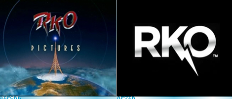
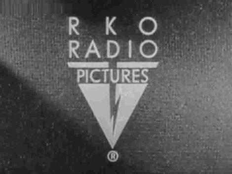
Few Hollywood movie studios or production houses are as tied to a single film as RKO Pictures is to 1941’s Citizen Kane. Perhaps it’s simply the fact that it is one of the most widely celebrated movies of all time and the animated radio transmitter has been played over and over. It also seems that, despite RKO pictures and its logo being around since 1928, there has been no logo other than that nostalgic beep-beep-beeping, black and white rendition. The before logo shown above has been in use since 1997. Selective film and identity memory, I guess. Recently — and for anyone that might know if this is not so recent, feel free to let us know — RKO introduced a new, simpler logo.

“End” logo that appeared at the closing credits of a film, it would take on the different flavors of each movie.
When it comes to the RKO Pictures logo, not everything is black and white though, since there have been numerous renditions of both the opening animation logo as well as a secondary static logo that appears at the end of the film. The best compendiums of these logos can be found at the fabulous Closing Logos wiki, and another album here. The closing logo may be the most resembling of a traditional logo and perhaps would have been more appropriate to use in the Before/After image, but since it is used as the main identifier I opted for the animated version.
Original 1929 animated logo.
1997 animated logo.
We will have to wait for the next RKO Pictures movie to come out to see how the new transmitter animation plays, if it plays at all. In the meantime: the new logo, in my mind, has enough of that nostalgic visual naivete that made the old logos memorable, after all, who uses thunders in their logos anymore? The typography is simple and Gothamish, which makes it feel immediately of the twenty-first century. The shine is a little unfortunate and I hope it’s just a web impulse. Also, before anyone dismisses this all as a copy of RCA’s old logo, I would suggest taking a minute to read through this.
Overall, I think it’s a decent logo that may be a century away from its origins but, let’s face it, so is RKO Pictures… unless Are we Done Yet? is the new Citizen Kane.
Thanks to Chris Dunshee for the tip.

Jump to Most Recent Comment
Pedro Brito’s comment is:
I didn't like the shine but it's a good logo...
On May.25.2009 at 09:07 AM
Avi’s comment is:
excellent upgrade!
On May.25.2009 at 09:08 AM
Ben’s comment is:
On the RKO site is a nice little opening sequence that could easily be the new transmitter animation, which is a real nice throw back to the black and white days. Let's hope it's that.
Also, when the web movie is loading there's a nice little icon of the tower which they should bring into their brand.
On May.25.2009 at 09:46 AM
jmk’s comment is:
Without the gradient it would be very clean and a great logo imho. by the way, isn't the new transmitter animation the one on their new site intro? http://www.rko.com/
On May.25.2009 at 09:49 AM
jmk’s comment is:
ha, sorry, Ben beat me to it while i was still writing :P
On May.25.2009 at 09:50 AM
Cam’s comment is:
Broken record, but it's great sans gradient.
On May.25.2009 at 10:25 AM
Sanjay Basavaraju’s comment is:
Armin, the new transmitter animation plays as an intro on the website. You can view it here.
On May.25.2009 at 12:09 PM
john’s comment is:
Following in the "it fits the market" theme, the gradient is fine. It is entirely appropriate for its entertainment market and silver screen/small screen application.
Geez.
On May.25.2009 at 02:01 PM
John Mindiola III’s comment is:
I love it. Going back-to-black is a great move. And the gradient? I'm actually okay with it. I think that logos nowadays are often NOT present in their B&W glory when on screen. That's saved for the letterhead, the truck, etc.
On May.25.2009 at 03:33 PM
Anonymous’s comment is:
LET THERE BE ROCK!
And it came to pass.
On May.25.2009 at 03:59 PM
Dan Warner’s comment is:
First thought: "What the heck does RKO stand for, anyway?"
The Short Answer
Second thought: "Does anyone else see this as a cross between Harry Potter's forehead and the plummeting stock-chart for the company over the last 60 years?"
Actually, a Harry-Potterish typeface treatment might have been fantastic to recall the energy / quirky mystery of the original, rather than another fat-face acronym...the logo as it stands sreaclls for me some long-forgotten sub-brand of VCR.
Who really knows, though? Could look fantastic in animated motion on a 50-foot screen...
On May.25.2009 at 05:33 PM
Alex C.’s comment is:
Their first logo looks more contemporary than the new one. This new logotype looks like they dug it out of some Rock Band recycling bin.
Maybe all it needed was a slight type"face-lift"—I know, it's an awful pun—to grandfather it into a newer generation. I thought it a well balanced mark, especially how it all sits on top of the registration mark.
I don't know what the hell they were thinking with the penultimate logo. It looks like they went the made-for-TV movie route with that eyesore.
On May.25.2009 at 06:00 PM
Nisio’s comment is:
I'm trying hard to like this a lot more than I actually do. I think the end frame older logo has got so much charm I look at the new logo and find it a bit too slick. No question it is a decent rebrand, I'd wonder whether they are repositioning toward a younger market - the mark to me is very youth orientated. And kudos for a type only solution, with the exception of focus I can't think of another type only identity in the same market (no doubt there is more).
That said I would question the gradient purely on the basis that it's a bit distracting and Doesn't add anything to the design. Maybe if it was applie differently?
On May.25.2009 at 06:02 PM
Chris’s comment is:
Look! It's the RKO Speedwagon reunion tour logo.
On May.25.2009 at 09:25 PM
bryan’s comment is:
it kind of reminds be of bolt bus's logo, even more so than the old RCA one.


rynot’s comment is:
The bolt feels wrong, like it should zig where it zags and vice versa – that way it'd leave the 'O' unmolested.
On May.26.2009 at 01:00 AM
Erik at Logo Critiques’s comment is:
I like it. I'm happy they kept the lightning bolt from the original.
On May.26.2009 at 07:26 AM
koyo’s comment is:
Pedro Brito’s comment is:
I didn't like the shine but it's a good logo...
Yeah... I Agree.
On May.26.2009 at 08:44 AM
Ryan Adair’s comment is:
I'm with the majority on this one. Lose the metallic gradient and you've got a solid logo.
On May.26.2009 at 10:25 AM
Roby Fitzhenry’s comment is:
I think they missed the opportunity to push the vintage story of this brand. The new logo looks too NOW and loses the sense of nostalgia.
On May.26.2009 at 05:09 PM
Johnny’s comment is:
Personally, I love the old "closing" logo, and I think that it was timeless -- or at least ahead of its time. Maybe I'm just a big fan of anything Zigzag or Streamline Moderne.
The new one accomplishes the "heritage" mission and is nice & straightforward, but...for some odd reason I'm getting a 1970's vibe, which rubs me the wrong way.
On May.27.2009 at 01:28 AM
jRod’s comment is:
its a little clunky but for the most part a pretty well done logo. no real complaints here...
On May.27.2009 at 10:50 AM
James Re’s comment is:
I hate the R... weak R i like the rest of it though...?
On May.27.2009 at 12:11 PM
Brian’s comment is:
I like it. It's rad.
On Jun.20.2009 at 04:28 PM
Mark’s comment is:
It's a nice upgrade, I could do without the shine though.
I hope this does mean they're dumping the famous radio tower, that would suck.
It's amazing how long this company has lasted, while other older movie companies have vanished.
On Jun.20.2009 at 07:19 PM
Mark’s comment is:
Oops I made an error WHAT I MEANT TO SAY:
It's a nice upgrade, I could do without the shine though.
I hope this doesn't mean they're dumping the famous radio tower, that would suck.
It's amazing how long this company has lasted, while other older movie companies have vanished.
On Jun.20.2009 at 07:24 PM
Mark’s comment is:
Good, according to the opeing animation on their web page it looks like they're keeping it. It's interesting how they go backwards towards the tower this time.
On Jun.20.2009 at 07:28 PM
Jamie in Las Vegas’s comment is:
"RKO Pictures" will always equate to me the "Rose Tint My World/I'm Going Home/Wild and Untamed Thing" part of "The Rocky Horror Picture Show." The original logo is the best.
On Jun.30.2009 at 03:20 AM
Comments in Brand New, V1.0 have been closed.


