NOTE: This is an archived version of the first incarnation of Brand New. All posts have been closed to comments. Please visit underconsideration.com/brandnew for the latest version. If you would like to see this specific post, simply delete _v1 from the URL.
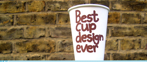
This is a slightly off-format entry, I have to admit. It’s not a redesign, it’s not about a logo, and it’s not quite about packaging, at least not mass consumer packaging. But it is about branding at a relatively micro level, which may speak more directly to the kinds of clients the majority of us work on from day to day. So, this is a peek at the work that UK-based designer and illustrator Jim Smith has created over the past decade for Puccino’s, a coffee retailer with franchise locations around the UK that has differentiated itself through humor and an off-beat attitude. And it has been the cups, in-store graphics and myriad little packages that have fully given Puccino’s its unique brand through a consistent style, approach and tone of voice. Following is a brief interview with Jim who has just designed six, brand new cups.
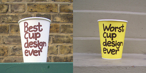
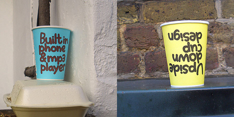

Six new cup designs.
Armin Vit: When did you start working on Puccino’s and how did you get the project?
JS: In 1998. I’d left college and had made a lifesize wooden Santa cutout for a lighting shop. He stood out the front looking menacing. The owner of Puccino’s saw it and asked me to do something similar for one of their shops. They had six then I think. Their marketing guy saw it and brought me in on a three month contract which has lasted ten years.

Jim Smith: What was the direction you got to start your designs?
JS: Everybody was busy growing the business so I was pretty much left to my own devices. They’d already bought into my style which at that point was a Ralph Steadman inspired scratchy pen and ink approach. I sat in a room above one of their stores and did loads of big drawings about coffee. They became posters for the shop walls and went on menus etc.
AV: How did you end up with this particular style?
JS: By constantly working and sucking things up. I draw in my sketchbook everyday and look around and get jealous. You slowly see a style appearing that is a pretty good reflection of yourself and the things you like. I’m pleased that I’ve been able to combine my love of drawing and packaging.
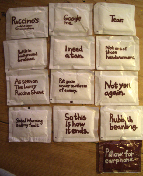
White sugar packets.
AV: Do you do all the copywriting yourself?
JS: Yes. It started out as a way to validate my drawings with a few words underneath and has ended up the other way round.
AV: How often does Puccino’s introduce new designs?
JS: A new set of cups comes out about once a year. I push for it to be more often. I’d like to get to a point where we only do one print run per design.
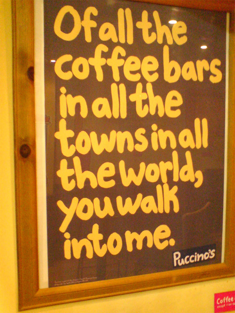
AV: What have been some of your favorite designs/writings that have not been produced?
JS: I wanted to have “suspicious package” on the side of our paper bags but that was vetoed. And my hanging man tea tag was banned after complaints. I used to like referencing tramps and coffee breath a lot and that stuff never got through. Apart from that most of what I do is accepted.
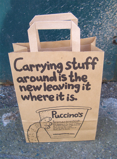
For more Puccino’s designs, check out Jim’s Flickr set of the ongoing work.

Jump to Most Recent Comment
Jamie’s comment is:
this post was a nice change of pace -- thanks Armin! :)
On Nov.14.2008 at 10:40 AM
Rodrigo Müller’s comment is:
just love everything about it! if there was a Puccino's in Brazil, I'd go there right now just to steal some of these cups!
On Nov.14.2008 at 10:51 AM
Andrew E. Clark’s comment is:
So this is how it ends
On Nov.14.2008 at 10:52 AM
Brian Monzingo’s comment is:
This is how it *begins*. Demographically self-aware branding will dance while Paul Rand catches his breath on a tucked away Central Park bench.
On Nov.14.2008 at 11:16 AM
damon’s comment is:
kinda cute.
what I like most is the idea that a client has a sense of humor about themselves which will ultimately make them stand out in a friendly personal manor that a clean modern graphic system couldn't have done on it's own.
this isn't going to change anybody's life, but it's fun and lighthearted, which I love.
On Nov.14.2008 at 11:28 AM
rickyaustin’s comment is:
Great brand.
Reminiscent of Macmillan Cancer Support by Wolff Olins.
On Nov.14.2008 at 11:30 AM
Timothy Long’s comment is:
We need a Puccino's in the US.
On Nov.14.2008 at 11:31 AM
Fr. Chris Decker’s comment is:
New Orleans has several Puccino's locations. I guess it's the same chain.
"Carrying stuff around is the new leaving it where it is." That's great!
On Nov.14.2008 at 11:37 AM
Andrew Klein’s comment is:
Love it, but I would hate to have to justify why it works to the client
On Nov.14.2008 at 12:55 PM
George - LogoDesign.org’s comment is:
I love it! Very funny and distinctive branding style. I especially like the "so this is how it ends" sugar packet.
On Nov.14.2008 at 01:04 PM
Mark’s comment is:
cool.
very offbeat and unique.

Mr Posen’s comment is:
Love it.
Makes my heart warm.

Matheus’s comment is:
well, humor pass the good-identity test.
On Nov.14.2008 at 02:39 PM
koyo’s comment is:
That's "Puccino's" tipography is funny, but the real Puccino's logo is ugly.
On Nov.14.2008 at 03:05 PM
Ampersanderson’s comment is:
Made me laugh. Good stuff.
On Nov.14.2008 at 03:39 PM
Wünderwoman’s comment is:
I love this! Wit, humor, consistency. This is design at it's finest.
On Nov.14.2008 at 03:49 PM
Andrea’s comment is:
I like, but this isn't really about the design; it's about the copywriting, yes?
The "design" is just a trendy font--used nicely.
On Nov.14.2008 at 03:55 PM
CJ’s comment is:
Andrea: I agree, seems like more clever copywriting. Design is there, but it's not what makes it.
On Nov.14.2008 at 04:37 PM
Rob’s comment is:
Andrea and CJ - design and copywriting go hand in hand... if this copy had been typeset in Baskerville, it wouldn't work as well
On Nov.14.2008 at 04:52 PM
adam’s comment is:
the "design" includes having short, humorous copy as the visual. design is not just about putting a drawing next to some typography.
its nice to see the designer have a hand in the direction of the brand, not just as an end of the line production monkey.
i like this a lot . . . at least its handdrawn and not set in comic sans!
On Nov.14.2008 at 05:36 PM
WilhelmR’s comment is:
I vote for more post like this one :)
"I need a tan" = awesome
On Nov.14.2008 at 09:40 PM
atarab’s comment is:
ahah
On Nov.15.2008 at 05:27 PM
Brad’s comment is:
Puccino's in New Orleans is not the same company as the Puccino's in the UK.
This work is brilliant.
On Nov.15.2008 at 09:49 PM
T-Bone’s comment is:
where's the abuse and slagging off? is this not brand new?
awesome work, brilliant tone.
On Nov.16.2008 at 07:53 PM
Kelly Hobkirk’s comment is:
Excellent. Great concept, great execution. Love it, all the way round.
On Nov.16.2008 at 08:52 PM
Philip’s comment is:
Cute? Yes.
David Shrigley rip off? Yes.

Preston Lee’s comment is:
I thought it was a nice change of pace. Nice interview and creative work.
On Nov.17.2008 at 11:06 AM
AL’s comment is:
Nice. I'll better go and check this out!
On Nov.19.2008 at 10:37 AM
Pamela L.’s comment is:
I hate to say this, but that "Upsidedown" design is a freaky accident just waiting to happen to just the right idiot!
Cute branding, though. Not terribly clever, but still pretty fun.
BTW, ADAM, right you are about the comic-sans. Thanks god!
This product line is definitly something I'll be adding to my design collection!
On Nov.19.2008 at 12:19 PM
Bruce’s comment is:
Some of his illustrations remind me of those by R.O. Blechman. Good stuff, and cheers to Puccino's!
On Nov.21.2008 at 04:26 PM
Roby Fitzhenry’s comment is:
This is really really awesome. Congrats to the designer AND the client for trying something new!
On Nov.25.2008 at 05:05 PM
LadyN’s comment is:
Awesomesause!
On Dec.02.2008 at 05:27 PM
Glenn Sakamoto’s comment is:
Love it!
On Dec.02.2008 at 06:44 PM
Nolen’s comment is:
David Shrigley rip off? Are you serious? Two people can't have similar ideas (handwriting as image)?
Man... the internet.
On Dec.07.2008 at 09:17 AM
Nolen’s comment is:
Also, this stuff is awesome. A great response to everyone's desire to overthink and overdesign everything.
On Dec.07.2008 at 09:18 AM
Tim’s comment is:
Zombies. This is all advertisement. What are you praising, slaves? Sure, it's pretty & cute, but you pay for it. Marketting is not art.
On Dec.20.2008 at 04:54 AM
Angel Montiel’s comment is:
awesome application!!!
On Jun.25.2009 at 03:08 PM
Comments in Brand New, V1.0 have been closed.


