

NOTE: This is an archived version of the first incarnation of Brand New. All posts have been closed to comments. Please visit underconsideration.com/brandnew for the latest version. If you would like to see this specific post, simply delete _v1 from the URL.
![]()
Given the accompanying text in the tips I received about this one, I have the feeling we are up for another heated discussion and I will preemptively ask that any “This sucks.” comments be kept to a minimum. Please expand beyond that, it’s not that hard. With that out of the way, Pentagram partner Paula Scher has redesigned the identity of the New York Philarmonic, another constituent of the redesigns Scher has done for the Lincoln Center.
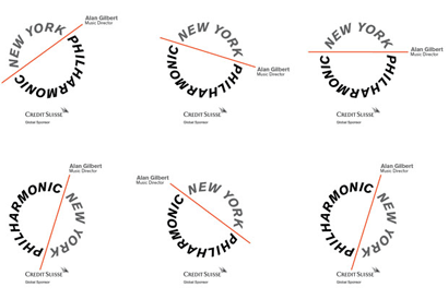
If there is one thing not for discussion is that the previous logo was boring, generic and in dire need of an update. My first reaction when I saw the new logo was, literally, “whoah.” I was so taken by surprise to see uppercase italics on a circle that I just couldn’t think about anything else. And what at first seemed like some sort of typographic faux pas turned into a really interesting and engaging set of letterforms with an inherent dynamism that, to me at least, is a nice representation of listening to a live orchestra: A kind of whirlwind of emotions. The red line is meant to be a conductors baton, which is much more interesting than the previous’s five lines representing a music staff.
I believe the logo will not be well received because this type treatment is uncommon and since we are all more comfortable with things that we are used to, something that steps out of the norm is generally received with distaste — Exhibit A: anything by Wolff Olins. To conclude: This is one of the most interesting wordmarks I have seen in a while.


Jump to Most Recent Comment
Remy Overkempe’s comment is:
I don't think "it sucks", but I do wonder what it's supposed to mean. A conductors baton, yeah, I got that, but for the rest... The italics make it look flowingly and moving, but that's all I'm getting. I don't especially like the fact that the donut centre is bigger on one part than the other, and... Yeah, I'm rambling a bit, but that's because I'm trying really hard to see why they picked this interpretation.
On Jan.15.2009 at 09:06 AM
Brian’s comment is:
My first impression was that it looked like a table-saw. And that sort of association is not the best for an orchestra.
On Jan.15.2009 at 09:15 AM
Peter O'Connell’s comment is:
Sucks? Well yeah but even worse the look is boring and ignores the brand. A baton? It's a red line!
Oh well, so much for ticket sales.
On Jan.15.2009 at 09:17 AM
Ricky Irvine’s comment is:
I thought the mark was rather boring when I first saw it, but then I saw it come alive in all the design materials. Really, really, really well done.
On Jan.15.2009 at 09:27 AM
Chris’s comment is:
Not that the old one was any great shakes, but I expect this kind of thing from a low-rent regional airline.
On Jan.15.2009 at 09:29 AM
Dean’s comment is:
I wasn't too keen on it at first glance but after looking at the applications on Pentagram's webiste I think it works really well. It's quirky enough to be memorable and also quite versatile. Scher has used a simple circle and line to great effect!
On Jan.15.2009 at 09:38 AM
Jonathan’s comment is:
Purely going off looks, the before looks like something medicinal. Then I looked closer and realized what this was for. It's different, its not what you would expect and I don't mind that. I think that Pentagram really has produced some great work lately, esp. Paula, so I'm going to go off trust here. Perhaps this client did too!
On Jan.15.2009 at 09:38 AM
sra’s comment is:
The italicized type really kills it for me. It feels retro in a bad way.
That being said, I am really taken by the red line/baton. Great choice there.
On Jan.15.2009 at 09:39 AM
Brooke’s comment is:
I was slightly horrified when Pentagram first posted this on their blog. After taking a closer look, I must say I'm impressed. The actual mark represents more than just a conductor's baton; it symbolizes sections of many instruments you would find in an orchestra.
I have to agree with Ricky, the mark really does come alive in the design materials.
On Jan.15.2009 at 09:41 AM
Ricky Irvine’s comment is:
Armin: you should have shown some of the design collateral to put it in context. It takes shape in its context.
Everyone: open your eyes. First impressions aren't always so important or lasting.
On Jan.15.2009 at 09:42 AM
Jonathan’s comment is:
Go look at all the applications now before you comment! The mark is great! and is applied so excellently!
On Jan.15.2009 at 09:42 AM
thomas’s comment is:
If any other design firm were to of done this mark it would be slammed for its typography. I don't think "uncommon" is the right word for the type treatment, but just plain bad.
On Jan.15.2009 at 09:46 AM
Neil MacLean’s comment is:
I do like how the line/baton is used to separate information in the brochures and programs.
On Jan.15.2009 at 09:46 AM
chaac’s comment is:
Sorry, I think the concept could have been executed beautifully and it wasn't anywhere near that. I like the corporate applications but that is a almost entirely separate merit.
Better things could have been done with a better brand.
It is music people. Music.
So there's no way I can think this brand is appropriate for the NYP or any Philharmonic orchestra.
On Jan.15.2009 at 09:49 AM
damon’s comment is:
first reaction was woah! as well, but the more I look at it the more I think it's kind of cool.
there is huge potential for the typesetting to look odd in all cap italics around a circle like that, but they look pretty solid to me.
I think there are also a lot of interesting applications for this that can be rolled out to make it more dynamic and engaging overall. I'd like to see some of the stuff that this new branding lives.
On Jan.15.2009 at 09:50 AM
Jeffry Pilcher’s comment is:
Blech... I really don't like it. I think it's more plain and boring than the previous -- definitely much more common than the slightly sophisticated, upscale look of the previous logo.
Putting italics on a curve makes letters look like they are going to "slip off" the baseline.
This is one of the top 3 worst redesigns I've seen since I started following this site. Bad design, bad typography, bad strategy.
On Jan.15.2009 at 09:53 AM
damon’s comment is:
oops, missed the link at the top. Yah, I think it's interesting.
On Jan.15.2009 at 09:53 AM
Mathias’s comment is:
Drop the italic, looks like a tablesaw. Nice move with the line baton — but I have to admit, at first I thought it was the AUDIENCE/NEW YORK on one side, and the ORCHESTRA on the other. Which works too, imo.
On Jan.15.2009 at 09:56 AM
Mrs. M’s comment is:
On its own, the logo initially smote me with its sparse geometry. I wanted to recoil from it, bat it away. If you stare at it long enough, the letters suggest a revolving motion. The hard edges of those majuscules do have a bite to them, don't they?
However, in context with the materials presented on the website, it succeeds. I just don't like it sitting all by its lonesome on the preview here. It thrives as an element of pattern, as a brief sort of seal, and a frame.
I hope it grows on people.
On Jan.15.2009 at 09:59 AM
Anonymous’s comment is:

You really need to see the other pieces for this logo to work, I'm not quite sure the reliance on these other pieces to understand the logo is a good thing, but it's executed very well as a campaign - which for me is the only thing that sells the logo.
When viewed alone I find the mark reminding me of a table saw (as someone else mentioned) The italicized words even appear as saw teeth. I would never have guessed the line to represent the conducting baton, because it just appears as a line to break the text (and nothing more) and without the visual cue in the collateral the explanation holds no water.
The other versions, mainly the horizontal line - almost lead me to believe that the thought of the line's relevance was almost an afterthought (why else would an irrelevant horizontal line version be developed, which certainly wouldn't even come close to being understood as a conductors baton)
I do appreciate Pentegram's (partner) work for being Pentegram's work, and they can take risks like no other (every designer's dream) – but I think this may be an example as to why that's not always a good thing. It just seems gimmicky, and I don't think it has any staying power.
It also looks much better with "New York" in the 50% tint rather than in all black.
On Jan.15.2009 at 10:01 AM
danny’s comment is:
Paula Scher's work always has a way of surprising me. I have a similar "whoah" reaction to all of it. Its the simplicity of the idea coupled with the off-the-wall approach and refinement of form that always leaves me scratching my head.
the mark is great. it breaks typographic "rules" succesfully and is still beatiful. The fact that the letterforms are in italic works to the benefit of it being in a circle. It keeps the baseline of the forms from squeezing together in that odd fan looking mess you normally see.
come on, give it a chance. you'll be kicking yourself if circular italic typography is hot hot hot in 2009.
On Jan.15.2009 at 10:03 AM
JBIII’s comment is:
I never realized that the conductor's baton was red?
I see a "table/circular saw", especially when animated. A tad harsh for their audience...no?
I also notice that the logo falls apart when layered, especially on their brochures.
Would really love to see all the explorations done before coming to this final.
On Jan.15.2009 at 10:03 AM
Andy L’s comment is:
No, this was just bad.
On Jan.15.2009 at 10:04 AM
Nick’s comment is:
As it's been said the ITALICS are a little off putting at first, but I think that has a lot to do with this style of typography as being generally frowned upon throughout the halls of the design world. Seriously, look at page 357 quatrain 57 of the designer hand book... Thou Shalt Refrain From Using Italic All Caps...!
But seriously, in this instance I think it works. Primarily because it's interesting to look at. There's a movement to it that's kinda nice. It goes beyond what is expected (especially for an orchestra) I think the idea is simple and effective. However, I can not disagree with the comment about the table-saw twang, but it's not a brand killer IMO.
As far as the comment on the mark not going along with the brand... I find the new brand direction as a whole is pretty fluid.
Is this the rebranding of the decade? No. Will it stand the test time? Probably not, But that seems to be the case for all branding these days. Is it appropriate for the audience? I think so. Is it a step forward for the client? Definitely.
On Jan.15.2009 at 10:21 AM
Anonymous’s comment is:
Also, I have no idea what the hubbub is with the italics – to me, that's not the what makes this logo weak.
On Jan.15.2009 at 10:24 AM
Nick’s comment is:
Forgetting conventional typographic dogma for a moment, this does everything that a logo should do. It is very recognisable, it is emotive and it is the kind of shape that will stick in your mind. It is memorable.
That the line is meant to represent a batton is the kind of designer's idea that won't be appreciated by anyone who isn't a designer. But seeing it in context, in the printed collateral, it makes sense, and appears very elegant indeed.
On Jan.15.2009 at 10:25 AM
debbie millman’s comment is:
I think it is genius. It is telegraphic, it is innovative and it is simply gorgeous.
On Jan.15.2009 at 10:26 AM
Marko Lokas’s comment is:
I love the simplicity, and the possibilities of visual play introduced by the line. I'm really curious about the way the idea was presented and sold to the client...
On Jan.15.2009 at 10:26 AM
Ty Halasz’s comment is:
The logo standing alone does look a bit week, but the integration into all of the collateral is, in my opinion at least, borderline genius. Let's not forget that this identity is for a high culture company, and with that comes a certain avant-garde nature to the brand. If nothing else, you have to appreciate how unique it is. Just be thankful it's not Web 2.0.
On Jan.15.2009 at 10:31 AM
Dave Klonke’s comment is:
Seeing it action really does it all the justice. I do think it will go down in history as the table saw logo, but I also think it's very well done and works with all the concepts that are presented on the Pentagram site. When you understand the rules, you can break them. Oh no, will this be the return of italicized caps because everyone will think it's ok? This is how tired trends start. Too bad Paula Scher can't say "please don't try this at home."
On Jan.15.2009 at 10:36 AM
Rodrok’s comment is:
at first glance yeah I said it sucks, but that's because it was displayed on the white background all alone in the...bright... pretty boring.. to be honest...
but after seeing the collateral the logo simplicity set few rules and the layout designs got very creative, so I think there is a nice link between the visual opportunities that can bring a simple logo.
You have a main element, now play with it like crazy...
Chris Swift’s comment is:
Just really reminds me of the Red Hot Chili Peppers logo, that being said the execution of the collateral materials is very well done. Paula Scher's work always gets top marks in my book - this one might just take a bit of getting used to.
On Jan.15.2009 at 10:50 AM
dave’s comment is:

I like the look of the pattern created on the mailing materials - a mix of all the sounds working together, but the black folder reminds me of an instrument panel. I think it would have been nicer to just use the red baton at different angles, to represent the conductor's use of the baton during a performance.
On Jan.15.2009 at 10:50 AM
thehappyhuskie’s comment is:
I personally don't like it. Even in the collateral.
I am always impressed by the way designers treat the "greats" of design when they come out with a flop (and yes, they do, everyone has a bad day now and again). "Oh its refreshing" "Oh it breaks the rules" "Oh its thought provoking"
Maybe so, but this high acceptance of "the design greats" work disappoints me and impresses me at the same time. I wonder what would have happen if the designer was Henry Blowwater of Backwoods Kansas...most likely would have been eaten alive.
(and no Henry isn't a real person to the best of my knowledge)
M Goodale’s comment is:
I really like the way the type looks, but for an orchestra it doesn't work for me at all. It looks like a really great automotive parts company logo.
Though I do have to admit it looks much better in context and used with effect. But still that shouldn't be necessary for an organization this well known.
On Jan.15.2009 at 10:54 AM
Scott’s comment is:
Does/will the conductor use a red baton?
One picture insinuates that, the other shows a white one ...
For a true, 360 degree brand effect, all of their conductors should use red batons, moving forward.
Otherwise, it's a missed opportunity for full integration. Which would be a shame (as so often happens when design does not meet public relations at the same table).
On Jan.15.2009 at 11:00 AM
Jim Bridges’s comment is:
On its own, I am not impressed. Tablesaw blade references aside, I just think the look of the italicized letters and how it's executed looks a bit sloppy. Why it's been done as it was done is not at all clear--and its execution makes it look like there is intent behind the look. Yes, it may be memorable, but I am not sure it's for the right reasons.
However, like others, it was seeing the whole line of collateral and how the logo is being used that I do see the potential. And I quite like what they are doing with it in a lot of the uses they've shown. But the logo on its own merits? I am not sure it will stand the test of time.
On Jan.15.2009 at 11:03 AM
Brad’s comment is:
My gut reaction to the new design was disappointment. I was struggling with the ITALICS a bit even though I realize it's to emphasize a conductor’s movement and so forth. Having said that, I think the new design is an improvement over the previous one and once I saw the logo displayed in the variety of applications in print and signage, I felt much better about it. It makes me wonder if a well executed application can make any logo look good.
On Jan.15.2009 at 11:04 AM
Josh B’s comment is:
The mark itself is pretty amazing. I had the same reaction as Armin... all cap italics on a circle!? That's some crazy sh*t. But wow is it cool!
But then I thought, the only people who will appreciate how unusual this mark is, and how difficult it was to make, are designers. So in that respect it feels a bit boastful to me. I can almost hear the congratulatory back-slapping at Pentagram now. Still, regardless of how well the general public understands the unusual nature of the design, it should still be seen as a pretty beautiful thing.
Now, all that said, I'm surprised to see so many comments saying the mark is weak, but the collateral is strong. I happen to think the collateral is underwhelming. Repeating the logo over and over in a tone-on-tone background pattern? Really? That's the sort of thing students do when they don't know how else create a fully developed system. And the sheer repetition of the logo as a background element only strengthens my feeling that there's some serious self-congratulating going on here.
On Jan.15.2009 at 11:05 AM
Keenan Cummings’s comment is:
A circular type lock-up is nothing new...it feels classic, which important for one of the country's most well known and established cultural institutions. But the italics are new and energetic.
This kind of back-lash happens in the music biz all the time— a band ha a hit record, then they go back to the studio as changed and experienced musician, make something new and interesting, and people get upset that they aren't getting the same old stuff. The skill of an AD like Paula is that she cannot only push beyond what we have seen before, but she can sell a client on it who probably asked for more of the same thing.
As a final note: is anyone really expected to read a typographic rule as a conductor's baton. I have to role my eyes when designer's make grandiose claims about the concept embedded in every detail of their design. (I love Chip Kidd, but read his book and you will get what I'm talking about.) I love the mark, but I didn't see a baton—to me, it invoked a long, warm churro that I would by at intermission from the snack bar.
On Jan.15.2009 at 11:11 AM
Andrew Sabatier’s comment is:
It's a very cerebral brand identity.
I can imagine additional intellectualisations. Such as the unity of audience and orchestra marked by the separation of the 'baton', which also literally represents the stage. The audience 'New York' and orchestra 'Philharmonic' make up a circle because they are interdependent and are worth little without each other. The 'baton' in the mark is itself an intellectualisation, made acceptable by the context and because Paula said it was a baton.
The difficulty with intellectual design is that it is not self-evident. You need an inflated set of instructions to understand what it means, just as you need to understand a Mondrian painting. This type of work leaves the 'intuitives' feeling a little cold. Where is the warm fuzzy, the expected emotion embodied in the music it is meant to represent? Where is the rythmic, harmonious and graceful elements of say the London Symphony Orchestra?
Uppercase type on a curve creates visually inelegant interruptions on the circle. Not only is it uppercase on a circle but uppercase italics on a circle. Italics are nearly always awkward and problematic without the additional complication of the circular arrangement.
But it is...
distinctive,
counterintuitive
and confident,
... and likely to get a lot of press because it is so unexpected. So what if it upsets a bunch of uptight designers?
I suspect the new identity is intended to represent a self-aware, complex and consciously orchestrated set of elements which appeal to the musicologist, who, I also suspect, get more excited by the idea of music than the sensation of music. Although I think the new identity is on the dry side of what it could have been, I think it is successful for these reasons.
On Jan.15.2009 at 11:19 AM
matt lohkamp’s comment is:
I don't know. First instinct is - I like the old one better. I really like the 'flow' of the staff, although I could also see it as 'techy' as in 'ribbon cable', but the 'philharmonic' clears that ambiguity up pretty well. Maybe a better treatment of those staff lines, something a little less stereotyped then the 'twisted ribbon around the word' formation? And cutting down the words in the first one to just NYPhilharmonic, perhaps?
I think the main thing is that the new one doesn't at all suggest music to me, and the 'philharmonic' portion of the name is twisted and upside down so you don't even read it immediately, and are left wondering what sort of a company has a logo with words wrapped around a circle with a red slash through it? And what do the unequal hemispheres of the slashed circle imply? I don't know - a bottle and a cap? The invocation of music just isn't there for me - and I guess that's not absolutely necessary, but since the logo itself isn't otherwise remarkable (in a general non-'industry professional perspective' sense), my guess would be that a lot of average viewers are going to just glance right past it.
On Jan.15.2009 at 11:21 AM
Jw’s comment is:
No thanks, and yeah, my first thought was power tools. I don't really equate jaggedness with an orchestra. Nor do I want to.
I don't think it's a bad logo, and I don't think it's poorly executed. I think it is trying a bit too hard to prove itself relevant, especially after looking at the applications on Pentagram's site.
"Look I can rotate in any direction!" Fine.
"Look, I can be different opacities!" that is pretty lazy "pattern" buidling.
Hm. The only place I think it really works is here:

But that has more to do with the grainy nature of the photography, and how the mark's harshness complements it. I really don't see anything else appealing there.
I think it's somewhat rude to say that people will dislike something just because it is uncomfortable or different than "the norm", especially to fellow designers. You're essentially setting the conversation up thusly: "I know you won't like it, but you're wrong, so go ahead and knee jerk, but you'll like it later, and you'll know I'm right." Not a great way to start a dialogue... just as bad as posting "this sucks" and leaving, actually.
People don't hate London 2012 because it's different. It's because it's hideous. In fact it is the opposite; I think the people who say they love it feel that way just because it's different. It goes that way with fashion, food, music, etc. Some people like to feel better than others by liking something that is no good.
New York Philharmonic is nowhere near as bad as the recent Wolff Olins fare, but it is not great.
On Jan.15.2009 at 11:23 AM
unrulydesigner’s comment is:
I'm not here to stroke any egos. Sorry, no agenda here.
Unequivocably, this logo fails in a big way. It's not only ugly, but apparently it needs scads of collateral material to "explain" the concept.
A conductor's baton my a$$! Fail!
On Jan.15.2009 at 11:25 AM
Lauren ’s comment is:
unrulydesigner said: "but apparently it needs scads of collateral material to explain it"
Yeah, that just about sums up the issue I have with the logo. When reading Armin's optimistic review, I too feel optimistic. But experiencing the logo without the narrative? It looks, in a word, default.
I am guessing that the designer explicitly did NOT want to add thick/thin styling to the baton, or use a non-default-looking typeface for some personal agenda.
I can respect a deviation from the trends, but at the end of the day the question is still "Does it sell NY Philharmonic or not?" I think the answer is "not."
On Jan.15.2009 at 11:35 AM
Austin’s comment is:
For a representation of classical music, I like the logo for Oslo Filharmonien. I think it captures the strength and grace of classical music, still using the idea of the conductor's baton.
The New York Philharmonic is interesting, and does work well in the applications.

Anonymous’s comment is:
I'd just like to quote this comment because I think it's the most accurate criticism here - it hits the nail on the head.
"People don't hate London 2012 because it's different. It's because it's hideous. In fact it is the opposite; I think the people who say they love it feel that way just because it's different. It goes that way with fashion, food, music, etc. Some people like to feel better than others by liking something that is no good."
As someone in the field, I well know that Pentagram employs that EXACT type of person. Is there anything wrong with that? No, not really - and Pentagram is well known for good reasons beyond that.
I think designers often have to acknowledge that Pentagram's (along with a few other major firms) work isn't always liked because it's "good" people often like it because it's better than you. That's how the world works, it's how trends (good or bad) are set, and I'm ok with it - just don't piss on my leg and tell me it's raining.
The worst thing you can do as a designer is blindly agree that something is designed well because Pentagram, Paul Rand, or anyone else with a lofty reputation did it.
On Jan.15.2009 at 11:39 AM
marnie’s comment is:
My first reaction, honestly, was to recoil and shudder--it was very visceral. Seeing the various applications is helping to win me over, but honestly, on its own, I don't know how to describe it exactly but my eyes don't want to look at it. I almost love NEW YORK but I just can't take in PHILHARMONIC.
Over time, as it becomes recognizable and people stop actually reading the words, though, it may prove quite successful. I would argue that's why it succeeds on the collateral, because one is gazing at it rather than reading it.
On Jan.15.2009 at 11:44 AM
Nate G’s comment is:
The line kills it for me moreso than the typography. A baton, really? Someone could put anything in there and justify it somehow. I agree that the collateral materials are done well. Even though it's in orange, the line could use some more weight. And at first glance, it looks like a 0 with a line through it (null... meaning 'nothing' or without value or consequence.), not exactly something i'd want to represent a brand.
On Jan.15.2009 at 11:59 AM
Patrick’s comment is:
"...turned into a really interesting and engaging set of letterforms with an inherent dynamism..."
I wonder if you would have thought the same if this had come from a nameless designer from a nameless firm. I'm not criticizing your comment; but I am really curious about the subconscious biases we have toward rock stars.
On Jan.15.2009 at 12:03 PM
T’s comment is:
Interesting. The baton through the middle reminds me of the signs used to indicate "No ___". Is this a protest of the NY Philharmonic in disguise? Any logo that can not stand alone needs to be tweaked, and this one seems to take careful study or vision in contest to be accepted....
Maybe a bit more development of the concept?
On Jan.15.2009 at 12:20 PM
Filipe’s comment is:
I think it works better on the stationary but... a logo should work well alone, shoudn't it? The worst thing for me is the colors.. black, grey and red. It just doesn't fit.
By the way this is my first comment, but i've been checking BrandNew for a long time, its one of my favorite blogs. I have a little blog myself (very little, 2 posts yet) but my last post is related with your post about BBC's logos some months ago. Im a design student in Portugal and i made a research one yar ago about Channel 4 logos and id's
On Jan.15.2009 at 12:35 PM
Dale Campbell’s comment is:
I don't really get it. Sorry.
I mean, the Pentagram site says the red line is a graphic element symbolizing a baton.
To me it's a red line symbolizing a red line.
And that text treatment? Seriously?
If I were to do this for any one of my clients, I would lose the client. Pentagram does it and it's automatically deemed to be great.
I...just...don't...get it...
On Jan.15.2009 at 12:41 PM
Emily Charette’s comment is:
I genuinely, completely appreciate that the client was willing to stretch and accept a concept that was purely, well, conceptual; that nothing in this says anything literal about music; that it speaks only about the feeling and energy of the music.
On Jan.15.2009 at 12:47 PM
AL’s comment is:
Not jaw dropping but I think it is a good, memorable and flexible logo. Some collateral examples are better than others, but overall i like it.
On Jan.15.2009 at 12:49 PM
eric’s comment is:
I do like this mark in context of the collateral but I really hate the space between the red line and the N. It's seems very off to me. Otherwise I think it's a nice redesign even if it does take a second glance to appreciate it.
On Jan.15.2009 at 12:51 PM
daveO’s comment is:
Some of the spacing and letter forms are a little uneasy on the eyes. uhmm, actually maybe the whole thing feels a little wonky.
On Jan.15.2009 at 12:57 PM
Rob’s comment is:
what up with the tracking being more open on "NEW YORK" than it is on "PHILHARMONIC"???
On Jan.15.2009 at 01:00 PM
A’s comment is:
It reminds me of the old SNL logo from the late 80's and early 90's.
On Jan.15.2009 at 01:01 PM
Michael Luboa’s comment is:
I never saw the table saw, and I thought the italics on the circle looked great. What I didn't get was the red line at first, because it made me think "division," and why divide the name, in that way?
The logo really works when applied, and I thought it was just fitting. But alone, as has been said...you really do kind of need some explanation, because I never saw a baton, even after reading that it was, until I saw it used in the brochures.
Anonymous’s comment is:
This is a Grotesk logo Akzidenz. Italics on a curved path? Really?
A disappointing, pedestrian treatment for an organization that deserves better.
On Jan.15.2009 at 01:05 PM
felix sockwell’s comment is:
works very well in context (as brand, on pentagram's site). alone (here) not so much. my guess is that people will learn to love when they see it in action. its really smart.
On Jan.15.2009 at 01:08 PM
Anonymous’s comment is:
I agree with everyone that thinks this mark is a lot better in the context of the whole identity system.
I don't think this logo says "classical music" at first glance, but I appreciate the thought that was put into the identity system and since this is such a high profile organization, their mark may indeed convey "classical music" more immediately once the world has gotten familiar with their mark.
On Jan.15.2009 at 01:09 PM
ES’s comment is:
You know, when I think classical music, I don't think this image would ever have come to mind. Sure, it's different. As a group it might even been well executed--but for some other company
When I take a look at the ticket design, for example, my knee jerk reaction is to think "oh a night club"... probably because SNL has vaguely similar circular logo.
In short, the logo isn't elegant, it's efficient. Definitely more suited to something that has nothing to do with the Arts.
On Jan.15.2009 at 01:10 PM
Martin Nicolausson’s comment is:
Is "I love it" ok?
On Jan.15.2009 at 01:14 PM
paul Lloyd Johnson’s comment is:
My first reaction was "Ew, I hate that, alot!"
Then I saw it pictured with the conductor and thought "clever".
Now I'm at "I hate it."
On Jan.15.2009 at 01:17 PM
Kevin’s comment is:
Some have said it may look more like a baton with thick/thin strokes, or perhaps more definition. I would be a little nervous of wandering into chopstick territory.
On Jan.15.2009 at 01:20 PM
jRod’s comment is:
well, despite the fact that a person might think that the first logo was perfectly fine, i have to say that putting the type over the 3 red pinstripes confuses the eye and is not a good idea. but then again i haven't seen it on anything else.
problem with the new one is that its so simple that its no good. music isn't that simple, why should the logo be?
On Jan.15.2009 at 01:25 PM
Kevin’s comment is:
I think it is a much better look than the old logo, and it pops out on the collateral.
I think that by itself you really have to step back and look beyond just the simple type and red line. You have to see the way the letters react to one another and the space around them. That's what got me. It seemed like negative space played with everything making up the positive space. It creates an almost-3d look and motion. You only notice these things because "philharmonic" is upside down and you don't read at first glance.
Either way, it's another example of how Paula Scher takes something as simple as the text and manipulates it to make it something more....Public theater logo anyone?
On Jan.15.2009 at 01:36 PM
Chris Rugen’s comment is:
Tack me on as the millionth person to say: context makes it better, but I'm still not feeling it.
Kudos to all involved for taking a bold step. I've read enough by/about Scher to know that she is one of a few designers who could pull something like this off.
But I'm not fully sold on the mark. It feels like it's juuust a few more revisions away from the right solution. Scher clearly likes bold typography in her work, and this is no exception. Time will tell for this one.
On Jan.15.2009 at 01:36 PM
Daedbird’s comment is:
I would have to say that the biggest thing is the new logo feels like it is missing something which would change it from feeling so stripped its generic, to feeling inspired. How about a black circle encompassing the words with the baton extending beyond - I like this logo a lot more with the words in white, or white and grey to contrast more. Or maybe a silohette or line representing the conductor's hand to bring the viewer closer to the concept. Or secondary logos incorporating instruments into the logo, like a violin or harp. I see the old logo and I think strings, but it also feel it was outdated, but the new logo feels it misses the mark and is not an upgrade at all, that relies on creative stylizing to feel cool.....
On Jan.15.2009 at 01:48 PM
BJN’s comment is:
It's a circular saw. Sorry, but I don't buy this as a "cutting edge" symphony logo. Aggressive and lowbrow - but perhaps the orchestra includes a metal band section?
On Jan.15.2009 at 01:53 PM
Amanda’s comment is:
It's growing on me the more I look at it.
The comment about “you'll be kicking yourself if circular italic typography is hot hot hot in 2009.” - could be kind of true. I think Paula can have a pretty good instinct about things but as a coworker mentioned to me recently, many things that break out of the usual mode are met with resistance.
Sometimes I wonder if people are not just attacking the mark because Paula did it. Based on that last Truvia post and now this one, I feel like there is a lot of bias floating around here imo. But I guess with design, there always is...
On Jan.15.2009 at 01:56 PM
Stuart’s comment is:
The identity SHOULD look strong on its own and not have to rely on supporting collateral. This mark fails to do that. Designers should not have to design the collateral to make the identity look good, they should design collateral to support the message.
On Jan.15.2009 at 01:57 PM
bobby’s comment is:
The collateral makes the logo work. The logo is pretty "typical" of Paula Scher, though.
On Jan.15.2009 at 02:00 PM
Andrea’s comment is:
I agree with those who said the red line should maybe actually take on the shape of a baton as opposed to just a line.
At first, I thought it was trying to be some sort of musical note.
It's an artistic logo for an artistic client, and that's why they can get away with it. Something more mainstream just wouldn't seem to capture the essence of this art form.
On Jan.15.2009 at 02:10 PM
Kodie’s comment is:
One of the responses, Dave's it was, related the graphic to an instrument panel... I forgot about those and thought it was more like an oven, but that makes sense. Except! We're dealing with an orchestra (not a recording studio), fanned out like the NEW YORK part, and the audience, fanned out like the facing PHILHARMONIC part, with the conductor in between. I kind of liked it right away and tried to consider every reason to dislike it that has been given. Maybe I'm too naive at this to like it "for the right reasons," but it's cleverer than at first I saw it. It's like a concert hall.
On Jan.15.2009 at 02:23 PM
Bendy’s comment is:
I absolutely dig the new one... there are many parts to it that feel musical to me.
Obviously, music is structured, and I feel like the new logo respects the precision of true orchestral music. Where most logos try to represent the 'flow' of music (lots of curves and softness), this one focuses on the structure of it.
It looks like a string over the sound hole, an extraction of a bar of music, a conductor's baton, or a simple illustration of an orchestra hall (the 'arch'), or the arm of a metronome.
There are so many things that the logo can represent about orchestral music that I think anyone who's interested in it will see their own instrument/piece of the orchestra.
I love it.
On Jan.15.2009 at 02:45 PM
J. Woodward’s comment is:
I like it. The italicized type reminds me of musical notes, and I like the way it is applied to the materials.
On Jan.15.2009 at 03:15 PM
Dave Bastian’s comment is:
Baton? What baton? I see the blood-red line of clean incision; I imagine that logo ripping through violins and cellos and the entire woodwind section, slicing through timpani and trombone alike, tearing up the scenery, past the conductor, into the audience in a giant, spinning spectacle of gore. You just can't get that from something more sedate or elegant.
On Jan.15.2009 at 03:20 PM
Pamela’s comment is:
I'll look at it again in a few days...maybe it's one of those "its growin' on me" kind of logo?
Sure, I'd lose the italic...but I kinda like the intrusive red line! :D
On Jan.15.2009 at 03:25 PM
Harper’s comment is:
At first, reading through some of the more positive comments, I felt like the boy who points out that the emperor is in fact not wearing any clothes.
Then I followed the link to the collateral material and I have to say it all makes sense. No, the logo doesn't stand on it's own. But logo's so rarely are required to stand on their own anyway.
On Jan.15.2009 at 03:29 PM
Wünderwoman’s comment is:
The concept is great. The application is brilliant. It's very "New York intellectual" which fits the audience and the brand.
The italic typeface is worrisome. I feel it creates some funky kerning situations ( the HAR for example). Am I the only one seeing this? Is everyone afraid to say anything simply because it's a Pentagram/Paula Scher design? I've seen this group chop tiny details down to bits. I think you're all playing chicken.
On Jan.15.2009 at 03:43 PM
Grant’s comment is:
Honestly, it just seems clunky. The reason people don't use italics on a circle is that the type begins to fall over on itself. And honestly, this logo proves that point.
Also, How utilitarian a typeface to use for such a logo that is all about the artistry of music. The line, representing the baton, is a weak representaion at best. And to be honest, I don't think anyone would realize it unless they were told that's what it is supposed to represent.
There is nothing artful about this logo. And in my opinion, nothing good.
On Jan.15.2009 at 03:44 PM
mca’s comment is:
Oh come on, it's crap. It's student work at best. I feel bad for the client who thought they were going to get something good by going with Pentagram instead got sold on a circle and line. Pathetic.
I'd really be interested to read these comments if this were done by some unknown designer.
On Jan.15.2009 at 04:20 PM
Ryan’s comment is:
Besides this being another example of why I feel that Paula Scher is over-rated, this is too close to the design of the Crafts Council logo, another Pentagram project from the early 90's. I am a fan of nice typography, but is that all Pentagram has to offer its clients? Talk about a one-trick pony!
On Jan.15.2009 at 04:32 PM
Christopher Monnier’s comment is:
I like the design in the context of its applications, but I don't think it succeeds at conveying the baton metaphor or a sense of dynamism when used in isolation. In isolation, it looks like a cool logo for a new wave/punk band (I think New Order has an album cover that uses a diagonal red stroke), not an elegant symphony, which I think the old logo does quite well (if a bit boringly). I wonder if the baton metaphor could be used with a different wordmark to create a design that looks good both in the context of its applications and in isolation?
On Jan.15.2009 at 04:37 PM
Andres’s comment is:
Call me old fashioned. All I think is a logo should work as a spokesperson of the company.
To me , the best logo is the one that needs no explanation, the one that speaks for it self, the one that gives us our first impression. In this case, Pentagram or not, I think they missed it.
Great concept, bad result.
Sorry, but all I see is a clock with a missing hour hand.
On the other hand, I loved the Oslo Philarmonien logo!!!
On Jan.15.2009 at 04:48 PM
Amanda’s comment is:
Pentagram is doing well in my book lately.
However, this logo does not stand on its own at all. It works really well in the materials — but, in my opinion, when it comes to the logo on its own: Great concept, Boring execution, Boring Type.
On Jan.15.2009 at 05:09 PM
Glenn Sakamoto’s comment is:
Huge fan of Pentagram and Paula Scher.
Great concept and applications,
but the italic typeface ruins it for me.
Nicolas Alexander’s comment is:
This whole new look makes me feel exactly like I felt when I first saw sagmeister's casa da musica. The logo/wordmark is not visually appealing, at all, but the implementation makes it really interesting and prove that it works.
On Jan.15.2009 at 05:38 PM
Kris Bazen’s comment is:
This is weak, goes against the most basic of design fundamentals... Doesn't even get an "A" for effort.
On Jan.15.2009 at 06:04 PM
Von Glitschka’s comment is:
The fact this mark is a little more palatable in context of it's implementation doesn't change the fact in and of itself it's a lame mark. Identity pieces and collateral can always polish a turd.
"I know the mark looks like weak cheese, but wait until you see it on the brochure I have in mind." When was the last time you heard anyone sell their design like that?
Sorry I can't celebrate mediocrity. The mark stinks. The mark in context stinks a little less.
On Jan.15.2009 at 06:19 PM
Shane’s comment is:
At first site, it took me awhile to even be able to read it and understand it. I also don't think that it communicates as well as the old logo.
On Jan.15.2009 at 06:34 PM
Holli’s comment is:
I really find this appealing. *Because* it's different, it stands out. Sometimes standing out creates negative reactions, but for me personally, I'll remember this one for a while and in a good way. I especially like the different uses presented in some of the other materials people have posted in the comments. I think it's a great logo. But I also see why it's debatable.
On Jan.15.2009 at 06:54 PM
adam’s comment is:
you can't say "this sucks because it goes against "design fundamentals.'" you need to know the rules, and know them intimately, to be able to break them successfully. i guess i was absent the day they handed out the venerate GRAPHIC DESIGN RULEs BIBLE (dun dun duuuuuuuun)...
i will concede that the all-black-text version in the "after" is weak by itself. the version with "new york" in grey is miles beyond that in composition and hierarchy. i also think that seeing the logo in context (interior of the program, as a background/texture element, etc) creates more appreciation.
logos are not always designed to be displayed plopped onto a stark white background on a design blog/forum.
i admire (envy?) designers of this caliber because they can do things that would get shredded apart if i presented them, mainly because of their status (not to say that their work is laughable, quite the contrary, actually . . . they can take risks and be more free and creative and individualistic)
On Jan.15.2009 at 07:54 PM
Dale’s comment is:
If the letters weren't italicised, I don't think the letters would have fit together as well. Certainly creating an impression of movement (albeit a circular saw) has been achieved while keeping the circle tight and solid.
Like everyone, it seems, I was thrown at first. But first impressions aren't a final say, especially on brands and logos. Brands are how markets feel over time about particular things.
Over time, seeing collateral (looks great on giant banners and next to Paula's other logos), took away that feeling of 'ooh are you sure?' – to something more unified.
On Jan.15.2009 at 08:13 PM
John Mindiola III’s comment is:
Red line? Yes. Italic caps in a ring? No.
On Jan.15.2009 at 08:18 PM
g’s comment is:
Sh*tty.
Von Glitschka's comment is the most spot on.
On Jan.15.2009 at 08:19 PM
g’s comment is:
BTW, that's the kind of logo I used to make when I was in first semester...
On Jan.15.2009 at 08:20 PM
Kosal’s comment is:
Okay, aside from all the italics bashing I think we need to look at the big picture. Is the logo simple? Yes, just type and line. Conceptual? Yes, the line's a baton. Flexible? Yes, it's scalable, reduceable to one color. Trendy? no. Cliché? No. Outstanding, imperfect, or ugly? Who cares! That's all subjective.
On Jan.15.2009 at 08:28 PM
Artiepants’s comment is:
I don't mind it, and as many have said it looks very strong in the collateral applications, but does anyone else think the relationship between the "N" and the "E" in "NEW" is a complete disaster?
I can't not look at that negative space...
On Jan.15.2009 at 09:09 PM
damon’s comment is:
I think it would benefit greatly from some colour or even a screen of the same colour between the two sections of type.
anyway, obviously nobody's favorite logo, but I think it's interesting.
On Jan.15.2009 at 09:17 PM
J.S.’s comment is:
I don't think you guys get it. Paula Scher designed this. That makes it briliant. You don't get it. She's Elvis. She's Picasso. She's Dickinson. She's Hawking. She's PAULA FRICKIN' SCHER! If you look at how she has implemented the logo it's perfect. P-E-R-F-E-C-T. She is the authority on Brand Identity who has been rewriting the rules of the system since before some of you knew what a typeface was. You CAN blindly accept everything she does. She doesn't make mistakes. If you find that you disagree with her decisions it means you tell yourself you're wrong. That's how serious this is.
On Jan.15.2009 at 09:21 PM
J.S’s comment is:
Before some of you get up in arms. NO. You CAN'T stress the importance of who designed this too much. When it comes to criticism, none of you can even touch her work.
It's not "lame" Von. I'm really disappointed in you, Mr. Glitschka. Your work is highly derivative. It's awesome, but it's all so derivative. I have several books with your work in it, I read your art blog, and I've used your texture books. I even know some people who know you socially, and have great respect for you. But you're so off base it's not even funny. That sushi logo you did that looked like a samurai fish...THAT was lame. this is timeless. Let's see how many of your marks last mre than 20 years, and see how many of Paula's have set the standard for design. Shall we?
On Jan.15.2009 at 09:32 PM
Paul Cooley’s comment is:
Whoa! It's so great to see so many comments in such a short time! I really love this blog!
Anyways, glee aside...I think it is a unanimous decision...It just isn't there yet for a number a reasons.
1.) Type on a curve, certainly GOOD type on a curve is probably one of the hardest things to get right.
2.) I'm an avid supporter of minimalism and sans serif type, but this mark doesn't have that "dazzle" that the finest minimalist works have with so little elements.
3.) A curve, All Caps and (!) Italics screams "Refine me!" oh so bad i can hear it.
All in all, i feel it's almost there...but in it's current state it just feels unfinished.
I do agree though that it does get a boost from being placed in context...but i wonder if that is her work or some in house design team? Anyone know?
-P
On Jan.15.2009 at 10:37 PM
Paulo Pereira’s comment is:
I like it it works - simple as that.
I definitely get the line as the baton, no confusion there. I see the conductor represented as the baton in the center or in between the philharmonic (orchestra) and the new york (the audience).
The italic type is a dynamic play with each other (the music).
Simple but powerful, congrats to Paula pure genius.
On Jan.15.2009 at 10:54 PM
Mark’s comment is:
At first I was going to say "this sucks compared to the old one" HOWEVER, that opinion changed when I read what went behind it and how it was applied to print material.The fact that it's based on the conductor's baton, is quite clever. I also find myself liking this logo for it's simplicity. It's quite uncomplicated, it's based on two elements the baton shape and the circular text. I also like how it appears to be in motion when it's not even moving. Compare this to the old one which while quite beautiful was quite stagnant. While this one which appears to move with the music.
If all the other ones are saying this sucks, well then I guess I'm in the minority here. I still like it.
On Jan.15.2009 at 11:07 PM
flask’s comment is:
My initial reaction was that I didn't like it, but I was implored to ask myself why. Most of the issues have already been addressed here, but I'll just echo that I *immediately* thought "table saw" upon seeing this. Literally, that was my first thought. The sharp, biting typography only exacerbates this.
Strangely, I didn't have any trouble reading the upside-down "Philharmonic," although I have no idea why. I do think the gray "New York" is much stronger than the solid black.
However, I never would have gotten "baton" from that red line if I stared at this logo for a million years. Even after I read that that was the intention, I didn't see it. In the context of the collaterals, especially the one that beats you over the head with it by literally coloring the conductor's baton red in a photograph, it does make a little more sense. And that element can be repeated in many different contexts, such as where they split blocks of type using the diagonal of the red baton.
But here's a question no one seems to have asked yet. The red conductor's baton is quite prominent, and seems to be the "brilliance" of this logo. My question is: Why?
Is the conductor's baton really that important, that it needs to be portrayed within the logo itself? I realize professional orchestras tend to treat the musicians as a homogenous group led by a conductor whose name is plastered all over the promotional materials, but I still question why such a big deal is being made about his baton. I would think something implying music, or an emotion of music, or even some abstract concept of what music is or does or evokes, would be better than the object which controls it. I don't know what the better solution would be, but I do find a conductor's baton to be an odd choice for portrayal in a logo.
On Jan.15.2009 at 11:34 PM
Keaton Bloom’s comment is:
I actually can see how this logo would be very versatile, or at least much more so than the previous. The old logo just seems to be to large and cumbersome for conveniently slipping it onto programs, websites, literature etc.
My only real qualm is the "baton" that is portrayed. I am an avid musician, yet I would never suspect that to have been a baton without explanation. Maybe more of a taper to the line Something to make it resemble a baton versus just a line. A line could be anything, but a baton is a baton. Just too vague.
On Jan.15.2009 at 11:51 PM
Von Glitschka’s comment is:
J.S.'s,
Try reading the header of this site. It says "Opinions on corporate and brand identity work."
It doesn't say "Kiss the ring."
On Jan.16.2009 at 12:03 AM
ICTWoody’s comment is:
I like Von's Samurai Sushi logo.
I like Paula's level 5 in the stairway.
I don't like the new Philharmonic logo. I too thought that it was better in context and I like aspects of the brand... but the mark itself is lame.
Boo for what feels like a non-effort.
On Jan.16.2009 at 12:30 AM
unrulydesigner’s comment is:
Hey JS, Paula Scher isn't gonna come down off her throne and throw you a bone. There's no job waiting for the biggest kiss-ass comment. Von Glitschka was being amiable, the logo is a huge disappointment.
Boo on you Paula Scher you should know better.
On Jan.16.2009 at 12:51 AM
Steve G’s comment is:
This is NOT a bold step. This is NOT an innovative move. Look up half of Nike's graphic tees from 1985-1995 and you will see this treatment. That's not the reason I feel it's weak but I'm suggesting that it not be said as a bold move. That's more than a stretch.
A very big factor in my critique of any logo/mark/identity is that it must convey the core message of what it is representing as best it can at its lowest common denominator in terms of reproduction. if the red is not seen, if the mark is on newsprint at .5" in black and white would it work. The answer is emphatically "NO" here in this case. The italic type doesn't bother me alone. No matter the look of the mark it misses at the point of context; The "in context" use should not support the logo. The logo should be the gatekeeper and support to the larger context of the product. In this case the sound, emotion and music in the context of a concert hall and the playing of the NY Philharmonic. Which illustrates my point that a red line is not enough to support that product in context. As it was so nicely stated previously, the logo can't wait for "context" to explain it away. That is not the job of "context". That is the very task of the logo itself.
---
(quoting an earlier post)
"i admire (envy?) designers of this caliber because they can do things that would get shredded apart if i presented them, mainly because of their status (not to say that their work is laughable, quite the contrary, actually . . . they can take risks and be more free and creative and individualistic)"
The above, in my opinion, is the elephant in the room. A perfect example of the problem with creative hero-worship. Why should anyone blindly envy or admire any one individual if the exact SAME WORK from another, dare I say 'lesser', name would be blown clean out of the water?! Is this not an abuse of said earned status? Is this not the exact opposite of letting those who have done amazing things off the proverbial hook and not holding them to the very standard that they have supposedly set? If you were to do amazing work but were not as well known, is it not still amazing work? I have witnessed some of the most hideous, lazy, poor excuse for work from "hit makers" and that poor work gets lauded and the perpetuation of the problem gets new and horrible life. Weak is weak, it takes more guts and balls to admit that and move on. This is not an attack on any single person, this is a critique of a poor logo. Paula is still quite legendary for other things and her skills are known and incredibly respected so I wouldn't dare attack her pedigree. But newsflash; I'm not going to hell because I find this particular iteration unsavory.
On Jan.16.2009 at 12:52 AM
Gavan Michael’s comment is:
The debate that is raging here about a designer's status effecting the interpretation of their work, and about such a phenomenon leading to an abuse of a high-profile designer's position, has absolutely nothing to do with this work that has been reviewed. People here are currently forming opinions on this work based on their impassioned opinion about Paula Scher's apparent celebrity. Because that's the way this thing works. All design is contextual.
And so to make such base comments as dismissing an identity system because to work it relies on the collateral for which it was designed (!!) is incredibly naïve and shows you to be, frankly, an amateur destined for mediocrity.
For people who think that work of this calibre is achieved only by designers who are famous enough to pull wool over the eyes of the client have the cause and effect completely arse-about. Household names become household names because they have the ability to create work of this calibre.
I like it. I see nothing revolutionary or shocking here. I don't see what the fuss is about, to be honest.
The most specific comment I can make is that the Flash Animations that often accompany Paula Scher's new identity systems on the Pentagram Blog (specifically this one and the Philadelphia Orchestra) are pretty useless. Unless they were executed with a little more technical proficiency, I find them to be a fairly clumsy way of introducing the idea behind the design and would be better off dropped altogether.
On Jan.16.2009 at 01:31 AM
Dom’s comment is:
Seems it was designed with how it would be applied already in mind. It's definitely smart, and works really well with the imagery and collateral.
Seems that the type gets a little heavy in AROMONIC. I think for it to work, the type had to be italic to give it the right kind of movement and sans serif to keep the simplicity of a design element when working with the pictures and to let the baton (I love the simplicity of the baton, btw) do it's work.
Overall, I think the type maybe could have been something that felt a bit more modern - this almost feels like something from the 80's.
Overall, I'm definitely not crazy about the logo, but I think the fact that it was designed the way it was to be used as a piece of the overall identity and visual language is good strategy.
On Jan.16.2009 at 01:34 AM
K. West’s comment is:
I have to agree that the thing shouldn't need quite so much application to build its equity.
If you look at all of the applications, it becomes clear that you could remove the logo and replace it with ANYTHING. The surrounding grids of type and beautiful photography and wonderful color choices would make any vaguely circular object look pristine and ornamental.
I am a lowly print designer, and when I get to brand a business, there is no guarantee that I will be the designer that gets to apply the logo on every piece of collateral. I have to try to think 20 steps ahead and make the logo strong enough that it wont die when it's in insensitive hands.
I do admit that it's interesting, but i';s clear that the italicized type is a failure. It just feels awkward.
On Jan.16.2009 at 01:37 AM
Nisio’s comment is:
When I first saw the mark it reminded me of that flurry of noise as the orchestra tunes up, with the conductor baton poised and ready. The motion in the mark is great. The applications are, for the most part not great imo.
On Jan.16.2009 at 02:24 AM
AL’s comment is:
Well, some may find it lame or too abstract but it grows on me even more. I think the strenght of this mark is in its circular shape that draws you in but then there's this red line! Tadaaam! When I first saw the logo it reminded me of a music hall where the red line is the edge of a stage and where 'New York' is the orchestra and 'Philharmonic' is the audience.
On Jan.16.2009 at 05:33 AM
J.S’s comment is:
Nobody is suggesting that you're an idiot for posting your opinion, Von. I'm suggesting you're off your rocker because of what your opinion is. If you post an opinion on this site it is also up for debate.
Unrulydesigner, you think I purposely withheld my name and still hope for Paula Scher to give me a job? This isn't about kissing ass. It's about knowing our history. People who don't know their history always say it's overrated. When, and if, they finally do learn it they begin to see how important it is. If you knew who Paula Scher was, and I don't mean knowing her office title at Pentagram or browsing her online portfolio, then you would know this is high-caliber work before you ever saw it. She practically invented Post-Modernism. That attitude you have? Yeah, that's post-modernism, and she gave it life so you could have it. Von isn't going to throw you a bone or give you a job for defending him. He was being a doofus--not amiable.
To all else who don't care for this mark, I have nothing against you. Just back up your opinion. When you say that this mark doesn't excite you because it lacks performance in some area that's great. It gives us an opportunity to see your rubric. I don't expect a logo to work without application. Some of you do. That's cool. I don't expect a logo to "Wow!" me with it's seductive qualities. I expect it to serve a much more rudimentary purpose. In my opinion, some of those other purposes get in the way of the most primary objective of any Branding material: to identify.
On Jan.16.2009 at 06:34 AM
Moriarty’s comment is:
I'm not usually a fan of Paula's work but I really like this - I also think it works better on it's own rather than in the collateral. It has a very modern and clean feel and seems just right for New York and classical music. The red 'baton' line really helps to pull the logo out and I love the way it works when rotated.
On Jan.16.2009 at 07:03 AM
IhateDesign’s comment is:
exist a unknown rule in design (im kidding) its: a logo must be "understandable" in every way.
so i tried to "understand" the logo, i thik "its a hand but its too dificult to understand.
its not the best result, i thiks is average and may be poor.
the logo "only" its "unredeable" for simple people, and me as a designer its the same.
On Jan.16.2009 at 07:31 AM
LB’s comment is:
At first I was just confused by this mark, even after reading the explanation of the baton. When I saw it applied to folders, banners and the like, I saw some very clever design. Really, very nice design. In reality, it's rare to see a logo all by itself. While there are some logos that can stand by alone and knock my socks off, this isn't one of them.
On Jan.16.2009 at 09:07 AM
Josh’s comment is:
"She practically invented Post-Modernism."
That's an amusing comment.
I'm not a huge fan of this mark by itself. The only reason I know what it's related to is because of the self i.d. HOWEVER. There are a lot of really great marks out there that don't convey what they sell. Nike is a great example of a mark with enormous equity that has absolutely nothing to do with the company. Coca-Cola is another one. Neither of those marks actually describe the product being sold, but they're strong of their own accord.
I don't think Scher's logo does that, but I do think it holds up much better after application. The materials are all well done both in her choice of pattern and photography as well as her clear ability to set and layout type. There is no debate, as far as I'm concerned, about that.
My initial reaction was to pass it off, then hearing Scher did it I just became confused. It doesn't make a lot of sense, however, to judge a mark that works (even if it's not the "best" or "wittiest" at face value) based on the mark alone and completely forego looking at application.
The other thing I'm not sure I like, even though I do enjoy the application, is that this is the third identity for the Lincoln Center and it doesn't really depart from the first to. At least not enough to distinguish it from them. Sure, it's a much greater departure than the Ballet mark, but these three all go together. I reserve judgement though, because that might be a good thing. It might even be the client's desire to have them all attached to some degree.
On Jan.16.2009 at 09:12 AM
mca’s comment is:
HEYLOOK/IMADEALOGO
On Jan.16.2009 at 09:30 AM
Bob’s comment is:
It looks soulless to me, which makes it difficult for me to understand how it can be a representative of anything music.
I can see how it plays out in a system, but there too, it pulls farther away from finding its soul and closer to its sponsoring cousin in corporate America.
And formally for me the ital on the curve should work, but this execution actually comes off as manipulated forms and not beautiful type.
On Jan.16.2009 at 11:12 AM
Arlo Vance’s comment is:
I think it's interesting that the criteria for the logo is not at all addressed. (At least in the comments I read). The success of a logo is not purely aesthetic. How does this logo meet the criteria that were given at the onset of the project? If one of them was to renew interest in the Philharmonic and engage a younger audience, then i think this is a very successful logo. If the criteria was to communicate the performance of classical music (granted, the repertoire of the orchestra may not be limited to scores older than 100 years) then I think it fails.
Graphic design is not purely subjective in its solutions, although many designers would like it to be so, and it should not be judged purely from a subjective point of view.
On Jan.16.2009 at 12:34 PM
chris’s comment is:
There are deep challenges that come with working for a large, historic, revered institution. I am sure that there is a ton more to this story that is expressed in the design solution. Most of which none of us will ever know about. But if you have ever done this kind of work, you will understand.
I like the solution and see many meanings that are not immediately obvious, all related to the performance of an orchestra. But this will be lost on many people. I don't mean to sound snotty, but it's apparent given many of the negative comments in the post.
On Jan.16.2009 at 01:11 PM
Jonathan C’s comment is:
I like it. It is legible and has a recognizable shape. It seems new and fresh.
The old one seems quite generic. Those lines are overdone and overlap the type.
On Jan.16.2009 at 02:10 PM
Paul Cooley’s comment is:
I just read through nearly all of these comments, and apart from a few somewhat innocuous statements, I think everyone here has some valid point.
J.S. comments about basically the inescapable product of discourse, post-modernism, and more specifically Paula Scher's work is a very interesting point.
...And at the same time i also think the seeming extreme polarity in opinions also proves that point.
Regardless, the conversation is engaging and as a student of Graphic Design I gotta say i am so happy about becoming apart of such a constructively critical/culturally aware group.
Interesting indeed.
On Jan.16.2009 at 02:16 PM
Maria’s comment is:
The hard, sharp edges and leaning letters brings to mind the clatter of falling music stands. There is definitely tension and a sense of the precarious. (Two qualities much present in classical music, n'est ce pas?)
The previously noted jarring, "buzz saw"-like quality was initially irritating. My very first thought was, "Wow, what were they thinking?!" I still don't think this logo is sublime, and it's somewhat homely. But I have grown a little more sympathetic to it, after seeing the collateral. I prefer annoying to cloying, and I'm grateful Paula didn't go the standard route of flowy lines or flowery ornaments (yawn).
Yes, I think this mark is awkward. I dislike the lettering and negative spaces. I do like the very nice proportion of intersection, and the graceful red line. Overall, it works, or could work. I feel it can represent the whole of classical music: the discordant, the avant garde, the "ugly" work that pushes boundaries...alongside the frilly, the harmonious, the delicate. In this, purposely or not, Paula encapsulates some of the zeitgeist of both the NYP and NYC.
Anyway, with this logo, the New York Philharmonic, like classical music itself, has embraced what can be called..."Weil." Whether this brings in more (and younger) ticket buyers and energizes the organization depends more on the implementation than the logo alone.
I applaud Paula's courage, even though I myself prefer Chopin to John Cage.
On Jan.16.2009 at 02:20 PM
Roger van den Bergh’s comment is:
It is simple, powerful and extremely appealing.
I particularly like the red baton displayed on a b/w photograph.
Roger van den Bergh
Onoma, LLC
New York
adam’s comment is:
i think my comment above was slightly misinterpreted ("blah blah ... i admire (envy?) designers of this caliber because they can do things that would get shredded apart if i presented them ... blah blah") with the folow-up comment about it "being the elephant in the room" thing.
i am actually opposed to the "rockstar designer" mentality. i am not saying i like this because "some name" created it. im not even saying i "like" it or i dont "like" it.
what i admire is that a designer can become specialized and make a niche for himself and create and sell the work he wants to, not just always having the ideas filtered through all the bureacracy and having things mutilated by some board of directors or whatever. having the professional history backing you up so that clients will be more willing to take chances and approve something different and more "out there." even the "big names" or
true, a good idea is a good idea, no matter who presents it. the same with a bad/ineffective idea.
On Jan.16.2009 at 03:25 PM
L Peters’s comment is:
I'm afraid I think it's incredibly weak. I've seen many good logos shaped and saved with good application. But how would those pieces look if they had something better to work with?
It looks quite amateurish and I really don't find it appealing. While the previous mark has some mileage, it appears to have been well designed, and I certainly prefer it to the new mark. The new mark doesn't seem to meet the most basic level of intrigue.
A mark needs to stand on it's own, especially one of this stature. What does it mean? How does it speak to the audience? This is a mark for the public, and if it needs clarification to be understood, it's tough to deem it successful.
Personally, I think it's a poor use of typography and would expect more from Pentagram.
On Jan.16.2009 at 03:29 PM
adam’s comment is:
oops, i went to lunch in the middle of that post.
i meant to finish:
even the "big names" or "art & creative directors" nede to have their work critiqued and have others weigh in with opinions and thoughts. no one is above that. multiple minds almost always output greater results.
On Jan.16.2009 at 03:30 PM
Von K’s comment is:
The old logo was not well-designed at all.
Look at where the red lines intersect with "New." That's sloppy and just plain bad. It's obviously not thought out at all. This execution looks like someone had a half-decent concept (musical staff) and picked an early, rough execution as a final.
The new mark is deceptively simple, not amateurish at all. Show me type on a circle set by an amateur and I will show you "amateurish."
I applaud Pentagram for (consistently) having the balls to do something that's well thought-out, on-strategy and unexpected. The unexpected part makes some people uneasy because, well, it's not what they expected to see. Oh well. Change or die, you know?
On Jan.16.2009 at 05:00 PM
Fabian ’s comment is:
Von's comment about turd polishing is spot on!
On Jan.16.2009 at 05:05 PM
Anonymous’s comment is:
Eh.
I don't think the materials sell the work through. Just screening the logo against a color palette. That's a system a student might employ. More like an exercise than a real exploration into capturing the New York Philarmonic. The real reason for criticism of this mark, in my opinion, is due in large part to the outstanding work of Pentagram and Scher in the past. Really, really innovative stuff that belongs in museums. This seems like standard fare for tickets and brochures. It's different, yes. Inspiring? Not for me.
On Jan.16.2009 at 06:19 PM
b.r.o.o.d.y.’s comment is:
I don't think this logo is going to last for very long. Sure it looks cute next to a photo of a director holding a baton, but after the 10th or 15th time of looking at that forced interaction slapped in some disc cover or leaflet I think everyone will be totally sick of it. And there's not much more it can stand for.
While I think the designs made with this mark are enviably beautiful, its inability to stand on its own is going to doom it. I mean, I don't even know where to begin listing the ways in which it looks funky or inappropiate.
On Jan.17.2009 at 02:30 AM
Derrick’s comment is:
It would have been so much better if the text wasn't italic, and instead of the red line, they could have put the text around the baton in the picture.
On Jan.17.2009 at 10:14 AM
g’s comment is:
OMG REALITY DISTORTION FIELD!!!!!!1!!!1!!1
On Jan.17.2009 at 02:43 PM
Neil’s comment is:
I think you have to be a big design agency to get away with something like this. I don't think a freelance designer would be allowed to.
On Jan.17.2009 at 03:55 PM
Tony N’s comment is:
I think the entire system works well. The mark out of context is not the most memorable, but looking at the total system with environmental graphics, collateral, business system and packaging - I think it is strong. I appreciate a mark that can be rotated and viewed at all angles.
I have to agree with Von G. on that idea that WHO designs the mark is of no relevance in judging its impact, significance or merit. The idea that a famous designer has carte blanche to do whatever they wish with no accountability is absurd. No work is immune to criticism. Except maybe my 2 year old's drawings that I will gladly tape to the fridge.
On Jan.17.2009 at 06:47 PM
mongoose’s comment is:
Italics in a circle. I agree with Armin, that's a pretty "Whoah." idea, and it's distinctive indeed. Crisp legible letters, should work at a variety of sizes. Billboards to business cards, as the saying goes.
And while it's an improvement on the old one, I don't really like it. It doesn't seem particularly musical or cultural; the line 'representing the baton' while echoed in the materials doesn't come across at all in the logo on its own.
B- for a real improvement. Fundamentally it's a strong logo; I'm just not sure it's the song they were searching for.
--Mongoose
On Jan.17.2009 at 08:56 PM
Joshua Levi’s comment is:
A sample thought process--or at least how I think about possible decision making in reverse format from part of a process I was not involved in...
The New York Philarmonic...... thats 18 charicters. It wouldn't really make much since to give this organization a silly do-dad to pair with their ridiculously long name (like their previous mark), so how can you start to create some sort of distinctive wordmark that has meaning? After all, what would be the reason to give them a do-dad? What type of materials do they need to produce? What are the most important ways this mark will be used? So, what shall we do? Stack words... hum, no... put the words in a circle? The circle feels more fluid... feels like more of a 'mark'. Wow, this would look great on CDs, and iPods. Kinda feels like it could be an element in sheet music. Now we need some way to make this mark easier to read. Type that flows in a circle can be difficult to read; it has no real beginning or ending. if we could only separate 'New York' and 'Philharmonic'. Wait... we can! Oh, but now that type feels too static with that line in the middle. What if we italicize it? Alright, good. Now, what if we rotate the mark in different positions. That starts to do it... it's dancing...it's dancing like a conductors baton!
In short, it makes sense, it looks good, and it works well. The 'baton' element works best against black or white, or B&W photography--which would seem to play a pretty strong role in the system. The ghosted logo patterns used as supergraphics in collateral get the baton/musical message across more clearly than a single mark alone. After all... this isn't a one man band. The muted color palate feels less integrated into the system as all of the other elements I might be more content with this system if it were just the red, black, and white.
And really, it doesn't matter if the viewer knows it's a baton or not.... it just doesn't. What really matters is that it makes the mark more distinctive & recognizable and that in application it gives a very simple static mark a lyrical feel. If people see the baton, great, if they don't...no big deal. It's just 'inspired' by a baton.
Other identity solutions off the top of my head which have used circles well to resolve long names (and are still distinctive) are Chermayeff & Geismar's mark for The New York Hall of Science (also italicized) and Landor's Paley Center for Media mark.
![]()
![]()
J.S’s comment is:
Well put, Joshua Levi.
If it's good enough for Pentagram, Chermayeff & Geismar, and Landor, then it's good enough for me (considering that between those three companies you have something like 400 of the top 500 logos of all time).
On Jan.18.2009 at 02:14 AM
David’s comment is:
To me, the type seems to restrict the motion of the baton/line, Or the line is restricting the motion of the type. One or the other. It might benefit from a lengthening of the line in in one direction. Right now they are fighting with each other. I love the thin red line and its potential.
On Jan.18.2009 at 02:31 AM
JT’s comment is:
i'm sorry this was created.
:(
Gareth Coxon - Dot Design’s comment is:
hmmm, I can't make my mind up about this new identity, I do like it but I'm not sure I love it.
BUT it does work very well when applied across the other material. I see the baton, but the font is a very bold move.
On Jan.18.2009 at 12:20 PM
Paul Ducco’s comment is:
I have to say ... I really like it. It DOES in my opinion represent a modern take on classical music ... without going over the top. It kicks arse over the old id - and then it only gets stronger when presented throughout the collateral.
Brand New - thanks again for yet another "dramatic" thread.
On Jan.18.2009 at 05:49 PM
Nora Brown’s comment is:
The problem with this logo is that the red line doesn't say "baton". The designers missed the opportunity to use the really attractive, tapered cross-section of a conductor's baton. Why?
The typography is also a little awkward. I wasn't even aware of the "italics-in-a-circle" faux pas, but now that I see this logo, I can see why it exists.
On Jan.18.2009 at 08:25 PM
M’s comment is:
The circle made me think of a string going over the opening on a guitar, not an orchestral instument.
On Jan.18.2009 at 08:33 PM
Billy Rae Jim-Bob’s comment is:
It's gives me a headache and makes me slightly queasy. But, if I lived in Manhatten, I'd probably think it was *&^%ing brilliant.
On Jan.19.2009 at 12:07 AM
designscene’s comment is:
It looks like its spinning, and it looks a bit too harsh. It doesn't suit the kind of feeling the music evokes. Its contemporary feel is refreshing, but it doesn't seem fluid enough.
On Jan.19.2009 at 03:54 AM
Anonymous’s comment is:
J.S.– IMO, you're not a designer, you're a design groupie.
There is no getting through to you. Even the best in their field sometimes drop the ball. To say that because these firms have hundreds of the top logos of all time makes this one good is just silly. They have also created plenty of logos that are not the top, possibly even real stinkers, but that doesn't paint a brush across all logos they've done and color them great and/or terrible.
They should be judged on their own merit, as their own solution to their own problem, not just part of the Borg.
On Jan.19.2009 at 10:13 AM
R Berger’s comment is:
Sorry, didn't mean to post anonymously.
J.S.– IMO, you're not a designer, you're a design groupie.
There is no getting through to you. Even the best in their field sometimes drop the ball. To say that because these firms have hundreds of the top logos of all time makes this one good is just silly. They have also created plenty of logos that are not the top, possibly even real stinkers, but that doesn't paint a brush across all logos they've done and color them great and/or terrible.
They should be judged on their own merit, as their own solution to their own problem, not just part of the Borg.
On Jan.19.2009 at 10:14 AM
stinkyboy’s comment is:
:vomit:
On Jan.19.2009 at 10:39 AM
Ray’s comment is:
I feel that the word mark feels awkward, the use of the "baton" only adds to the confusion. I certainly understand the concept, and I am all for pushing the envelope, but it just misses the mark for me (no pun intended).
I must give it to Paula and her team, their branding skills are brilliant. The collateral pieces are very well done. Lets face it, Paula could even make the Verizon logo look good.
On Jan.19.2009 at 11:28 AM
Rick Slusher’s comment is:
First thought: "LAME."
Second thought: "Not exactly my favorite mark of all time."
Third thought: "It's doing some sort of voodoo on me, I think I'm going to be forced to like this."
It's an easy mark to dismiss, but knowing that Paula Scher (ooooh) of Pentagram (aaaah) created the mark forces everyone to give it extra consideration. Like putting scribbles on the wall of a museum suddenly makes them seem profound. "What am I missing here? It must be above me. Therefore, I'm sure I must love it."
So as I give it that extra consideration Penta-forced upon me, I will say that there's a defiant "default" sensibility about it that seems to be a conscious rejection of cool. A Vignellian throwback. The new grotesque, refreshingly under-considered. (I think the application on the collateral brings it alive a bit.)
One thing it's not: a glossy three-dimensional marble with friendly, slightly-rounded type. And that at least is a good thing.
On Jan.19.2009 at 11:42 AM
Courtney’s comment is:
Not that anyone will actually read this far down the comments, but here's my two cents: Paula Scher and Pentagram, in many instances, produce overrated crap, to put it bluntly. That doesn't take away from their many beautiful design solutions, but this ain't one of 'em.
I was always taught that a logo or mark MUST stand on its own to be truly successful, and this one definitely doesn't. Granted, the collateral application is kind of cool, but it shouldn't take an entire identity system to make a logo seem "right."
A "different" idea/approach does not a good design make. Someone earlier had said that those of us who don't think the logo has merit are uptight; well, I'm not uptight, but I'm not a lemming either, willing to follow bad design right over the cliff of sensibility and sound marketing principles. Chew on that for a while.
On Jan.19.2009 at 05:11 PM
Jim’s comment is:
This appears to me that some so-called "designer" has a really old copy of TypeStyler running on an old Mac OS 9 machine somewhere.
Honest to gosh, how does something like this even get shown to a client to begin with, let alone selected?
On Jan.20.2009 at 09:37 AM
Josh’s comment is:

David P Crawford’s comment is:
I dub it the New York Fail-harmonic logo.
On Jan.20.2009 at 03:03 PM
anonymous’s comment is:
Sarin Palin (who we hate) continually complains about a class-ist system in politics where a supposed elite gets a free pass from the media.
Could the same be true in design? If Joe 6-pack designer had done this it would be universally panned (and not even considered). Because Pentagram does it and it is “genius”. Maybe it is, but I doubt it.
On Jan.20.2009 at 04:45 PM
Quality Vintage’s comment is:
It struck me as well as a bit 1st semester design school as well, until you start to look at the collateral materials. Obviously a lot of thought and craft did go into it. It hits on most of the attributes of a great mark (practical, graphic, simple in form, single message, appropriate) except for being distinctive. It's just drier than dust and weaker than diluted tea. The materials look good, but not great. I wouldn't even compare it to the Oslo Filharmonien, which is ok, but smacks of more "thornament" styling, which can be equally as lame. NYP, A- for effort, C+ for distinctive and memorable.
On Jan.20.2009 at 06:17 PM
freddygirl’s comment is:
I don't know what else I can add to the conversation except to say in my mind it's a classic case of brilliant idea, poorly executed. I totally get it -- it's the structure of music, it's a musical note, it's a baton. But where is the passion? Isn't music supposed to be passionate? And shouldn't the New York Philharmonic be passionate about its music? I just don't see it. The fact that emotion is expressed only in application tells me the mark is weak on its own. And I'm practically a Paula Scher stalker, I like her work that much. Usually.
On Jan.20.2009 at 08:43 PM
Todd Simmons’s comment is:
As logos go, I quite like the new mark.
It's a refreshing departure.
I don't think it's paid off well (or leveraged
to it's potential) in application though.
It's missing the rest of the "brand" expression.
Todd
On Jan.20.2009 at 09:39 PM
Sullivan’s comment is:
*Sigh*. I'd hate to sound like my mom but 'everyone is different.' Analyzing others' opinions and drawing generalizations about those who disagree gets us nowhere.
So lets get it out of the way.
Yes some people will like it purely because its Pentagram. Yes some people will hate it purely because its Pentagram. Some people will like it because it's different while others will hate it because its different. And some will even love/hate it based on aesthetics alone. No one will be able to do anything about it.
I like it (except for the translucent layers in the collateral materials and the different angle where the 'P' butts up against the baton). I'm not sure which category I belong to at the moment. To be honest (and a bit ashamed) my automatic settling it to balk at the rock stars but I can't seem to do it this time. Maybe I'm just a sucka for circles.
The design is far from perfect but in my eyes its a surprisingly workable solution with a few typographic taboos which normally scare the bejesus out of me.
And it gives us something to discuss on a dull Wednesday afternoon.
On Jan.21.2009 at 08:45 AM
adam’s comment is:
your third paragraph was very well put, sullivan.
On Jan.21.2009 at 12:13 PM
Dave’s comment is:
Anyone else see this? It popped out at me immediately.

Anonymous’s comment is:
The way in which they implement the logo makes it outstanding in my opinion...at first glance didn't like it, at second glance was scared to like it, and after reviewing the link I love it...sometimes love takes time...
On Jan.21.2009 at 04:25 PM
MontgomeryQ’s comment is:
I love and completely agree with Jw's comments.
At first glance I hate it, and then upon studying it and seeing the collateral. I hate it more. It surprises me, because I usually love Paula's work.
I think what I hate most is the fact that this the NY f-ing Philharmonic. There are so many beautiful ways to go with a client like this. I would love to be able to do work for them. But it's not jealousy that's talking. It's just disappointment.
On Jan.21.2009 at 05:35 PM
steve ballmer’s comment is:
Someone with a Mac did this!
On Jan.21.2009 at 06:47 PM
Heinrich’s comment is:
It's simple, it certainly looks better than their previous mark but it does look a little similar to the UK Arts Council logo with the exception of the red line.

kurt’s comment is:
I was quite surprised that my first reaction quickly disappeared and I realized that I really liked this interpretation. When I first saw it, It didnt express much of anything to me and the italics really threw me but then it grew on me very quickly and has such a layer of depth that you rarely see in such a simple mark.
A really thoughtful and excellent design and then when you see it come to life, it totally delivers.
On Jan.22.2009 at 03:28 PM
ray Sanford’s comment is:
I can rationalize anything given enough time. While I like some of the applications, when something has to be explained, it's usually not right. Over the years, I've found that my "gut" is more reliable. My gut doesn't like it.
On Jan.23.2009 at 11:06 AM
Pentagram Sucks!’s comment is:
As an identity it is a complete failure on many levels. It is remindful of a 1956 stereo tuner and the italic typeface does not help, if anything, it looks like an identity that a college design student might comp-up. On the other hand, the identity works well when incorporated into the packaging and print campaign for the New York Philarmonic. Who at Pentagram is smoking crack?
On Jan.23.2009 at 02:10 PM
sopi’s comment is:
course it works with all the fancy publicity. but a logo should work standing alone. i really dont think its good at all. besides the terrible type use (in my opinion, call me old fashioned if u will) and well. its horrible. it couldve been much much better with the exact same idea.
On Jan.23.2009 at 03:06 PM
Bjorn’s comment is:
does anyone else see the uncanny resemblance? Made me think of this INSTANTLY. Come on. Kandinsky has already staked his claim on circles and lines. Invent new shapes please.
Bjorn’s comment is:

Chris Rossi’s comment is:
Wow. Definitely a ton of comments on this one!
I agree with those who mention seeing the logo in context of print materials. It definitely comes to life in the dynamic layouts.
I will admit, at first glance I was very skeptical. I didn't think it was very strong. It felt to me like it lacked a weight of its own.
I love the use of it in the materials, very wonderful. A "heavier" logo wouldn't work in such layouts.
I do wonder however, if the logo is cannot exist by itself, is it successful?
It seems as though it calls for fabulous, innovative layout design in order to work. The philharmonic better be sure to employ a talented designer to continue to produce materials for them.
Bruce’s comment is:
Paula's work has been a great inspiration to me over the years, but this one is proof that neither she nor Pentagram hits a homerun every time. Simple is good, but this one is too generic. I actually prefer the previous mark because it has rhythm, and the way the type interacts with the flowing music bars looks like an F, for "philharmonic."
On Jan.25.2009 at 07:24 PM
Caleb’s comment is:
It's a little reminiscent of a table saw for me.
On Jan.26.2009 at 01:11 PM
Anteneo’s comment is:
Is THIS a kind of joke?? Well, it didn't make me laugh at all. First I though the "after" one was the "Before" and inverse! I really like the previous logotype one, and really dislike the new circlecrossedbyalineohmygodissooofabulooous one. Yes, I think a logo doesn't need any explanations to understand it, it IS or it isn't. (Here it isn't : )
Come on guys!! It's a circle with a line! The typo is NOT readable! The genius one here is the guy who INVENTED the circle the first time! Many people here had a very bad feeling at the first glance, then THAT is normal, and that's it. No need to go further, we are in a world of images now, no more text (I saw in my job that nobody has the time to read anymore), so this image should be strong, relevant and immediately recognizable: a LOGOTYPE.
(it's just my opinion and I agree with it ; )
This entire post is in italic just to make fun of it. Not easy to read heh?!
JC’s comment is:
This is an example of an identity which needs to be seen in action, in person perhaps (versus in pictures of it in print, web pages, etc.)
It looks great as a pattern and in application. On its own, it is less exciting but, we never see it on its own, do we? We see it with colors and repetition or with typographic design.
The designer troglodytes see logotypes or symbols as singular "bugs". Bugs are not the future for identity design, despite what your design professor may have told you. Identity and brand is tied to macro and micro culture and the broader culture is now tied to technology. Print is not dead, but things we once saw in print we might not see, that way, much, any more. Instead, we'll see them on screen, moving or in large or specialized application like environments.
Eric’s comment is:
The emperor's got no clothes!
On Jan.26.2009 at 04:03 PM
pat Taylor’s comment is:
Who is it at Pentagram that sells refrigerators to Eskimos?
This person is really good! Nice Job Paula.
David Stafford’s comment is:
I'm not really enough of a designer to give this an informed critique but I will say that it moves the whole concept of an orchestra logo into the future, past the flowery ornamentation of musical notation and other hallmarks of a "classic/al" look. Anyone who has attended a classical concert and witnessed the sea of gray heads knows that the cultural survival of certain art forms depends on bringing in new blood. At this level, I think it succeeds though I have to say that something about the way Philharmonic leaves the starting gate makes me recall Tony the Tiger saying the word "Greaaaat!"
On Jan.26.2009 at 06:38 PM
Paula Scher’s comment is:
The identities I design are kits of parts
That in total work together to cover a myriad of uses. I seldom design a logo to purely by itself, because there is always other info being conveyed. If you saw the full page last Sunday in the NY TIMES designed by the agency that will do the advertising, it gives a complete picture of the system at work.
Since Armin chose to isolate the wordmark in this discussion, the critical comments are fair, but it is sort of equivalent to writing a critique of the buttons in exclusion of the dress.
I feel badly that so many here think I blew-off this job and used my "fame" or the power of Pentagram to turn in lazy work. If you know me, you know that isn't true.
I think this is agod identity for Alan Gilbert's directorship at the Phil. Watch it for a year and then weigh back in.
On Jan.26.2009 at 06:55 PM
felix sockwell’s comment is:
Since Armin chose to isolate the wordmark in this discussion... it is sort of (like) the buttons in exclusion of the dress.
Agreed. Armin you should rebrand this site Logo New.
On Jan.26.2009 at 07:41 PM
RickyFry’s comment is:
round...shows movement, and yet connected but cyclical. flowing...like the music.
italics..urgent,hip,edgy, yet not avant.
red line-baton, yes, but also says "continental new york city" and presides over the orchestra, city being paternal. separates the "owner" from the "pocession".
move the whole thing like a knob and...voila'..multi-facet/id/pathway to whatever.
On Jan.26.2009 at 07:53 PM
Armin’s comment is:
For whatever it's worth... I didn't include the applications to fit any given master plan of logo isolation. I assumed that people would take five extra seconds to click on the link to Pentagram and see for themselves. It's really not that difficult and I'm surprised that most people just see the top logo image and go comment without reading.
On Jan.26.2009 at 08:51 PM
Rob Henning’s comment is:
Hmm, depending upon orientation, I get planets (Saturn) or the sun setting on the horizon. But, mostly I just get circular saws, gears, clocks, clocks, and more clocks. But I don't much get music. The rhythm is far too regular, predictable, geometric, and boring to express the dynamism of music. This is true of both the static mark and the applications with repeated marks. I'm left to think the NYP is spinning in circles. The movement of a baton in conducting is very dynamic, but this baton is utterly static; merely a gesture of slicing into two parts. Somebody has awkwardly started cutting the pie. I wonder if anybody thought about making the words themselves into a baton or into the movement of a baton? There's an idea here, but the final solution falls far short of realizing the potential in that idea. Of course, it is easy for those of us who did not get this assignment to be critical. It's a hell of an improvement over the old identity.
On Jan.26.2009 at 08:56 PM
Frank’s comment is:
"The identities I design are kits of parts"
So ? Does that mean if one part of the kit is a logo, it doesn't need to have the ability to stand on its own anymore because after all, "it was designed to be part of a kit" ?
What kind of school of thought is this ?
Like, what if your client requires the logo to stand on its own in certain situations - do you tell him, "sorry the logo wasn't meant to stand on its own" ? Really ?
Sorry.Any good logo has to be able to stand on its own.If it isn't, it's not a good logo.
What matters is:
If you have a logo - no matter if it was designed as a part of a kit or not - you have a logo.
So has to work as such.
Simple.
On Jan.26.2009 at 09:25 PM
Anonymous’s comment is:
paula did it, its brilliant!
On Jan.26.2009 at 10:52 PM
Josh’s comment is:
Despite my lack of opportunities to do identities let alone for huge clients as Paula does, this mark works in sort of a duality that exists in design currently. Web 2.0 and obvious vs. cerebral/maybe ugly/possibly brilliant.
I think good designer can take risks like Paula did (though she doesn't call it a risk, nor would I), and create a mark like this (or the previous in 08). Not every mark can be a pictogram. Nor should every mark carry with it tradition. The previous mark honestly was not elegant and more cliche and yet nondescript at the same time. So any direction you travel from the old mark you have better chance of finding water.
I wouldn't call this beautiful in any sort of classical way. Valid points have been made about uppercase italics in a circle being kind of weak, but I don't find many conventional things beautiful. I get more inspired by Microsoft clip art posters than by the haughtier than thou CSA fan club poster printers that dot the American landscape from coast to coast.
As we as consumers prove every day....SACRED IS NOTHING, so why not do yourself the favor and forget most of what you know and start going with your gut, instead of what you copy from Logo Lounge 97. Perhaps one day one or two of us will be the new Paula Scher or Michael Bierut and then we can be free of right and wrong, and free to do whats right for the client.
On Jan.27.2009 at 02:35 AM
Carl W. Smith’s comment is:
/ / ; o
Syncopation occurs when a temporary displacement of the regular metrical accent occurs, causing the emphasis to shift from a strong accent to a weak accent.
In other words . . .
it is music to my eyes.
alice’s comment is:
It works. What else matters?
On Jan.27.2009 at 06:34 AM
Matthew Black’s comment is:
The primary job of an identifying mark is to 'identity'. You are meant to recognize that it stands for the NewYork Phil and in the context of the broader package and associated media you will.
If you show someone an inkblot the will try and read something into it. With context you get communication. Out of context you get all sorts of weird opinions. This kinda looks like a buzzsaw as much as a Swastica looks like a Ninja throwing star but I don't think Japan when I see it.
Sure, I find Paula's wordmark challenging in its bold starkness but that's the point. It reflects that the NewYork Phil are not trying to be your cliché orchestra. Hence the before and after.
Nothing wrong with a bit of healthy debate but show some restraint and bit of respect. Do unto others...? More like
Tall Poppy Syndrome I think.
Derek Stewart’s comment is:
It's pretty smart and if you venture over to the Pentagram page you'll see it in its full glory. I have to admit I may not be up for all of its applications but it is very dynamic, fresh, elegant, musical and very New York. Bravo!
On Jan.27.2009 at 08:21 AM
Viviane’s comment is:
Wow! The NY Philharmonic moved to Saturn!
On Jan.27.2009 at 08:51 AM
Peter Lewis’s comment is:
I'm impressed with how unique it is, although I agree with some of the other folks who commented that it feels a bit harsh. The colors she chose to compliment the red look dated in this context, but overall I'm really glad to see something so unusual (and well-executed) coming from a very established organization.
On Jan.27.2009 at 09:37 AM
adam’s comment is:
i think some of you designers are too hung up on the very static term "logo." i thought designers, by nature, aren't designers supposed to be progressive and questioning? why, then, are many of you so stuck on such an archaic definition of the word "logo"?
as we move forward and redefine what branding is (as it is us who are in control of the future of how brands and identities manifest and present themselves to society), maybe we should question and rethink the purpose of a "logo." this new evolution of the logo needs to work on so many levels aside from just being a stamp on piece of white paper or embroidered on a t-shirt.
if someone is accepted as an "expert" in a field, it is only right for their colleagues to question and critique them, but dont those requesting their expertise have the right to listen to them? that is why they had an "expert" do the job and not an intern.
i thought the point of a design (logo), most times, was to reduce a concept to its most simple form to clearly and effeectively communicate.
On Jan.27.2009 at 12:22 PM
Matthew Black’s comment is:
Hence the term 'identifying mark' or 'trademark' (or 'wordmark' in Paula's words).
Logo is a shortened version of logotype which doesn't define a lot of what are now called logos. Semantics I know but that is the etymology of the word and professional designers should know the difference (ahh but then there is the definition of professional).
On Jan.27.2009 at 09:32 PM
Austin Web Design’s comment is:
I think if you have to say what the line is supposed to be it's unfortunately a failure. A lot of redesigned logos have this idea behind them that they need to have a shape that represents something else. I really don't get it! :)
On Jan.27.2009 at 09:33 PM
Armin’s comment is:
Some of the arguments against this logo are really "surprising."
I.e., I think if you have to say what the line is supposed to be it's unfortunately a failure. A lot of redesigned logos have this idea behind them that they need to have a shape that represents something else.
What is the Nike swoosh supposed to be? It has to be explained. It's just a check mark as much as this is just a red line. Against context you know that the Nike swoosh is supposed to look like the wing of Nike the goddess of victory; and this red line is supposed to look like a baton. Otherwise, yes, the Nike logo is also a failure because it has to be explained.
On Jan.28.2009 at 05:52 AM
Acedro’s comment is:
Before viewing this mark on Brand New, I saw it on Pentagram's blog and I'll admit I had some hesitation initially. The italic type didn't bother me much, what did was the red line. Then I scrolled down and saw the mark in action and my hesitation was gone. I think the identity is brilliant and works so well across the many applications it's going to be used on.
On Jan.28.2009 at 06:13 AM
Frank Donald’s comment is:
it sucks. the red line is the worst part of it. the text is fine, but would they have just used text? if so, then that's fine.
the work of paula scher in particular is dated. as is much of new york graphic design scene, the same old schlocksters. please tell glaser that he and his cronies are at least thirty years behind. not to say that the contemporary designers are any the better.
the old logo with the typography was garbage as well. the graphic itself was fine.
On Jan.28.2009 at 09:06 AM
Anonymous’s comment is:
What is the Nike swoosh supposed to be? It has to be explained. It's just a check mark as much as this is just a red line. Against context you know that the Nike swoosh is supposed to look like the wing of Nike the goddess of victory; and this red line is supposed to look like a baton. Otherwise, yes, the Nike logo is also a failure because it has to be explained.
Armin, I guess I was just riffing and not explaining. I don't think the logo is a failure, I meant the symbol :). It's kind of like when you go to Abaljuba.com and it says next to the logo that it's "Esperanto for joy." What's the point!
On Jan.28.2009 at 01:03 PM
Inquisitor’s comment is:
Some comments in here are given by idiots that went to some crappy 6 month graphic design institute, you know, those on tv. BECOME A GRAPHIC DESIGN IN 3 MONTHS! I'm sure your mediocre opinions match your work.
On Jan.29.2009 at 06:10 PM
Ryan Adair’s comment is:
I am an Art Director from Munn Rabôt, the agency responsible for the New York Philharmonic's advertising.
To Paula's point, you really need to judge the identity as a system working over a broad range of applications, and not just a mark alone.
In case you missed it, we've posted a link below to the New York Times full-page ad that she is referring to. This should give you an idea of one of the ways we are implementing the Philharmonic's new identity...
Cheers!
On Jan.30.2009 at 11:19 AM
Frank’s comment is:
"To Paula's point, you really need to judge the identity as a system working over a broad range of applications, and not just a mark alone."
No.
If a mark/logo isn't working on it's own it has failed.No matter if it's part of an identity system or not.A mark is a mark is a mark.And has to work as such.
That's really identity 101 - period.
On Jan.30.2009 at 01:04 PM
The Call Out Guy’s comment is:
So Frank...what does your design work look like?
Please feel free to attach a link to your website/portfolio. I mean honestly with such harsh words, one should perhaps...back up their criticisms with their own solid portfolio of logos and brand identity.
You think the logos bad? Fine, lets see YOU do something better. *waits* Ohhhhhhh thats right! Opinions are like a$$holes...everyone has one.........................right "Frank"? I see alot of people on here with such harsh criticisms and their websites linking to some very poor work.
I sense some jealousy perhaps?
On Jan.30.2009 at 04:03 PM
Anonymous’s comment is:
Yeah this so called 'argument' will go on forever, because it is being perpetuated by amateurs who do not understand what corporate identity is, and would rather pretend that they have a better definition that is directly contradictory to every professional design studio in practice today.
On one side you have highly-skilled professionals who get hired by corporations to design their identity system, and on the other you have enthusiastic amateurs with "corporate identity" in their email address and no real knowledge of the industry or the actual process.
And the belligerence with which they repeat their ill-founded views pretty much dictates that they're never going to learn.
On Jan.30.2009 at 09:32 PM
Aaron’s comment is:
If this hadn't been done by Paula Scher everyone would hate it. Period.
Does it look good as a pattern? Sure. But as a logo it's just not up to snuff.
To all the trolls with the "HURR DURR LET'S SEE YOUR WORK" comments, this woman was paid hundreds of thousands of dollars to do this. If you give me $250,000 I promise I can come up with something better.
On Feb.02.2009 at 05:33 PM
The Call Out Guy’s comment is:
Says "Aaron" who lacks an online portfolio or any type of link that would lead to a quick view of his/her work. Not only was Paula hired to do the logo, but perhaps you forgot her design TEAM at Pentagram as well... If you're going to talk the talk Aaron, please back it up. Why is it always about the money? If you're so good and you feel so strongly that you could do something better, please design something in your own time and post it here for all to see. Big talker.
Sincerely,
HURR DURR.
Aaron’s comment is:
@The Call Out Guy,
Does Roger Ebert need to make the best film ever before he can criticize films?
Do all book critics need to write the best book before they can critique them?
Grow up, kid.
Just because people on the internet are pissing on your personal hero doesn't mean you get to remake the rules. I doubt you make similar demands for people criticizing anyone else's work, so stop trying to make an exception for what comes out of Pentagram.
Why is it always about the money? Because people don't do this for free, because time is a valuable commodity, and because Pentagram in specific is an EXTREMELY expensive design firm.
Personally I love a lot of the work that comes out of Pentagram and normally I'm more than willing to defend what they charge clients because of the superior quality of what they do, but this specific example just isn't very good.
Stop being so butthurt.
On Feb.03.2009 at 02:27 PM
The Call Out Guy’s comment is:
Yes yes, I know. Opinions are like as*holes. I am grown up "kid". Paula Scher and Pentagram are not my personal heroes. I like and dislike their work as many here do... I also am not "butthurt" as you cunningly phrase it. I just happen to know when people post blatant utter false bullsh*t statements.
I'm simply calling you out on that. We all know if you were given $250,000, I know for a FACT you actually couldn't design a better logo. You would try, sure... but you would fail miserably. Dont get all hissy prima donna...I wasn't the one who made such a bold claim. You did.
On Feb.04.2009 at 10:38 AM
Anonymous’s comment is:
very good, typographic and effective
On Feb.05.2009 at 12:55 PM
Andrew Harrington’s comment is:
Some of the arguments against this logo are really "surprising."
I.e., I think if you have to say what the line is supposed to be it's unfortunately a failure. A lot of redesigned logos have this idea behind them that they need to have a shape that represents something else.
What is the Nike swoosh supposed to be? It has to be explained. It's just a check mark as much as this is just a red line. Against context you know that the Nike swoosh is supposed to look like the wing of Nike the goddess of victory; and this red line is supposed to look like a baton. Otherwise, yes, the Nike logo is also a failure because it has to be explained.
This is exactly right. Since when did a logo ever, ever have to explain anything? A logo is not an "About Us" brochure and it's not a "What We Do" page. A logo is a symbol that represents someone or something. It can tell you about the company, but in no way does it have to, nor should it be expected to. It could be as simple as a man who always wears a red shirt. The red shirt doesn't tell me about him, but that is "The Red Shirt Guy" because the red shirt represents him to the rest of the world. That red shirt would represent him whether he was a plumber, a courier or a homeless guy. I can't tell what ABC does based on its logo, nor NBC, nor Nike, McDonalds or Mercedes-Benz. All great marks that represent their companies very well, but not necessarily the products they produce or sell.
On Feb.05.2009 at 01:45 PM
carly’s comment is:
my immediate thought was that the red line was an added visual comment on how the negative space between the words was at a positive angle. I can't get past that thought. good application or no, it looks like a giant mistake. it would be cool if they used a stroboscopic photography effect with the baton. uh, maybe.
On Feb.05.2009 at 04:15 PM
Char’s comment is:
I loved this entry, very entertaining reactions. I love how people get freaked out so easily over people trying not to play by the rules. Fist time I learned about Paula Scher was during GRAPHIC DESIGN HISTORY class.
My first reaction was to look for the execution and it is flawless. Very inspiring.
Thanks
Barclay D.’s comment is:
at first glance, i wasn't impressed, but after seeing how it was used, and played with in print, i totallyed changed my mind. well done pentagram, way to safe yourself after bobby's burger palace.
On Feb.06.2009 at 09:41 PM
steve p.’s comment is:
LMAO!
I hadn't seen the ultra-shitty redesign for Bobby's Burger Palace.
http://aht.seriouseats.com/archives/2008/07/bobbys-burger-palace-type-design-by-pentagram.html
http://pentagram.com/en/new/2008/07/new-work-bobbys-burger-palace.php
Wow, that thing makes this logo look really amazing in comparison.
What a remarkably horrid-looking design!
On Feb.09.2009 at 08:09 PM
Anonymous’s comment is:
ummmm. i first saw this logo as a full page nytimes ad. my first response was... "huh?" and then seeing it implemented in stationary, banners, mailers... it comes a little more into focus. BUT shouldn't it be able to stand on it's own to work? On the pentagram blog page where it shows the logo next to the other lincoln center logos... it's the weakest of the group. the overall execution doesn't feel fully realized.
On Feb.10.2009 at 12:02 PM
Goffredo Puccetti’s comment is:
Love it.
Superb implementation.
Top marks.
MMC’s comment is:
Paired with the collateral, the logo is lovely. Standing alone it resembles a professional sports logo.
On Feb.26.2009 at 05:21 PM
.’s comment is:
Char’s comment is:
"I loved this entry, very entertaining reactions. I love how people get freaked out so easily over people trying not to play by the rules. Fist time I learned about Paula Scher was during GRAPHIC DESIGN HISTORY class. "
Same here.
I remember the first time I heard of her was when we were discussing her conspicuous rip-off of Herbert Matter for her Swatch ads.

I'm sure everyone here knows about this already, but the original design by Matter is on the left, and Paula's "homage" is on the right.
On Mar.02.2009 at 07:20 PM
Rantique’s comment is:
How can I post a JPEG?... I "redesigned" the NYP logo ( with all due respect to Paula!) and I would like you guys to see it... maybe "start a fight"? :)
On Mar.15.2009 at 03:01 PM
Big D’s comment is:
I worry that our conversations about design exhibits, become grounded too quickly. Let's stay with the imagination for a moment:
You are designing a mark for a group of highly talented people. The best at what they do.
They work as a seamless unit, while retaining their individuality.
They are creative people.
They create performance art.
They are located in America's cultural capital—NYC.
They are part of one of the greatest cultural institutions in NYC.
How well does this mark represent that?
Does it represent these people?
Most importantly: IS IT MEMORABLE.
On Mar.23.2009 at 10:07 PM
Ann Miller’s comment is:
It is simple yet covers a lot of ground spatially, makes a neat icon on collateral, is both open and closed, and stands away from text without pushing an agenda of style (like the previous logo). Besides, I feel the woofer vibrating when I look at it.
On Mar.30.2009 at 06:13 PM
Comments in Brand New, V1.0 have been closed.


