NOTE: This is an archived version of the first incarnation of Brand New. All posts have been closed to comments. Please visit underconsideration.com/brandnew for the latest version. If you would like to see this specific post, simply delete _v1 from the URL.

If you live outside of New York City, you may only be nostalgically familiar with this frozen dessert retailer by way of mentions on Sex and the City and The Apprentice. And if you’re from the 1990s, Tasti is the rumored unaccredited culprit on the “Yogurt” episode of Seinfeld. To the uninitiated, this dairy based treat is “Not frozen yogurt, because it doesn’t contain yogurt. Not ice cream, because it contains less fat,” according to Tasti faqs. So let’s just call it substance.
Over the winter when normal people weren’t craving frozen desserts, or blogging about them, Tasti D-Lite launched a new website and identity program. This came on the cusp of its acquisition by SPG Partners, declaring that they will “facilitate the growth of the brand to markets both domestic and international.” Subsequently, existing stores are falling into rank and converting to a franchise model which will presumably allow for tight implementation of the new brand.
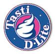
That said, the new logo is tempting — sort of like peeping at a dessert through a key-hole. Forms, and elements from the previous identity are reassuringly present; including the sweet pink and rich blue. The dollop holds its own without a thick badge, and the expression is now less Droste Effect without the fancy glass bowl. Avenir is refreshingly light as a support to brand the otherwise slick and generic symbol. The lockup is proportionally top-heavy with the huge dollop of product floating over the loose type.

Perhaps taking its cues from Pinkberry or other premium retailers of frozen substance, the size is restrained on cups, and applied daintily. As contradiction of terms itself, the product demands that the brand be equally flexibile. While low-fat can only be said of the cold, creamy substance, one is always prompted to top their Fluffernutter™ with Butterfinger™ or any other number of high fat candies and whatnots.

The duplicitous tagline, “dessert your guilt” is a fitting oxymoron for a product which is promoted as light+delicious+healthy+sinful. If Tasti can speak to multiple audiences’ cravings for health and indulgence with diplomacy, their magic recipe for frozen dessert product will spread across all continents at the fastest rate that venture capital will allow.
When the new logo first hit the street on cups and napkins, I asked the Tasteologist at my local Tasti what he thought of the new logo, and if he could speculate whether this new look might impact business. He furrowed his brow and said, “If it’s hot, people come in. That’s all I know.”

Thanks in advance if anyone from corporate headquarters wants to send me more coupons — they will be put to use. Seriously.

Jump to Most Recent Comment
Jamie Longstaff’s comment is:
The first thing this logo made me think of was looking at a turd through a key hole. I'm not sure if that says more about the logo or me but in either case it's not good.
Otherwise, this is definitely an improvement in the direction of upmarket food branding. I'm sure if it's hot, rich ladies with small dogs will come in.
On Jun.19.2008 at 02:06 AM
dg3’s comment is:
I would've liked to see them update it while retaining the retro feel of the earlier logo.
On Jun.19.2008 at 02:31 AM
dg3’s comment is:


vectr’s comment is:
The minimalist in me likes the reductionism... but... yeah, it's a whipped turd.
On Jun.19.2008 at 02:44 AM
lowfatdreams’s comment is:
Even if I do like the icon (I'm thinking more Jabba the Hutt having joined the KKK than a turd) there is something about the text below that really grinds my gears.
I know it's been done to symmetrise it all, but I don't like the wider spacing in lite at all - it makes it appear as though they've used a finer type.
On Jun.19.2008 at 03:58 AM
rickyaustin’s comment is:
Love the icon.
I think you understand ice cream before a turd. Ice cream come to mind first, especially in the color palette. If you over-think it, sure, feces... but it's pretty clear what it is.
The typography seems a bit odd.
tasti D•lite
That's a strange combination of uppercase, lowercase and bullet. It just gives the words a weird shape and doesn't make much sense to me.
On Jun.19.2008 at 04:01 AM
anonim’s comment is:
lol! It's looks like a piece of shit!:D
On Jun.19.2008 at 05:06 AM
coda’s comment is:
Definitely a turd.
On Jun.19.2008 at 06:20 AM
Divya’s comment is:
I thought of turd first too! I think the logo submitted by dg3 looks more like an ice cream. somehow a diagonal positioning makes it less like turd!
On Jun.19.2008 at 07:59 AM
spliffy’s comment is:
The logo itself is alright. To be honest I prefer the old one. Especially around the container. It feels richer and more delicious. Like some old time ice cream maker stuff, Instead of lighter and airy.
My main issue is their tag line "dessert your guilt". While it's mildly clever is probably going to be very effective. Ethically I am so %&$ tired of ice cream company's playing off of women's guilt complex about their self image (99%* are affected). FFS it's ice cream, so stop mind &*$&ing the ladies and lets just enjoy some.
*observational stat based in metropolitan area
On Jun.19.2008 at 09:18 AM
Ted’s comment is:
I'm afraid that in this post-2girls1cup world, all I can think of is a turd as well.
However, I can see beyond that and I do like the new logo very much.
On Jun.19.2008 at 09:36 AM
dbrenton’s comment is:
tasti•D•lite
i think adding a bullet between tasti & the D would help balance out the typography of the new logo better. Overall, I like the minimalist new logo. Definitely my style.
(and to all those people who see a turd....grow up! seriously!)
On Jun.19.2008 at 09:39 AM
Prescott Perez-Fox’s comment is:
I'm a big fan of Tasti D and this new identity. My only crit is for the odd capitalisation. To me it seems more logical to be written as Tasti D-Lite, or perhaps all lowercase, tasti d-lite. There's no reason the D needs to be cap, especially because it's a fake word in the first place. Y'know?
On Jun.19.2008 at 09:48 AM
Joe M. ’s comment is:
The wacki capitalization and spelling, along with the decorative bullet point, is just dorky. Why not go high-brow and name it "Tasteful Delight?"
On Jun.19.2008 at 10:08 AM
ScottS’s comment is:
I'm not sure why I seem to be the only one who didn't see a turd before the dollop, but I think overall this is a fine update. I'm almost always in favor of retaining some element of the original logo to retain brand equity--in this case, the colors and dollop are maintained. I understand the reasoning behind the use of Avenir light but visually it doesn't seem to work right the thick/heavy dollop. I am bothered too by the mix of upper and lowercase and the use of the bullet...it's an awkward arrangement and it distracts from the visual simplicity of the logomark.
On Jun.19.2008 at 10:11 AM
nicelogo.com’s comment is:
Before you point out the turd in their logo remove the hunk of sh!t in your portfolio.
I think it's sweetly executed and tasty to look at.
Nice work!
On Jun.19.2008 at 10:14 AM
Márcio Lobo’s comment is:
It looks like a shit.Lol.
On Jun.19.2008 at 11:01 AM
Anonymous’s comment is:

HEY LOOK!!! A TURD ON A CONE!!! No, wait...that's tasty vanilla ice cream.
See how dumb you guys sound. That new logo looks like a "tasti" treat. It's obviously not a big white turd. Once again...grow up.
On Jun.19.2008 at 11:17 AM
dbrenton’s comment is:
The DQ ice cream photo above is my post...i forgot to add my name before posting it.
On Jun.19.2008 at 11:25 AM
Frank’s comment is:
I don't really saw a turd in the new logo but i still think the old logo and identity (if the cups are an indication) looked way more "luxury" and classy.
On Jun.19.2008 at 11:35 AM
Darrin Crescenzi’s comment is:
This wordmark is just an unfortuante creature. As lowfatdreams has pointed out, the tracked-out "lite" opposite the tightly-kerned "tasti" is a typographic atrocity. There is definitely a better solution out there…
As far as dbrenton telling us to "grow-up," I think that such unfortunate visual assosiations are completely valid to point out — if people here notice the gaffe then you can bet some consumers will as well.
On Jun.19.2008 at 11:48 AM
dbrenton’s comment is:
to darrin...
You have a valid point.
(but i still see ice cream or yogurt first)

ben’s comment is:
I love the comments on the branding of politics yesterday. and find the crap in the ice cream today, surly the designs gods are smiling upon us for our keen insight into all aspects of life!
On Jun.19.2008 at 11:55 AM
Hibryd’s comment is:
Anonymous -
The white ice cream cone benefits from a different shape and a cone to put it into context. Just a blob on it's own, yeah, it looks like a cow pat.
The problem with amorphous logos is that once someone suggests a "meaning" to it, it's hard to get that meaning out of your head. (I *still* see Lisa Simpson giving a blowjob every time I look at the London 2012 logo.)
On Jun.19.2008 at 12:21 PM
Andrew Harrington’s comment is:
If the turds you see on a regular basis look creamy, white and as if applied by a soft serve machine, you've got more to worry about than the latest logo releases.
Honestly, though, it's well-rendered and it translates more as ice cream than a turd. The type is strange, though. I noticed in the original there is a cap L in 'lite' and I think retaining the cap L would have helped with the tracking of 'lite' given its extra width.
On Jun.19.2008 at 12:29 PM
dk’s comment is:
this sure is no Pinkberry or even Red Mango…
On Jun.19.2008 at 01:32 PM
Dyna’s comment is:
My first thought was that's exactly "Baskin-Robbins pink."
I see an actual serving of tasti D•lite and think "turd." The plague of non-ice cream dairy desserts infesting New York is at a bursting point right now. There's 5 pinkberry clones (and tasti itself) within a block of my apartment.
On Jun.19.2008 at 01:42 PM
Sebhelyesfarku’s comment is:
It's a turd, no doubt about it.
On Jun.19.2008 at 01:52 PM
Bart’s comment is:
I'm with dbrenton on this one. Is there ANY ice cream cone in the world that doesn't look like a turd? Are we to ban ice cream cones from all logos because people think they look like turds? By that same logic we can't have bananas in logos cause they look too much like penises....
On Jun.19.2008 at 01:57 PM
karen’s comment is:
turds? seriously? i see no turd. i see deliciousness. as a former dq curly-q artist (i figure if subway people are "sandwich artists", then i can say this), i have respect for the soft-serve form.
i really like the new mark, i think it does its job. i'm not sold on the lettering... like many others, i don't understand the upper-lowercase-bullet situation that's going on. i'd prefer it to all be lowercase.
On Jun.19.2008 at 02:59 PM
Wünderwoman’s comment is:
I think it's an improvement!
Nice work.

j’s comment is:
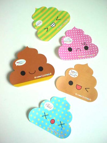
i do really prefer the old logo with the cute little dessert dish. because, erm, I hate to be on the poo bandwagon, but the stand-alone soft serve certainly does remind me of unko-chan, which is basically a sanrio-esque pile of poo.


orangetiki’s comment is:
The lettering loses it for me.
On Jun.19.2008 at 04:43 PM
T-Bone’s comment is:
clean as a whistle.
it would take a very talented dog to craft a turd that tidy.
On Jun.19.2008 at 10:00 PM
Glenn ’s comment is:
Tasty swirl. Bad tasting typography.
On Jun.20.2008 at 12:20 AM
andrew miller’s comment is:
I have a feeling its Interbrand, but I'm not completely sure. does anyone know if im right?
typography (specifically the tracking) is puke worthy.
On Jun.20.2008 at 10:26 AM
damon’s comment is:
I think they should have kept the wine glass type cup, it makes it feel high end. the coiler there looks like dog shit, you know the one weird piece of white dog poo you see in the park sometimes and it freaks you out.
the type is a bit weak feeling too, the weight feels wrong and the tracking on lite is totally different than tasti
On Jun.20.2008 at 11:49 AM
Emily Charette’s comment is:
I think the decision to use blue to create the frozen swirly bit was a great one -- I see that white and blue and instantly think Icy, not Sugary. Unlike the previous mark, which seemed more like an idulgence, Tasti D-Lite feels refreshing and healthy. Nice one.
On Jun.20.2008 at 12:55 PM
edgar winter’s comment is:
get out your old 80s clip art mags, look up ALBINO POOP in the index. i love it!
On Jun.20.2008 at 03:17 PM
Joseph’s comment is:
It's an upgrade but seems like it was put through the web 2.0 ringer a bit. It looks as bland as the product tastes and the typography is just horrible. Design student level.
On Jun.20.2008 at 03:52 PM
Chris’s comment is:
Hey did you hear that? He said "poo"... ha! Sometimes I really question my collegues.
Old logo needed updated. It looked way dated, and not in a cool retro way, just ugly. Update is more modern and timeless, although I question the typography usage and color palette (esp. on that cup: way BLAND, not original). Overall an improvement. Average Joe wouldn't see the bad type usage, and as bad as I don't like the palette, I think it's an improvement.
On Jun.20.2008 at 11:05 PM
Matt Klaman’s comment is:
simple, clean, beautiful.
the type could use a little work. I think all lowercase could solve some problems.
also, for those who see a "turd," what are you eating to have something like that exit yours or anyone elses body?
how unfortunate.
On Jun.21.2008 at 10:50 AM
mammalpants’s comment is:
if thats a turd, then i eat delicious turds!
do you guys all have creamy, soft serve poop? maybe i need to change my diet or something.


Jonathan Hughes’s comment is:
I've never seen a turd that looked like soft serve ice cream. I'm curious about both the consistency of the poop, and the ass motion that would be required to extrude a turd that looked even remotely like soft serve.
On Jun.24.2008 at 10:38 AM
neogrey’s comment is:
"Jabba the Hutt having joined the KKK" - that made my day :) While so many people see a turd in the logo, there is probably something wrong with it. It doesn't look like a turd in the old logo - maybe because of the glass.
On Jun.25.2008 at 07:03 AM
harv’s comment is:
I like the new execution, and think it's actually a lot stronger than the preivous one. Yes, it seems like everyone is running away from serif, but the whole "turd" comment (and there have been quite a few) is comletely rediculous in my opinion. When was the last time you crapped out something looking like that? If you had, more power to you,..you're a 'turd artist'.
On Jun.27.2008 at 12:11 AM
Char’s comment is:
comparing this logo with a piece of poop is so dumb, I'm sorry.
On Jun.27.2008 at 11:02 AM
Char’s comment is:
Sorry, I have to add... comments like seriously makes me not want to come back here ever. I am sure a lot of people feel the same way. Comments like those are juvenile.
On Jun.27.2008 at 11:04 AM
Char’s comment is:
oh, sorry... about the mark.
I love the logo, however, the logotype seems a bit weird. The spacing is too awkward, I understand that they tried to make LITE a bit "airier", but it looks more like bad kerning.
Also, tasti d•lite tastes like nothing, hahaha.
On Jun.27.2008 at 11:07 AM
OMEN’s comment is:
Nice icon, baaad type.
If your turds look like this, you should seek immediate medical attention.
On Jul.02.2008 at 09:37 AM
Joseph Maguire’s comment is:
That's a fantastic Update. Huge improvement.
On Jul.10.2008 at 05:24 PM
Amanda’s comment is:
"Nice icon, baaad type. If your turds look like this, you should seek immediate medical attention."
— This coment made my day. Also, i don't think that when people pass the store, they will think — "Oh! They must sell turds."
On Jul.14.2008 at 10:36 AM
Edward’s comment is:
Dear tasti D.lite, please stick with vanilla ice cream in your logo. By all means, DO NOT use chocolate. It's for your own good.
On Jul.15.2008 at 11:32 AM
Amanda’s comment is:
Not sure what it is about this but it makes me feel really uneasy. Somehow it didn't taste as good after the redesign either...
On Oct.28.2008 at 02:46 AM
matt’s comment is:
redesign looks better than the original. Now they can spend some time on the actual product, man does that stuff suck...
On Oct.28.2008 at 12:01 PM
sukisouk’s comment is:
" />
hehehe really nice animation. I obviously didn’t grow up yet. :(
On Jan.15.2009 at 09:41 AM
sukisouk’s comment is:
hey it didn’t work. here’s the animation from Paul Robertson:
http://paulrobertson.mechafetus.com/unkowalkp1.gif

Comments in Brand New, V1.0 have been closed.


