NOTE: This is an archived version of the first incarnation of Brand New. All posts have been closed to comments. Please visit underconsideration.com/brandnew for the latest version. If you would like to see this specific post, simply delete _v1 from the URL.

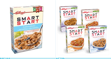
For at least eight years I have regularly eaten Smart Start cereal for breakfast. The first time I tried it, back in my Atlanta days, was simply because I loved the packaging and I thought that anything packaged in such a way could only taste good. It goes without saying that the cereal aisle in a grocery store is simply, and visually, cacophonous. Every color in the rainbow is represented through mascots, beveled typography, and giant spoonfuls of cereal — and the closest thing to white space is the milk dropping from the sky and into the delicious bowl you will enjoy if you decide to pick this, that or the other brand. Smart Start, introduced in 1998 by Kellogg’s, literally stood apart from the competition. Despite the obligatory shot of the product in situ, the box was the whitest thing my cereal-loving eyes had ever seen. Designed by Duffy & Partners, Smart Start also sported another anomaly in cereal box design: A flat logo, without shadows, and was not set on a bulging curve but, instead, on a very straight and horizontal line, and only used red and black. [You don’t have to imagine my description, you can scroll through the rest of the post to see the real thing]. As the years have passed, the Smart Start box has slowly deteriorated with modifications, nutritional-fact add-ons and other cereal-selling, visual paraphernalia, while maintaining a hint of the original design. But on my most recent unpacking of Fresh Direct boxes I gasped at the latest iteration of Smart Start.


Original logo and box, 1998 — check out the back of the box, that’s, like, empty! Images from Duffy & Partners

What I loved the most about the old box was the hardcore logo, set in a harshly geometric type treatment that gave Smart Start an edgier feeling, as if this was the true cereal for health-obsessed people who were intense about eating the best cereal possible — it was sharp and sans bullshit. I always enjoyed the typographic play of the logo as well, so simple yet clever. Now, the logo is set in a light Art Deco-ish (or Neutra-ish) typeface that looks like it’s bulging at the seams — just look at those Rs, they look like Muffin Tops. The balance that the old logo achieved is completely lost in this new version, with too much white space around the letters resulting in very odd counterspaces. Certainly the typography is only part of the problem about this redesign: Who in the world eats out of a heart-shaped bowl? The whole look steers definitely into an older, female demographic, so in that sense the change is appropriate yet I can’t help but be saddened by the slow devolution of Smart Start’s category-breaking design. Regardless of the logo, I still eat Smart Start almost every morning, proving that design doesn’t matter.
I kid. Because I love.

Jump to Most Recent Comment
Aloke Pillai’s comment is:
Yay, I want some girls cereal right about now!
lol, i totally agree with you man!
Keep Rocking!
Aloke Pillai
On Feb.03.2008 at 06:38 PM
Eddie Wilson’s comment is:
Im 50/50 with you on this one. Usually you hit it right on the mark but I think you might be too emotionally involved right now :-)
I think the initial box design looks dated (specifically the photography, with the 50's diner milk dispenser). Its refreshingly sparse, but also had a "concept/not completed" feel to it. I do like the new heart-shaped bowl as it INSTANTLY says "just incase you didnt know im good for your heart" (as if there isnt a cereal thats trying to go for this market segment), and I do like that you can instantly tell where the facts are (top right) and where the catchy marketing stuff is (bottom left). I do miss the use of blue in the origional packaging as it was a refreshing tone for the shadows. I will pretend that the in-between design didnt even exist; has "designed-by-comittee" all over it (althought I do like the color-coded bar for each sub-type of smart-start).
The new identity does speak to women, now more than ever but I think the real problem is that the letterforms detract from the "criss-cross sing-song" of the linking "A" in each word. Previously the slab-ish letterforms made a visual link between the words and that is lost now. Plus the leading between the two words is very tight and really reduced the value of the initial concept.
I would however have had the bowl on the left and the marketing garbage on the right of the bowl. The heart tip kinda leads my eye right off the box which might not be a good thing. I try not to think to deep into the subconscience of things like this.
So Identity -1, Packaging +1 maybe.
I think we should give it some time and then maybe someone can dig up some sales numbers for each packages time period. I mean we could debate all day but...
On Feb.03.2008 at 07:48 PM
Armin’s comment is:
Eddie, I know, it's easy to get attached to sweetened multi-grain flakes and crunchy rice and oat clusters cereal.
On Feb.03.2008 at 08:25 PM
Jay’s comment is:
On the subject of cereal box design...
Target has a brand called "Archer Farms" which has truly amazing packaging. I absolutely love the lack of distracting elements and clean use of typography.
On Feb.03.2008 at 08:54 PM
marko savic’s comment is:
Being a cereal aficionado myself I hated the direction all the national brands started going to in recent years. Even if it weren't healthy, (I've turned into some strange eco-hippie lately) I've found myself drawn to Dorset Cereals.
I'm lucky in a strange way that Sobey's (National grocery chain in Canada) has a "Natural Source" section in every aisle – healthy, organic and full of beautifully designed goods. Kellogs, eat your heart out!

image stolen from somewhere on flickr
On Feb.03.2008 at 10:09 PM
Nubby’s comment is:
Certainly the typography is only part of the problem about this redesign: Who in the world eats out of a heart-shaped bowl?
*sheepishly raises hand*


Greg Formager’s comment is:
Just look at those muffin top R's. Can you believe the idiocy? And who eats out of a heart shaped bowl anyway? Losers, that's who. Smart start, stupid finish.
On Feb.03.2008 at 10:55 PM
Jason Hendricks’s comment is:
I remember being stopped in my tracks when I saw the first version of Smart Start come out. But then I looked at the nutrition facts and ingredients a quickly put the box back on the shelf. 17g sugar, high fructose corn syrup (in both the rolled oats and cereal in general), partially hydrogenated soybean oil-which means trans fat and not very heart healthy.
I'll stick with Cheerios, which, by the way, uses heart shaped cereal bowls on the box.
On Feb.04.2008 at 12:04 AM
Danny Tanner’s comment is:
Judging from their website
it would seem smart start
is indeed targeting a mature
female demographic. The
prominent text size adjustment
tool and messaging are testament.
My only assumption is that this
new marketing ploy is an attempt
to further separate the product
from that of Total, Grape Nuts, etc.
Curiously, cereal in general,
was invented to be a healthy
breakfast alternative. Peanut
butter, also popularized by the
Kellogg family of Battle Creek,
MIchigan, was developed as
a means of delivering protein
to hospital patients. Curiously,
through time, both of these food
either became, or became
viewed as unhealthy.
Jason, great comment.
What bothers me is the epidemic of
"wellness" thinking in America.
As a society, we feel we need products
like "Smart Start" to be well, because
our state of normalcy is not well.
Smart Starts website even has tools
to tell you "if you are at risk,"
without being able to tell you
if you are, but by more generall
asserting that YOU, especially if
YOU happen to be a woman,
ARE AT RISK FOR ALMOST
EVERYTHING! Messages like this
only serve one purpose-
possibly scaring you into
buying their product.
We are set up to perpetually ride
a treadmill of health seeking yet
never finding a permanent state
of wellness.
By the way, Armin, perfect title.
On Feb.04.2008 at 03:18 AM
Chad K’s comment is:
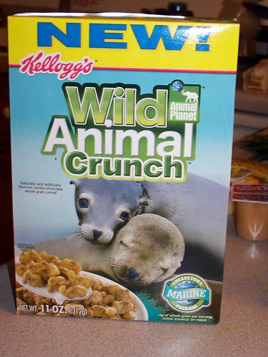
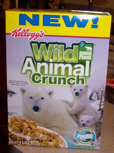
I don't know what's worse. Color-happy bevel type... or wondering what goes into the Wild Animal Crunch cereal. The sea lions are disturbing:


Armin’s comment is:
Nubby, ha, well no offense meant.
On Feb.04.2008 at 08:17 AM
Andi’s comment is:
I've had beef with Smart Start for the past two years when they had this commercial on....I know you've seen it. A woman starts off by saying "Do raisins have brains?" She continues to talk about the cereal, and says this: "It's called smart, for reason." No article in there. Now anyway, back to the logo.
I really love the play on the "A" lines from the old logo and I think they've really ruined it. I really appreciated the Smart Start logo until I've seen what it's been replaced with. I wouldn't eat that food to lose weight. My god! Look at those letters! They've had way too much cereal!
And I saw "Wild Animal Crunch" in my supermarket the other day and though it was hysterical. It's either animal food or it's animals in the box. Who knows?

John Mindiola III’s comment is:
i feel you. the smart start cereal box has been bastardized and it doesn't seem like anyone who isn't a designer (or married to one) notices or cares. i'm sick of the me-too-ness of the packaging design world. will some brand please take a chance at being different? is everyone so sure that beveled type is more successful? and why are only the organic products of the world in well-designed boxes? what about the unhealthy rest of us? are we less deserving of a higher aesthetic?
On Feb.04.2008 at 09:33 AM
C-Lo’s comment is:
I'm gonna miss you bank gothic.
*snicker
(sorry couldn't hold it in.)
On Feb.04.2008 at 09:35 AM
Jessica’s comment is:
Speaking of Wild Animal Crunch, can we please talk about the new Animal Planet logo?
On Feb.04.2008 at 09:55 AM
Armin’s comment is:
Jessica, good things come to those who wait. I've been trying to get a little more info/images before posting it. It's not been easy though. By the end of the day we'll have something I think.
On Feb.04.2008 at 10:00 AM
Andrew’s comment is:
Haha, I'm with C-Lo on this one!
Seriously, though, I think the overall design is much lighter than the original. This seems to be pretty consistent with the idea Kellogg's wants to implant into the minds of their consumers. Buy this cereal cause it looks "healthy". Everything is light and airy. Plus, your side by side comparison shows that the old version looks like it could lose a few pounds.
I for one welcome our White Space overlords
On Feb.04.2008 at 10:09 AM
Tom’s comment is:
Honestly, I was watching the dog show on Animal Planet wondering the same thing...what the hell happened.
On Feb.04.2008 at 10:11 AM
felix sockwell’s comment is:
nice Post® Kellogg'sLove®
love em or hate em Duffy creates great packaging. I always loved what they did with htis as well as the Minute Maid OJ container, which has also been watered down in-house.
This is neither here nor there but a few years back they (Duffy, NY) called me to design a range of icons for that great Bahamas ID... I forget what I bid (500-1000 per I think, nothing outlandishly high) but when I was deemed too high by the account executive I remember the conversation like it was yesterday... "Hi Felix. Can you do $250?" No. "Hmm. You won't budge, aye? OK, well Maybe next time you'll get to work with Duffy and Partners®." Click. Haven't heard from em since.
On Feb.04.2008 at 01:55 PM
Chris’s comment is:
Good thing Dr. Kellogg did also market an enema in a box as part of a balanced breakfast:
Smart Fart, anyone?
On Feb.04.2008 at 02:46 PM
Park’s comment is:
I was just thinking this morning (over a bowl of Smart Start) that I would like to see what a redesign of the logo and cereal box would look like. I think the 1998 original is great; it's too bad they didn't bring that design back to show to the world. Needless to say, I'm disappointed at with the new look, but as long as they don't change their cereal, I'll still buy it.
On Feb.04.2008 at 04:47 PM
damon’s comment is:
wow, never seen that old white box before
it's really nice....the back panel is so free of garbage.
On Feb.04.2008 at 04:48 PM
Derrick’s comment is:
New Animal Planet logo:


Armin’s comment is:
People, you WILL get your Animal Planet post!!
On Feb.04.2008 at 04:59 PM
DG3’s comment is:
Granted, the original logo was a head of it's time. It was doing clean and simple before it was cool.
But this is cereal, and sometimes you have to modify the look just to get noticed in the aisle.
On Feb.04.2008 at 05:39 PM
Jung’s comment is:
Dear senseless human being,
Just wait till the new post.
What Animal planet logo has to to with the forum discussing the cereal box logo????

Mark’s comment is:
Back on topic.
That 1998 box, looks quite different and clean, wow.
the rest, not that great.
I'd hate to see what Wild Animal Crunch will look like with the new logo, yikes.
On Feb.05.2008 at 10:29 AM
Tom M.’s comment is:
Has anyone mentioned Total cereal yet? I took the box out this morning to admire it (while eating Cheerios). A lot of the same principles seem to apply there. Anyone know if it's another Duffy package?
On Feb.05.2008 at 01:06 PM
Jeff’s comment is:
OOOOOO. Baker's Hat "Strong Heart". I want to read what the box says about its "NEW LOOK" - I can only imagine.
The old box has that pedometer, digital calorie-tracking, heart-monitor, B.M.I. graph look for people who may actually be exercising in addition to dieting ... The new package and typeface is perfect for the lazy, die-before-they'd-try generation of hopeful weight-lozers.
On Feb.05.2008 at 02:44 PM
Anonymous’s comment is:
I think brand it self has good affinity to the intended target audience. Is like a conscious embodiment, Clean and Smart. Working on the field, I most give BIG Kudos to Kellogg’s to finally implementing the nutritional signage in the front, after a big battle against many Consumers NGO's.
NUTRICIÓN - That’s Important when the consumers start thinking smartly.
The box feels somewhat Marthastewardish, which gives it a luxury feel, unique, none saturated, for people that think before buying.
Sample DEMO: On the Go, Young Professionals, Health Conscious, I will say females, but some of you guys are metro, right?
On Feb.06.2008 at 01:15 PM
john smith’s comment is:
Wow. Every box sucks badly. Original START-SMART logo is just terrible. Can't get any worse than that... no art direction...
Now, the new logo is not much better... but at least is not so heavy. Do I think it's ugly? Yeah, pretty much.
Hearth is a plus. That's a good creative decision, as somebody said above. It communicates the product is good for consumers health. However, art direction/typo sucks badly again. What disturbs me most in visual context, is the hearth in front of "strong hearth" claim. It looks as shit, is placed wrong and we already have a huge hearth form on the picture...
But I don't think this is a 100% design problem... that looks like client problem, too...
On Feb.11.2008 at 06:43 PM
Andrew Boardman’s comment is:
I'll never forget the first time I saw that clean, weird-white cereal box on the shelves ten years ago. At first, I thought it was a mistake - like my Brooklyn supermarket was a commercial testing ground for mutant consumers. Who would possibly buy this thing? I brought that box home and adored it for days.
On Feb.13.2008 at 11:48 PM
Sir Vertual’s comment is:
Visual Vomit...on the front of your cereal box - is 'not' where you wanna' see it...but unfortunately it's printed on most of the stuff at the supermarket these days...
I buy Merita Bread's 'Sweet Sixteen' powdered-donuts - mainly because the package is 'comfort food for my eyes'...and my 'old dog will learn a new trick' for the donuts inside...including opening the package & making every donut disappear - in the time it takes to pump gas...
On Feb.22.2008 at 10:37 AM
jazlow’s comment is:
The real problem here is the dressing up of an unhealthy product as being "Smart". There's nothing smart about high fructose corn syrup which is listed twice in the ingredients. The chemically engineered sweetener is linked to obesity, liver disease and diabetes and reeks more havoc on the body than plain old fashioned sugar. Just goes to show you how easily packaging can fool the consumer.
On Mar.10.2008 at 01:59 PM
Comments in Brand New, V1.0 have been closed.


