

NOTE: This is an archived version of the first incarnation of Brand New. All posts have been closed to comments. Please visit underconsideration.com/brandnew for the latest version. If you would like to see this specific post, simply delete _v1 from the URL.
![]()
Experiencing continuous growth as it has acquired many organizations in more than a decade, Norway Post launched a new identity that is now part of a bigger family of brands under the new parent company, Bring. A press release has all the information necessary about the set-up of the new company, along with plenty of numbers that establish the importance and relevance of Norway Post and its different branches.

There is something really off about this redesign. Sure, it feels more corporate and like a multimillion enterprise, but there is something about postal service logos that call for a more traditional approach. The old logo featured the Crown of Norway (one of only three logos allowed to use it), a post horn — Norwegian postage stamps since the nineteenth century have featured the advanced sounding arrival mechanism — and a very European sans serif— which may look like Gill Sans, but I think it’s Edward Johnston’s precursor for the London Underground — that gave the Posten a formal, trustworthy aesthetic. In contrast, the new logo carries no meaning and, while in five or ten years time it will surely become ubiquitous and recognized, it doesn’t stand for anything. This is a very similar case to UPS, where the company was more about its logistics superpowers than the thrill of receiving a package — resulting in a more abstract logo, devoid of meaning. Way to lead by example.
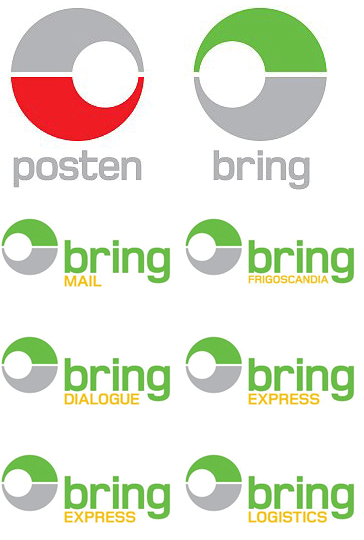
Since interpretations of what the new icon means (or why it faces two different directions) and what the new typography stands for are surprisingly absent from press releases feel free to add your own.


Jump to Most Recent Comment
JP’s comment is:
I'd have to dissagree that it "feels more corporate and like a multimillion enterprise"
To me it looks cheaper and more cliched.
The old logo was fine in my opinion. If there was anything to change I'd perhaps tweak the horn a little. I'd be interested to read the reasoning behind the change. Personally, when I do a redesign I like to somehow link the old to the new, even if it's far removed it still connects it in some historical way but these guys haven't even used the same red.
On Sep.10.2008 at 07:27 AM
Stephen’s comment is:
Who knew the Deathstar was nothing more than a nordic sorting office?
Plamen’s comment is:
The new Death Star?
The 'before' font is so much classier, eh.
On Sep.10.2008 at 07:31 AM
Mr. Harry Nusbaum’s comment is:
Soon some random internet-dude will post this image here:

marco’s comment is:
I would defenitely opted for a reversed endorsed rebrand for the BRING company, using the posten identity as an anchor in the portfolio...
On Sep.10.2008 at 07:34 AM
Thomas Jockin’s comment is:
Ah! Mr. Harry Nusbaum beat me to the pokemon reference!
On Sep.10.2008 at 07:45 AM
jen’s comment is:
My first thought when I saw it is that the shape is the view looking THROUGH the horn.
It's not an awful design, it's just rather generic. An update of the crown and type in the old version probably would have served them better. It certainly would have been more recognizable.
On Sep.10.2008 at 07:47 AM
John Williams’s comment is:
Thanks to Mr. Nusbaum. My first thought was "why are they catching Pokemon?"
On Sep.10.2008 at 07:49 AM
Charles Forster’s comment is:
gotta catch em all!
On Sep.10.2008 at 08:15 AM
John McCollum’s comment is:
The old brand could have used an update, but it was a treasure. To a non-Norwegian, at least, it evokes a certain romance, a heritage, a terroir.
Remove the logo from its box, create a new lockup with the type, introduce a new color palette and some supporting graphic elements, and you've done your job.
The new one? Everything about it is trite. Worse than meaningless, the mark communicates both arrogance and amateurism -- not what you want from what must have been a centuries' old, venerable institution.
It blows.
On Sep.10.2008 at 08:21 AM
Remy Overkempe’s comment is:
Wow. Bad choice. The original logo seems to me a lot more sophisticated and classier. The new one just looks... like any other generic logo. Wow. Mistake!
On Sep.10.2008 at 08:22 AM
John McCollum’s comment is:
"not what you want from what must have been a centuries' old, venerable institution."
Unless, of course, I'm wrong. I assumed this was Norway's federal post office. Now, upon further inspection, I'm not so sure about that.
The new brand? It still blows.
On Sep.10.2008 at 08:24 AM
Daniel Green’s comment is:
I might be wrong about this, but I see two mirrored horns in the new symbol. Even if I'm correct, however, the focus naturally goes to the negative space between them, while the horn shapes get lost.
On Sep.10.2008 at 08:38 AM
Plamen’s comment is:
John, you're not wrong - Posten Norge is founded in 1647 and as of 1719 is fully owned by the Norwegian state.
On Sep.10.2008 at 08:40 AM
Kristian J.’s comment is:
This redesign has sparked some controversy here in Norway - the logo is a bit too similar to the logo of London Clearing House
On Sep.10.2008 at 08:45 AM
Tomasz Ronda’s comment is:
looks crap to me. doesnt at all suggest reliability, whichshould, in my opinion
On Sep.10.2008 at 08:47 AM
Hein Haraldson Berg’s comment is:
Sweet! Everywhere I turn, the feedback is almost exclusively negative. Both at the Norwegian and the foreign/international communities.
Tomasz: Well... They're not actually known to be very reliable, so, maybe this is for the better? Heheh.
On Sep.10.2008 at 08:59 AM
Kris’s comment is:
sweet, I love pokemon.
On Sep.10.2008 at 09:03 AM
Armin’s comment is:
> I'd have to dissagree that it "feels more corporate and like a multimillion enterprise" To me it looks cheaper and more cliched.
JP, exactly... The four things tend to go hand in hand regularly.
On Sep.10.2008 at 09:10 AM
Peter Whitley’s comment is:
I absolutely love it. It's cleaner and can reproduce at different sizes. It would look awesome on the side of a building.
It's ownable and belongs in this century. The old logo didn't have near the flexibility that the new one does...and, as stated, with color and the orientation of the negative bulb one can develop an interesting language that CHANGES the logo. I like that!
The thing I like best about it is that it carries a pride in the form. As if to say, "we're happy being a circle...that's good enough for us." It's not trying to tell the story or live in past accomplishments. In fact, it sort of allows itself to meet the viewer more than halfway. I think that's very generous.
Suddenly I want a martini.
On Sep.10.2008 at 09:20 AM
Jacob Cass’s comment is:
I choose you, Pikachu!
On Sep.10.2008 at 09:26 AM
Lasse Rintakumpu’s comment is:
It's interesting to watch how in the age of global capitalism national postal services (big, often private and international businesses by now) are dropping their old identities in favor of more "corporate" logos.
The same happened to neighboring Finland's postal service Posti (Itella) few years ago as the stylized horn was replaced with more abstract form, in this case, a circle:

According to Posti the blue point "has a relation to another blue point which changes its position and content" and is therefore supposed to "reflect know-how and talent".
On Sep.10.2008 at 09:28 AM
dc’s comment is:
I see two horns and I like it. It's not perfect, but certainly not horrible either. Rather, it's sleek and stands out from the numerous other European horn and/or crown postal logos one finds across the continent. That said, I'm not convinced a change was actually needed, as the old logo wasn't bad by any means.
As far as focusing on the negative space is concerned - my eye went straight to the red horn. It's too bad the crown has been totally abandoned though.
On Sep.10.2008 at 09:34 AM
dale harris’s comment is:

Tom Hackett’s comment is:
It makes me nostalgic for my old Toot-a-Loop

Jørgen Tellnes’s comment is:
If I were a tourist in Norway trying to get a postcard home, seeing the new logo on the side of a building would not at all suggest to me that this might be a post office. I would assume it were a place I could rent movies or play Pôkemon games. The old logo clearly identified a postal office when placed on a sign outside a building [1], the new one don't. They just threw out a very valuable property in a logo, and replaced it with some generic crap.
The worst part is that when announcing the rebranding, Posten proudly stated that the rebranding had cost around 300 million NOK (~$60 million). While at the same time closing down post offices, removing postboxes and trying to save money. It leaves us, the customers, wondering why they had to spend 300m to get a new logo and new colours on their cars instead of spending it to provide us with better service.. :/
[1] http://gul.no/bilder/21570.jpg
On Sep.10.2008 at 09:56 AM
Arve Systad’s comment is:
- Since interpretations of what the new icon means (or why it faces two different directions) and what the new typography stands for are surprisingly absent from press releases feel free to add your own.
Somewhere in the press releases they state that the new logo(es) are supposed to be simplified post horns. I can see it when someone explains it to me, but should that be necessary?
Still a ghastly redesign.
On Sep.10.2008 at 10:04 AM
Dave S’s comment is:
this actually reminds me of fedex -- with the name/sub-brand setup like that for a postal company that also does logistics-ish things.
On Sep.10.2008 at 10:11 AM
Rov’s comment is:
You mean to tell me they couldn't have freed the horn from the box, introduced a new color scheme and possibly updated the typeface? I agree with Jørgen, how does this new logo say, POST? It really bothers me that we abandon tradition and history for something new that can not relate. Ugh!
On Sep.10.2008 at 10:14 AM
Chris Rugen’s comment is:
I'm still trying to figure out what was wrong with the original logo.
On Sep.10.2008 at 10:15 AM
Jonatan’s comment is:
Current buzz around this logo-launch is that it is accused of being plagiarism.... See for yourself..
On Sep.10.2008 at 10:26 AM
John McCollum’s comment is:
Plagiarism? Doubt it.
It's just so damn unoriginal that similarity to a hundred other unoriginal logos in inevitable.
Everything -- the typography, the logo, the color palette, the application -- is unoriginal. It's about as "ownable" and visionary today as Frutiger Italic with teal swoosh was in 1993.
Yuck. Double yuck.
On Sep.10.2008 at 11:12 AM
J’s comment is:
http://www.kjefta.org/posten-har-ny-logo/
85 comments, i think 84 of them are negative. It says alot...
On Sep.10.2008 at 11:15 AM
Proclaim’s comment is:
Bungie's Marathon, anyone?
![]()
Mongoose’s comment is:
It took me a while to see the twinned horns, even with the highlight color. It's a simple, clean, direct logo.. but darnit if I don't see Death Star and Pokeball. I just can't get past that, especially with the red/white.
Armin nails it: Generic, but it'll be simple and ubiquitous. And from the press release.. the company is multinational. When you're trying to handle mail and package services across international lines, keeping too close of ties to the Crown of Norway as a logo motif isn't a wise idea.
I give it a B-. It'll accomplish what they want accomplished, but damn. Death Star.
On Sep.10.2008 at 11:35 AM
John McCollum’s comment is:
"When you're trying to handle mail and package services across international lines, keeping too close of ties to the Crown of Norway as a logo motif isn't a wise idea."
Respectfully, I disagree. I have to bet that there are enough positives associated with Norway as a national brand that one could leverage those toward a unique market position.
Fact is, they kept the least internationally-marketable aspect -- the funny-sounding Norwegian name "Posten."
It's like the Ikea of shipping. But crappier.
On Sep.10.2008 at 11:41 AM
exigent’s comment is:
The old logo had character and a definate european feel. Whereas the new logo is just terrible. Lost is any sort of nostalgia or tie in to their original design... granted, one could stretch and say that the red area is an abstraction and simplification of a horn, but the washed out grey above?! I see no crown. If they were to have gone that route, I would be more pleased. Also, the typography does nothing for the icon whatsoever. Optima anyone?
On Sep.10.2008 at 12:08 PM
Kim Siever’s comment is:
I see three horns. Two viewed from the side, and one viewed through the bell.
I prefer the new one. It actually seems older to me than the former.
On Sep.10.2008 at 12:10 PM
John McCollum’s comment is:
"It actually seems older to me than the former."
Older in what sense, though? Like 1990s older? Perhaps.
I guess this proves the point that the previous logo still had legs, and didn't need to be ditched to convey some vague concept of modernity and globalism.
Anyway. Not sure why this rebrand has my undies in a bunch, but it's just so distressing to see all of the logos with real heritage ditched and replaced with banal logoworks wankery.
On Sep.10.2008 at 12:21 PM
adam’s comment is:
good point with the reference to the ups logo redesign, about how they dithced a logo that held meaning and was descriptive for a logo that simply touted their brand superpowers with no meaning behind it, except that it is now beveled and shiny.
On Sep.10.2008 at 02:01 PM
david young’s comment is:
Reminds me of the Australia Post logo...
![]()
Rico’s comment is:

Dylan Mullins’s comment is:
I don't get the mark or choice of type. It gets my goat when rebrands like this don't harken to the original in any way, be that through use of type, or revision of a mark.
Nothing carries over into the new mark, and as many people have said, the new mark really means nothing to anyone.
On Sep.10.2008 at 02:40 PM
Michael’s comment is:
My mind also immediately went to Poké ball:

Von Glitschka’s comment is:
Nice Proclaim's! That is what I immediately thought of. Great game BTW. Ah the memories of designing my own maps and hiding weapon caches. LOL
On Sep.10.2008 at 03:02 PM
Steve’s comment is:
Yeah, as soon as I saw it I was astounded by how pokemon it is. If I scrub the pokemon from my mind, it still has no meaning or particular appeal. It's very unremarkable. At least, like mentioned, it'll be really easily recognized in five or ten years.
On Sep.10.2008 at 03:32 PM
Bauldoff’s comment is:
Forgettable Mediocrity, I choose YOU!!!!!
On Sep.10.2008 at 03:40 PM
frebro’s comment is:
There has also been the usual loud voices about the logo being plagiarised.
Thankfully the Swedish Posten kept their classic symbols when they redesigned a few years ago:

Adam’s comment is:
for all the death star comments, I strangely had the immediate feeling of the rebel alliance symbol...
On Sep.10.2008 at 04:51 PM
Andrei’s comment is:
Anybody who doesn't see the Pokeball is either
a) older than 35
and/or
b) doesn't have kids.
It's a bloody pokeball and its ninja-turtle twin.
On Sep.10.2008 at 05:31 PM
Trond’s comment is:
Many are sad to see the Crown of Norway leave the logo. Fact is, Norway Post is no longer entitled to use the crown in their logo. Don't know why, I read it in the paper. Maybe it's because they're a regular company now.
On Sep.10.2008 at 06:45 PM
Paul Ducco’s comment is:
Also immediately went "Australia Post"
On Sep.10.2008 at 06:57 PM
Chris Austin’s comment is:
Ditto, i also saw Australia Post
KtotheP’s comment is:
This is a very similar case to UPS, where the company was more about its logistics superpowers than the thrill of receiving a package — resulting in a more abstract logo, devoid of meaning. Way to lead by example.
More abstract than an outline drawing of a package? And devoid of meaning? There was still a shield, within which were letters that said UPS, right? Doesn't the strong protective shape convey meaning? Are we really going to fault a company for following its customers common usage and use initials? (FedEx, anyone? WaMu?) It's a never-ending question for me why designers talk to other designers as if the businesses we all do the work for don't exist. Armin, you don't like the UPS logo, we get it — but the point you are making about business reasons for logo creation is undermined by your (now) knee-jerk opinion.
Another tired trope: It looks like...
- a pokeman ball
- a telephone
- the deathstar
- a hat
- a brooch
- a pteradactyl (and if you're younger than 30, you probably don't get it)
The only valid comparisons posted here were the Swedish and Australian mail logos. (LCH is a separate discussion).
Both in shape, color and business category, the new Posten logo is far too similar to Australia's. Perhaps it doesn't matter since they're probably not direct competitors.
However,"Classic" and "traditional" symbols are as meaningless and as abstract as any others. The old Norwegian post and the current Swedish post are, except for the surrounding color and shape, the same. In fact the postal services of the countries that surround Norway (read: most of Europe) are chock full of horns, crowns and the color yellow. Do your own wiki search to find out why, but what's clear is that these symbols represent history, nothing more. Heritage has no intrinsic value, unless there's a measure of quality attached to it, and that must be re-established in the present. So a further abstracted horn or crown is just a leap towards even less differentiation, and less definition. Again, maybe that didn't matter to Posten, though it might make an interesting discussion point. If color was a factor, using green for specialized services may have been the best choice of the design exercise.
The Posten logo is no prize winner, but there isn't a great mark in the entire competitive set. That's a shame and a real missed opportunity, but it's only one of many distinguishing aspects of what Posten may be up to. Where is the larger discussion here? This site is call Brand New, not Logo New, but postings and the comments always seem to reflect the latter name.
Side note: Posten=ha, ha? Not really. Just not your language. Is Posta funnier? Ask the Czechs. Posturinn? Icelanders might disagree. Here's what's not funny: small-mindedness.
On Sep.10.2008 at 08:01 PM
Rov’s comment is:
I vote for...
![]()
Mingshi’s comment is:
Look - their neighbor the Danes are doing a better job! They still get the horn.
![]()
Branding by Kontrapunkt
On Sep.11.2008 at 05:00 AM
PP’s comment is:
I don't like this new identity. But KtotheP’s last comment touched some interesting points. This logo doesn't have any connection to the traditional postal service, mainly because it's far away from symbols we immediately associate with the late (horns, crowns, etc).
Maybe, as a brand, Posten Norge wants to say that they aren't just the traditional mail company, that's why (using Armin words) "it feels more corporate and like a multimillion enterprise". And maybe they are, and that's the all point. If we like the approach and the result?! That's another issue.
Anonymous’s comment is:
@ Rov - Hellenic post is also one of my favorites, but it's not very well explored and applied when comes to identity.
Another one is the portuguese:

@ Mingshi - Keeping the horn crushed like that doesn't make it better.
On Sep.11.2008 at 06:40 AM
PP’s comment is:
The "Anonymous" was me!
On Sep.11.2008 at 06:41 AM
M. Jackson Wilkinson’s comment is:
According to wikipedia's posten norge page, Posten Norge is in the process of "liberalization" and deregulation, so I can guess that would be the reason why the crown may have been removed.
On Sep.11.2008 at 08:33 AM
Lauren F.’s comment is:
BOO! The old one is awesome. I agree with Mr. Harry Nusbaum, looks just like a pokéball.
On Sep.11.2008 at 09:25 AM
danny’s comment is:
I get the abstraction of the horn, and in that respect it has an interesting movement and dare I say dynamic perspective to it? The problem, is that the icon should probably have been rotated so the off center empty space was at the bottom. Right now it feels like a terribly generic "fedex" look.
The icon I can deal with, but that typography is terrible. Does anyone know what face it is? It would have been nice if the typography matched the icon or at least looked a tad more custom.
*sigh* another busted brand.
On Sep.11.2008 at 10:10 AM
danny’s comment is:
Also:
![]()
designscene’s comment is:
The old logo had a traditional, cultural feel to it, which is completely lacking in the new one. The new one looks like it could be a logo for just about anything. A postal system logo should in some degree reflect something about the country it comes from. The new logo is just completely dead. It doesn't reflect any qualities about either Norway, or a postal system. its plain old boring. There is no concept, neither is there any aesthetic brilliance, or originality.
On Sep.11.2008 at 12:16 PM
Matheus’s comment is:
BULBASAUR, I CHOSE YOU!
This brand is ridiculous and made up in one minute: Circle, line, select, divide, color, circle, subtract, save, laugh, laugh more and send to stupid client
On Sep.11.2008 at 01:13 PM
adam’s comment is:
i really do not see how posting other logos that sort-of resemble the logo being discussed, especially if the logo for the other company is not in the same industry, let alone the same culture/country, is really relevant.
now, comparing it to the australian post or lch is somewhat relevant, since one is in the same industry and the other is apparently(?) a big political group in a neighboring country.
On Sep.11.2008 at 02:25 PM
Jim Basio’s comment is:
@Jørgen Tellnes My first thoughts as well. Crown or not, the new logo just does not suggest that it's a post office.
On Sep.11.2008 at 04:29 PM
max’s comment is:

Kristian J had it right. It did cause some controversy in Norway because of its particularly similar look to the London Clearnet logo. It was even on the cover of NRK's website making headlines when it was released.
As far as changing it from the crown and horn bit, Norway is notorious for wanting to be different from some of the other countries in Scandinavia...especially Sweden. After gaining their independence from them there's been some a-hem... distancing of sorts.
On Sep.11.2008 at 04:34 PM
Gary’s comment is:
What a W.A.S.T.E.
Mongoose’s comment is:
John McCollum’s wrote:
>Mongoose wrote:
>"When you're trying to handle mail and package >services across international lines, keeping too >close of ties to the Crown of Norway as a logo >motif isn't a wise idea."
>
>Respectfully, I disagree. I have to bet that >there are enough positives associated with Norway >as a national brand that one could leverage those >toward a unique market position.
I misphrased that, and you're right to call me on it. I was trying to get across the point that Posten/Bring is obviously now trying to look like an International company, not a Norwegian one. While you're right that 'Norwegian' isn't a negative.. 'European' or 'Global' are more likely to appeal outside the country.
On Sep.12.2008 at 12:40 PM
Mark’s comment is:
damn it, all I can think of is eyes, and the Death Star.
the second picture makes the "eyes" look cross eyed.
On Sep.12.2008 at 01:05 PM
Hedge’s comment is:
Pokemon logo? Pinchdamon logo is more like it.

Neil’s comment is:
For me, red + yellow + crown = mail. In my case, Royal Mail (UK). My first thought on the new logo if I were a foreigner in Norway is that that logo was for perhaps a train station. Don't ask me why.
On Sep.12.2008 at 10:32 PM
Mark’s comment is:
After looking at all the the European postal service websites I can understand why the dropped the horn, I mean a lot of them use an almost identical horn motif, with minor adjustments.
Also I can help but like the name "Bring" for a delivery service, great verb, it gives a good association with taking in the mail after it's been delivered. Also with the words put after it it makes each of them sound like an action. Plus it sticks out and doesn't sound as formulaic and mundane as the repeated names of the country/reference to government symbolism with "post","postage","service" or "postal" stuck at the end/middle of it.
I hope I'm not sounding so cheesy.
On Sep.12.2008 at 10:39 PM
Mark’s comment is:
ugh, I missed something....this is what I meant to say.
After looking at all the the European postal service websites I can understand why the dropped the horn, I mean a lot of them use an almost identical horn motif, with minor adjustments.
Also I can't help but like the name "Bring" for a delivery service, great verb, it gives a good association with taking in the mail after it's been delivered. Also with each of the service words put after it it makes each of them sound like an action. Plus it sticks out and doesn't sound as formulaic and mundane as the repeated names of the country/reference to government symbolism with "post","postage","service" or "postal" stuck at the end/middle of it.
I hope I'm not sounding so cheesy.
On Sep.12.2008 at 10:41 PM
Postman Pot’s comment is:
They should never have dropped the old horn. A update was probably in place, but the new logo is hideous and not very functional.
I don't really see a problem with using a classic post horn like alot of european countries do. Why would you want/need to look different from other countries' postal services? It's not like you're running a risk of going to a Belgian or Danish postoffice instead of a norwegian one just because their logos are a bit similar... unless you're on PCP and forgot that you traveled to a different country last night.
On Sep.13.2008 at 07:41 AM
Goffredo Puccetti’s comment is:
Oh please...... please tell me that you got the 'before' and 'after' switched...
On Sep.13.2008 at 07:59 AM
Tony Spaeth’s comment is:
Because strategy should come before design, I think this discussion is incomplete until the (apparently) driving design intent is recognized - to create and launch the Bring co-brand. Bring's purpose is to give Posten a more credible FedEx-type competitor, leaving Posten with its traditional service commitment undiluted.
Clearly, Bring needed a different design expression than the old Posten mark provided. Having said that, it seems a shame to lose the old mark's appeal. But I guess the strategic message here is that "Posten, too, must compete in a new world and we are bringing new ideas and energy to it, just as we are with our new Bring service."
On Sep.14.2008 at 04:32 PM
Einar Lie Slangsvold’s comment is:
In 1996 the norwegian parliament decided to transform the state postal service into a joint-stock company. Since the company is no longer directly controlled by the ministry of transport, it lost it's right to use the crown in the logo, even though the norwegian government still is the companies sole shareholder. The parliament also decided that Posten should use their free role to expand beyond the norwegian borders. Posten started to buy private transport companies in the other scandinavian countries, and started to compete with the other scandinavian, stateowned postal services. Therefore the Posten Group decided to make a graphic profile that is easy to recognise, both for norwegian customers and for customers in the other scandinavian contries, without being mixed up with other state postal services that also uses crowns and horns as their symbols. At one point they even considered changing the name completely. Their decission was to make two new brands that could be used side by side on different markets. The name "Posten" is still to be used on the norwegian private market, while the name "Bring" (which is a great name, because it is easily pronounced both in english and norwegian, and it actually gives the same meaning as well) are supposed to be used in the company marked, both in Norway and Scandinavia.
Some months ago, the state postal services of Sweden and Denmark joined forces, and is now one company with two different brands. This will probably not last very long, and it will be interesting to see how the new compay will choose to organise and brand itself.
But! I must say that I think the new logo is horrible. I like that they have picked the green colour for the Bring-profile, but I think the symbols should have been more symmetric. The new, green Bring-cars did hit the streets here in Oslo the same day the logo was launched, and it is not a pretty sight. The red Posten-vehicles havn't changed yet, and I am not looking forward to see their new design. Definately not if it's going to be as bad as the Bring-cars.
It is sad to see the crown go, as a result of new public management (NPM) and international competition, but I am afraid that was unavoidable. Althoug, I am sure it could have been done in a more elegant way. I hope the swedes and danes will have better luck.
Nemolom’s comment is:
Tradition is worth something if customers associate it with something good, like reliability and familiarity. I understand the need for Posten to update the logo, but I think it could have been done without alienating the home marked so much. I expect it's still their biggest marked.
I would have kept more of the old in the new, and tried to come up with something more uniquely recognizable. The main problem to me is that this one's too generic, and too simple. That's why it's so easy to find all kinds of other stuff that looks similar.
On Sep.16.2008 at 09:27 AM
Typolion’s comment is:
much to do about nothing, its a shame, what a difference design would make, norwegian wood, tell me why, i cant get no- satisfaction!
On Sep.16.2008 at 09:49 AM
Captain Awesome’s comment is:
A few years ago, another Norwegian state-owned-turned-public company, the telco Telenor, changed their logo to a meaningless "propeller":
![]()
I, among many others, thought it to be a bad logo representing mediocreness, but we've been since proven wrong, as Telenor has now become what you in the US call a "multinational" (everything here is multinational) and the logo is very recognisable. I would dare to put it in the same category as the Nike logo as being meaningless, but aesthetic and recognisable.
Both logo changes happened as a response to a number of European industries being liberalised with laws forcing companies out of the control of the states. They now have to compete on equal terms with other companies, and do things like this to stay in the game. I don't think this logo change will be as successful as Telenor's, but it provides some rationalisation for the move.
Oh, and a company delivering mail can not have a logo without a horn in it! Damn it.
On Sep.22.2008 at 05:47 PM
Petter’s comment is:
To all that comments on the removing of the crown: Norwegian Post is not allowed to use it anymore (as the Post is now a commercial company). This was one of the main causes for the redesign in the first place.
As for the horn consider this aspect: Post companies are increasingly getting to be global corporations that competes not only in their own country, but at least in neighbouring as well. Traditionally a post horn is a nice touch, as everyone would know all over the world what they do. But yet, there lies also the problem with the horn; they all look almost the same. And colours? Quite a few already use red or yellow, or both.
So, how to differentiate your logo if your company is competing with postal services in other countries - at least you should not use the same posthorn and colours that everyone else does. I know tradition is nice and all, but this is big business, and a lot more than just delivering letters and postcards - which actually is a decreasing area of work. It's now all about delivering advertisement, parcels (home delivery), logistics and such all over the world.
Sorry, but Postman Pat is dead.
On Sep.23.2008 at 02:56 AM
Neil Martin’s comment is:
I really don't care what they call it...
Simple fact: last month I posted a parcel and it cost Kr150 (rekommandert), this month I sent exactly the same package and it cost Kr300.
Complete madness, it seems as if we, as customers must pay a lot to have our postal service in its fine new livery.
I long for a more competitive and less monopolised country.
On Oct.31.2008 at 08:21 AM
Patrick’s comment is:
I love it! You can now really go to the PokeCentre in real life.
On Nov.30.2008 at 11:27 PM
JeffT’s comment is:
While perhaps they wanted having nearly the same logo as the neighbouring Swedes (thus copying someone else) I'd - like so many others - say they should have kept at least the horn and colours. Its not just throwing out tradition but also quality aesthetics.
On May.05.2009 at 11:20 PM
Eileen’s comment is:

this logo is the reflected logo of the ISA from Killzone2.
what the hell.
On May.23.2009 at 12:44 AM
Comments in Brand New, V1.0 have been closed.


