

NOTE: This is an archived version of the first incarnation of Brand New. All posts have been closed to comments. Please visit underconsideration.com/brandnew for the latest version. If you would like to see this specific post, simply delete _v1 from the URL.
![]()
To stay within the theme of postal services, we now turn our attention to Mexico’s Servicio Postal Mexicano (Mexican Postal Service) that recently announced a major change in name to Correos de México (more or less Mail of Mexico), identity and services. For the more than twenty-one years I lived in Mexico I think I sent no more than five letters through the postal service. In part because at that age I had no one to send letters to but also because it just didn’t feel like anything would get anywhere, as it’s a slow under-developed service and most people pay their bills by going to the bank or to the utility’s offices. Even now, when I send Holiday cards from the U.S. I am always surprised that they get to their final destination before the beginning of a new year. Just to give you an example of the difference in use of the postal service: For each citizen Mexico delivers seven letters a year, and the U.S. delivers 700, granted, a lot of it are coupons and offers to credit cards with low-interest rates, but still.
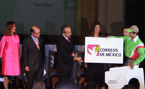
This past Monday, Felipe Calderón, the President of Mexico, helped unveil the new identity and offered a sense of hope for the service alluding to anything that could give citizens a sense of security and confidence in the service: Better, well, service, facilities with Internet, more inspectors, etc. In this case, a drastic new image is perhaps the best way to signal change. And nothing signals better than lime green and hot pink — colors often seen throughout Mexico but rarely in government services. While the old uniforms were a typical mundane blue and white, the new ones will bring inherent attention to the mailmen and mailwomen in the public — I think seeing them milling around the city would help in letting the customers know that, indeed, people are transporting letters from one place to another.


The logo itself is nothing to bask about. It’s a rather simplistic drawing and the change from an eagle to a pigeon seems odd. The new name is actually an old name, which goes back to the beginning of the twentieth century, so I guess they are going for tradition and nostalgia with the idea of a pigeon hand-delivering beak-delivering your mail. The typeface looks as default as it can be, I don’t even know what it is, but I do like the hot pink accent over the “E”. So, overall, it’s a great way to define a new era for the postal service, but the execution leaves a lot to be desired.


Thanks to JJ for the tip.


Jump to Most Recent Comment
Nick Irwin’s comment is:
really? ...what have we learned about pigeon carriers through past FedEx commercials?
On Sep.12.2008 at 07:39 AM
Tomasz Ronda’s comment is:
awful!! it looks like from 80-ties, colors are not really pleasant and there is nothing to like about it. looks more like clipart than logo
On Sep.12.2008 at 07:46 AM
Yotam’s comment is:
Horribly kerned.
On Sep.12.2008 at 08:27 AM
Ty Halasz’s comment is:
Though the design of the logo is seemingly bad by our standards, it might serve to accomplish exactly what they're looking for: greater visibility. As Mexico desires to become more than a developing nation, investing in and improving the postal service is a key part of that. So what better way to completely change and call attention to yourself (to encourage more citizens to use the mail) than to make an identity of this nature?
On Sep.12.2008 at 08:37 AM
Gregg’s comment is:
Kind of reminds me of sugary goodness

Remy Overkempe’s comment is:
Awful! Is the eagle to pigeon transformation a statement of new strategy? I'm not saying the pigeon logo is a wrong idea, but the execution is... bleh.
On Sep.12.2008 at 08:47 AM
kaz’s comment is:
Wait, you mean it's not April Fools'??
On Sep.12.2008 at 08:48 AM
Tom Hackett’s comment is:
Pretty ghey.
On Sep.12.2008 at 08:58 AM
Plamen’s comment is:
It's fresh and will work.
Who cares about the execution.
On Sep.12.2008 at 09:05 AM
Stereo Radiation’s comment is:
This color scheme is ridiculous. Pastel versions of the national colors of Mexico. Fortunately, for the people who have to wear these gawdawful uniforms, there is no pastel white.
However, I like that it looks less like the postal service of another, nearby country:

but what is with the bird's wing? The wing looks more it is twisted out of place than as if the bird is about to fly.
On Sep.12.2008 at 09:07 AM
rickyaustin’s comment is:
Corre Os
De Mé Xico
Antonio’s comment is:
The font must be the same as the rest of the Presidential Identity, called Presidencia built by Gabriel Martínez Meave
http://tdc.org/news/2008Results/Presidencia.html
Here is a huge sample of the logo:
http://img.skitch.com/20080912-m11e88jsh83es472m7ijarxtm5.jpg
Antonio’s comment is:

Chaac’s comment is:
As a Mexican citizen and Designer, I have to say I am very disappointed. Would it be possible to know who did this?
Ideograma is the design bureau who did the presidency identity and a lot of other stuff for this administration and the prior.
I wouldn't guess they did this.
On Sep.12.2008 at 10:12 AM
Mondayne’s comment is:
You have got to be kidding me and my balls!
On Sep.12.2008 at 10:34 AM
Eli’s comment is:
I don't mind the logo - it's got much more national identity baked in than the last. I like that the Mexico has some zing (hot pink accent, giant X), and even though the kerning sucks, I like the size and boldness of the type - I think this will look strong even small. My major complaint is the letter image, which seems like an afterthought - too large and awkwardly integrated with the smooth lines of the pigeon. It's not the most artful thing they could have done, but its memorable and a vast improvement.
On Sep.12.2008 at 10:36 AM
Blue’s comment is:
Jesus, look at the point, bottom left, where the angled line meets the vertical!
Do they have a different date for April Fool's Day in Mexico?
On Sep.12.2008 at 11:12 AM
max’s comment is:
You gotta be kidding me.
What the hell happened to the falcon? Didn't they carry messages as well? They're sure as hell better looking than the rats-with-wings that are pigeons. However, if you can actually get a pigeon to deliver anything with just their beak like this new logo appears to be telling us is possible, I might reconsider.
On Sep.12.2008 at 11:49 AM
ArnoldP’s comment is:
Mexican pigeon ice cream anyone?
On Sep.12.2008 at 12:10 PM
Anonymous’s comment is:
About the bird change: I second that.
A falcon is a predator, selfish and ruthless.
He flies high and don't give a fuck about those ground-bound humans.
A pigeon is a much more humble and social type, familiar with the men of the cities and the countrysides.
If I was a brand, I'd associate myself with a falcon only if I knew my services were perceived as flawless.
If not, as it seems to be the case here, I wouldn't risk to look like a predator of my own users.
On Sep.12.2008 at 12:22 PM
Mongoose’s comment is:
Hmmm. I'm kinda flummoxed by this one. Visibility they'll get, though.. it's a lot brighter, more distinct, not easily confusable with the US Post office iggle as the old brand was. The pigeon is.. weird, but friendly at least.
Still.. wow. Hot pink and lime green, those are audacious colors. The overall rectangularity works, and I concur with Eli about the oversized X in 'Mexico'.. that's just playful enough without being silly.
I give it a C for the new logo, but a B for the new brand strategy: Pink and Green should work as funky tropical colors, and in another ten-fifteen years when they redo the logo, they can keep the colors and adapt the pigeon.
On Sep.12.2008 at 12:26 PM
Dylan R. Mullins’s comment is:
Bad. Their government should be ashamed.
On Sep.12.2008 at 12:46 PM
Mark’s comment is:
cute.
wait aren't government agencies not supposed to have cute logos?
*brain burns out*
hell it's adorable.
Anonymous’s comment is:
It´s not a falcon so fool.
It was the mexican eagle.
We are losing the institutional images.
We are returning to the Porfirio Diaz times (Diaz was a mexican dictator).
Anonymous’s comment is:
There's nothing like hiding behind your monitor and bashing every logo that get posted here. It's the same group of cowardly prima donnas who crap on everything here at BrandNew, but yet ths same group of idiots have never offered up any of their own work as the shining example of how things should be. Get a friggin life. Appreciate the fact that there are designers out there who are attempting to do good work instead of jacking off to his own lowly intellect.
On Sep.12.2008 at 03:12 PM
Tom Hackett’s comment is:
There's nothing like telling everyone off in an anonymous post.
On Sep.12.2008 at 03:33 PM
Wünderwoman’s comment is:
I agree with Tom & Ty,
Let's get off the high horses. Ty's right. It is a step forward. The application shows that the Postal Service is excited about the brand. This is a key element to building a memorable and long lasting brand culture.
There's a lot of energy in the uniforms, motorbikes, boxes, store design, etc. If you ask me, they look excited and happy about the update. The colors are fresh and the brand is energized.
Typography...not so good. Colors great. Icon..ok.
Brand development and extension...nice.
Job done.
Next logo.
On Sep.12.2008 at 03:42 PM
Steve’s comment is:
Well, it's a far step away from postal service brands North Americans and probably the rest of the world are familiar with, but the truth is, it doesn't appear silly, unreliable, careless, or anything negative really - The brand simply presents the same service in a softer, more friendly light than we'd expect. I don't see that as a negative at all.
Some of the design isn't done as well as it could be, it doesn't feel particularly tight, but I really like the effort to portray a service in a new way. I find the post so boring and plain here and I really wouldn't be put off by having a happier, brighter, friendlier face put on the service.
I find a lot of people feel brands have failed if they don't look like they could kick your ass. That's silly.
On Sep.12.2008 at 03:57 PM
g’s comment is:
Time to relax about logos...we're not saving children here. We're discussing an identity.
I agree with Steve...
I'm sure everyone would do things a little differently, but it feels like a step in the right direction to portray this service in a new light.
Dusty Ahrens’s comment is:
I agree with almost everyone on here... Logo's retarded, doesn't make much sense, but hey, the bikes are rad... Nothing like having pink on your motorcycle.
On Sep.12.2008 at 04:37 PM
David Sanchez’s comment is:
I am anonadado, estupefacto, pasmado, atónito, but really something different and unique.
On Sep.12.2008 at 04:39 PM
jj’s comment is:
I actually like the colors. They're crazy, or maybe I'm crazy, but they do the job of signaling change. The idea of a pigeon carrying the letter is a bit cliche – though appropriate – but it's the sloppy execution that makes it feel a bit unfinished. The typography in some pieces is kerned more or less ok - while in others it's all out of whack.
It's a bold direction. It could have used some craft. But I applaud the effort behind it all. Courage is always nice to see. Now, if only they could figure out how to send a parcel consistently from Saltillo to Oaxaca.
On Sep.12.2008 at 05:06 PM
lucid’s comment is:
Made by a sixth grader
On Sep.12.2008 at 05:06 PM
Antonio’s comment is:
Revista Merca2.0 afirma que el nuevo logo lo diseño Gonzalo Taisser, which I believe it's actually Gonzalo Tassier. from the Naranja Dulce agency.
http://www.merca20.com/?p=16258
On Sep.12.2008 at 07:15 PM
Von K’s comment is:
I like the change to a dove + the unexpected colors. I even like the font.
I hate the black stroke on the mark. It just needs a little finessing to make it look less thrown-together.
The slapdash look makes the service come across as disorganized and mom + pop-ish (in a bad way) to me.
On Sep.12.2008 at 09:04 PM
Mark’s comment is:
I wasn't being sarcastic in my first remark, I like the approach to a more friendlier image, plus it's a postal logo that manages to look cute, and is more approachable which is a first to me, since I'm used to most postal service logos as being robotic and serious due to them being part of the government which usually isn't perceived as approachable. Well this is sort of biased because I'm used to postal logos being like USPS.
On Sep.12.2008 at 09:52 PM
Prescott Perez-Fox’s comment is:
Reminds me more of pizza delivery chain than a postal service. Lacks a certain formality that I associate with government agencies. But still an improvement on that old stale blue nonsense.
On Sep.12.2008 at 09:58 PM
mingshi’s comment is:
Hmmm poultry... [in Homer voice]

Neil’s comment is:
Dear lord. And I thought Norway's postal redesign was bad. That's a work of art compared to this. Thick black lines, neon colours and a bird that looks far too comic-like. It's just not a post-related logo at all.
And as Prescott points out, pizza delivery is what comes to my mind as well.
On Sep.12.2008 at 10:37 PM
Quix’s comment is:
This Logo is horrible.
I understand it was some kind of design contest. I saw other entries from different designers which were WAY better than this one. The badly kerned typeface for CORREOS DE MÉXICO is not Gabriel Marínez Meave´s font Presidencia, that font is the one where the text is set white on the pink background.
I am just another Mexican unhappy with the results of this image change. Who judged this contest?!
Anonymous’s comment is:
@tom hackett: there's nothing like an apt name for a hack.
On Sep.13.2008 at 01:59 AM
anonymous’s comment is:
just to give you an idea of the type of designers who are really commenting and bashing logos here at BrandNew, here's a piece of work from one of them:

is there any worth at all in reading anything from anybody posting here? jesus christ.
illusio’s comment is:
This is award winning.
On Sep.13.2008 at 04:19 AM
Stewart’s comment is:
This logo makes me think of Japan, since they are well known for their cute and brightly coloured logos. especially in Government, where every organisation has it's own "mascot". I don't think the colours really go that well, but they do stand out. Growing up in Mexicos culture would probably make them more relevant and considering that's who this logos primary target is, then I hope the people approve.
On Sep.13.2008 at 09:50 AM
Jerry Kuyper’s comment is:
The only advantage I can see is that it looks less like Pemex, a highly visible oil company, which also sports a sliced eagle as its logo.
http://www.pemex.com/index.cfm
On Sep.13.2008 at 11:30 AM
Anonymous’s comment is:
![]()
Kula bácsi’s comment is:
I thought that I never see crappier logo than the London2012 Olympics. I was wrong.
On Sep.13.2008 at 02:06 PM
Guillermo Brea’s comment is:
Me llama mucho la atención que la discusión se centre tanto en los aspectos formales del logo (deficitarios, por cierto) y no haya mayor cuestionamiento a las razones estratégicas.
No conozco el Correo de México, pero dudo de que enviar cartas sea su principal fuente de ingresos. El negocio postal está en retroceso y los correos del mundo (oficiales o privados) centran su core business en las remesas de dinero, las encomiendas, el envío de muestras comerciales, el marketing directo y el finishing. Si este fuera el caso, la marca tiene problemas más graves que una floja ejecución formal.
On Sep.13.2008 at 07:24 PM
dg3’s comment is:
It's Mexico. I don't expect much professionalism from them.
On Sep.13.2008 at 08:45 PM
dg3’s comment is:
Guillermo's translated text:
I called a lot of attention that the discussion would focus both in the formal aspects of the logo (deficit, by the way) and there is no greater challenge to strategic reasons.
I do not know the Courier Mexico, but I doubt that sending letters is their main source of income. The postal business is shrinking and e-mails from the world (official or private) focuses its core business in remittances, parcels, sending commercial samples, direct marketing and finishing. If this were the case, the mark has problems more serious than a loose formal implementation.
On Sep.13.2008 at 08:47 PM
hub’s comment is:
The mark itself I have some issues with (namely that curve connection to the straight line in the bottom left corner and the use of strokes to define the image) however distinguishing Mexico from it's northern neighbor is good by moving away from a bird of prey to a friendly bird.
As for the colors i have been wanting to write a about international coloring for a couple of years now. What americans deem as dated 80's colors many other countries can relate to strong historic icons and heritage for that country so don't write them off. I think its a good change but needs a bit of refining which might happen over the next decade.
On Sep.13.2008 at 11:25 PM
Nik Daum’s comment is:
This logo and colorscheme seems awkward to me. It seems like they should have chosen a bolder or more trustworthy look than a gentle pigeon hanging on to a letter. Plus, that design on the motorbike makes it look like a desert delivery/babyshower vehicle.
On Sep.14.2008 at 01:42 AM
Mongoose’s comment is:
To 'Anonymous', dissing on us dissing on logos:
You just don't get it. Brand New turns redesign into a spectator sport.
I don't have to be able to manage a baseball team to say "Yikes, the Pirates made some bad trades this year." or "Hurrah! The Cubs are playing small-ball great!"
Some of us have more designer chops than others.
(Hell, I cook for a living.) But I think in the ability to find the good, find the bad, have open and frank discussions on what each of us individually think is such.. we're furthering the cause of good design. Even if most of us are 'Armchair Paul Rands' as someone once put it- comment, criticism and debate don't take a Master's Degree in design. And the best folks here pick things apart on deep, insightful levels.
Plus, quite frankly, I see as much exultation here in the fresh and good as harshness to the trite and ugly.
On Sep.14.2008 at 02:23 AM
Joseph Szala’s comment is:
Is someone ACTUALLY pissed that people are commenting here? That's what this site is all about. Here's a thought, stop coming to the site and if you choose to stay and be involved in discussions, man up and put your name on things.
Regarding the logo at hand: The execution is atrocious but the thinking is dead on. Part of being a designer is pinpointing goals and hurdles then meeting them and jumping over them via the creative process.
The colors are great. Yeah, not traditional, but different and the postmen will definitely stand out and become a part of a REAL identity instead of being pushed into the background of the minutia of daily life. Sort of like the brown and gold for UPS. It works.
The execution of this campaign needs help and looks like it was done by a first term design student. That is simply objective fact.
On Sep.14.2008 at 02:27 PM
nullrend’s comment is:
Yes, the logo looks like crap. What does strike me as odd is the actual change from an eagle to a pigeon, as most government-related enterprises tend to use an eagle as part of the logo.
This change basically does away with 50+ years of eagly history. The colors are — to me! — odd, given that the design was unveiled in September, our most 'patriotic' month. Government agencies tend to use the old stand-by mix of green, white and red.
Still, our current prez wants to be remembered for something other than years of drug trafficking and corruption. This is something towards that end.
On Sep.14.2008 at 04:36 PM
T-Bone’s comment is:
If this was in concept phase I'd be thinking it's a nice idea… execution lets this down big time.
On Sep.14.2008 at 09:50 PM
Matheus’s comment is:
terrible, anyone could make this stupid logotype in five minutes, it's not creative, not eye candy, not even close to a good brand. complete failure
On Sep.15.2008 at 12:21 AM
Bubble’s comment is:
Juas juas is a bad change but...
On Sep.15.2008 at 04:31 AM
Blandy’s comment is:
Joseph is dead right. The brand thinking is sound. I just wish whoever did it cared enough about the execution to spend more than half an hour working it up. Just because the client doesn't notice doesn't mean it's ok.
The bikes and uniforms etc are thought through well and I'm sure it will work overall.
On Sep.15.2008 at 10:08 AM
Roby Fitzhenry’s comment is:
Anonymous,
If you don't like reading the replies .. SKIP THEM. I'm willing to bet many of the people commenting on this site are some of the best designers in the world. Sure .. some may be crappy but who cares. It's about design news and passionate people have passionate replies. Your hypocrisy is killing me and I'm sure everyone else.
darrel’s comment is:
I have no idea what anonymous' point is...is he saying Paul Rand is commenting on blogs from the grave?
If so...COOL!
On Sep.15.2008 at 10:58 AM
rickyaustin’s comment is:
The idea of a carrier pigeon for a shipping company is nice.
The execution... well... bleh.
On Sep.15.2008 at 12:41 PM
designscene’s comment is:
Its refreshingly different, and interesting. It gives the postal service a much more welcoming feel. All logos don't need to look slick and glossy. Somehow, it works. I would definitely prefer going to a post office with this logo, that the old one which is extremely government-ish and boring. I don't know why everyone detests it so much. And for all the anti-pigeon people out there, in the good old days before technology, it was those poor dumb pigeons (NOT eagle, falcons etc) who carried mail to and fro. Maybe they were slow, but they did their job.
On Sep.15.2008 at 01:48 PM
designscene’s comment is:
in short, I love it. its too cute.
On Sep.15.2008 at 01:51 PM
orangetiki’s comment is:
It's definitely better then the old logo. The color scheme has a lot to be desired, but if they kept even with the more green and red of the uniforms / motorcycle rather then the ones they have in the logo itself it would hold up better.
On Sep.15.2008 at 02:15 PM
Mr Posen’s comment is:
I think the public will love this logo.
timf’s comment is:
Ouch. The poor bird's wing is on backwards!
On Sep.15.2008 at 03:00 PM
Coz’s comment is:
I like it. yeah it could be better but the colors are very mexico and the pidgeon is friendly.
On Sep.15.2008 at 03:07 PM
Blue Buddha’s comment is:
I don't know, but after spending a year-and-a-half working in Nogales, this seems just about right. I always thought I was stepping back into the 80s when I went down there and that was only 4 years ago.
The color scheme (especially on the bike) screams 80's repli-racers to me, which is exactly where a lot of bikes are going right now. There was even a Triumph a few years back that was sold in pink!
My only real gripe is with the wing. It looks like it's being held up at gun point or something. Overall, it IS a cute icon.
On Sep.16.2008 at 12:36 AM
Daniel Campos’s comment is:
It's so good!
On Sep.16.2008 at 02:40 PM
Jose roseva’s comment is:
¿What does this symbol convey? an old fashion postal service, a folkloric approach to communications, a cute but unprofessional service.
On Sep.17.2008 at 12:27 PM
Fa’s comment is:
La verdad les quedo de la cola...triste para el diseño mexicano
On Sep.17.2008 at 02:58 PM
Lorena’s comment is:
I'm ashamed, I'm a Mexican Graphic Designer and all that I can say is that the designer who did this must be Blind, or took the drawing of his 2 year old son... Bad execution, awful concep, totally inadequate for the institution that represents
As for Purificación Carpinteyro Director of Postal Services who is behind the decision of the change of logo deserves to be shoot. She obviously doesn't know a thing about what an Institution as the Mexican Postal Services (MPS) represents, far less what a Corporative Image is. She thought that the logo needed an update, and instead of giving it freshness she made it ridiculous, informal without the seriousness required.
A bad turn for the Mexican Graphic Design
On Sep.17.2008 at 05:45 PM
PP’s comment is:
Trust me: that pigeon looks like it's being robbed... I bet outside the logo there's someone shouting: your envelope or your life! That's why "for each citizen Mexico delivers seven letters a year".
On Sep.18.2008 at 06:19 AM
Andres’s comment is:
Básicamente esto es un trabajo digno del diseñador que lo hizo. Gonzalo Tassier es parte de esa mafia que se autoregalan premios de diseño y pretenden ser la “voz” de los diseñadores en México.
Su portafolio es mas que mediocre y seguramente le vendió la idea al director en turno de correos.
1.- De por si la fama de Sepomex es de un servicio lento (aunque eficiente por los lugares que cubre); el cambiar una águila por una paloma es muy lamentable.
2.- A pesar de que el cambio de color parece acertado, este mismo se podría haber aplicado sobre el anterior logo. El rosa mexicano que se sugiere es muy dificil de igualar y eso lo pueden notar en la ropa, vehículos y anuncios.
3.- Si de por si la tes de repartidores y personal es morena, ahora con su vestimenta se ven pésimo, falta de profesionalismo.
4.- No hay unidad en los trazos auxiliares.
El poner un icono de carta en estos días donde el Internet ya es la principal forma de comunicación solo demuestra que lo hicieron con las patas, sin un estudio profundo de las necesidades de la mensajeria hacia nuevas formas de comunicarnos.
La verdad es una vil “pendejada” el diseño de este tipejo. Los que trabajamos por honorarios y reportamos a hacienda, deberíamos de exigirle que regrese lo que le pagaron con nuestros propios impuestos.
Lo mas lamentable, es que forma parte de una mafia que ni por error ha hecho algo por dignificar y promover a los diseñadores que dice representar.
Seguramente le darán su premio en la siguiente convocatoria.
On Sep.18.2008 at 06:17 PM
Gabriel Martínez Meave’s comment is:
Gonzalo Tassier, a Mexican “pretigious” designer made the logo.
As a Mexican designer, I’m embarrased and dissapointed. The execution is extremely bad. Probably the idea of the pigeon could work, but the drawing is awful, clumsy, and the kerning of the type is very poorly done.
The companion typeface is, as stated in other comment, Presidencia, which I designed, working with the Mexican design firm Ideograma, which recently made the corporate image of Mexico’s Federal Government.
I personally don’t like this use of Presidencia, since I see no reason to link this service to the identity of the Federal government, which has very different applications and conceptual aesthetics.
Mexico is, as some people say in the first comments, a devoloping country in many ways. But there are VERY GOOD designers here, which have excellent standards, as high as other designers from any country you may imagine. It is for us, Mexican designers and visual communicators, a shame that an institution so important and traditional in our country (though highly inefficient and underdeveloped as a service provider) has a logo and identity so poorly and unprofessionally done, even by a supposedly “prestigious” designer as Tassier.
Saludos desde México and thanks for the opportunity to comment on these matters.
On Sep.18.2008 at 08:35 PM
Davekos’s comment is:
that;s cute
On Sep.19.2008 at 08:21 AM
Gustavo Tizcareño’s comment is:
En lo personal, no me agrada nada, colores pasteles o muy "mallativos" no van a una institucion de tantos años que es representativa en Mexico, se ve ridicula la aplicacion, mas bien parece de beneficiencia, estilo teleton o en apoyo a alguna causa, el color que lo empeora es el rosa, el verde si lo hubiesen manejado con azul, seria una combinacion moderna, pero no tan debil o media jotesca, pero bueno, lo hecho, hecho esta...
On Sep.19.2008 at 05:49 PM
Alexo ’s comment is:
A really bad design, a bad use of a good type, bad color selection, a really shame of the mexican design, we can only see with this work a Gonzalo Tassier is a fraud like a Graphic Dessigner
On Sep.24.2008 at 09:30 PM
Anonymous’s comment is:
me molesta el espacio negativo entre el cuello de la paloma y el sobre, no tiene mucho sentido la inclinacion del sobre, no entiendo la manera en q resolvieron la tilde, la ilustración no me convence, me gustan los colores pero no para una empresa de correos
On Sep.25.2008 at 02:28 PM
Miika’s comment is:
As a Mexican graphic designer I just wanna say that this is a total embarrassment and abomination as an identity or lets just call it 'work' from a 'supposed' professional.
The new identity is ugly, ineffective (will require a a redesign in the very near future), it looks cheap, not in sync with what the institution does or represents, looks even more unreliable and completely unprofessional. It gives the impression and the feeling that you will be insecure about using their services when the times comes making you in the end go for a company like UPS, Fedex for service.
As to the technical aspect of this work… it's poor. Horrible colours that looks horrible in every single application. The vector work is extremely amateurish and clumsy. Bad type work, unnecessary use of pink in the text. Silly rounded corner on the box that almost looks like an after thought.
The elements don't work together. Period.
You'd expect more even from a junior designer with 1 year of experience.
On Sep.28.2008 at 02:48 AM
Tania Fischer’s comment is:
I had it with this "designing complex" that this New Mexican presidency has, by insisting to change logos and uniform all government entity looks, their stationary looks terrible, because their secondary fonts don't match, with this new PRESIDENTIAL font. And this is the cherry on the cake! This is an insult, not only to the eye but to the postal service, doesn't matter if they deliver 1 or 1000 letters a day.
We have great designers in Mexico, why they had to pick this? color wise and design wise, this is a shame.
And knowing how the system works, they spend thousands of dollars on this embarrassment.
Kemie’s comment is:
Really disappointing. The execution and colors make me think of a kindergarden logo. It certainly makes for a friendlier brand, but a very unserious one too.
On Sep.29.2008 at 04:35 AM
Antonio Serrano’s comment is:
What?! I think the logo reflects exactly what the Postal Service is here in Mexico (crappy, laid back, slow, unreliable and unprofessional, but colorful).
If the intention, however, was to communicate professionalism, promptness, efficiency and confidence, I guess the logo REALLY doesn't work.
I must agree with most Mexican designers here: there are REALLY good designers in the country and the idea that a "renowned" one did this is baffling. They should have asked Gabriel Matrínez Meave (the designer of the typeface used on the "logo" and winner of numerous awards) for input on this.
Leave it to the Mexican government…
On Sep.29.2008 at 05:30 PM
Christian’s comment is:
i hate the pigeon is horrible, the pink mexican color is fine, BUT NOT for a postal service, the type is fine, but NOT the kerning oh my goodness... :(
On Oct.09.2008 at 08:09 PM
Denise’s comment is:
Al ver el nuevo logo de correos de méxico me recuerda a la de una marca de sal muy usada en el país.
http://www.brandsoftheworld.com/brands/0013/3077/brand.gif
A mi en particular no me gusta la nueva imagen para representar a correos de México.
Desde mi punto de vista el diseño es muy kitsch
On Oct.29.2008 at 03:25 AM
Anonymous’s comment is:
I like it - I think it is cute and new.
The colors, the dove - it looks much less bureaucratic than before.
On Oct.29.2008 at 10:51 PM
Angel’s comment is:
WTF!!! it´s a shit
On Nov.09.2008 at 03:31 PM
Pico’s comment is:
When a company use a Piegeon "mailing" right on the THIRT MILLENIUM!!! it's clueless. Shame. It's a shame.
On Nov.19.2008 at 08:02 PM
Paco Calles’s comment is:
En verdad me parece lamentable la solución gráfica, a decir verdad el mi juicio no es exclusivamente plástico, me refiero a que la nueva identidad gráfica NO representa los NUEVOS valoles identitarios que la institución pretende mostrar al público.
De esta manera en todo caso podríamos decir que la gráfica entonces sí es coherente con la lectura pública generalizada de los correos en México: infantiloide, mexicanoide, mediocre, etc
saludos desde Veracruz
Paco Calles
www.tiypo.com
nahui’s comment is:
It's not half as much about visibility as it is about nationalism.
First the color. In Mexico, this particular shade of hot pink is called "rosa mexicano", or "mexican pink". The name alone has made it an unofficial national color --a bit less unofficial now that it features the logo of this federal institution. It's very often used for the uniforms of Mexico's female athletes in international competitions.
Second. The combination of bright colors with simplistic design reminds me, at least, of Barragan style architecture, which is itself supposed to be a streamlined, modern version of "traditionally mexican" architecture.
In using these colors, these lines and in dropping the eagle, Correos de Mexico is simply trying to look more México and less Correos.
Anonymous’s comment is:
I am Mexican and I am a designer and I love it.
As Nahui says, it is a resemblance of many cultural icons of mexico as the color scheme and graphic style of Barragan and also of Vicente Rojo and Lopez Castro.
It also reminds me of talavera, loteria, papel picado, kermesses, etc...
The pigeon is a strong symbol useful for an aging institution who needs a kinder face.
Also it's cute and makes me want to mail a letter to my girlfriend.
On Feb.10.2009 at 01:22 AM
Comments in Brand New, V1.0 have been closed.


