NOTE: This is an archived version of the first incarnation of Brand New. All posts have been closed to comments. Please visit underconsideration.com/brandnew for the latest version. If you would like to see this specific post, simply delete _v1 from the URL.

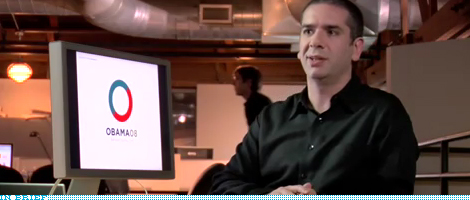
It’s important to note that Sender did the logo and initial identity standards but it was art director John Slabyk and creative director of new media Scott Thomas who extended the identity into novel and exciting executions, like the mutable logos for different sectors of the population.

Jump to Most Recent Comment
Marc’s comment is:
great watch.
One of the real joys of working in design is seeing your hard work out in public like this. It's almost surreal sometimes.
I also love watching other people's process and reasoning.
On Dec.13.2008 at 04:13 PM
Gregory’s comment is:
Thanks for sharing this. I thought the Obama campaign had some of the most impressive design I've ever seen in a political campaign. It's something immensely important but gets overlooked by most politicians. I think I would have been drawn to those buttons whether I supported his politics or not.
On Dec.13.2008 at 04:41 PM
jackson cavanaugh’s comment is:
i think i see chris marino (and my old desk) in that picture
On Dec.13.2008 at 04:59 PM
Glenn Sakamoto’s comment is:
Change we can believe in. Well done.
On Dec.14.2008 at 01:15 AM
Christian’s comment is:
How much do you reckon that logo would have cost the campaign? For such an important corporate logo, would it have been say USD $100,000?
(incidentally, i also asked this at Logo Design Love)
On Dec.14.2008 at 01:47 AM
Armin’s comment is:
Christian, this is pure speculation on my part, but I doubt this was more than $50,000. Maybe $75,000. Six-figure paychecks for identity work are reserved for large, national or multinational corporations. This logo is "important" in retrospect and its brand value is probably worth millions, but in the estimating phase that's rarely something you can charge for.
On Dec.14.2008 at 07:06 AM
Lawrence Anderson’s comment is:
I think Armin hit the nail on the head. However, after looking at the identity system created for all the different special interest groups it could have been more. But, of course you have to factor in that the logo and the identity system will only have a large exposure during the campaign process and probably only be used at all for 8-10 years at maximum. With a branding project for Xerox or HP they are paying for something that will be in international promotions for as long as it's in use.
On Dec.14.2008 at 06:13 PM
Jeff’s comment is:
I very much want a Pirates for Obama t-shirt.
On Dec.15.2008 at 01:42 AM
BWJ’s comment is:
I think you're right Jackson. Looks like he could use a haircut too.
On Dec.15.2008 at 10:06 AM
Nikki - Logo Design Guru’s comment is:
I think these are some interesting campaign ideas. How nice it is that the similarities of the "Ob" in Obama match so well with "08". It sure does lend hand to a huge list of design ideas that any artist would love the chance to play around with. These are great!
On Dec.15.2008 at 12:39 PM
Darrel’s comment is:
camera a...camera b...camera a...back to b...now show a...and b...a again...cut to b...a...b...a one more time...and let's do b...
Still, fun video.
On Dec.15.2008 at 03:59 PM
Morgan Smail’s comment is:
one of the most iconic icons of our time and definitely the best in presidential campaign history
On Dec.16.2008 at 03:27 PM
Jon Dascola’s comment is:
I'd like to see the same team rock out some logos for McCain and see how they end up.
Glad they chose the winner over the talk bubbles too.
On Dec.16.2008 at 07:51 PM
George - LogoDesign.org’s comment is:
They definitely picked the best one. Nice to see, thanks.
On Dec.17.2008 at 10:59 AM
Goffredo Puccetti’s comment is:
Great video. Great design work and highly informative background information. Top marks! Thank you UC!
On Dec.18.2008 at 12:34 PM
John House’s comment is:
Are you all kidding? The logo was practially a ripoff of McGovern's 1972 logo. Jaysus...there's absolutely no creativity left in this world.

Bertron 500’s comment is:
Absolutely in love with viewing the process. Good video. I don't think the logo was a ripoff. There is a big difference between ripoff and similarity. Anyways, why would someone ripoff a logo from a candidate who lost an election. Not a good idea.
On Jan.05.2009 at 11:17 PM
Comments in Brand New, V1.0 have been closed.


