

NOTE: This is an archived version of the first incarnation of Brand New. All posts have been closed to comments. Please visit underconsideration.com/brandnew for the latest version. If you would like to see this specific post, simply delete _v1 from the URL.
![]()
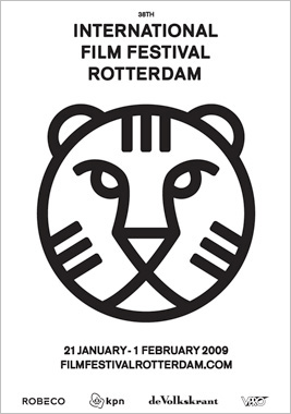
With the growing enterprises of film festivals around the world it’s becoming increasingly important for each to convey their own attitude through their branding and front-runners like The Sundance Film Festival or the Tribeca Film Festival have really strong design executions — and in the case of the big daddy of all film festivals, Cannes, the name alone does all the work, even with paltry design. The International Film Festival Rotterdam (IFFR), running since 1972 and handing prizes since 1995 is one of the top festivals but, unfortunately, you might never know that from their old logo.
Designed by one of my favorite designer/illustrators, Max Kisman, the old logo was a little too quirky in its typography and too cartoony in the depiction of the festival’s tiger mascot. The new logo and identity, designed by Rotterdam based 75b, is the complete opposite. And I really like it. Typography aside, which I think is perfectly neutral, the tiger icon is downright lovely. The uniformity of the line width and simplicity of the elements makes for a very fetching, memorable and unique identity. You can see more images of the black-and-white identity at play here.
This is an old rebrand, launched in October of 2008 — you can read the original press release here — but I thought it was very well worth it to post even if it’s just slightly old.
Thanks to Lena Kuppens for the tip.


Jump to Most Recent Comment
Adam F.’s comment is:
I’m into the new tiger image; however I can’t get behind the typeface. It seems a bit on the lazy side if you ask me.
On Apr.15.2009 at 07:28 AM
Remy’s comment is:
You should get the previous Tigers from the years before to see it evolve; really fascinating! This years kitty was a bit out of tone and also called the adidas cat ;)
On Apr.15.2009 at 07:33 AM
Josh’s comment is:
I liked the quirkiness of the previous Tiger. I can appreciate the new one too, so this is all my personal preference, but I wish they'd updated the type treatment and left the illustration.
On Apr.15.2009 at 07:37 AM
Erik at Logo Critiques’s comment is:
The tiger head is cool. All the a's and l's on the right edge are not very nice to look at. Anyway I like it better than the old logo which I found just to playful for my tastes.
On Apr.15.2009 at 08:08 AM
Jimmy Marks’s comment is:
Maybe I'm the outlier here, but I think the "new" is dull. The old one had its flaws, but this one...it has zero personality. There's nothing enticing, inviting, or interesting about it. How does a thing like this talk to a crowd, whether they're fans of this festival or passersby?
And truth be told, I don't love the way certain folks use color, but this could do with at least one color. If given the chance to design/demonstrate a logo, I start with B&W and work my way up. This just doesn't cut it, in my opinion.
On Apr.15.2009 at 08:17 AM
kristin’s comment is:
it reminds me of radiohead!
On Apr.15.2009 at 08:18 AM
Nathan McKinney’s comment is:
Is the tiger a "thing" in Rotterdam?
On Apr.15.2009 at 08:57 AM
emily’s comment is:
kristin: DITTO.
On Apr.15.2009 at 09:02 AM
emily’s comment is:
btw:

thats radiohead for all you non-believers.
On Apr.15.2009 at 09:03 AM
Skythe’s comment is:
Before:

After:

I prefer the classy Indian safari look. That was unique.
And where's the color? It's a film festival for heaven's sake. Why the black and white? Dull. What a pity.
On Apr.15.2009 at 09:10 AM
Brendan’s comment is:
The type has no contrast in stroke weight, nor does the tiger. Everything is center aligned. It seems to fly in the face of everything that's been drilled into me about dynamic compositions (not entirely. I like the varied stroke weight between the elements. It sets a nice hierarchy). It seems too sterile to me... Could those that really dig this one explain a bit more what they like about it? I'd like to understand the other point of view on this one.
On Apr.15.2009 at 09:11 AM
Ryan Adair’s comment is:
@Armin
The two "front runners" that you mentioned both have super weak and boring identities. If anything, the Tribeca Film Festival is the laziest of all.
This one, I think is very reminiscent of classic Dutch modernism (De Stijl, Mondrian, Zwart, etc...) Therefore, I think the "dull" type everyone is attacking actually works.
For that reason, and the fact that I really like the black and white starkness of the new tiger's face and how the posters stand out among a sea of color crap – I give it a thumbs up!
On Apr.15.2009 at 09:28 AM
David H’s comment is:
The new logo makes me think of the packaging used by the US government on their government food program packages (or at least, my memory of what they looked like back when I was five). A simple logo is okay, but I think the text makes it feel too sterile for my taste.
The old logo wasn't good, but it felt more "alive".
On Apr.15.2009 at 09:51 AM
Joe’s comment is:
To me, the new logo screams, "we have no actual drawing skills and are afraid of curves other than circular arcs."
The old tiger is 10 times better.
As for the typography, the old one is unnecessarily clever and the new one... well I fell asleep twice trying to get through it.
On Apr.15.2009 at 10:08 AM
peterpixel’s comment is:
I love it! But then again, I am biased since I love black and white.
On Apr.15.2009 at 10:31 AM
Mike’s comment is:
Maybe we can all appreciate it more if we knew the reason behind the tiger as the icon for a film festival.
I like the play in the type for the previous identity. The new one's just...centered...
I like that the new tiger is simple and easily recognizable, but I was hoping it could be more interesting when applied. Like in here.

Amanda B’s comment is:
Hmm... there was a lot that needed fixing in the old logo, but the new one is a little too safe. It's lacking in personality. I liked Josh's suggestion to keep the tiger and change the type!
On Apr.15.2009 at 11:28 AM
Dennis’s comment is:
don't they redesign it every year?
On Apr.15.2009 at 11:39 AM
jRod’s comment is:
the icon is definitely symmetrical bliss, but the lack of color in what I have seen so far is disappointing. I can live with the font. the thickness of the lettering goes well with the line density of the tiger itself.
and on top of all that, the roundness of the icon reminds me a lot of a film reel... i wonder if that was planned, eh?
On Apr.15.2009 at 11:56 AM
emily’s comment is:
If anything, the Tribeca Film Festival is the laziest of all.
you can't be serious. that logo is phenomenal.
looks like you need to go watch some paula scher videos.
On Apr.15.2009 at 12:17 PM
damondidit’s comment is:
I like the Tiger, but the type on the poster just feels off balance to me. Maybe it's the stair cased Ls?
On Apr.15.2009 at 12:25 PM
eCLIPSE’s comment is:
The logo is very well resolved formally, but overall the identity is rather dull.
I am not suggesting balloons or streamers, just maybe a hint of fun.
On Apr.15.2009 at 01:11 PM
Mark’s comment is:
Interesting it is an improvement. But it lacks something.
perhaps some color?
On Apr.15.2009 at 03:07 PM
Chris’s comment is:
I like the new symbol. It has its own brand of minimal character. However, the uniform line weight throughout the lockup is fatiguing to the eye. At the very least, Rotterdam should be downplayed a bit to create some kind of typographic hierarchy. In addition, all of the type could be smaller in relation to the symbol.
On Apr.15.2009 at 03:53 PM
Micah Goulart’s comment is:
Do you guys see a director's chair in the nose and mouth of the tiger? Seems intentional that subliminal message. Reminds me of the arrow in the FedEx logo.
If so, it's genius but could be a bit more obvious.
On Apr.15.2009 at 04:38 PM
Alex C.’s comment is:
The 75B guys are great. I had a wonderful opportunity to work with them at a workshop while I was at Art Center and I've been friends with them since.
You have to give it up to the Dutch for creating work that is seamless in its execution.
On Apr.15.2009 at 05:14 PM
Tony Spaeth’s comment is:
I suspect the director's chair is a reach, but I wonder: would a projectionist recognize those three three-bar stripes as a familiar feature of film canisters? An allusion like that would give this mark more depth. (Even if actual film is yesterday.)
On Apr.15.2009 at 05:31 PM
Taylor’s comment is:
@emily
I'm in agreement with the laziness of the Tribeca logo. Don't get me wrong, I definitely side with simplicity in the logo world, but Tribeca definitely reads like an art school solution to a festival celebrating innovation and excellence in film.
On Apr.15.2009 at 06:08 PM
Jem’s comment is:
I like that it is under-designed.
Color is so over rated!
On Apr.15.2009 at 07:56 PM
dg3’s comment is:
I dig it.
On Apr.15.2009 at 09:22 PM
Sally Faust’s comment is:
@eCLIPSE
I find the conscious level of control both in the logo and logotype quite memorable and not dull at all. It's the antithesis of all that is poofed these days. Appropriately so...and thank god.
On Apr.15.2009 at 09:56 PM
Glenn Sakamoto’s comment is:
Nice and simple. I like.
On Apr.15.2009 at 11:30 PM
John does Amsterdam’s comment is:
Sadly, I must disagree with most...
I prefer the original logo to the new; why?...
the old logo had spunk and quirkiness, something Dutch graphic design has long been known for. also, it had colour - which I feel is another reason Dutch graphic design tends/tended to stand out from the crowd.
While the old tiger graphic wasn't the greatest, it had something that helped differentiate it from other logos - and the typography was superb.
I propose: the old typography, with the new tiger logo. perfection.
On Apr.16.2009 at 05:29 AM
Anonymous’s comment is:
I'm still stuck on the tiger thing — what does it have to do with film or Rotterdam? I'm sure there's a rationale, I'd just like to know.
On Apr.16.2009 at 01:04 PM
Mongoose’s comment is:
The old logo I agree had a bit of a busy feel to it. I love the 'film festival' portion of it.. that M, wow... but it feels overly bound by the 'International' and 'Rotterdam', there.
The new typography is a forceful attention-grabber to be sure. It's very stark and crisp, and I quite enjoy the overall effect; it has feel of both government and cinema. It might be just a little too harsh for some, understandingly.
I'm less big on the new tiger, where the starkness seems overdone, but the line-weight so consistent throughout works well. It's tough to say 'It could use some color', because bad color hear could wreck the simplicity.. but I do think it could use some color.
Oddly, the smaller I see this logo the more I like it. It reduces incredibly well, but in larger size, the tiger and font look too chunky and stark.
I give this one an A- . Stark, but appropriate.
On Apr.16.2009 at 03:00 PM
Vins’s comment is:
The new tiger logo.. it's confronting, it's really making contact wih me.
The typography is based on subtitles. Slightly rounded and centered.
I really like it.
As for the tiger, it is simply the counterpart of the MGM lion. Although some say it is used because of the similarity in extinction of the tiger and true cinema, the first (kinda dull) reason is in fact true.
You can see the evolution of the advertising from IFFR here. Last year has been a set up for this years rebranding.
On Apr.16.2009 at 04:55 PM
Andy’s comment is:
I'd rather something be under-designed than over-designed, but I'd prefer it to just be designed, and designed well. This might be a little under-designed, but I do very much like it. I think a small amount of color and a tiny bit of typographic hierarchy might improve it.
On Apr.17.2009 at 09:44 AM
Adam Duquette’s comment is:
The logo really seems to stand out in context. I like it much better after seeing it in action.
At least they did a transitional step the year before to soften the blow of the new tiger.
On Apr.17.2009 at 12:34 PM
Michiel’s comment is:
Looks like the Tiger is blind in the new logo... Not good for a filmfestival.
On Jun.04.2009 at 10:52 AM
name’s comment is:
What is it,
On Jul.30.2009 at 12:34 AM
name’s comment is:
I like your work!,
On Jul.30.2009 at 03:55 AM
Comments in Brand New, V1.0 have been closed.


