

NOTE: This is an archived version of the first incarnation of Brand New. All posts have been closed to comments. Please visit underconsideration.com/brandnew for the latest version. If you would like to see this specific post, simply delete _v1 from the URL.
![]()
Guest Editorial by Ryan Hembree
“Go ahead. Stare.” That is the challenge posed by the new tagline for Armor All, a product used by millions of car enthusiasts to clean, shine, and protect their dashboards, steering wheels, and tires. And by spending some time staring at this newly revised brand we can see definite improvement in its execution, as well as some potential pitfalls.
If the intent of the new look is to project the strength of the Armor All brand, then this quality has definitely been achieved through the completely redrawn Viking character. Upright and stoic in his pose (complete with a new, shiny and polished shield), he has certainly grown up over the past thirty years. Originally the brand featured a more cartoon-looking Viking, drawn by “Big Deal”, shielding himself from the force of a lightning bolt — besides looking like clip art, the original character looked surprisingly weak for a “protector”; he is on his knees from the force of the blow, as if cowering and unable to fight back.
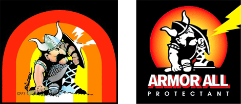
Original drawing by “Big Deal”; and eventual logofication
The most recent version of the brand was much more masculine and aggressive-looking, with bulging muscles and weapon at the ready. Perhaps some felt that this rendition of the character was too aggressive, or his portrayal was insensitive to the Vikings — because as the politically correct might say, “not ALL Vikings were the village-burning, women-raping kind.” Whatever the reason, the new execution of the Armor All Viking has been sanitized of anything that might be considered a dangerous weapon; the spike on the shield, the spiked arm band, the axe — even the horns on his helmet have been turned inward so as not to hurt anyone.
Overall, the visual metaphor of a warrior using a shield is highly effective at conveying the protective nature of the Armor All product. The message that might get lost, however, and subsequently be the rationale for the re-brand, is that the product also restores automobiles to their original “shine.” While the new brand embodies the essence of both cleanliness and shine, perhaps there is too much emphasis on “clean”-and the result is that it might be mistaken for a different product altogether. It bares a striking resemblance to both Tide Laundry Detergent and packaging for Bounce fabric softener. The outer glow and rays of sunshine emanating from behind the Viking make him look more like Mr. Clean instead of the staunch defender of your car’s interior.
Ryan Hembree is principal/creative director of Indicia Design, a full service graphic design firm in Kansas City, Missouri that specializes in visual identity design. He is author of The Complete Graphic Designer, and “Re:Marks: Thoughts on Design”, a bi-monthly e-newsletter discussing design and visual identity trends.
Thanks to Von Glitschka for the tip.


Jump to Most Recent Comment
Joe’s comment is:
The viking's new shield appears to be a refurbished
hubcap from a 25 year old Volkswagen Fox.

Mark’s comment is:
I've seen this logo.
Even though I'll miss the circle shape (oddly reminded me of Caldor's 70's rainbow logo) this redesign has improved the logo for the better.
It's defender looks more foreboding and serious.
It no longer looks cartoony.
You can actually see the front of the shield, therefore giving a better sense of protection.
What I dislike though is how the yellow has sloppily found itself onto the viking.
Surly they could of used the yellow better
On Jul.02.2007 at 07:10 PM
rynot’s comment is:
now more NASCAR-friendly.
On Jul.02.2007 at 08:03 PM
humanot’s comment is:
If they had decided to keep black as the primary color throughout their brand scheme, and use that vivid yellow and orange as accents ... this would've been nothing but an upgrade.
Unfortunately they glossed up the packaging for the whole line .. making it actually less aggressive and even more about the cleanliness mentioned above. Good mark, and upgrade overall though.
On Jul.02.2007 at 08:25 PM
Fernando Lins’s comment is:
I like it, it's a lot better. Specially the type.
On Jul.02.2007 at 09:21 PM
Jeff Fisher LogoMotives’s comment is:
It's so pretty...I mean manly...and shiny! Actually, a "new and improved" identity.
On Jul.02.2007 at 09:43 PM
Prescott Perez-Fox’s comment is:
Much improved! Makes everything shiny.
On Jul.02.2007 at 11:08 PM
L.Vazquez’s comment is:
It's strong. Confident, actually. I think it works overall.
L.
On Jul.02.2007 at 11:37 PM
Corey Buckner’s comment is:
LOL Joe, I used to drive a '88 VW Fox. A great car! As for the logo, I really appreciate the upgrade to the logo. It appears like it would do far better on various applications than the previous one. It also looks like something I can take more seriously; although the viking looks to be a cousin to Mr. Clean.
On Jul.03.2007 at 01:12 AM
Kevin M. Scarbrough’s comment is:
I'm really digging the well thought out details in this logo. The viking has a clear sense of character and purpose. I'd be interested to see what he looked like without yellow shading (might be too flat).
That mustache means business.
On Jul.03.2007 at 01:29 AM
Von Glitschka’s comment is:
This was the first logo that made me stop and think about logos when I was a kid. I remember my Dad first using it. It was probably the cartoon aspect of it that originally caught my eye, but I made the connection between the visual metaphor and the product it was suppose to represent.
The Norsemen character has slowly evolved over time into it's most recent incarnation which I noticed a few weeks ago.
Overall I think it's a huge improvement and the craftsmanship of the art itself is impeccable for the most part. That said there are attributes about this new character that just kind of bug me.
The character lacks any aggression. A Viking on Demerol™ if you will. I think a little more of a determined look and body posture would have been nice. You know because he's a Viking. They already took away his hammer so he can't defend himself at least make him stand his ground with some bravado.
The horns on the helmet are just girlie. Those could have been executed a lot better. Looks like one of those cheap halloween costume hats.
And I'd agree with Mark's comments about the yellow being applied to the Viking in a sloppy manner. They obviously fine tuned this art but the color wasn't thought out as well in terms of how it hits with the black and white on the character.
Yeah, I know I am being picky but it still is a vast improvement from the previous logo.
On Jul.03.2007 at 03:32 AM
Rich Lafferty’s comment is:
perhaps there is too much emphasis on “clean”
Armor All is branding an entire line of products, now, though -- not just the vinyl protector. A lot of those products are straight cleaning products, not protecants, so I think the Mr Clean suggestion works (and might well have been more intentional than we think).
On Jul.03.2007 at 07:47 AM
stock_illustration’s comment is:
Such was the power of the original image, that I will admit having created a hook rug in art class with the little guy on it...still have it hanging on my wall. Von, your reactions to the logo as a kid mirrored mine...I loved that logo. The new one is clean, well presented, modern and soulless. I sorely miss the character of the original.
On Jul.03.2007 at 10:11 AM
Shane Guymon’s comment is:
There was talk of the logo not describing or symbolizing ALL aspects of the product, and even talk of it perhaps getting mis-understood...
Are you seriouse, who in the Untied States does not already know what Armor All is. They are pretty well branded and already have a solid place in their market.
I think the re-design, or re-freshed design is solid, and well done.
On Jul.03.2007 at 11:28 AM
C-LO’s comment is:
Nice revision of the logo. Although I do like the cartoony guy of old. New guy's all business, and I think that's what people like nowadays. ALthough I do get a little haze feel with the new letters (white outlined in yellow?). With the old one the drop color behind it and the black giving it a nice seperation; it is much more pronounce and visable and that makes it easier to read to me, but I can still read the new one nicely. The trim and the box holding the letters sells me on the new logo.
On Jul.03.2007 at 11:40 AM
minxlj’s comment is:
it's a much nicer implementation of this brand - tougher, cleaner text and shape, and better colouring. The previous drop shadow on the text was just dating it.
On Jul.03.2007 at 11:58 AM
Tom’s comment is:
This is so much better. The type is current and the unification of all the elements of an already well known brand should serve them well! As mentioned the colors within the illustration complicate the execution, especially when applied to the website and packaging with another sunburst behind the logo.
On Jul.03.2007 at 12:44 PM
Andrew’s comment is:
The "Go Ahead. Stare" tag line is also a step up from their original tag line... "Makes Your World Less Rotten" as indicated in their first commercial:
http://www.armorall.com/swf/media/first_commercial.swf
On Jul.03.2007 at 02:27 PM
John’s comment is:
That's an excellent secondary mark for the Minnesota Vikings.
On Jul.03.2007 at 05:25 PM
Andrew Too’s comment is:
This logo can be nit-picked apart if you really want to get technical as we all have occasion to do but when you compare old vs. new, this redesign is a home run.
I dig it.
At this point the designer could take all these criticisms and make it flawless.
But then we'd have nuthin' to talk about.
This is a textbook-worthy redesign.
On Jul.03.2007 at 07:30 PM
Pedro’s comment is:
from Lord of the rings Gimli to Aragorn
good evolutionary improvement

Miranda’s comment is:
I generally like the new logo and the logic behind it is all pretty sound. The type gets me though - the additional levels of detail on the type seem out of sync with the relative simplicity of the other elements.
That being said - the viking himself is a big improvement. It does look like some kind of football logo though, the more I look at it... Maybe all the mustachio-ed corporate mascots should form some kind of league?
A side note: I am not their key demographic (as an urban 30 year old woman) but my car is new, the interior is dusty and I'm well aware of Armor All. But I don't buy it - I just keep driving with all the dust until my next service appointment, and the service centre cleans it for me. I don't think they can do much to convert me to an Armor All buyer. I also never wash the car...
On Jul.04.2007 at 05:31 PM
exigent’s comment is:
Vastly improved. I also agree with many of the comments. The helmet is girly... he is not determined looking... and the colors applied ARE done so in a strange manner.
All this aside, the new mark is so much better. This is one of the better illustrative marks I have seen recreated in some time.
On Jul.05.2007 at 02:39 PM
David E.’s comment is:
The first logo was the best. I dont agree that it looked like clip art...it had personality and confidence. It didn't need to be too serious. With the second logo, they took all the personality away. Even from a pure design standpoint its much more amaturish.
Having done that, there was nowhere to go but up – and the new logo is obviously a very professional execution. You're looking up at the Viking now, which makes him appear much more heroic. The shield is emphasized by showing the front of it with glinting light. This is a much better connection to the product. And there's less fussy detail in the rendering – it's bolder and more graphic.
Still, I like the original the best. Dave Deal ("Big Deal") used to draw comic strips in CarToons magazine, which I loved when I was a kid.
On Jul.09.2007 at 02:33 PM
Todd’s comment is:
Much needed update for today's market, Great job!
On Jul.10.2007 at 01:39 PM
felix’s comment is:
its... eggs sellent
— Smithers
On Jul.10.2007 at 08:44 PM
Andy Lewis’s comment is:
Anyone else notice his transformation from rough european Viking, into trim Captain America...
...you were all sitting there thinking:
*i know ive seen that sheild somewhere before.*
Borrowing a patriotic hero's element of 'protecting-a-nation' can now also work for your car!
:D
.andy.
Rob O.’s comment is:
Not saying it's a bad thing - and in fact, it probably works well to their favor - but the new logo immediately smacked me as being very similar in style to that of many of the sports teams now.
Car detailing is much bigger business now than when this product first made the scene, so it makes some sense to shift away from the cartoony logo to a more serious version. They're selling to (and in) a different market now.
On Jul.15.2007 at 07:43 AM
Rohit Mordani’s comment is:
Much cleaner - easy to reproduce at a smaller print size - I like it ! Now it looks more like a logo and less like a clipart !
On Jul.17.2007 at 04:45 AM
Copernicus’s comment is:
the first logo is completely inaccurate. Vikings a paragon of manliness, harness lighting and use it to complete their bidding. making a logo with a viking cowering is paradoxical in every sense and therefore illogical.
Thanks for the time.
On Nov.27.2007 at 09:15 PM
El Mariachi’s comment is:
Although a standing viking is a lot better than a cowering one, they went a bit too far with the stylized viking and tilted/italicized text.
My impression? It looks too much like an arena football logo.
On Mar.17.2008 at 01:40 PM
Diane T’s comment is:
Of course, I like the old Viking by Dave Deal, the best. It took a small company with plain packaging to a new level back in 1971...and made ARMOR ALL a household name.
I do not see it so much anymore...so I guess the new packaging is not as effective as the old one.
Don E. had a good point..about the angle...looking DOWN at the Viking...or hving to look UP to the Viking... The old version was more fun and humorous..the new one is very serious...but as I say...not so visible on the shelves anymore.
Marketing is the main point here, right???
On Nov.11.2008 at 04:38 PM
Dave’s comment is:
The viking has a name: Arnie. Years back his wife, Annie, adorned the Armor All Cleaner while his brother, Arthur could be found on a short lived product. Having spent 10 years with Armor All I was sad to learn of the logo transformation.
On Mar.24.2009 at 03:30 AM
Comments in Brand New, V1.0 have been closed.


