NOTE: This is an archived version of the first incarnation of Brand New. All posts have been closed to comments. Please visit underconsideration.com/brandnew for the latest version. If you would like to see this specific post, simply delete _v1 from the URL.
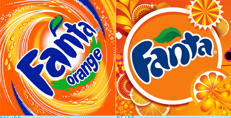
Quick Note: The opening image above is not exactly a before/after of logos, more of a visual language before/after.
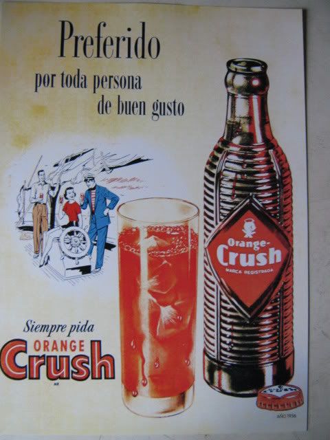
I have always had a soft spot for orange sodas, there is something about the combination of magic syrup, orange and bubbles that is just fun. In Mexico the undisputed taste champion (at least in my personal tests) was Orange Crush and I guess the funky glass bottle it came in had something to do with the experience. A close second was Fanta. So, yes, that was an odd segue to bring us to the subject at hand, but I really wanted to link to the Orange Crush bottle. With more than 70 flavors (including mind-benders like Banana Fermented Milk, Mellon Vanilla and Mint Raspberry) in 180 markets around the world, Fanta, from the Coca-Cola family of products, will be implementing a new identity designed by San Francisco-based Office.
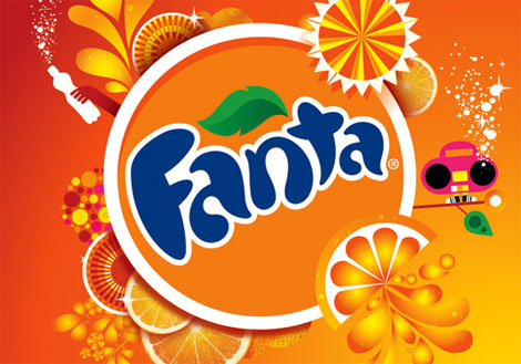
The official description of Fanta, from Coca-Cola, will help put in context the work:
Available in Europe since the 1940s, Fanta was introduced in the United States in 1960. Consumers around the world, particularly teens, fondly associate Fanta with happiness and special times with friends and family. This positive imagery is driven by the brand’s fun, playful personality, which goes hand in hand with its bright color, bold fruit taste and tingly carbonation.
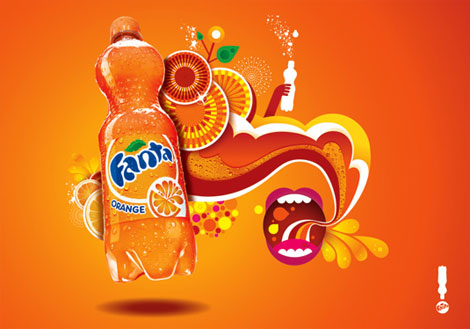
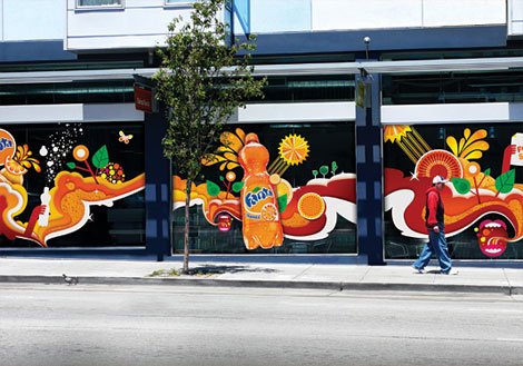
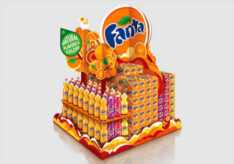
New identity elements by Office.
As explained on their web site (Work > Fanta) Office developed a flexible range of branding elements — in the form of a visual vocabulary of playful illustrations, shapes and colors — that can then be put together in a variety of different ways according to each locale’s message, audience and the flavors available. As well, an evolution of the logo has been introduced.

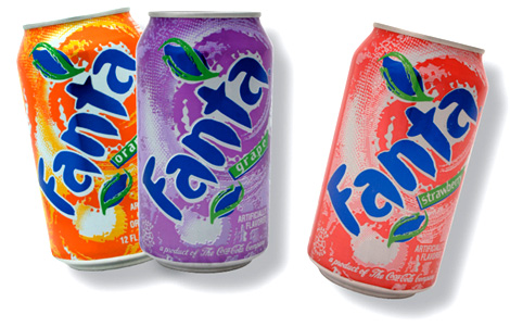
Current bottle and can design.
The old and current look of Fanta fits right in the soda market. It’s colorful, bold, and busy, relying heavily on swirls and eye-of-the-storm backgrounds to capture the attention. In contrast, the new identity is more cohesive, more evident about what it’s selling (oranges!) and, most importantly, it’s more varied, diverse and versatile. And the new cans, which may or may not be the final product, look pretty damn fantastic.
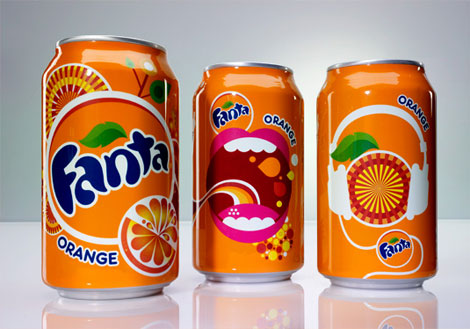
Can designs by Office.
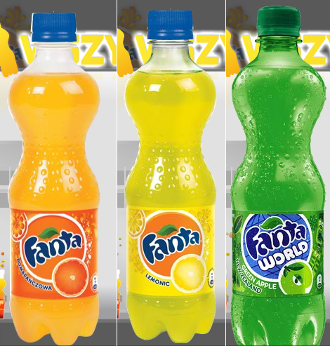
Bottle designs taken from Poland’s Fanta web site.

Not quite sure where this is from, but it does show what happens when good elements are paired with bad elements.
The new identity hasn’t been rolled out in the U.S. yet, but it has started to appear in Europe and Russia. Along with the identity created by Office, there is a new range of characters that inhabit the Fanta world, which I believe were created by animation powerhouse PsyOp, which combined, create a fresh, hip new identity.
I really, really like the work created by Office, it’s exuberant and well crafted, and it manages to be both elegant and youthful, and it stands apart from other fruit drinks. More encouraging is that the Fantanas will likely go away.
Thanks to my wife for the tip.

Jump to Most Recent Comment
Harv’s comment is:
I like it; the 'trippiness' is still there, but it's more fluid and much cleaner imo. As far as packaging; love the cans, hate the wreird little bottles.
As far as posters/other graphic treatments - you can definitely tell now that this is a coke product - from a mile away.

reyarts.com’s comment is:
At last, after a lot of years of horrible fantalogos, something good has come. I like it. Very freshy.
^_^
On Aug.21.2008 at 10:03 AM
Stereo Radiation’s comment is:
Not bad over all, but...What's with the mouth?


Lorraine’s comment is:
Yess! It's great to see a long-time favorite get a face lift. Now if only the orange-flavor tasted as good in the States as it does in its native Germany...
On Aug.21.2008 at 10:28 AM
Luis R’s comment is:

Dluxe’s comment is:
Love your site... always interesting!
But, you forgot to link the best Fanta ads ever.
On Aug.21.2008 at 10:47 AM
felix sockwell’s comment is:
great stuff.
love the mouth.... everything about is great.
congrats to Shulte & crew.
On Aug.21.2008 at 10:56 AM
sukisouk’s comment is:
Very nice Dluxe! "WHY CANT WE HAVE PEACH FLAV!!!! the jap. have everything!!...those bastards"
True, true.
The new design really is nice too, especially the animated ad... damn, I could start drinking that sugary sh*t again :/ ^^

Daniel Campos’s comment is:
Great, great!
Here in Brzil, Fanta use this visual!

lodenmuse’s comment is:
Very beautiful.
Fanta Orange is the New Black.
On Aug.21.2008 at 11:12 AM
Sal’s comment is:
It's rare to see a solid background field in this level of consumer packaging. Bold, but it totally sets them up for pile-it-on marketing elements. Just like the "want it win it" thing. I'm not feelin' the lettering at all. Horribly proportioned. I know it's meant to be bloated, but it could've at least maintained basic construction.
On Aug.21.2008 at 11:14 AM
Jw’s comment is:
Very nice. Now I'm thirsty.
Dluxe, those Japanese ads may be the best thing ever.
On Aug.21.2008 at 11:17 AM
Stereo Radiation’s comment is:
Among Mexican fruit-flavored soft drinks, I have to say: tastewise, Jarritos FTW.
But, that brand is in desperate need of an update.


jRod’s comment is:
well, i do like the wordmark. its great. well thought out and not rushed at all. but the rest of the junque in the background... i am not a fan. i can clearly see the fun from the 60's/70's reference, but there are WAY too many gradients going on back there. the mouth side of the can is wonderful because of the use of solid colors. go with that! don't kill the great wordmark with over-zealous eye candy.
On Aug.21.2008 at 11:42 AM
rob’s comment is:
Great more silhouetted vectors. Mech. The type is stomachable as a stand alone, but once its overwhelmed with other elements on the can it looks blobby. Feels forced, another case of style dictating design.
On Aug.21.2008 at 11:43 AM
bryan byczek’s comment is:
not to mention...

but seriously, its a great re-design, i love the play between photography (orange slices) and vector created art. its bubbly and bright and youthful - great job.
On Aug.21.2008 at 12:00 PM
Brownspank’s comment is:
Here in the Philippines, we have Royal Tru, which bears some similarities in branding (leaf on top of the wordmark, whirlpool background).
We also used to have Fanta back in the 90's, but it didn't quite catch on, as Royal Tru-Orange (as it was available only in one flavor at the time) already filled the need for a fruit-flavored carbonated drink.
As for Fanta itself, while I like the type treatment and restyled leaf of 'after', I would prefer if the kept and updated the whirling movement in 'before'.
On Aug.21.2008 at 12:15 PM
Diane’s comment is:
I thought that mouth looked familiar.

Hmm…
On Aug.21.2008 at 12:17 PM
David’s comment is:
Great redesign! Not to keen on the new shape of the bottle though.
On Aug.21.2008 at 12:20 PM
max’s comment is:
I agree with Luis R - no comparison.
On Aug.21.2008 at 12:28 PM
ScottS’s comment is:
I love the boldness of this redesign/repackaging effort. It screams "fun" and "happiness". It seems like working on this would have been a fun time as well. Kudos to the whole design team.
Now, I'm getting thirsty...
On Aug.21.2008 at 12:35 PM
Mr Posen’s comment is:
It's fun, I like it.

Axel’s comment is:
An improvement no doubt about it.
Tastewise for orange soda lovers, try to get a taste of Sumol. A Portuguese brand, not sure if available elsewhere.
On Aug.21.2008 at 01:16 PM
Glenn Sakamoto’s comment is:
Fanta-bulous!
On Aug.21.2008 at 01:27 PM
damon’s comment is:
I like it.
but I am starting to feel like this vector art style is getting a bit played out.
On Aug.21.2008 at 01:29 PM
eduardo’s comment is:
this half-surf-half-vector-bold-fat kind of design is a litle... annoying! everybody is using this graphic language everywhere!
and the colors now are cleaner, just like coke did to look more vintage... maybe we are really getting back to the 60/70s...

Ryan C.’s comment is:
I've always felt like the Fanta folks came up short in establishing a sense that their products were anything but a Sunkist or Minute Maid understudy, or perhaps a limited experience mentor for store brands. They were somewhere in soda no-man's-land.
Anyone else with me?
The design looks great!
On Aug.21.2008 at 02:56 PM
dg3’s comment is:
Nicely done!
On Aug.21.2008 at 04:35 PM
David Hartman’s comment is:
The work is lovely without a doubt, but also stands tall on the shoulders of other agencies who have done similar great work for Coke + their brands.
On Aug.21.2008 at 04:55 PM
Matheus’s comment is:
at least a good evolution in a sea of crappy redesigns
On Aug.21.2008 at 05:00 PM
Dico’s comment is:
Great work! I like it!
On Aug.21.2008 at 07:20 PM
adam’s comment is:
fanta is for nazis! haha, j/k, but seriously.
(the only way coca-cola was able to continue making money in Germany during WWII because they couldn't export their own brnad name)
On Aug.21.2008 at 08:04 PM
Dylan’s comment is:
Those curvy plastic bottles remind me of Orangina for some reason.
The designs are cluttered and overwrought, but fitting for the sugar-bomb this stuff is.
On Aug.21.2008 at 09:16 PM
Eric Janssen Strohl’s comment is:
Really fun & well executed.
Fanta is definitely a brand that can push the fruity/funky essence of their brand.
Its refreshingly clean for something so bright and energetic.
Me likes.
On Aug.21.2008 at 09:27 PM
dg3’s comment is:
It would be hard NOT to improve the older version. THAT was an awful logo.
On Aug.21.2008 at 10:09 PM
Mingshi’s comment is:
The yellow-orange gradient on the cut orange and juice is totally cheesy. Somebody please ban badly adjusted gradients...!!
On Aug.22.2008 at 06:23 AM
Plamen’s comment is:
Fanta has been the brand where Coca-Cola can experiment and try to be always hip and contemporary. Another excellent redesign this one. I’ve done a review on the Fanta logo history on my blog a couple of weeks ago. With the new logo introduction they’ve been pretty inconsistent in Europe as well, though... appearing on some new products like the Fanta World series w/o any official announcement and with ads showing both the old and new logo.
Armin, I’d love to see reviews of the recent Reebok and Asics rebrandings.
On Aug.22.2008 at 06:51 AM
Audrée Lapierre’s comment is:
Very refreshing and young.
On Aug.22.2008 at 08:20 AM
koyo’s comment is:
Now is in vogue.
On Aug.22.2008 at 10:50 AM
rich’s comment is:
well done office, nice stuff, great vector work with a sense of humour, simple...
down the hatch! x
On Aug.22.2008 at 12:06 PM
Marcello’s comment is:
Banana Fermented Milk?!?!?!
On Aug.22.2008 at 01:35 PM
g’s comment is:
The fanta characters have been in use here in Mexico for a while, I'd say almost a year.
And thank God we never saw those Fantanas!
yuck!

sam’s comment is:
Thx for sharing the Jap Ad Dluxe.
They are too Funny

David Sanchez’s comment is:
Nice refresh.
On Aug.22.2008 at 04:17 PM
BWJ’s comment is:
Love the new cans. Super fresh while maintaining the fun Fanta personality.
Great work Office.
On Aug.22.2008 at 05:24 PM
Deg’s comment is:
Nice logos. That commercial is so much better than the Fantanas!
On Aug.23.2008 at 11:00 AM
Dale’s comment is:
I predict this new logo's going to date pretty fast. Like in...3 months.
On Aug.24.2008 at 11:39 PM
*cg’s comment is:
Really nice and updated.
On Aug.25.2008 at 12:57 PM
Mr Double-U’s comment is:
Love the logo and the ads!!
The play.com livery is from the UK, it's an sms promo they run every summer.
On Aug.25.2008 at 01:41 PM
Design’s comment is:
Although, a nice(r) update, it's easy to jump from where they were, to something new and feel refreshed.
It's a poor execution of everything-trend.
Shallow—it will feel stale in a short while.
On Aug.25.2008 at 03:01 PM
Sean Farrell’s comment is:
I love the new logo, looks great
On Aug.25.2008 at 08:01 PM
orangetiki’s comment is:
I am really liking the new letters. That wanna be 3D look was never that eye catching. Also I am really liking the new bottle forms. Although some of the ads I am seeing look a little "istockphoto.com" to me. Whereas it is a lot of thick lines and out of the box illustrator effects, but no real meat and potatoes.
On Aug.26.2008 at 07:19 AM
Josh’s comment is:
"Once it hits your lips, it's so good" - Will Farrell
I agree with Lorraine above. Orange Fanta in Germany and Europe is way better than the American Sunkist version.
Looks as though were slowly going backwards in time as far a graphic inspiration. Next I wanna see car ads where the happy family is buying a new Buick
On Aug.26.2008 at 06:39 PM
Anonymous’s comment is:
Logo sucked before. Sucks now. Same suck...but different.
On Aug.28.2008 at 01:23 AM
Mark’s comment is:
refreshingly different.
On Aug.28.2008 at 01:22 PM
Corey Buckner’s comment is:
Still busier than a Japanese train station; but a definate improvement! I like the additions of the orange slices most coupled with the removal of that dang hurricane behind the old logo.
Bravo for this one!
On Aug.29.2008 at 01:39 AM
Char’s comment is:
I wanted to say something, but I rather go get a Fanta... brb
On Aug.29.2008 at 02:12 PM
Jimi’s comment is:
Jarritos ftw. I'll do their identity for a lifetime supply.
On Aug.29.2008 at 07:49 PM
mongoose’s comment is:
Still very recognizably Fanta.. blue letters, bright and 'juicy' color and art, and the leafy motif.
I think the addition of the actual fruit-image, not just the hurricane color, to the front of the bottle should further make it easy to figure out. I'm not entirely sold on the bulbous lettering, but it's not a step down, just a step different.
B+ for that circle-on-circle crispness.
On Sep.01.2008 at 09:39 PM
CBETA’s comment is:
This made me think me think one thing
FIZZY BUBBELEH!
On Sep.03.2008 at 12:06 PM
HerrK’s comment is:
The design of the new Fanta bootle looks like the "Fizzy Bobbele" soda bottle in the movie "You Don't Mess with the Zohan"... ;)
On Sep.11.2008 at 09:00 AM
Jonathon’s comment is:
About Jarritos> An agency that I was with a couple years ago was actually in preliminary talks to do a redesign for them, I think all the "brand" people there, if that is what you can call them, were pushing for it, but as usual all the old farts put an end to that discussion.
On Sep.30.2008 at 12:57 PM
Sarah’s comment is:
The packaging images shown here for the current design are not correct. The current identity is demonstrated in the logo 'before'.
The 'current' packaging you're showing is about 5/6 years old.

Minyminge’s comment is:
I love the "new" design by Office but I tend to agree with some of you folks as it is certainly quite refreshing but I have my reservations as to it's longevity.
As packaging designers we are always looking for the freshest and newest design that will capture the already jaded consumers. Sometimes we forget that we are here to come up with intelligent designs that will have a lasting impression on consumers ie. the Coca-cola logo.
Thats my 5 cents.
On Oct.06.2008 at 12:26 PM
Ramon Marquez’s comment is:
Here in Mexico this logo is just arriving, at this time it just appeared in cans and plastic caps... this logo looks good!
On Oct.16.2008 at 01:44 AM
Anonymous’s comment is:
blah
On Oct.31.2008 at 10:34 AM
Schumi’s comment is:
The original Crush with the regular kick-ass "guiro" bottle is sold in Mexico. The formula is the same old-school orange flavor, they even have a great crush light that has almost no after taste, as other light drinks have.
anyone in Mexico should definitely try it
On Nov.26.2008 at 12:46 PM
Florian Z.’s comment is:
You have to admit that whatever the rebranding of Fanta would have gotten out of the box it would've been something better. CocaCola's gone far from just being a multinational company and has become a multicultural one that maintained its brand recognition features to setting itself in pop-art culture. However they'll do it from now, it's going to be a trendsetter in branding.
On Dec.01.2008 at 02:26 AM
Jordan’s comment is:
Excellent re-design. Very nice, specially the cans.
On Jan.06.2009 at 03:45 PM
callum tyler’s comment is:
i think it's the bestest drink they have made but y can't they just do the faverit one coz the strabery is eww and the rasbery and the blue
On Jun.08.2009 at 06:50 AM
Michelle Lynn’s comment is:
It reminds me a little of an anime design but I like the boldness of it!
On Jun.08.2009 at 11:50 AM
Comments in Brand New, V1.0 have been closed.


