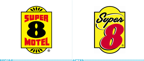

If staying at an Econolodge is too highbrow for you, perhaps one of the 2,000-plus locations of Super 8 Worldwide (formerly just Super 8 Motel) would satisfy. Because I believe everything I read in Wikipedia, I now know this is “the world’s largest budget hotel chain,” which is a testament to the ubiquity of these motels as you drive through any and all states in the U.S., and how well it has blended into the background since its inception in 1973. The new logo was introduced back in April of this year but has slowly begun to be displayed in about twenty of the properties, including a recent unveiling at the first Super 8 to grace the landscape of Aberdeen, South Dakota. As with any hotel rebranding, this one is meant to signal a change in the amenities and services offered by the chain — there is a press release to tell you all about it.
Continue reading this entry
I was first tipped to this rebranding back in March of this year — thanks Clifton Alexander— but I didn’t make much of it. Having never stayed in an Econo Lodge hotel and, from looking at a few photos, being convinced that I would not want to do so in the future for fear of being maimed by a freak with a mask coming out of the hallway as I put a dollar bill in a vending machine, I decided to not follow up on it. But as promised in the press release, “this summer, travelers can anticipate to begin to see the updated logo on exterior signage on new Econo Lodge hotels,” more people have sent in e-mails about it, so I’m finally putting it up. Another reason of why I may not have been eager to post it is because there is probably not much to say: Mediocre-but-satisfactory hotel chain has a mediocre-but-quirky wordmark replaced for a mediocre-period shiny swoosh that shimmers — oh, and it has a clever TV ad involving a princess, a frog and a logo. I have to admit though, the swooshy “e” could have gone somewhere in the right hands, but definitely can not say the same for the condensed typeface that looks like the bastard child of Rotis Sans and Optima.

If the image above is confusing, it’s simply reflective of a confusing situation, for which I have no explanation — and, oddly enough, I don’t mean that sarcastically, I literally don’t know what’s going on as there is no information online and the one lead I had did not reply to my queries. The new hotels.com logo on the upper-left corner of the After section was first leaked at trademork.com back in early February when the Expedia, Inc.-owned reservation service filed a trademark registry with the United States Patent and Trademark Office; shortly after, it appeared in a TV commercial; and only this past week the logo was reflected in the hotels.com web site, with no fanfare whatsoever — the logo was designed by TBWA \ Chiat \ Day (they won the account back in November of last year) in collaboration with outside design firms (names withheld so as not to upset anyone). This logo looks to be in representation of the U.S. market, while the other, chipper, scriptier logo has been designed for the Europe, Middle East and Africa (EMEA) markets and can be seen at the EMEA version of hotels.com. So, there you have it, two new logos replacing one logo — which is not all that strange, you’ll remember Sunglass Hut had a European logo that later teletransported to this side of the swamp. However, there is no word on what happened to Benny the Bellman, the perennially content mascot of hotels.com, that has carried its customers bags since his introduction in the late 90s — when it was renamed from its original Hotel Reservations Network. It’s hard to assess his disappearance, as I would think he was pretty recognizable, but maybe he represented some sort of social class distinction that became politically incorrect, I don’t know. The new logos are okay: The scripty logo is pretty and happy, maybe too playful; and the elevator logo is an interesting idea, but I don’t think it’s well executed or that it makes for an interesting visual. I won’t miss Benny, but I will always wonder about his fate… maybe he now restfully sleeps with the fishes.

[Update 10.30.07: Additional images of the new identity added at the end]
Let me start by saying this: I love Holiday Inns. As a kid, traveling to the U.S. from Mexico, it was with happy regularity that we stayed at one, whether we were in Texas, Florida or New York. Like his car purchases, my dad was never much for additional and extroverted fanciness (and cost) when it came to booking a hotel. Perhaps it’s my association with those early years of travel and discovery but there is something undeniably comforting about Holiday Inns. They are, by far, not the best hotels but, for the most part, you can count on good service, a clean bed, cable TV, air conditioning and — despite an attempted break-in into a room housing my mom, grandmother and aunt many decades ago in a San Antonio Holiday Inn that, later, made the news — a sense of security and familiarity that welcomes you as you are introduced to a new place, far from home. I may have inherited a penchant for mid-range priced hotels from my dad, as spending more than $300 for a room in which you are only going to sleep in seems preposterous. I am not cheap, by any means, I like me some fancy things as much as any other designer but, when it comes to hotels, Holiday Inn is, for better or worse, the expectation (of price, service, and amenities) that I measure every hotel against. And in my increasing affection for identity design created anytime before 1999, it is painfully nostalgic to see Holiday Inn’s fabulously odd script logo — just how awesome are those reverse italics? — check out.
Continue reading this entry
La Quinta, a Texas-based hotel chain, recently updated their logo as they try to expand their customer base. In an effort to become a major hotel chain in North America, “La Quinta plans to nearly double its network of 586 hotels by 2011, focusing on Canada, the Northeast, Florida, California, the Northwest, and the mid-Atlantic. Later this year, it will open its first property in Mexico.”
Continue reading this entry
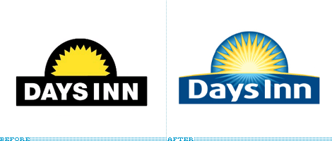
In general I have no shortage of connections to make to any of the given brands discussed here. With Days Inn, I have nothing. And it’s not because I scoff at budget hotels; I have stayed at my share of low-priced hotels and I may have even stayed at a Days Inn for all I know, but I would never know, since their branding seems so low-key… and it has been so, at least, for the past 37 years, when Days Inn was founded in 1970 and was granted its first (and, until now, only) identity. This past February, Days Inn unveiled its new logo to 1,800 of its managers and owners. The new identity helps support the chain’s “A Promise as Sure as the Sun” brand promise and, to boot, because the shape is nearly identical, it won’t break the bank: “We kept what was good and powerful in our logo — the unique and familiar shape and the warm yellow sun — but freshened up the look,” says Chris Trick, VP of marketing, “By preserving the shape of the logo we were able to keep signage replacement costs at a minimum since there is no need for franchisees to replace the physical signage container if still in good condition.” The old logo clearly needed a refresh, the dark frame made it feel like one of those motels where you could be murdered in your sleep or in the shower; the typography was uninviting and stodgy; and the sun looked more like a 50% off! starburst than an actual sun. Now it feels fresher — maybe too fresh? — and more inviting. But, funny, I still feel no connection.
Thanks to DesignMaven for the tip.
(Total Number of Pages in Hospitality: 1)


