

No matter where you are right now — specially on a Monday — the thought of being in a Caribbean island surely does not sound like the worst alternative to reading about logos on a blog. But if, like the rest of us, you are stuck in front of your monitor the least we can do is show you some design related to Caribbean islands. Earlier this year the Department of Tourism of the U.S. Virgin Islands launched a new identity, designed by J. Walter Thompson, with a Mocko Jumbie, a traditional stilt dancer, as its main icon.
Continue reading this entry
I was in Cincinnati last year for less than 24 hours and in that limited time I got to see some amazing architecture and get a little taste of the city, which feels nothing like the new logo for the official City of Cincinnati released last week. But it’s not the awkwardness of the new logo that stood out for me, but the fact that Cincinnati-based retail store Macy’s paid LPK’s design fee of $75,000. It’s like the ultimate Sugar Mama, paying for dinner, vacations and some branding. The logo has all the pitfalls of a weird logo: Odd lock-up, questionable typography (is it supposed to be small caps?), undecipherable meaning of icon and, in this case, just too many “C”s. It could be worse certainly, but as forward-looking as Cincinnati feels in its cityscape, this is rather limiting.
Thanks to Matt Barnes for the tip.
Copenhagen’s clever new campaign has a huge range. Open Copenhagen is designed to transcend and reinforce promotional efforts for tourism, business, events, investments, and more. Previously, each rogue group boosted their similar programs independently without any coordinated brand to tie it all together. OPEN COPENHAGEN arrives at a time when the city’s northern european neighbor cities have launched similarly rhetorical proposals to would-be visitors — I AMSTERDAM deploys a similar wordplay.
Continue reading this entry
At the risk of offending our Canadian readers I will say that I don’t know much about the province of Alberta, except the passing knowledge about their oil sands and the potential environmental dangers they pose. Apparently, I’m the exact target audience for the new brand launched by the Government of Alberta this week.
Continue reading this entry
I debated quite a bit about posting this logo, because it’s like dangling a bloody bundle of fish in front of a great white shark — a great white shark that can hit “post.” Nonetheless, it’s a story that has made the news quite a bit and I think it’s worth giving it a formal run here on Brand New. Last Monday, Wisconsin Governor Jim Doyle unveiled the new logo and slogan for the Wisconsin Department of Tourism to help attract visitors to the state as well as helping it portray a positive image. Like most state or city logos, the Wisconsin logo has ignited plenty of criticism, and even though I am absolutely no fan of the logo I thought I could debunk a couple of its publicly mocked misgivings.
Continue reading this entry
So the word is that France — home to the revolution, notable poets, an even more notable short emperor, lots of cheese, the largest erector set achievement the world’s ever seen, and the world’s hottest, recently-ex-italian first lady — hosted 82 million visitors last year who aren’t spending enough euros to make the country No. 1 in tourism revenue. Enter the France rebrand.
Continue reading this entry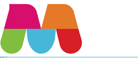
Through the Communauté métropolitaine de Montréal, Greater Montréal released in late October a new identity to brand the region, as part of its economic development strategy. The result is a contemporary M monogram that is divided in five parts to represent the five sectors that compose Greater Montréal and, in greater detail: “With its solid three-point footing, the monogram echoes the population’s roots and pragmatism. Its stylized and friendly curves reflect the straightforward and warm welcome offered by the region’s residents. Its modular interior can be easily adapted to display Greater Montréal’s many levels of diversity (geographic, economic, cultural, community, etc.).” The concept of dividing a logo as a patchwork of colors, textures and images isn’t anything new and it can apply to any city or corporation in the world, but in this case it is at least very well executed and handsome. The typography is very nice too and the whole program is cohesive and engaging, and it can all be seen at the web site linked aboved.
Thanks to Yotam Hadar for the tip. And apologies for the extra brevity or apparent hurriedness of this post; still traveling and with limited time and internet access.
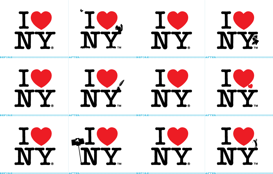
Back in May of 2007, it was announced that advertising agency Saatchi & Saatchi had been awarded the I Love New York campaign run by The Empire State Development Corporation with an alloted budget of approximately $17 million — budget that goes into the production and media buys, not into Saatchi’s pocket as some people have misunderstood — to promote tourism for the state of New York. The first set of print ads came earlier this year and the now infamous logo with a squirrel on it has been popping up regularly but for some reason there is a rekindled interest in this story and some fun material has come up, so we are happy to give this the attention it deserves.
Continue reading this entry
Imagine a utopian destination—a geographic equilibrium servicing the dualing needs of business & pleasure—conveniently near a regional airport. In this mythical location, one might fantasize about relaxing with a proverbial partner and two children at a waterpark, mall, zoo, or even an art museum. Maybe some golfing with executives followed by candid conversation…and closing a deal or two in a comfortable hotel lobby. There would be strong exotic drinks served by colorful and sexy locals in a continental atmosphere drenched in free wi-fi. This natural state of promise, abundance, and uniquely American opportunity does exist. It’s not in the Bahamas, not in Second Life, and not in Dubai. It’s in Raleigh.
Continue reading this entry
At the heart (pun!) of every city or country branding effort is a zealous desire to portray the destination as world-class and home to the greatest people on earth — and, sometimes, like New York or Slovenia, there is nothing sweeter to communicate this than with a heart. Belfast, the capital city of Northern Ireland, unveiled a new identity to help promote tourism and enhance the perception of a city that has experienced its share of political, cultural and religious troubles from the 1970s to the 1990s, and has only recently experienced positive growth and perception. And what better way to grow than by opening your heart.
Continue reading this entryNext Page
(Total Number of Pages in Destinations: 2)


