
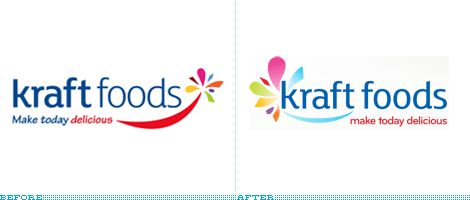
A little over five months ago Kraft Foods introduced its new corporate logo with an accompanying press release that stated: “[The new logo] signals to employees, consumers and investors what the new Kraft Foods is all about.” This past week Kraft Foods modified its logo already. So, as a consumer, what this logo change signals to me about Kraft Foods is a company that can not make sound decisions to begin with and, once made, can not live with them. Which is a little harsh, but if we are to believe what we read in press releases, then let’s keep corporations accounted for their spin.
Continue reading this entry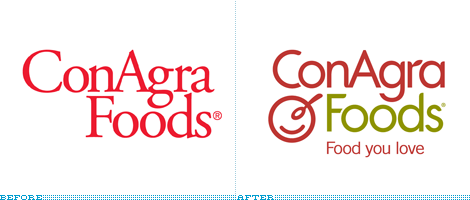
Behind some of the most recognized grocery brands — Healthy Choice, Chef Boyardee, Egg Beaters, Hebrew National, Hunt’s, and Orville Redenbacher’s, to name 6 out of 40-plus of them — is one of the least recognized food manufactures: ConAgra Foods. Kraft and Procter & Gamble are probably the first that come to mind, but even those two don’t seem to have the amount of popular brands run by ConAgra Foods. And it’s this sense of lack of recognition that drove the impetus for a new identity as ConAgra Foods moves from being a behind-the-scenes holding company to a more public-facing operating company.
Continue reading this entry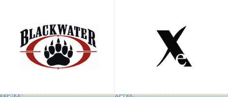
In 2007, Blackwater Worldwide, the world’s largest private security company, made the wrong kind of headlines when Blackwater contractors allegedly shot and killed 17 Iraqis in a crowded square in Baghdad. This resulted in protests, congressional inquiries and the Iraqi government refusing to allow the organization to operate in the country. And now, in an effort to improve public perception, Blackwater has changed its name to Xe (pronounced ZEE).
Continue reading this entry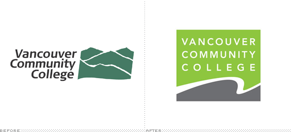
When one thinks about massive convention centers it’s not rare to visualize an endless maze of soulless corridors, horribly patterned carpeting, and a sense that sunlight has not seeped inside for many, many years. The 2003 AIGA National Design Conference was held in the Vancouver Convention Centre (VCC), and while there were hints of its convention centerness, the floor-to-ceiling glass windows that welcomed you as you stepped out of each session with views of mountains, sea and birds was literally a breath of fresh air. That was by far one of the best settings for a conference I have been to. Since then, the VCC has expanded and been beautified even more over the past five years. While convention centers wouldn’t be the first industry you would think of of having some serious branding energy devoted to them, VCC has risen the bar for the kind of branding these places need to start thinking about.
Continue reading this entry
Kraft Foods, one of the largest food and beverage companies in the world unveiled yesterday a new corporate logo. I emphasize early that the change applies only at the corporate level, the uppercase oblong logo, used for both the corporate and brand identity, will stay as the consumer brand, so you won’t miss it when you are buying your Macaroni & Cheese. So let’s get started with some press releasing.
Continue reading this entry
Understanding the scope of global conglomerates sometimes escapes me, so allow me to copy-and-paste: “Essar [Group] is a diversified business corporation with a balanced portfolio of assets in the manufacturing and services sectors of Steel, Energy, Power, Communications, Shipping Ports and Logistics, and Construction. Essar Global employs over 40,000 people across offices in Asia, Africa, Europe and the Americas.” Got it? They are big. And it’s corporate identity work like this that really gets me going.
Continue reading this entry
With title apologies to Erasure.
Amsterdam-based AkzoNobel, a powerhouse in the global production and distribution of decorative paints, performance coatings, and specialty chemicals, unveiled a new identity this past April, following the acquisition of ICI, one of the largest chemical producers in the world — the ICI name and logo will slowly fade away as they are not part of the rebranding. The original logo was designed by Wally Olins in 1988 through his namesake Wolff Olins, and the outstretched man was inspired by a Greek bas relief sculpture hosted at the Ashmolean Museum in Oxford chosen “as both a scientific and an artistic symbol, reflecting the values it wanted to express — those of striving and achievement.” The new identity was also designed by Wally Olins, now through his new company, Saffron. The old logo was clunky at best, even if metaphorically strong, so the redesigned male of unidentified race or political inclinations is a welcome evolution to the concept — although it seems more fitting for a healthcare organization than a decorative paints producer, but I am willing to take the leap of faith. The accompanying typography is enjoyable and foregoes the all-lowercase trend, proving that it’s possible to appear accessible and friendly while maintaining a corporate demeanor. There is a wealth of references about the AkzoNobel brand, so please enjoy at your own pace: An overview and brief history of the identity, Brand Center, showing well edited brand movies, and a press release.

With the recent acquisition of Candian company Inco, CVRD (Companhia Vale do Rio Doce) has become the world’s second largest mining company, named Vale — even if, colloquially, it was already referred to as such to shorten the mouthful. While the legal name stays the same, this name change is more of a pruning of the original name — leaving us with the portuguese word for valley. And of course with a new name comes a new logo.
Continue reading this entry(Total Number of Pages in Corporate: 1)


