NOTE: This is an archived version of the first incarnation of Brand New. All posts have been closed to comments. Please visit underconsideration.com/brandnew for the latest version. If you would like to see this specific post, simply delete _v1 from the URL.
As the year comes to a close and the list tradition bears on, I thought a Best & Worst selection from the 2008 archives of Brand New would be entertaining. These are my best and worst and they don’t represent the comments on each of the original posts, whether positive or negative. Other than the first item in each category (my favorite and my least favorite) the selections are in no particular order. I’ll take this opportunity too, to thank everyone that visits Brand New — every single month of 2008 our readership increases — and for all of you that send us tips, we would literally not have the great content we have if it weren’t for your contributions. Posting will be light for the next two weeks. Enjoy your Holidays and have a happy new year.

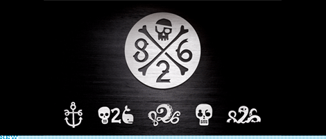
826 Valencia / Top Honor / This project has unfair advantage against most on this site — it has a visionary and design-savvy leader in Dave Eggers — and it doesn’t involve the risks that most corporations or brands face but, damn, is it awesome. And as far as I can remember, this is the only post in the history of Brand New that has come close to 100% positive remarks.
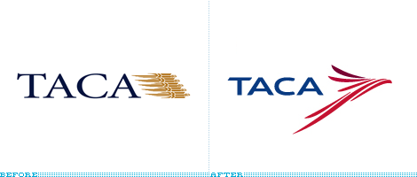
TACA / Probably the best new icon of the year, either as a representation of an eagle or a guacamaya. Heck, even if it represented a frog it would still be great.

SanDisk / Pound for pound, letter for letter, ligature for ligature, the best redesign of a wordmark that retains the essence of the original while pushing the company into the new, young century.

rtve / Neither the most original, nor the most groundbreaking, but when you are dealing with a country’s radio and television station anything that surpasses the stranglehold of committees at this scale and visibility gets a nod. And, it’s actually a vibrant and cohesive identity.

Camel / Because it’s a project that most designers would scoff at, and it’s one of the best packaging redesigns in a while that actually advances the brand.
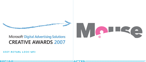
Mouse Awards / Sure, the old logo was barely a logo and pretty much impossible to screw up on the rebrand, yet this is an adorable and clever new logo. Plus, johnson banks had everyone in a tizzy with their April Fools.
Ford / Suckers! We had you going for our own April Fools. You were all good sports though.

Breastcancer.org / In a category full of single-loop ribbons, this one offered a new alternative. Plus, it even made Optima look good.
Lifetime / A desperately needed change that managed to avoid something overly feminine or cloying and was able to introduce something with personality and emotion.

Planet Green / Best use of a circle.
Pepsi / Top Dishonor / The response (best seen in this 400-plus-comments post) was absolutlely, defeaningly negative. I guess that speaks volumes to the lack of appropriateness for this change.
Anheuser-Busch InBev / A missed opportunity to create something that didn’t look like it came from istockphoto.com. And, seriously, that type?

Capital One / A swoosh in 2008? And, even by swoosh standards, a crappy one at that? Really?
Animal Planet / This logo is neither animal nor planet. Discuss.
South Dakota State University Jacks / The result wasn’t so offensive, but the process that led to it was simply embarrassing.
WGN America / It’s for a TV station in just one market, so the damage can be quarantined in one area but, man, that’s one ridiculous concept of what a logo is.
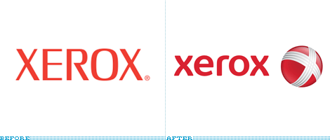
Xerox / Taking the marble-lowercase trend to the extreme. And sucking at it. Barclaycard came in close second in this category.

Econolodge / Yikes. Even for low-cost hotels this is one hell of a bargain. Key word: hell.
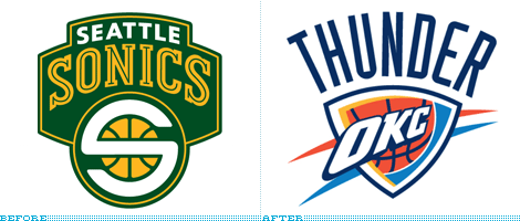
The Oklahoma City Thunder / You can take the Supersonics out of Seattle but you can’t take the lame out of this logo.

Euronews / Worst use of a circle.

Jump to Most Recent Comment
Lindsay’s comment is:
Interesting review. But surely Hans Donner's rbs tv is the worst on brand new.
On Dec.22.2008 at 06:11 AM
Sarah’s comment is:
Thanks for a year of interesting posts.
Another favorite of mine was coke's simplification.
Worst definitely pepsi.

john McCollum’s comment is:
I can't decide between the Capital One and the OKC Thunder. Both of them made me want to punch myself in the throat.
Oh. Hell. Thrown in WGN, too.
None of the "Best" was half as good as those three were bad.
On Dec.22.2008 at 06:19 AM
poohugh’s comment is:
Animal Planet looks like a crappy bar.
On Dec.22.2008 at 08:59 AM
Jeff’s comment is:
Big love for WGN America.
On Dec.22.2008 at 09:00 AM
Anonymous’s comment is:
WGN definitely the worst! It's not even a real logo...
On Dec.22.2008 at 09:12 AM
Remy Overkempe’s comment is:
WGN definitely the worst! It's not even a real logo...
On Dec.22.2008 at 09:13 AM
Barn Man’s comment is:
Dude! I love that Pepsi logo! I don't know why nobody else in the world doesn't!
On Dec.22.2008 at 09:39 AM
Matheus’s comment is:
WORST OF THE YEAR: WOLFF OLLINS WINS FOR THE 5968354TH TIME IN A ROW. OMG THEY REALLY SUCK! There, I said it.
On Dec.22.2008 at 10:07 AM
BWJ’s comment is:
Capital One is the worst as far as large companies go. And having to see it plastered all over the place in NY everyday doesn't help ease the pain.
826 and Coke's simplification were the highlights for me...and Obama! I'm surprised it wasn't mentioned.
On Dec.22.2008 at 10:26 AM
Mark’s comment is:
I actually quite like the new Animal Planet logo, at first I didn't but I think it has grown on me to a certain extent.
On Dec.22.2008 at 10:30 AM
steve’s comment is:
the new Lifetime logo in the BEST category? really curious choice to me...
i had an immediate visceral reaction when i first saw it - like they had plucked an option from a [really] old phase one. that sort of drippy, irregular script just screams '92.
On Dec.22.2008 at 10:33 AM
Armin’s comment is:
> and Obama! I'm surprised it wasn't mentioned.
The funny thing is that we never talked about it as a "New" or "Before/After" logo, which is what I based these selections on. "In Brief" didn't count. Not sure why, but that's what I decided.
> WORST OF THE YEAR: WOLFF OLLINS
For whatever it's worth, and I'm not saying this just to be cool for liking something that everyone else hates, but they are the best brand identity design firm of the 21st century. By far.
On Dec.22.2008 at 10:37 AM
blue’s comment is:
Merry Christmas and a Happy New Year to you Armin; many thanks for an enjoyable site.
On Dec.22.2008 at 10:42 AM
Tom’s comment is:
WGN is a "super station" carried by cable systems from coast to coast, so their horrendous "logo" is not quarantined in just one market. As a White Sox fan living in Minneapolis, my eyes have been assaulted by it far more often than I'd like.
On Dec.22.2008 at 11:22 AM
Goffredo Puccetti’s comment is:
I remember I loved the Sendai Idenity redesign
http://www.underconsideration.com/brandnew/archives/this_way_to_the_cosmos.php
Surely one of the best identities of this year.
Considering Xerox, Barclaycard and Pepsi... I think this has been an annus horribilis for our profession.
May I take this opportunity to thank the admins of this site and to wish everybody a happy new year.
On Dec.22.2008 at 11:26 AM
BWJ’s comment is:
but they are the best brand identity design firm of the 21st century. By far.
Agreed.
On Dec.22.2008 at 11:28 AM
Thomas Hanson’s comment is:
RE: Armin:
For whatever it's worth, and I'm not saying this just to be cool for liking something that everyone else hates, but they are the best brand identity design firm of the 21st century. By far.
I feel like that comment caused an angel somewhere to lose its wings.
On Dec.22.2008 at 11:33 AM
AJ Teachout’s comment is:
Between WGN and Capital One, the list couldn't get much more crap-tastic.
I am a big fan of the April Fool's Ford logo. If only...
On Dec.22.2008 at 12:15 PM
Marco’s comment is:
RE: Armin:
For whatever it's worth, and I'm not saying this just to be cool for liking something that everyone else hates, but they are the best brand identity design firm of the 21st century. By far.
+1
Thanks a lot for keeping up the good posts, Armin, and have a nice holiday.
On Dec.22.2008 at 01:07 PM
jeremy’s comment is:
no mention of the Olympics logo for 2012? technically it is a really really bad update.
also that Animal Planet logo hurts.
On Dec.22.2008 at 01:32 PM
Kevin Zwirble’s comment is:
You mean that CA Lottery logo didn't make the best list as best-crappiest logo?
....and don't get me started on pepsi.
On Dec.22.2008 at 01:39 PM
Von K’s comment is:
Agreed 826 is awesome stuff, though I still maintain that the Animal Planet logo is good, fwiw.
On Dec.22.2008 at 01:40 PM
jrmm’s comment is:
IMO... the worst logo of the list is the WGN America one... not good, not even original, it reminds me the logo that The Movie Channel used from 1989 to 1997:

One question... that Ford Motor Company logo is out now? because I don't see it on its corporate website.
On Dec.22.2008 at 02:30 PM
jrmm’s comment is:
Oh wait... got it... it was an April Fool's logo... sorry :p
On Dec.22.2008 at 02:36 PM
Jw’s comment is:
Camel / Because it's a project that most designers would scoff at...
Really? What designer would scoff at a chance to revamp classic brand packaging? Seems like a great opportunity, actually.
rtve = nope
And while I love the fun of 826, there is only one of those that I can actually read. Even the main graphic you show had me thinking "What is 'death to S-26' supposed to mean?"
On Dec.22.2008 at 02:40 PM
Jw’s comment is:
For whatever it's worth, and I'm not saying this just to be cool for liking something that everyone else hates, but [Wolff Ollins ] are the best brand identity design firm of the 21st century. By far.
If that's true, then that shows us that either:
1. Wolff Ollins had a really bad year. Everything I saw come out of that place in 2008 was pretty awful. Even the newest version of their website is crummy.
or
2. Branding/Identity had a really bad year, if something from Wolff Ollins could be considered a superlative in 2008.
I don't know their entire history, so maybe they are a good firm that just for some reason lost their mind this year. But the fact remains that they put out some chunky garbage over the last 12 months, and in my opinion they definitely deserve a "Worst of 2008" award.
On Dec.22.2008 at 02:47 PM
Gopal Raju’s comment is:
Nice List.
Gopal,
http://www.productivedreams.com
http://twitter.com/gopalraju

Craig’s comment is:
When I first saw the Oklahoma Thunder logo on TV I had to do a double-take. Absolutely horrible.
On Dec.22.2008 at 03:22 PM
felix sockwell’s comment is:
well done arm.
i can't disagree... though Obama did win top honors (as he should have)
On Dec.22.2008 at 04:25 PM
Clarexu’s comment is:
Pepsi & Xerox redesigns, I do not understand at all.
Animal Planet is very fun, although I don't see the connection either.
On Dec.22.2008 at 04:36 PM
Colin’s comment is:
Thomson Reuters was my favorite this year.
On Dec.22.2008 at 04:48 PM
Igor’s comment is:
Hm, I love Animal planet logo, but I don't get the Camel redesign. What's the benefit of that circle?
On Dec.22.2008 at 04:55 PM
howard2112’s comment is:
I was about to scream bloody murder about the Science Channel Logo not being in the best, but I looked to find it's date as Dec 29, 2007. Perhaps it missed last years list. definitely one of the best I've seen in recent memory. As far as this year is concerned. I've got to go with the SanDisk update for best.
On Dec.22.2008 at 06:17 PM
armand’s comment is:
Animal planet (after)~ is truely horrid
On Dec.22.2008 at 06:48 PM
Aaron Pou’s comment is:
Hands down – WGN America is the ugliest 'design' I've ever seen, it's doesn't even qualify as an identity/logo. Wow. Looks like they found some out-of-work freelancer on Craigslist and got him to 'design' a logo for very little money. At least I hope thats what happened because if they paid a design studio to do this - that said design studio will be mocked and out of business soon.
Oh my goodness!
Close second in the worst category would be Pepsi - only because Coke's redesign was executed 100% perfectly by Turner Duckworth and because Peter Arnell of Arnell Group is a complete fraud and a horrible, horrible man. I liked him better when he was overweight. He was a grumpy man and he had a reason to be.
On Dec.22.2008 at 06:55 PM
ARDELL’s comment is:
Re-think Capital One along these lines.
It's not a "swoosh". It's a boomerang. As in "here's hoping all the money we lent to people comes back so we don't need a big bailout."
Using that rationale, it may be the best logo change of them all.
On Dec.22.2008 at 07:51 PM
T-Bone’s comment is:
interesting comment about the percentage of positive remarks – perhaps you could add an optional 1-5 click rating in posts?
and that pepsi logo, sheesh. i don't even drink soft drinks but that still grates at me. ugh.
On Dec.22.2008 at 08:17 PM
tommy!’s comment is:
Ouch - how did Walmart not make the worst list?
On Dec.22.2008 at 08:38 PM
Amy ’s comment is:
The Animal Planet one made me flinch and gasp in horror all at once. That is really awful. Am I missing something? What's the deal with the M?
On Dec.22.2008 at 08:48 PM
BrooklynJoe’s comment is:
@Amy:
The Animal Planet logo really is a head scratcher. It looks like something off a late 80's "Tribal!" t-shirt. I'm surprised they didnt give it a leopard print pattern.

matt lohkamp’s comment is:
I'm glad I ran across this blog earlier this year - keep it up, I check every day for updates! :]
On Dec.22.2008 at 09:58 PM
Red’s comment is:
Great post. And great comments too. I wish you could post more. There were so many disasters in the last year. And only a few good ones.
On Dec.22.2008 at 10:16 PM
Andrew’s comment is:
Jw:
Amen Brother!
Wolff Ollins sells really expensive snakeoil.
As I like to say: 'The proof is in the pudding' –and EVERYONE is spewing Ollin's out.

Andrew’s comment is:
Although I'll admit Ollins IS an artist...a CON artist.
On Dec.22.2008 at 11:03 PM
DG3’s comment is:
Mine are:
Camel: Best
Animal Planet: Worst

js’s comment is:
The xerox one is cool except for the stripes on the x.
On Dec.22.2008 at 11:50 PM
Steve’s comment is:
Thanks for the year! I cut my RSS reader from 78 to 10 feeds; this and Speak Up both remain - fantastic criticism through and through.
On Dec.22.2008 at 11:53 PM
Mark’s comment is:
I'm surprised you missed the failed onanistic OGC logo redesign.
On Dec.23.2008 at 03:46 AM
Cali’s comment is:
I agree, Pepsi is definitely The Worst. Maybe worst ever in the entire history of logos.
On Dec.23.2008 at 04:02 AM
Justin Hill’s comment is:
At least the new Pepsi logo grew on me. It looks more like a rubber ball to play jacks with.
On Dec.23.2008 at 04:31 AM
Lauren Gray’s comment is:
No way are they going to use that Pepsi logo....nooooo!!!
On Dec.23.2008 at 08:53 AM
Justin Hill’s comment is:
They are using that Pepsi logo. Deal with it. End of story.
On Dec.23.2008 at 10:15 AM
Barrie Adams’s comment is:
taca is very good design, love it, Pepsi? oh no they've created a monster
On Dec.23.2008 at 11:56 AM
Anonymous’s comment is:
WGN - by far the worst!
Capital One and Econolodge a close second.
On Dec.23.2008 at 11:57 AM
Cary’s comment is:
I loved the Chicago Olympics mark (revamped even) and absolutely hated the one for London.
Hate WGN - prolly the worst logo in the last few years for such a high profile company, it has NO good elements at all. Even Pepsi, in all of it's new ugly, retained a modern simplistic quality. WGN just crapped all over anything they (didn't) already have.
On Dec.23.2008 at 12:01 PM
Nikki - Logo Design Guru’s comment is:
I liked most of the original logos better, especially the pepsi one, but I guess with time comes change and innovation so naturally logos change as well. This was an interesting comparison of new and old. Thanks for sharing.
On Dec.23.2008 at 12:03 PM
Mike’s comment is:
I loved the Discovery Channel redesign, but 826 is ridiculously beautiful.
Not a fan at all of SanDisk's, I wish they had done a little more to it.
On Dec.23.2008 at 12:30 PM
DJG Design’s comment is:
Animal Planet has grown on me. I see some critters in there. What about some other big ones like Walmart and SYSCO? While driving on vacation a few weeks ago i passed a giant old and reliable SYSCO logo on the side of a building and said to my wife, "Now there's a logo that will never go out of style, freshness and fun." A week later a friend sent me a link to the old design going to the butcher block. I felt I had lost a childhood friend. -djg
On Dec.23.2008 at 12:32 PM
Andrew’s comment is:
Thank you for taking jabs at Clay Bennett and the Oklahoma City Thunder ownership group. Every time they get criticized, a kitten is born.
On Dec.23.2008 at 01:30 PM
MeanGeanSean’s comment is:
Their logo (The OKC Thunder) deserves the lashing. It is absolutely horrid on every level. emotional, type design, color rational, etc...
On Dec.23.2008 at 01:45 PM
Jonathan Patterson’s comment is:
That's a nice list. The Jack's logo is very clever.
On Dec.23.2008 at 02:28 PM
Steven Sessions’s comment is:
Great review! And funny how Pepsi keeps trying to be Coke. In their new logo the wave graphic gets closer and closer to the Coke wave. After all these years and even after winning the taste tests of the 80s, Pepsi still looks up to Coke, which remains the category leader. Effective Branding.
Link

JJPurdue’s comment is:
Somebody should tell Euronews that Europe isn't round.
Worst use of a circle indeed.
On Dec.23.2008 at 02:52 PM
Eric Heiman’s comment is:
I think the Euronews logo as a worst pick is a bit misguided. While I was in Europe this past fall, I saw the mark and overall brand in play in both broadcast and print media and the results were very sophisticated, clever and appropriate. I think it's often tough to fully judge a logo outside of its context and usage out in the world. This is a good example.
Then again, I don't want to see that new Econo Lodge in any format, ever. And, frankly, the new RTVE is seriously clunky and will look dated within the end of the decade. So let's call it even.
On Dec.23.2008 at 03:44 PM
Josh’s comment is:
HUGE fan of Animal Planet, but HATE the new logo. I'm very disappointed. I don't even understand the tipped over M, is there some animal or planet related reason or is that for what they may think as "aesthetics"? I'm also curious about what people may think of the new WalMart logo. That weird orange flower petal/star pattern thing. I'm neutral on that
On Dec.23.2008 at 04:08 PM
Paul Lloyd Johnson’s comment is:
I actually like euronews' identity. I have caught the channel a couple of times and it seems quite professional, which is how news should be.
On Dec.23.2008 at 04:20 PM
alex’s comment is:
jesus the new animal planet logo is horrendous, its like when i was five and stretched letters out of proportions to make the entire word look like a rectangle, id like to know who approved of such abhorrent design
On Dec.23.2008 at 04:41 PM
dacian’s comment is:
I think the eurosport rebranding is one of the good ones, especially when i think of all the intermissions, fades and other graphics on the simple circle-planet theme they have on tv. very minimalistic, appropriate and cool.
also, while i don't like the new animal planet logo compared to the old one, in it's defense i'd say that the new lettering suggests disarray and apparent randomness, which is basically what nature is.
On Dec.23.2008 at 05:36 PM
Denis’s comment is:
This is a fascinating post. I swear, if you mix these logos up between the "worst" and "best" categories, I would not be able to tell you which category each "change" came from.
On Dec.23.2008 at 05:37 PM
dacian’s comment is:
correction:
euronews, not eurosport.

vos’s comment is:
Apart from "Mouse" and 826 Valencia all these so called logos are a major suck. Every second spended at this crap is a waste, such a waste.
On Dec.23.2008 at 06:39 PM
Brian’s comment is:
I saw the new Pepsi packaging in the grocery store yesterday, the minimalism of it actually made is stand-out and it looked quite good.
On Dec.23.2008 at 06:58 PM
Dave A.’s comment is:
Worst use of a horizontal graphic to group elements: This page.
The "BEFORE/AFTER" element separates the logos from the remarks, and instead suggests that the remarks belong to the logos below them. Why?? Especially when you reverse the design in the comments, using essentially the same design element in the opposite manner.
On Dec.23.2008 at 08:06 PM
Don’s comment is:
The Obama branding was all unveiled in 2007 (he declared his candidacy in May of that year.) It all came to fruition in 2008, though.
On Dec.23.2008 at 10:54 PM
David Arias’s comment is:
lifetime made one of this year's best? is this a joke? looks like a first year design student who has just learned the word typography made it! is that even a logo? come on! I'm sure others will agree with me.
On Dec.23.2008 at 10:54 PM
Connor Cimowsky’s comment is:
You're missing the new Wacom logo.
(Under worst obviously)
On Dec.23.2008 at 11:25 PM
Connor Cimowsky’s comment is:
Wow, nevermind....it's older than I thought.
On Dec.23.2008 at 11:26 PM
Paul Cooley’s comment is:
Oh what a lovely year for this lovely site!
Most of my end-of-year-non-music-conversation involved pointing out and debating the pros/cons about the Pepsi rebrand...even my dad just wasn't feeling it.
Just look at those 2 liter bottles you know that it just doesn't work.
It's also nice to see that dreadful animal planet Logo(?) in it's rightful place.
Here's to next year!
*e-champagne clink*
On Dec.23.2008 at 11:44 PM
Joe’s comment is:
What about London olympics? or was that 2007? No before version, except Mexico, etc....
On Dec.23.2008 at 11:59 PM
Patric King’s comment is:
the one thing i disagree with is the assessment of sandisk.
the type's okay (and only okay), and they took out the one element that pointed to what the company does.
not that it did a great job. but now that it's removed they look like any other conservative tech company.
On Dec.24.2008 at 12:31 AM
Derek Giromini’s comment is:
Following Animal Planet's terrible redesign is Discovery Channel. It looks like they didn't even try.
"Well, let's just make an enormous hollow D and stick the Earth on it somewhere. Done."
Ugh.
On Dec.24.2008 at 01:18 AM
Ben Hamilton’s comment is:
great post i think http://www.tycromedia.com logo needs a facelift too i mean the logo is and name is fine they need to jump in web 2.0 but then again somethngs its better to leave certain things alone
On Dec.24.2008 at 01:37 AM
Mik STAWSKY’s comment is:
Animal Planet
New logo is so WILD so NATURAL!
It seems like a virgin plants and ...
And who does hide behind this jungles?
ANIMALS!
isn`t it?
not worst!
On Dec.24.2008 at 02:27 AM
Fred’s comment is:
The 826 logo doesn't appear on their main website page. They don't like the logo?
Or am I missing something?
On Dec.24.2008 at 02:45 AM
steph thirion’s comment is:
JJPurdue I thought somebody should tell you that being called euronews doesn't mean they only cover Europe.
I'm not in love with the logo, but I definitely wouldn't put it in the worst. They did a terrific job with the new website by the way.

Hsjdh’s comment is:
Glad the Obama logo wasn't featured. It's nothing special, just has a load of fanboy spunk drenching it because everyone loves the guy too muchg
On Dec.24.2008 at 07:34 AM
Adelie’s comment is:
I was late coming to the new Pepsi logo conversation, but I saw one of the new designs at my mom's last weekend and mentioned, "Hey, that's the new Pepsi design." My mom hadn't even noticed the change and couldn't remember what it had looked like. So, don't think it's going to make much of a difference (good or bad) in the long run.
On Dec.24.2008 at 07:57 AM
Mike’s comment is:
I don't know about the "best" list. Not that any better ones immediately come to mind, but none of them are really great either.
I'm also having a hard time with why the Camel piece is here. It's well done, but it's not a logo update. They've used the blue version of their mark for years in various places. If we're opening this up to package re-designs there are dozens better than some of these logos.
I feel that often we judge re-designs not on the integrity of the new design, but on how desperately an update was needed. For many of these, the original was so poor that any hack could substantially improve it. Seriously though, if you saw that new Lifetime logo, without ever having seen the original, would you actually put it in the top designs for the year?
On Dec.24.2008 at 09:07 AM
Salva’s comment is:
RTVE? Are you kidding? It looks horrible on the TV screen (the radio channels are ok with the new logo, though), and the logos for the individual TV channels are too childish. They would be nice while watching a kids program (really), but they look totally out of place while watching the news or any other serious content.
Have you really seen the new brand in context?
On Dec.24.2008 at 09:24 AM
Devin’s comment is:
The Obama logo should have been there.
It has been raised to the level of icon, it's quite spectacular, regardless of whether or not, from a design perspective, it is spectacular.
On Dec.24.2008 at 09:25 AM
Pepsi Co’s comment is:
The Pepsi description has a typo: "defeaningly" should be "deafeningly"
On Dec.24.2008 at 10:04 AM
Klokanko’s comment is:
I have to defend Animal Planet logo. I like it very much. You have to think about it on screen, animated - it works great, it's fun, it's different. It's 21st century :)
On Dec.24.2008 at 10:08 AM
Anonymous’s comment is:
the animal planet logo blows monkey
On Dec.24.2008 at 10:36 AM
The Flying Jaco’s comment is:
I would say WGN is the worst. From a design point of view, it sucks. And even from an artistic point of view, it reeks of laziness. It is blatantly obvious that they drew the one eye, copied it and flipped the copied eye horizontally. The result: You got yourself a chick with a lazy eye.
I don't know how accurate their slogan is, but this certainly is a "logo" that I can't ignore.
On Dec.24.2008 at 10:44 AM
brandsinger’s comment is:
This entire exercise of before-and-after comparisons is hugely entertaining. Thanks for the delightful commentary. I have to say, however, that overall, the older, classic designs stand up (Camel, Xerox, etc.)and the latest ones -- no matter how logical -- lack expressive personality. Something is missing from contemporary commercial re-designs... give it up entirely, I say. Keep the old or make something new... but leave the past to rest.
On Dec.24.2008 at 10:47 AM
Todd Dominey’s comment is:
RTVE? Really? I much prefer the old one. The huge "e" at the end just looks like a mistake, and don't get me started on the gradient. Might look better as a one-color spot, but the version you posted is anything but an improvement.
Also have to disagree on Animal Planet. Yeah, the characters on the top row are a little scrunchy, but I still dig it. It really works on television (especially as a network watermark) because its fat, bold, quirky, and instantly recognizable. The sideways "M" is probably the best part. I'll admit, it looks kind of janky when viewed here, but look at it on screen.
On Dec.24.2008 at 11:19 AM
RooMi’s comment is:
the worst of them is "WGN America" ..it is like a zoombi logo coming out of the 90's!
On Dec.24.2008 at 11:32 AM
Navega’s comment is:
I think Mexicana Airlines new Logos and Paint Scheme should be included in the 2008 Best List.
On Dec.24.2008 at 11:52 AM
Knowshon 4 Heisman’s comment is:
in 2009, will gm or coke get a new logo? the capital one logo SUCKS and will make georgia look bad in teh capital one bowl on new years day. GO DAWGS!!
On Dec.24.2008 at 01:43 PM
Michelle’s comment is:
I like the new Pepsi logo and font they cleaned up the design when you look at the packaging and it looks so much cleaner. I have agree the WGN logo is ugly.
On Dec.24.2008 at 02:46 PM
Anonymous’s comment is:
I'm sad to see that Sunkist packaging didn't make the best of list. It's a huge improvement
On Dec.24.2008 at 04:35 PM
praga’s comment is:
The Pepsi is very bad and the Ford has was make by his family
On Dec.24.2008 at 08:25 PM
Panasit Ch’s comment is:
Your worsts are spot on (though some are not THAT bad) but your bests... I only like Mouse and Camel. But hey, that's just me.
On Dec.25.2008 at 04:07 AM
Wünderwoman’s comment is:
Brilliant! Thanks for the recap...and for all that you do. Here's to a new year of best/worst!!
On Dec.25.2008 at 10:33 AM
apg’s comment is:
Econolodge... The logo speaks to the quality of the experience you'll have in the hotel... Sure, it's cheap. But honest.
On Dec.25.2008 at 02:26 PM
tomassino’s comment is:
euronews logo... a waste of money
On Dec.25.2008 at 08:17 PM
Anonymous’s comment is:
the old TACA one is f*** ugly, it would be hard not to improve it. The new one is a me too, looks like a refurbished set of American Airlines wings.
Not very creative, don't knwo why its in top place and on this list altogether.
The rtve has gone from the 70's/80´s to the 90's. Is that great?
On Dec.26.2008 at 02:22 AM
cutt’s comment is:
Great Post...
I dont know why but the first impression that I have in Animal Planet is Anibal Lecter... Oh my mind.
Well, WGN is the worst... sorry

Idearted’s comment is:
Muy buena referencia para saber que es lo que se debe hacer y que es lo que no se debe de hacer en un logotipo, pero no se realmente que quisieron hacer con WGN.
http://www.idearted.blogspot.com/

workpant’s comment is:
Great post! I have seen euronews on screen and its no doubt right picture. I would be bless a designers for transformation "N"orth "E"ast "W"est "S"outh to NEWS. Not so bad? Logo just is tip of the iceberg. Circle - why not?
On Dec.26.2008 at 11:14 AM
Ho Ho Ho’s comment is:
Very well done. I was just bitching about the Pepsi logos yesterday as a matter of fact. They were just changed out of the machine... Then everyone here at work went on your site... BUT, surprisingly, you did forget about this one...
On Dec.26.2008 at 02:54 PM
101101’s comment is:
The new pepsi is just horrible indeed.
On Dec.26.2008 at 04:41 PM
DRoss’s comment is:
New walmart logo = Worst. Logo. Redesign. Ever.
On Dec.26.2008 at 05:38 PM
maui’s comment is:
Well done. However, some of the "worst" might need a second thought. I like the simplicity of the euro logo, less is more. Also feels European.
I want to thank you for posting Animal Planets new logo as the worst. It is a disgrace to the marketing department who chose a logo that has zero design appeal and to reference to the mission. I guess they where going for "eye sore that must be remembered, wow im so smart" bullcrap.
On Dec.26.2008 at 07:17 PM

yellowstone.ie’s comment is:
Interesting groupings - however, i would have to disagree on Camel and I'm soft on Xerox too.... it really is all about personal taste on occasion
On Dec.26.2008 at 08:08 PM
Paul’s comment is:
It would be great if someone could put up a poll so we can crown the best of the best, and the worst of the worst.
On Dec.27.2008 at 01:52 AM
Joen’s comment is:
I get the feeling that some of these logos were redesigned because of year-end budget spending sprees.
Company: "Hey guys, we've got to spend more this year, or our design budget for next year will be downsized! Can we redesign our logo or something?"
Employee: "Hell yeah! I've got a nephew who's real sharp in design! He just made a logo for my brothers soccer-club."
On Dec.27.2008 at 01:26 PM
steve’s comment is:
i have to say that i've never quite understood the venomous reaction to the pepsi redesign. sure, the changeable globe is a stretch and the detailing is not right. overall, it scales back the video game animation feel of the previous pack and makes it more sleek and forward thinking.
this is just run-up to my question of why the tropicana redesign is not included in the worst list? i've noticed it rolling out in stores and it is just horrendous. the initial images featured on this site were better because the color on the images was much more vibrant and interesting. at the time it was the one striking thing about the design. but now having seen it for real, the juice color is very grey and dull. there are definite printing limitations given the process and substrate. the other disappointing element is the lack of the proprietary closure on the final cartons. the initial images had shown an orange-shaped closure but it is in actuality just the stock closure. this sort of subtle design is about perfection in detail and the end result has none.
On Dec.27.2008 at 09:56 PM
omtv’s comment is:
The Pepsi log is just so wierd...
On Dec.27.2008 at 11:39 PM
chris’s comment is:
I feel that alone the Pepsi redesign looks like shit, but those new new Pepsi cans look pretty good.
On Dec.28.2008 at 02:19 AM
Ray’s comment is:
No love for Vale? I thought that was one of the best this year.
And my vote goes for lippincott as one of the best firms this year, Walmart and all.

adam’s comment is:
HISTORY CHANNEL logo changed too
On Dec.28.2008 at 08:09 PM
dale’s comment is:
Pepsi re-branding looks bad on paper...but I've just started seeing the cans in stores. Works so much better in real life.
I think this is a re-brand that will turn out to surprise many. Watch and see...
On Dec.29.2008 at 01:26 AM
Lev Eidinov’s comment is:
O, c'mon, new Animal Planet logo is wonderful!
On Dec.29.2008 at 07:58 AM
dani’s comment is:
hey, wtf? new ford logo is THE SAME of trenitalia logo (italian railways), look:
trenitalia 
ford: 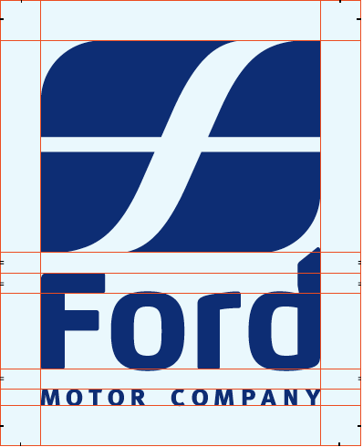

John McCollum’s comment is:
Ford logo = Hoax
That having been said, it's a hell of a lot better redesign than some of the actual projects we've seen this year...
On Dec.29.2008 at 10:34 AM
JORGE’s comment is:
HEY!!
THE NEW PEPSI LOGO LOOKS LIKE A CANARY BIRD SILHOUETTE !!!!!!!

Eric Shafer’s comment is:
Tracked back to from here: http://www.presidiacreative.com/web-picks-5/
On Dec.29.2008 at 02:15 PM
Chris’s comment is:
Great list! The WGN re-do is easily the crappiest logo I've seen in years!
Like some others, I'm surprised the Obama campaign logo didn't make the cut. Here's an interesting link about the design process and some of the rejected campaign logos:
On Dec.29.2008 at 02:54 PM
Chris’s comment is:
Whoops.....here's the link:
Obama Logos

John’s comment is:
I actually quit smoking because Camel switched their packaging. Thanks Camel!
On Dec.29.2008 at 04:03 PM
Ryan’s comment is:
I love how we're so overly concerned about something that won't matter when we're all dead.
On Dec.30.2008 at 02:43 AM
Coff’s comment is:
you can almost see the thirty second pen tool process on the pepsi redesign. looks like somone took the original vector and fell asleep with their finger on the trackpad.
On Dec.30.2008 at 04:02 AM
Brbbl’s comment is:
Animal Planet is the absolut worse! Call it Building Planet, make the letters grey and black and it suits the name.
On Dec.30.2008 at 04:29 AM
Cruz’s comment is:
I think Pepsi is moving in the right direction and their design speaks for itself. It's very well done, clean, light and fluid. Just like strip malls, stores, and other retailers they have to re-facade to keep up with the times and keep that sense of new and fresh look other people will divert away from them. Take Target for example. Their stores get make over about once every 5-10yrs. My point is the design done looks like they took that into account. I really enjoy the design and look to enjoying them all. At Pepsi has the guts to realize that in order to stay with the times one must change with the times.
Look at Coke, they haven't changed in eons, same old logo, granted while it is a very well done logo and in some aspects classic they don't do much for themselves. They rely heavily on their aging consumers which are slowly shrinking. It has nothing to do with which you like more because lets face it most of the time we don't care what's in the dispenser at our fast food place, as long the mix they syrup and carbonation right we're happy. But if we're in a grocery store and go to grab whatever soda, we're going to go for what appeals to us more by the packaging. Don't lie you know you all do it, determining on how good something is by how it's package. Hell, I do it all the time. I see something amazingly designed in its package and I'm sold. Good example are the Method Products.

Jessica’s comment is:
I agree with all of these except for the XEROX logo. I actually like the new one.
On Dec.30.2008 at 12:22 PM
LadyN’s comment is:
Awwwwww, the memories... *sniff*
WGN America has a speshul place in my heart.
On Dec.30.2008 at 12:52 PM
Tim’s comment is:
I'll second the shout about the Wacom logo.
And while we are about it, can't the rules be bent a bit to allow London 2012 logo to compete for a second year.
PEPSI - is just me or does the new roundal look like a mouth kind of 'smirking'?
Has there ever been a case of a major corporation missing the target with its rebrand. Surely a return/rehash to the classic 1970's stylings is the way to go.

James Kurtz III’s comment is:
Pepsi. Wow. How does that even get approved.
On Dec.31.2008 at 12:58 PM
jesus’s comment is:
NOT ALL THE BAD ONES ARE REAL BAD, ITS JUST THE POINT OF VIEW THAT YOU EMPLOY TO APPRECIATE AN ARTWORK.
On Dec.31.2008 at 04:12 PM
Postcard Printing ’s comment is:
Pepsi’s redesign was the worst! I don’t see why they changed their wave to look more like Coke when they’ve always been branded as the anti-Coke. Also, the new typeface looks ’70s to me, and not in a good way. The stick-thin font makes Pepsi look weaker than Coke, I think. Thanks for the round-up – I had forgotten about some of these! The Mouse Awards logo is great – I love it when images are vague! (Seriously.)
On Dec.31.2008 at 05:53 PM
SOPI’s comment is:
amazing list. but i dont think jacks is THAT bad. Having said that... WTF with the pepsi re-design?
On Dec.31.2008 at 07:54 PM
BuyDesignGraphics’s comment is:
Some interesting changes, good and bad, but has anyone seen the new Bank of America logo. OMG! Red lettering on a red background. It's such a bad idea they don't even cover that in design classes. Who could be so stupid!
On Dec.31.2008 at 08:25 PM
Justin Hill’s comment is:
Pepsi introduced a new soda:
Find out here:
Link

Roman Coke’s comment is:
Who cares?
On Jan.01.2009 at 10:29 AM
gerard pawling’s comment is:
what about esso going to exxon and tony?
On Jan.01.2009 at 12:48 PM
emidio’s comment is:
the ford new logo have the F as seen on ferroviedellostato.it
On Jan.02.2009 at 01:47 AM
Alvin’s comment is:
Another worst: Walmart
Also, wut's wrong with Animal Planet? Looks light, fun and kind of animal-y with the "M" mouth.
On Jan.02.2009 at 10:24 AM
Anonymous’s comment is:
How about Stop&Shop? I have no idea what that logo is supposed to be.
On Jan.02.2009 at 12:42 PM
Zippy the Pinhead’s comment is:
I laughed I cried I wet myself laughing and then I cried about that.
On Jan.02.2009 at 03:48 PM
Anonymous’s comment is:
The absolute worst thing that happend this year was the xm/sirius merge! I hate sirius...it's all unorganized and to think I paid a whole year in advance!!!:(
On Jan.02.2009 at 05:00 PM
Ronny’s comment is:
I vote 'Sandisk' for the best of 2008, and 'Capital One' for the worst.
'GSN' gets the lazy arse defualt design award, and 'Wacom' gets the WTF award.
On Jan.03.2009 at 12:03 AM
shen’s comment is:
Hey you missed out HP's new logo, which I felt was a great revamp. They retained the existing look and feel, to bring a new web2.0ish look to the new logo.


Anonymous’s comment is:
good
On Jan.04.2009 at 07:29 PM
Ron Burgundy’s comment is:
Was there any logo's that you liked? Hard to believe so many got changed in 2008.
On Jan.04.2009 at 08:45 PM
AJ’s comment is:
I think every person in Oklahoma shed a collective tear the day the Thunder logo was unveiled. Absolutely horrendous. Not to mention a complete ripoff of the NJ Nets logo.
On Jan.05.2009 at 08:05 AM
Anonymous’s comment is:
Great 2008. I started following Brand New just at the end of 2007 and it's always a first read when a new post appears. I don't have a background in branding, but as a trademark attorney I'm interested in the many considerations that go into selecting a strong mark that will connect with consumers. Keep up the great work. Oh, and although I initially agreed with your comments on the Pepsi logo, I actually think it works in their new ad campaign. We'll see where they go with it.
On Jan.05.2009 at 10:51 AM
Kenan Farrell’s comment is:
Great 2008. I started following Brand New just at the end of 2007 and it's always a first read when a new post appears. I don't have a background in branding, but as a trademark attorney I'm interested in the many considerations that go into selecting a strong mark that will connect with consumers. Keep up the great work. Oh, and although I initially agreed with your comments on the Pepsi logo, I actually think it works in their new ad campaign. We'll see where they go with it.
On Jan.05.2009 at 10:51 AM
Ali Goldie’s comment is:
Hi,
Great review bro.
The mouse award logo looks simply creative and so is the Camel new look.
I must say, the Animal planet logo has gone worst and I think the designer for pepsi was drunk?!?
Xerox tried a new look, but reminds me so much of Xmen cartoon.?

sam’s comment is:
I disagree with the place of pepsi and animal planet logo. I think they deserve to be in best.
On Jan.06.2009 at 12:02 AM
himangshu’s comment is:
animal planet logo is the biggest crap but i don agree with the xerox logo being worst> its beautiful
On Jan.06.2009 at 07:52 AM
Jean Claude vanMammal’s comment is:
i love the animal planet redesign! i completely disagree with the comment that it is neither animal nor planet.
it is wild like the jungle! i do think it could be pushed even further, but overall, i love it...and get this...i like it more and more when i see it on tv.
there is no way it is one of the worst of 2008...especially lumped in there with turds like econolodge and wcn.
On Jan.06.2009 at 10:44 AM
Amanda’s comment is:
The Pepsi logo makes me throw up a little.
On Jan.06.2009 at 11:02 AM
J totha B’s comment is:
Yeah so that pepsi logo.....i could not believe it when i saw it at the store.....i had to stare at it for 5 minutes before accepting that pepsi had taken a very strange brand direction. First thoughts was that it was horrible... then i thought "wow seriously?".. Anybody who thinks otherwise loses alot of my respect.. it actually starts to look like the girlscouts logo. Great site....happy new year to all....oh and please avoid pepsisms this year....haha!!
On Jan.06.2009 at 11:45 AM
Kirk’s comment is:
re; FORD/joke.. I didnt even expect for it to be a joke since i read these later on.
I would be totally not surprised if they did something like that. the Pepsi one.. and Toyota back in the day seemed like more of a joke than the ford one.
happy new year
On Jan.06.2009 at 06:24 PM
Jason’s comment is:
I agree with the unfair criticism of the new Pepsi logo. I happen to like it, especially when viewed in context. It's not just a new logo, it's a new logo, font, cans, packaging, etc...
I think it works well, and the "old" Pepsi logo will probably never truly go away.
I think it's a fresh new look.
On Jan.07.2009 at 02:09 PM
이창희’s comment is:
ㅋㅋㅋ
On Jan.07.2009 at 07:37 PM
waaz’s comment is:
I gotta say, It's not that I like the Pepsi LOGO, I just love a different, cleaner direction.
Give these guys a hand for trying.
On Jan.08.2009 at 12:08 PM
Jordan’s comment is:
I agree with jason. I like the new pepsi logo.
On Jan.10.2009 at 11:15 AM
Kristian’s comment is:
Anyone see the resemblance between the fake ford, the true trenitalia and this one for a private school:
:p
On Jan.10.2009 at 08:09 PM
Rajesh’s comment is:
The Animal Planet new logo sucks. No relevance to the content. Old one was good. Needs rework.
On Jan.11.2009 at 08:15 AM
Kris’s comment is:
These are the old and the new logo for the Norwegian postal service. I'm not even gonna comment it, the logotypes speak for themselves imho.


Straderade’s comment is:
Thanks for this quick & clean review. Capital One I think has to be the worst change yet - I really hate that swoosh they have.
Nice Post!
On Jan.12.2009 at 09:42 AM
Anon’s comment is:
FYI.... this post (and therefore essentially a year of Armin's work) is being ripped off here http://www.graphicdesignblog.org/redesigned-logos-2008/
The ripoff is linked to here http://www.thegraphicmac.com/25-exciting-redesigned-logos-2008
They even put up the April Fool's joke!
On Jan.13.2009 at 03:41 PM
Nick L’s comment is:
The WGN Superstation is different than WGN America, If u want to see WGNTVs logo its at http://www.wgntv.com/. I have to warn, its even worse!!!
On Jan.13.2009 at 05:46 PM
Nick L’s comment is:
The ford logo looks like Forum Snowboards logo and the Pepsi logo looks like teh Tokyo Air (or Japan air) logo. Is ridiculous all these copycats out there
On Jan.13.2009 at 05:47 PM
Mikey ’s comment is:
I feel that the Xerox logo was actually fine and nothing was wwrong with it
On Jan.13.2009 at 07:11 PM
haseeb rizvi’s comment is:
not sure i agree with the xerox logo being worse actually. maybe not the best logo ever but certainly better than the original no?
On Jan.14.2009 at 05:31 PM
Joe Pemberton’s comment is:
The Pepsi mark is misplaced. The Pepsi redesign is a huge improvement if you consider the entirety of the packaging and identity. (Yeah, as Nick Shinn suggested, don't judge an identity by its logo.) Nitpick the curves all you want, the whole redesign is a step in the right direction for Pepsi.
Check the Typophile thread on the Pepsi redesign: http://typophile.com/node/53586
On Jan.23.2009 at 02:31 AM
Kevin’s comment is:
The EuroNews logo looks like they sucked the soul out of the company.
I don't like how they redesigned the circle in the Pepsi logo. It doesn't seem right.
The Animal Planet one is just disgusting.
On Jan.23.2009 at 04:42 PM
00m’s comment is:
Really like the new Ford logo, classic era is over.
I really agree with you about Animal Planet, what the "rotate M" mean? things they did to the "N" and "L" are type crime.
but, I kind of like the new Xerox...
On Jan.27.2009 at 03:21 AM
denis’s comment is:
I agree with you: The Pepsi redesign is totally pointless. However, the Camel redesign was equally pointless. The package and look are in themselves the brand identity, and I can't see how they gained anything.
On Jan.30.2009 at 01:08 PM
yhuddeeglopidm’s comment is:
NATALIE PORTMAN NUDE CLOSER
[url=http://NATALIE__PORTMAN_NUD.vidiLife.com]NATALIE PORTMAN NUDE CLOSER[/url]
NATALIE PORTMAN NUDE CLOSER
[url= http://NATALIE__PORTMAN_NUD.vidiLife.com ] NATALIE PORTMAN NUDE CLOSER [/url]
TERI POLO NUDE PHOTOS
[url=http://TERI__POLO_NUDE_PHOT.vidiLife.com]TERI POLO NUDE PHOTOS[/url]
TERI POLO NUDE PHOTOS
[url= http://TERI__POLO_NUDE_PHOT.vidiLife.com ] TERI POLO NUDE PHOTOS [/url]
JOHN CENA'S DICK
[url=http://JOHN__CENAS_DICK.vidiLife.com]JOHN CENA'S DICK[/url]
JOHN CENA'S DICK
[url= http://JOHN__CENAS_DICK.vidiLife.com ] JOHN CENA'S DICK [/url]
HEATHER AT I DEEP THROAT
[url=http://HEATHER__AT_DEEP_THR.vidiLife.com]HEATHER AT I DEEP THROAT[/url]
HEATHER AT I DEEP THROAT
[url= http://HEATHER__AT_DEEP_THR.vidiLife.com ] HEATHER AT I DEEP THROAT [/url]
HUBAD NA PINAY
[url=http://HUBAD__NA_PINAY.vidiLife.com]HUBAD NA PINAY[/url]
HUBAD NA PINAY
[url= http://HUBAD__NA_PINAY.vidiLife.com ] HUBAD NA PINAY [/url]

Aaqib’s comment is:


Super’s comment is:
I agree that the Pepsi logo is awful.
It looks like a sailboat or a plane ad.
Awful.

A Crayon’s comment is:
Worst: Wolf Olins 2012 logo. Urgh!
However, no matter how much you hate it, every time you see it you know what it is.
What were WGN thinking?

Mauricio’s comment is:
Worst of worst : Pepsi new logo
I really dont like the Animal Planet too its not what you expect from that kind of brand.
WGN are on drugs!
I like the Mouse and the Sandisk
On Feb.16.2009 at 12:28 PM
Tez’s comment is:
you forgot to add the dreaded Syphalis logo oh sorry Sci Fi channel logo to the list of the worst. That was bad just plain bad, and not fit for public consumption.
On Apr.05.2009 at 07:50 PM
P-Easy K-Shizzeh [PenaltyKillah]’s comment is:
Animal Planet is, well, animalistic. And it doens't just represent elephants, or Earth (are there life on Mars?) So what?
And WGN? ROTFLMAOWTF!?!?
On all the others...
Yup. This is the result of designer inbreeding. Unoriginality at the best. Smooth, slick, pixel-friendly. Blech.

oscar’s comment is:
new animal planet logo is the worst
On Jun.05.2009 at 12:43 AM
Kim’s comment is:
Site is great, but what I really want to know is the which brand indentify companies created the new branding.
On Jun.19.2009 at 02:50 PM
Chaz DeSimone’s comment is:
XEROX: The earliest version of the recent Xerox logotype in all caps, which had descending tails on X R X, was elegant and uniform. I miss that logo.
AT&T: I've never cared for the current at&t logo, but now that Xerox has truly bastardized its concept, I like it a little bit more. Still miss the bold caps that snuggled the ampersand, in the Saul Bass design.
PEPSI: I admire any company that is not afraid to break from tradition. It's truly admirable that Pepsi is now into making sails.
GREAT SITE - THANKS!

name’s comment is:
So where it to find?,
On Jul.30.2009 at 12:35 AM
name’s comment is:
Great site. Keep doing.,
On Jul.30.2009 at 03:55 AM
Comments in Brand New, V1.0 have been closed.


