NOTE: This is an archived version of the first incarnation of Brand New. All posts have been closed to comments. Please visit underconsideration.com/brandnew for the latest version. If you would like to see this specific post, simply delete _v1 from the URL.

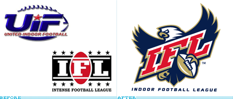
If 100 yards feels like too many or being subjected to the whims of nature is not your thing, then indoor football might just be what you need, and there is a new league waiting to fulfill your full-field-length passes: The Indoor Football League (IFL). Created from a merger of two existing leagues, United Indoor Football and (the awesomely named) Intense Football League, IFL will bring together the teams from each league for next year’s season.

Wordmark sans eagle.
The former logos definitely felt second rate and rather unexciting. The new logo at least conforms to first-rate sports logo standards: Mean animal, beveled typography and strokes, lots of strokes. This, of course, does not make it a good logo and by first-rate standards this one falls at the bottom of the pile. Everything that could be wrongly depicted on the eagle is: Wings are too short, the claws grasping the ball are awkward and, poor eagle, appears to have lost his eyeballs. The lettering is nothing we haven’t seen before and there is an odd relationship between the width of stems and the height of the serifs that makes it look stretched. The nudges in the top junctions of each letter are kind of cool, but that’s about it. The football is overly shiny and at an odd perspective, judging from the laces.
So, while it’s an improvement from the previous logos and a more authoritative look, the result is too standard and not well executed. But at least the eagle won’t get soaked indoors if it rains.


Thanks to Drew Davies for the tip.

Jump to Most Recent Comment
Aaron Riddle’s comment is:
I agree with the comments. The Eagle looks like a little baby.
On Aug.11.2008 at 09:24 AM
darrel’s comment is:
Seems to adhere to the pro sports formula of '3 colors + fat line drawing of an animal + slab serif'.
As for the biological errors in the illustration, let's not forget that this is an INDOOR eagle. Not the typical outdoor one. So, uh...yea, it evolved differently.
On Aug.11.2008 at 09:35 AM
john.q’s comment is:
looks nice for a sports logo.
very obese eagle however, needs to spend some more time outside
On Aug.11.2008 at 09:51 AM
Nick Irwin’s comment is:
little overwhelming but it is a sports logo so I guess it serves that purpose
they couldn't put a dot in the eye of the eagle...does it have to look so "intense" or possessed
On Aug.11.2008 at 10:14 AM
Tony’s comment is:
But a dot for an eye might be construed as the eagle doping or something...
I like the consistency of the placement of the football in the eagle and wordmark logos.
On Aug.11.2008 at 10:44 AM
Arnold P’s comment is:
The eagle is fat and "cute" indeed. (very bad drawing) But the logo in general feels good. I just wish they tried a little harder.
On Aug.11.2008 at 10:46 AM
Darrin Crescenzi’s comment is:
It's a parrot!
On Aug.11.2008 at 11:25 AM
Daniel Campos’s comment is:
I liked!
On Aug.11.2008 at 11:32 AM
Bob’s comment is:
I have to say that some of these comments could be summed up as "I don't like American sports logos..." The type does suck ass, but I think the width of the eagle is fine. Let's remember that this is a graphic and as designers we often appreciate graphic symbols in their simplest forms rather than true-to-life renderings. That is not to say that this eagle is simple nor elegant, I just think harping on the eagles wingspan is needless since the increase in width would make for an imbalanced logo. I would also never give the demon eagle an eyeball, and I think he should be allowed to rip out yours with his talons for suggesting such a ridiculous thing.
Overall, I would say that American sports need to go back to sweet type logos (a.k.a. Yankees look). And why don't cities adopt color schemes and forced their teams to adopt city colors, like European cities do? Pittsburgh seems to get it... Boston should just be green... and everything in Wisconsin should have cheese logos.
On Aug.11.2008 at 11:36 AM
Mark’s comment is:
ooh how intimidating!!!...not.
what kind of name is indoor football league anyhow, sounds kind of wimpy.
On Aug.11.2008 at 12:30 PM
Davekos’s comment is:
should a sport logo always be like that? breakthru is needed.
On Aug.11.2008 at 12:48 PM
Peter Whitley’s comment is:
I think the INTENSE FOOTBALL LEAGUE logo had more going on. Black and red (representing pain and suffering, respectively)...add a copious quantity of stars (representing ambulances)...intense indeed. Extremely intense.
Makes the angry parakeet logo look benign.
But whatever. It all works fine for what seems to me to ultimately be a failed premise. I have some ideas that can make it worthwhile (if only they'd listen):
• Topless referees
• Each quarter represents a season (heat, snow, wind, water)
• Trampoline turf
• Spectators encouraged to participate
• Ball explodes when it hits ground
• Helmet cams
• Topless referees (too important to only list once)

Chris Herron’s comment is:
Big improvement over the previous two logos. I just wish the angle of the Italic letters didn't fight the eagle's angle of attack. Maybe the eagle needed to be facing the right?
On Aug.11.2008 at 01:00 PM
Mingshi’s comment is:
B.O.R.I.N.G...!
Can't they come up with a different style using new elements?
Their image lacks individuality anyway. Replace the initials and you can have another league or team. How lazy.
Gotta do more research on sports logo before designing... For a start I suggest looking at the football/soccer leagues in Europe.
On Aug.11.2008 at 01:05 PM
BJN’s comment is:
There's not enough room indoors for an adult eagle to fly, hence the "eaglet". If they wanted to position indoor football as the baby brother to the real thing, they succeeded.
Good luck to the embroiders with all of those strokes...
On Aug.11.2008 at 01:25 PM
Mark’s comment is:
This logo makes it looks like it's a minor league association, but if you look it up it's actually a professional league, sure it's not the NFL BUT it's not a small league either, I'm hoping this logo doesn't cause to much confusion.
On Aug.11.2008 at 01:50 PM
darrel’s comment is:
"I have to say that some of these comments could be summed up as "I don't like American sports logos...""
Or rather that the genre has become rather derivative and almost cliche over the past decade. The cookie cutter formula, while making for some consistently well rendered logos, isn't really producing much in the way of interest.
On Aug.11.2008 at 01:57 PM
koyo’s comment is:
Typically North American.
On Aug.11.2008 at 02:11 PM
dg3’s comment is:
As for the biological errors in the illustration, let's not forget that this is an INDOOR eagle. Not the typical outdoor one. So, uh...yea, it evolved differently.
LOL!
As to the logo, I like it! Blows away their older versions.
On Aug.11.2008 at 03:21 PM
MattT’s comment is:
Using the eagle is a mistake. The use of a mascot implies the logo represents a specific team, and not the league overall. They should go with just the wordmark as the league logo.
On Aug.11.2008 at 03:31 PM
madeo’s comment is:
We should remember that this logo should be representing the whole LEAGUE, not a team. In that context, this logo missed the mark entirely. This eagle, type treatment can be applied to almost any sport TEAM. How can this logo successfully coexist on the same application with a IFL team logo and mascot? Imagine this eagle with another mascot on the same jersey. There's nothing unique, or memorable about this logo. who designed this? i'm guessing Logoworks?
http://www.underconsideration.com/speakup/archives/005099.html
On Aug.11.2008 at 03:36 PM
dg3’s comment is:
The IFL treatment by itself (sans bird) is what I think looks better than the other two original logos. I agree that the eagle version could be applied to any team that has one as their mascot, and thus, does not work as a league logo.
On Aug.11.2008 at 08:11 PM
Matheus’s comment is:
I can't understand why amaricans call this sport football. England created the football, and it's not soccer. Also, the real name for it is Rugby. With armors.
On Aug.11.2008 at 08:16 PM
dg3’s comment is:
I can see how American football seems lame for those in other countries. It popularity probably has more to do with marketing than with anything else.
Look how stupid Nascar is, yet it draws large numbers of people to see cars turning left at high speed. It's all about marketing.
On Aug.11.2008 at 08:33 PM
Matheus’s comment is:
Yes, dg3's. I think that for the rest of the world, it's quite strange the American's sports. It seems that USA it's more self-centred then other countrys. The major sports event on Europe is Uefa Champions League, watched all over the world, while in America, it's NFL. You can go deep in africa and the people will know who is Barcelona or Manchester United, but, nobody has ever heard of NY Giants or Dallas Cowboys
On Aug.11.2008 at 11:06 PM
dg3’s comment is:
And isn't it ironic that the so-called "World Series" only includes American teams.
On Aug.12.2008 at 12:01 AM
Amanda’s comment is:
It definitely does the job, I think it is a huge upgrade from the previous logos.
On Aug.12.2008 at 08:16 AM
john’s comment is:
any idea who did this?
On Aug.12.2008 at 09:06 AM
jRod’s comment is:
I don't know if this was mentioned before, but I like how they crammed the football in between the F and L to fill in the gorge that was left there from over-stretching the font. And the first thing i noticed was that the football had an unnecessary highlight on it that makes it look like a gold "plated" plastic trophy.
On Aug.12.2008 at 10:55 AM
Hamish's’s comment is:
Look I think the logo is cliche and boring- it looks like any other american sports logo.
However this indoor football sounds sick. I play Aussie Rules Football how can I get involved in this shit?
On Aug.12.2008 at 01:06 PM
Bob’s comment is:
I think MattT’s comments are most appropriate:
"Using the eagle is a mistake. The use of a mascot implies the logo represents a specific team, and not the league overall. They should go with just the wordmark as the league logo."
And also, English invented "futbol" being better than American football - in any way shape or form - is just pathetic. Remember, the US went to war with England... TWICE... and won. Let's not turn the comparison of sports into a futile pissing contest... our PPs are just plain bigger in the US.
Also, Americans aren't egotistical... we're just better.
On Aug.13.2008 at 11:05 AM
Char’s comment is:
Like I recently posted in another entry. Someone needs to make a sports logo that doesn't look so standardized and generic. I can find 100 sports logo and put it right next to this.
Honestly, I am myself trying to find ways to innovate. It's not an easy task, but it's not impossible... I'll tell you that for sure.

Ger’s comment is:
If Bob says that Americans aren´t egotisticals why they take the name of ALL the Continent....
On Aug.13.2008 at 11:27 AM
Bob’s comment is:
We (Americans) are jackasses, Ger... I realize. This logo sucks... I realize this, too. I think the problem is that sports logos are trying to be intimidating by putting cartoon characters with no pupils smack in the middle. We need to think of more elemental symbols - the All Blacks for example... nothing makes you want to poop your pants more than seeing the Haka performed before by Māoris dressed in all black. Sports need a more creative brand strategy than "I dunno, put a fucking pissed off eagle on the front. That should work."
On Aug.15.2008 at 03:51 PM
KJtheGreat’s comment is:
I agree with Bob (except on the Jackass part): The Haka is crazy exciting but it wasn't started as a marketing ploy so that wouldn't really count. The Eagle looks blind and unintelligent, not bold and fierce like I'm sure it's supposed to be. But to end on a positive, they really don't have THAT much to change to make it worth while.
On Sep.05.2008 at 11:48 AM
Trey’s comment is:
Yeah why cant they get ideas from games like blitz the leauge 2 or something unless they want the logo to look all pee wee styled. I mean i could draw a better logo than that.
On Mar.04.2009 at 11:06 PM
Comments in Brand New, V1.0 have been closed.


