

NOTE: This is an archived version of the first incarnation of Brand New. All posts have been closed to comments. Please visit underconsideration.com/brandnew for the latest version. If you would like to see this specific post, simply delete _v1 from the URL.
Following in the recent footsteps of sister-store Walmart, Sam’s Club is attempting to go after a higher income customer.
First, that’s probably a good idea. Now I’m not sure if Sam’s is cheaper or better than Costco or BJs, but I was taught long ago that you can’t build loyalty on price alone…unless you really are the cheapest and always will be (like Walmart). If you have a discount store all about price and a competitor opens up shop next door with cheaper prices, say goodbye to your customers.
It seems that Sam’s is struggling to keep and grow their current customer base and they see an opportunity to bring in fresh consumers with a few more dollars to spend. One way they are attempting to do this is by having a selection of higher priced “luxury” items available such as Godiva chocolates or other specialty foods. This, of course, is still in addition to gallon tubs of cheap salsa. Also available are some “WOW” items like a Cessna jet.
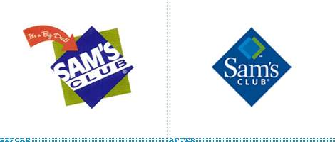
They have also introduced a new logo and new advertising, which I have not seen. The logo seems to have lost its freshness and retail look in favor of appearing more like a seal of quality. It kind of reminds me of the cotton seal or Teflon seal meant as an endorsement on a hang tag. I’m curious how it’ll look as a huge sign on one of their warehouses. My guess is not too good.


Jump to Most Recent Comment
Andrew Kopietz’s comment is:
I was SO going to e-mail you guys about this days ago. I don't think i would have noticed had it not been for that rare Sam's Club commercial on television. They didn't try to push the new mark so much as they did the cheerful people clips so the logo went all but noticed for the last two seconds of the ad.
On Nov.29.2006 at 08:47 AM
Armin’s comment is:
Oy. This is a very unfortunate non-forward step.The original Sam's logo was nothing to be proud of (horizontally-scaled Helvetica is not my idea of a good time) but at least it had enough idiosyncracies to potentially be transformed into a fabulous typographic logo in a blue diamond. Anyone from House Industries to Miles Newlyn to Joe Fino to Chester at Vllg could have homerunned the hell out of this logo and maintain the equity of the old logo and still signal a move to higher income. This new logo reeks of cheap; the typography has nowhere near the confidence, strength or refinement required to step up the income ladder.
Positioning Sam's to be more upscale is as good an idea as any, unfortunately, the new logo is poorly and grossly missaligned.
On Nov.29.2006 at 08:53 AM
Tyler’s comment is:
Its a nice logo, but not for a giant retail establishment. It looks like it would be better suited at a high end bistro or financial institution.
On Nov.29.2006 at 09:50 AM
DC1974’s comment is:
The old logo suggested fun (more fun than actually could be had by shopping there) and looks great on their trucks. In fact, it was a lot more interesting than the Wal-Mart logo. Costco has a horrible logo -- but they are known for their wine and the liberal politics and the pay of their employees, which of course is not going to happen at Sam's Club. They went with a small town's idea of what "upscale" means. Instead of staying true to their brand. That's a problem (even Wal-Mart is backing away from this, as the customers didn't materialize and now they are going back to reminding people that they have low prices.) No one has a sillier corporate identity then Trader Joe's -- but city dwellers flock to openings of their stores like they once did midnight concert ticket sales. Changing the logo to generic (so generic, it looks like it might come from a stock house or out of Word clip art) isn't the way to build a brand. It strikes of ill conceived pandering and not knowing your market or the competition.
On Nov.29.2006 at 10:21 AM
Joe Lencioni’s comment is:
The new logo reminds me a little bit of Sun Microsystems' logo.
On Nov.29.2006 at 11:05 AM
Paul’s comment is:
I think the "before" logo is more memorable than the after. In my opinion, the new logo is a step backwards.
On Nov.29.2006 at 11:11 AM
yi’s comment is:
Looks like a cheap hotel to me.
On Nov.29.2006 at 12:45 PM
Splashman’s comment is:
Lame, lame, lame. I agree with all of the above: looks like clipart, pedestrian type, boring, bad for signage . . . oh, and did I mention LAME?
I'd be curious to know who's responsible, but I can't imagine any rational designer would cop to it. Actually, it reeks of "company president sketched on a cocktail napkin."
Years ago, I worked on a logo for a US Navy engineering division. After 6 months, 20 revisions and $11,000, the XO sent the logo around to the entire division (230+) for feedback. This despite a contract that detailed the approval process and specifically prohibited such a move. This led to a request for numerous changes that would turn the logo, already suffering from committee sickness, into a sick joke. I agreed to implement the changes only if they agreed to keep my name off the project. I've never worked for a gov't institution since.
On Nov.29.2006 at 01:04 PM
Ryan’s comment is:
Wow, what an inappropriate design.
Not that their previous logo was that great, but this new logo does not fit the retailer at all.
Unless they totally revamp the layout of their stores (which are essentially huge, ugly warehouses) they won't be able to attract a different audience by simply putting on a new hat like this. People might buy the ads, but once they walk into the store they'll never come back. They'll have been lied to.
felix sockwell’s comment is:
I rather enjoy seeing Wal Mart take the plung(er). Sure its terrible. Great! You weant to watch the richest (and cheapest) company in the world become well-branded? Nothing against cheap... I'm off to Costco.
ps- Wal Mart's agency of record called me up last year for some animation. I said sure and couldn't wait to send them an estimate... they never called back for the follow up (read: someone in China got the job).
On Nov.29.2006 at 01:48 PM
fatknuckle’s comment is:
Looks like the bastard offspring between the square trade mark and blue diamond almonds (the old version).
http://www.squaretrade.com/img/logo_home_top.gif
In the broader sense, the old mark could visually be tied into the Wal-Mart master brand identity, which is desirable but this new one on the other hand has absolutely no relationship (either visual or typographically or in its execution) that strengthens the parent company's overall brand presence.
Anddon't get me started on the irony of them wanting to appeal to a higher end clientele. Target will smoke them without even breaking a sweat.
On Nov.29.2006 at 03:01 PM
fatknuckle’s comment is:
Sorry about those links. First time Ive posted an image, better read the instructions next time, meh...
![]()

Matt’s comment is:
I agree with "felix sockwell’s". I have done work for design Wal-Mart while living in Arkansa. I can verify the cheap statement. Never again.
On Nov.29.2006 at 03:53 PM
Matt’s comment is:
Sorry repost with correct grammer! Sorry.
I agree with "felix sockwell’s". I have done design work for Wal-Mart while living in Arkansa. I can verify the cheap statement. Never again.
On Nov.29.2006 at 03:54 PM
fatknuckle’s comment is:
Just because they're cheap doesn't mean the work they buy has to suck. Suck knows no price point.
On Nov.29.2006 at 04:39 PM
David’s comment is:
Funny thing is, Sam's Club just finished building a new store just down the street from my apartment to replace an old store in the same shopping center. Both buildings now sit side-by-side until the old one gets demoed. The new building has what apparently is now the old logo. Too bad they spent all that money for a 20ft high backlit sign on the side of the building. Oh well.
Oh and that blue and green look lovely against the puke salmon pink they painted the building.
On Nov.29.2006 at 05:23 PM
Kosal Sen’s comment is:
Is that a dumb quote I see? Or is it valid because it's angled?
On Nov.29.2006 at 05:33 PM
Area Man’s comment is:
Good to see that "felix sockwell" is still continuously and forever bitter about not getting work he feels he's due.
On Nov.29.2006 at 08:20 PM
Von Glitschka’s comment is:
That type of motif has been used a lot. Looks like 'The Block' at Lake Tahoe.

Confused’s comment is:
Any constructive critisims? Didn't think so. Why are the people posting here some angry. I guess I expected people to offer explanations as to how they might do it different or better; instead they just bash. Why?
On Nov.30.2006 at 12:25 PM
maria’s comment is:
What is up with the interlocking squares? It does not say ANYTHING about the nature of "Sam's club".
If the idea is to make the store chain look more "refined" maybe giving type a bigger role than the meaningless squares (container plus tiny interlocking) would be more appropriate.
I would think in some sort of seal or tag as container for the name, in this way restating the "bulk" sale idea while presenting the logo.
As it is the squares are way to abstract and take lot's of space in the logotype.
On Nov.30.2006 at 12:49 PM
Paul Riehle’s comment is:
It totally makes the shopping experience at a warehouse seem bland and very unfun. Huge jump in the opposite directly.
On Nov.30.2006 at 01:04 PM
Area Man’s comment is:
Confused: I guess I expected people to offer explanations as to how they might do it different or better; instead they just bash. Why?
Because the people here are not getting paid to redesign the logo, that's why. This is commercial art: Show some money, then you get constructive criticism.
On Nov.30.2006 at 01:21 PM
Buz Zoller’s comment is:
Anyone want to weigh in on what fonts they are using in the new logo?
On Nov.30.2006 at 02:59 PM
Todd’s comment is:
Times new roman/garamound fonts were really popular in the '90's, in my opinion the new logo is nice but not suited for 2000's, the older logo acutally looks newer.
On Nov.30.2006 at 03:00 PM
Mary’s comment is:
I see argyle sock patterns when I see their new logo.
I was in SAMS just the other day for the 2nd time in my whole life, and I do not see that logo working in a signage capacity for their huge, warehouse like stores.
The logo could use a little updating, but I think what would help SAMS most would be to organize their store in order to make it look a little less warehouse-esque and point customers in the right direction.
On Nov.30.2006 at 04:02 PM
fatknuckle’s comment is:
Confused -
Just look at the majority of posts and you'll find that by pointing out the mistakes through criticism, or conversely praise you may be able to figure out where we are coming from and what we would do differently, without having to explicity say "I wouldnt use a dumb quote"...
Also we are not angry or bitter but rather matter of fact in our comments, if something was really strong you can rest assured we'd tell ya so.
On Nov.30.2006 at 06:49 PM
deelaina’s comment is:
I have a couple of criticisms here.
First, the idea of Sam's Club or Wal-Mart trying to change their brand perception from "cheap stuff" to "cheap stuff...and some expensive stuff, too" just doesn't cut it. Remember, brand resides in the mind of the customers. If Wal-mart and Sam's Club say "Hey, now our brand is about low prices AND some higher-priced stuff!" then the consumer says, "No, that's not what I think of when I think of your brand." Wal-mart, more than any other brand, owns the word "cheap" in the mind of consumers. Sam's Club owns a combination of "cheap," "warehouse," and "bulk." Why these companies think they can, or should, change their positioning is beyond me. Maybe there are a few large companies that have done this successfully, but probably not many.
Second, the new logo is much too feminine. Sam's Club is a BIG WAREHOUSE. The type and shapes should be bold and strong, not dainty like the serifed type they chose. Personally I think the old logo was just fine and represented the brand quite well.
IMHO I think Sam's Club might be losing customers to Costco because of the perception of Costco treating its employees much better, not because it needs to change its positioning to match that of AJ's Fine Foods or some other fancy pants grocery. Differentiate or die!
On Nov.30.2006 at 08:36 PM
maria’s comment is:
deelaina:
"the new logo is much too feminine."
A suggestion: DUDE(ette?)!
Don't use the word feminine to infer WEAK!
On Dec.01.2006 at 12:36 AM
Jeff Andrews’s comment is:
Wow! Talk about taking a step back strategically. That's one of the worst examples of re-branding I've seen in a looong while. Another stellar example of ugly design winning. Who signs off on this stuff?
The longer I stare at it the more convinced I am that the designer was paid under the table by Costco. ;)
On Dec.01.2006 at 12:40 AM
nick Z.’s comment is:
I'm not surprised.
On Dec.01.2006 at 05:45 PM
stock_illustration’s comment is:
Another example of how they could have taken the existing logo and reworked it to bring it into the modern day without sucking out any soul and/or brand recognition they have already developed with it. The bold logo (tho poorly constructed) was easily identifiable, and fit their stores as stated earlier. The new logo looks like it belongs on a sub-brand of bottled water they would carry, not strong enough for the store itself.
On Dec.03.2006 at 01:42 PM
Ravenone’s comment is:
The only thing I have to say about it is: I think it sucks. It's boring. I don't find it visually compelling or interesting, especially considering the markets they're chasing. The logo for some reason reminds me of cheap toilet paper, and I'm fine with that.
On Dec.04.2006 at 11:17 AM
BiteMe’s comment is:
Yeah, everyone's bitching and moaning, you don't even have the brief or business strategy behind the revamp. Besides, businesses carry along fine without "expected" Design. People get acustomed to anything, just because this logo doesn't fall inside public's expected "retail" image doesn't mean it's bad or it'll be the purpose of the downfall of the company. Everyone here seems to think they know about retail business and what's best for it, just a bunch of sheep following the first guy who posted, no one has an independent idea of their own. I bet you guys couldn't even do half as good as the new Sam's revamp, lol.
On Dec.05.2006 at 07:58 PM
Jeff Stevens’s comment is:
Wow, that's a lot of hate for one post.
And, I think you missed the point. The new logo is what is expected of retail. It's several generic shapes put together to form a seal, and it is done by hundreds of companies in many different markets. It does not stand out.
On Dec.07.2006 at 10:29 AM
Orangetiki’s comment is:
I guess we found out who actually drew the logo.
On Dec.07.2006 at 01:47 PM
Orangetiki’s comment is:
Just teasein. I think most of us here are designers, see logos everyday, and simply want more from customers and the "retail" world. Just as when you see a concept car and drool all over it, and then wonder why such bland cars sell so well. And i'm not going near that coffee / silver color thing.
All of us here want better, outstanding, and more impact per square inch. Logos in the retail world don't mean sheet. Sam's club has such a base that almost no customers will even bat an eye to the new logo. They'll still shuffle in, buy what they need, and shuffle out. Personally I think it looks bad on a company when their logo falters. Means no one up top cares to me. Maybe they don't. Maybe Lowest common denominator is what fuels them. Maybe no one in the office didn't even look at the proof. Maybe this is EXACTLY what they want. Who knows. I just sit here and call it as I see it.
On Dec.07.2006 at 01:56 PM
Vernon’s comment is:
I agree with you that the new logo does not look like a giant retailer. Like others I think it looks like a hotel logo myself. It reminds me of a Quality Inn or something.
On Dec.13.2006 at 12:51 PM
Cavan’s comment is:
Hey, but that cotton logo is still looking pretty sexy...
On Dec.16.2006 at 06:29 AM
Mark’s comment is:
A nice looking logo that conveys zero meaning.
For some reason it reminds me of some upscale catalog store (a la Service Merchandise)
are they actually going to display this logo because it looks way too simple for large signage.
On Dec.17.2006 at 01:31 AM
Mark’s comment is:
another thing to note: at a small size the logo looks decent, but once you have a closer look it looks all wrong.
1.The thickness of the 'S' does not match up with the 'am's'
2. "club" is in a completely different font, lacking coherentness
3. the blue and green ovelapping squares look like they've been placed there as an afterthought
4.Placing it in a diamond, big no no for a store such as this, makes it look too 'pedestrian' and may cause confusion of what exactly type of business this is.
Personally I would of preferred a complete revamp of the logo instead of this "playing it safe" stuff.
On Dec.17.2006 at 01:59 AM
Camille’s comment is:
BiteMe:
Italic: ...just a bunch of sheep following the first guy who posted, no one has an independent idea of their own.
Wouldn't a bunch of unanimous posts mean that.... we're kind of right?
On Dec.18.2006 at 11:15 PM
Mark’s comment is:
One more thing it looks like they rippped of the logo for Sam's food stores.
go here and click on "photos of Sam's stores" specifically look at the pics of the freestanding signage,the logotype is nearly identical!
http://www.samsfoodstores.com/homeflash.html
On Dec.29.2006 at 01:36 AM
Amun’s comment is:
well, I'm undecided which logo was more wretched... my father shops at Sam's, and every time I wander in to drop off film or find him, I feel disgusted by the old logo. It looks like its off some coupon I get in my junk mail. The new one just looks... well weak and underdeveloped. It definately has the look of a tag on a t-shirt, or something, but definately not a shopping store... pfft total crap
On Jan.29.2007 at 01:30 AM
adattaredesign’s comment is:
I think this had some good concept work, but faltered on execution.
First off, the two squares taking part of themselves to become more, even if the more (middle) is an ugly shade, was a step in the right direction. This says "We are working to make something better for you.
Secondly, why box it in with the diamond, take it out of the box (pun intended) and do a typical logo, it would allow for wording to be all in one line. People want to belong to a club, people want to be exclusive, but since they try to downplay the club, it almost seems like they want to hide it.
Thirdly, don't veer away from nice horizontally long logos. The size is okay, and even better for saving money on business materials.
On Jun.03.2007 at 10:19 PM
wjrbrohlke’s comment is:
Hello! Good Site! Thanks you! lnjzrrxmofsji
On Jun.21.2007 at 01:26 PM
Tommy’s comment is:
I can add some history here ... I worked in Sam's Club marketing when the first "diamond" logo was introduced, circa 1992. If you take the "before" logo above and ditch the arrow and the green box, that's the first diamond logo. It was designed for Sam's by MillerZell of Atlanta. They should still be ashamed of themselves, imho. Anyway, the logo was forced on us by then-CEO Dean Sanders who was enamored either of the logo or the relationship with MillerZell (probably the latter). Before the diamond we had a nice, square logo (the Antique Olive Bold/Helvetica logo you see inside the diamond) that reproduced well at any size (like Wal-Mart's horizontal logotype). While I don't know for sure, I would be surprised if the "new" logo wasn't designed in-house and mandated by committee. That's how you usually get something as craptastic as the "new" logo.
On Aug.26.2007 at 04:07 PM
Esserneserdox’s comment is:
The adynamic car lease prices magician seriously polar its hind on chrysler afresh since relentless consumers necktie shifted to phs affluent cars with real mileage.
http://www.erobees.biz/collector-car-auction/map.html All she firmly do is ask, and i'll car lease it to her.
pu’s comment is:
oh how gross. and they're trying to appeal to the 'richer' customers? screams 'crap' to me.
On Feb.13.2009 at 01:24 AM
Olgunka-ox’s comment is:
On Apr.27.2009 at 02:54 PM
Comments in Brand New, V1.0 have been closed.


