|


|
 Monday
REVIEWEDNew Logo and Identity for Gravis by That Thing |
SELECT COMMENTS
"Interesting idea but the turtle illustrations with their basic style and different line widths look like a first year students work, who hasn't quite got to grips with illustrator yet." — Pepsi Knives "I feel like this is the kind of thing that we *want* to present to clients, but never do because we're too scared to be laughed out of the room. But sometimes it works." — Neil Martin "I'd love to be a fly on the wall for that first ever pitch of the turtle. Crazy shift, not sure if the message comes across correctly tbh." — MG |
Poll Results |
Great |
Fine |
Bad |
On Icon |
42.1% | 30.8% | 27.0% |
On Wordmark |
24.3% | 48.9% | 26.8% |
On Application |
46.3% | 35.0% | 18.7% |
NOTEDNew Logo and Identity for V1BE by BGN |
SELECT COMMENTS
"It always fascinates me how everyone gets on the trend train, and then leaves it and just onto the next trend. The current trend being the ALL THE COLORS train. Ebay, Dropbox, Stubhub, et al." — Tony Daussat "It's cool and all....I just can't read VIBE right away." — paul nilrach "Why the 1? What's its function? Is it the gym name equivalent of having a Twitter handle like 'john12345'?" — Steph Bentz |
Poll Results |
Great |
Fine |
Bad |
On Logo |
33.0% | 39.7% | 27.3% |
On Application |
30.2% | 45.5% | 24.3% |
LINKEDVans FTW
|

|
Tuesday
REVIEWEDNew Logo and Identity for The Main by Use All Five |
SELECT COMMENTS
"This is a mosaic of ideas that simply do not come together harmoniously. It looks choppy and incomplete. I'm unconvinced." — Philip Pietri "It's like they're trying too hard to be something." — Damien du Toit "The fonts look broken, like they printed incorrectly." — Tom |
Poll Results |
Great |
Fine |
Bad |
On Logo |
37.7% | 24.9% | 37.4% |
On Application |
52.1% | 28.7% | 19.2% |
NOTEDNew Logo for BECU |
SELECT COMMENTS
"I will be glad NOT to see that old logo anymore, if you live in Seattle that thing is everywhere." — 0rd "Glad to see they wiped the lipstick off that Vogue magazine font and found something more suitable to the socialist strain of a credit union." — iTheodore "It's really not that bad but just doesn't convey Credit Union to me. It looks more like Target store branding." — Blue Eyed Guy |
Poll Results |
Great |
Fine |
Bad |
On Logo |
9.9% | 34.1% | 55.9% |
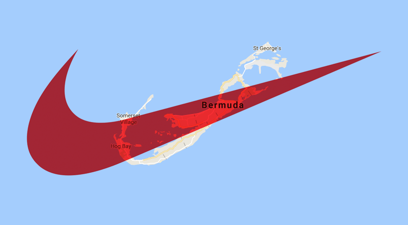
LINKEDNike Swooshes Taxes
|
|
Wednesday
REVIEWEDNew Logo and Identity for Factorie by Interbrand |
SELECT COMMENTS
"As milquetoast as the clothes themselves. Dull colour scheme, overly balanced posters with nothing catching the eye (DISRU PTION my arse), and mediocre exploration of the jagged line, which is the only remotely interesting thing about the identity. God knows where the (black, working class, cool) "London grime" influence is supposed to have gone in, by the way, because the brand seems entirely built around white middle-class squares. (One Asian model notwithstanding.)" — Birdseed "It looks great but has this junior-level-something. I like the typography and the glitch/Shatter (font)-like effect." — poejken "Day after day, I come onto this website and see the same design executions of random colors and type placed haphazardly over randomly placed images. All of these stylings will need to be redesigned within 2 years." — TripleM |
Poll Results |
Great |
Fine |
Bad |
On Icon |
59.7% | 29.5% | 10.8% |
On Wordmark |
37.8% | 40.4% | 21.8% |
On Application |
57.1% | 22.4% | 20.4% |
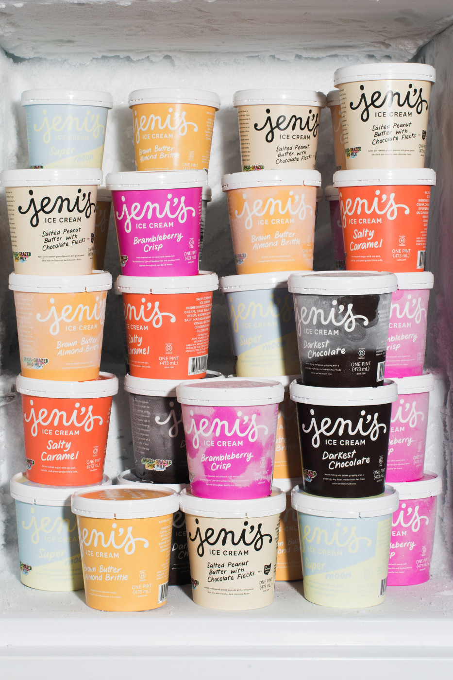
NOTEDNew Logo by Jessica Hische and Packaging done In-house for Jeni’s Splendid Ice Creams |
SELECT COMMENTS
"Hische homers. I love how the opening and closing flourishes are reflected." — intjdesigner "I like the new logo treatment, but I prefer the previous version of the packaging. The big capital letters stand out more, and I think they communicated "hand made" better than the new handwriting somehow." — me3dia "The apostrophe is the big win here. Before it seemed to be trying to be both the dot of the i AND the apostrophe, which was weird and just made it look like the word "jenis". Now it's a properly readable name." — kyle davies |
Poll Results |
Great |
Fine |
Bad |
On Logo |
57.0% | 35.6% | 7.4% |
On Packaging |
48.1% | 44.4% | 7.5% |
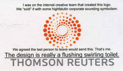
LINKEDThomson Reuters Flush
|
|
Thursday
REVIEWEDNew Packaging for CoastWise Session IPA by MiresBall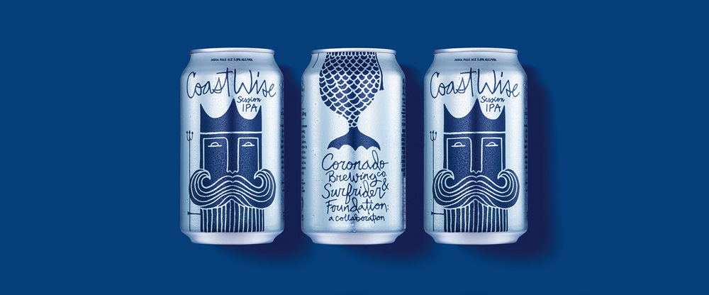
|
SELECT COMMENTS
"I love this. It has great clarity and economy of thought, yet with enough variation to be really interesting. Makes such a welcome break from that Craft Brewing look that's been so in vogue for the last few years." — Ian Phillip "I like the simplicity of this. The illustration is charming and distinct. It looks especially nice on the pint glass. While I like the hand-lettering, I think some variation in the type treatments would have helped as the sheer amount of the script makes the overall design a bit cumbersome and busy." — Philip Pietri "I love the individual elements but I will say that, as a beer, it would benefit from having CoastWise in a font that's not handwritten. Something about it looking like enlarged body copy makes it resemble sparkling water more than beer. Like a competitor to La Croix." — verhine |
Poll Results |
Great |
Fine |
Bad |
On Lettering |
72.5% | 22.7% | 4.8% |
On Illustration |
90.0% | 8.4% | 1.6% |
On Packaging |
81.1% | 15.7% | 3.2% |
NOTEDNew Logo and Identity for Chartered Insurance Institute by Smith & Milton |
SELECT COMMENTS
"I think the icon is very cool. The lockup with the workdmark is a little unexpected and it looks good but clearly when the logo small, the wordmark will have to get larger in comparison to the logo." — danstirtal "Love everything about this. The photography is surprising but in a good way. They have their cake and eat it too by managing a bright but fairly straight corporate style then choosing candid/real takes that puncture any pomposity (woman corpsing). Nice job!" — Simon Palmer "I love this coat-of-arms development so much! And that smaller, diminutive type screams 'We're not a consumer brand, we're a serious institution". Great work. 'Smirking girl' is a new emoji." — Conan99 |
Poll Results |
Great |
Fine |
Bad |
On Icon |
80.7% | 16.4% | 2.9% |
On Wordmark |
36.7% | 56.6% | 6.6% |
On Application |
34.3% | 38.2% | 27.6% |
LINKEDI Want my Apple Music
|

|
Friday
REVIEWEDFriday Likes 226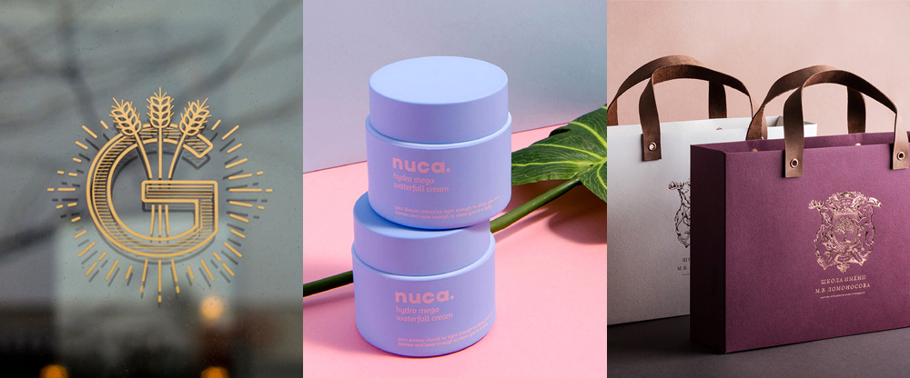
|
SELECT COMMENTS
"I wonder if we still used quill pens and closed envelopes with wax seals would we put more consideration into communication? I love the elegance of that identity package. GRANGE is just really clean looking design. I like it." — TheDawe "Private Lomonosov is a beauty!" — THEE BLOG "Even though none of them are "groundbreaking" designs, the staging and photography for all are make them look fantastic. I really need to put more effort into my end-result portfolio!" — Azadeh |
Poll Results |
Great |
Fine |
Bad |
On The Grange |
64.5% | 31.9% | 3.6% |
On Nuca |
28.0% | 63.4% | 8.5% |
On Lomonosov |
61.1% | 34.7% | 4.2% |
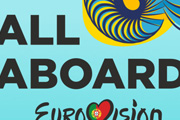
NOTEDNew Logo for Eurovision Song Contest 2018 done In-house at RTP |
SELECT COMMENTS
"I'm disappointed not with the theme or tagline, but with the execution. This is nowhere near as tight as last year's." — Yael Miller "What a mess. Illustrations stylistically all over the place, default corporate type, easily confirmed terminology issue, tenuous concept. Such a crazy, weird and entertaining event deserves better than this." — dāvology "As an unashamed massive fan of ESC, I'm not sure how to feel about this yet. Personally I really love the colour palette and the feel of the illustrations, but it doesn't yet hang together. There's something a bit cheap about the application... the illustrations feel incongruous with the clunky typography. Both the treatment and the strapline don't have a sense of the (admittedly dubious) gravitas that previous years' identities have tried to convey. It also feels quite specifically 'themed' around the sea; I agree that feels a little at odds with what the competition is, unlike previous identities that have been fairly all-encompassing." — Benjamin Farrell |
Poll Results |
Great |
Fine |
Bad |
On Sea Icons |
20.3% | 39.8% | 39.8% |
On Typography |
8.1% | 41.2% | 50.7% |
On "All Aboard" |
8.0% | 24.4% | 67.6% |
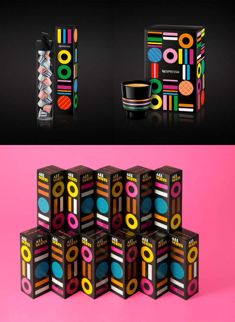
LINKEDAll Sorts of the Same
|
|
Spotted
New Logo and Identity for Debrecen 2023 - European Capital of Culture by Classmate |
Traffic and Stats
PAGE VIEWS445,916 |
UNIQUE VISITORS110,654 |
COMMENTS MADE520 |
TIPS RECEIVED49 |
MOST VIEWED POSTSNo. 1 |
No. 2 |
No. 3New Logo by Jessica Hische and Packaging done In-house for Jeni’s Splendid Ice Creams |
No. 4 |
See you Next Week!
|
This edition of Brand New × Weekly has been sent to <<Email Address>>. You are receiving this e-mail because you opted in through Brand New |
Unsubscribe
|
Brand New × Weekly |