Opinions on corporate and brand identity work. About
A division of UnderConsideration. Contact
AboutContact
adv @ underconsideration more info on this
Brand New encourages the practice of sketching, doodling, jotting, listing, scribbling or any other method for capturing fleeting ideas on paper for the purpose of designing great logos that can serve as the foundation for even greater and broader identities for corporate, cultural or educational institutions, consumer brands, non-profit organizations or the corner laundromat.
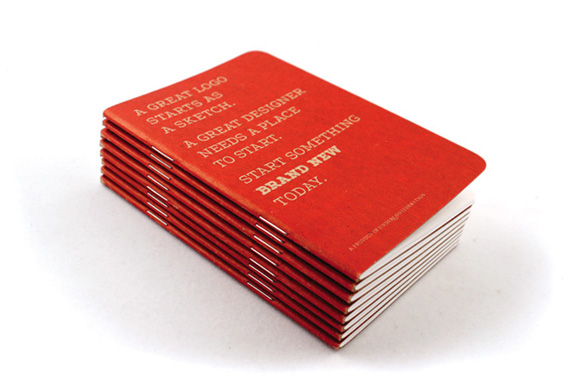
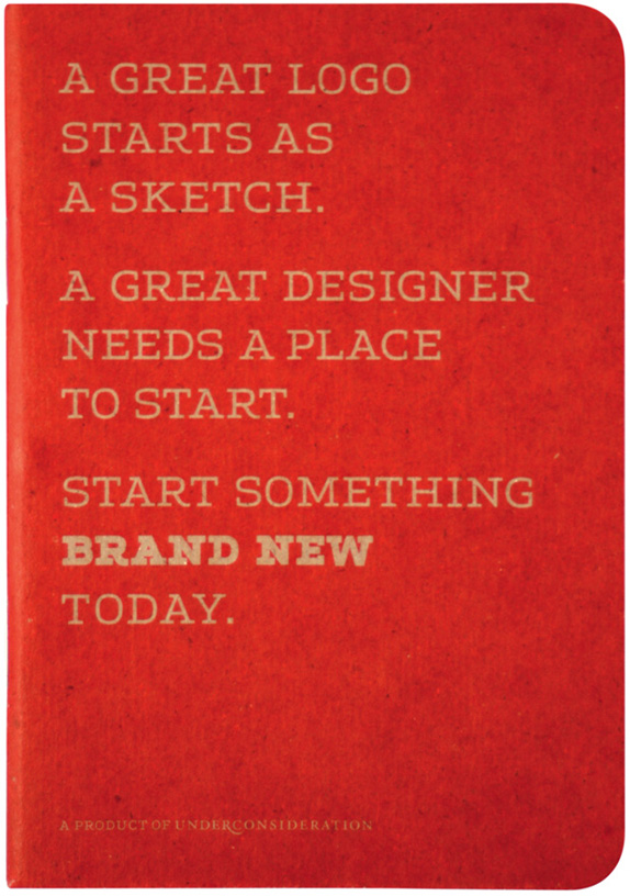
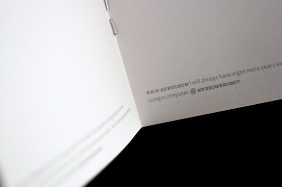
To make this practice, easier, more enjoyable and to remind you of how much you enjoy Brand New, we have put together this modest, pocket-sized sketchbook so that you can take it with you, because you never know when that great logo idea will come.
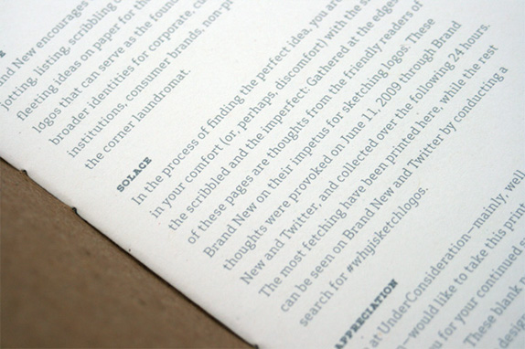
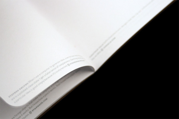
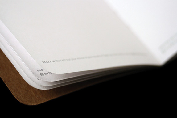
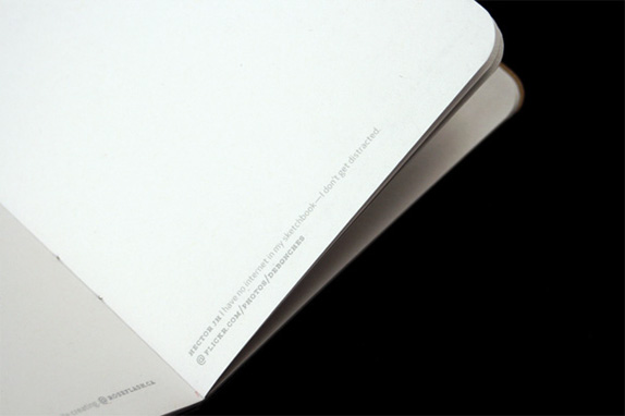
Gathered at the edges of these pages are thoughts from the friendly readers of Brand New on their impetus for sketching logos. These thoughts were provoked on June 11, 2009 through Brand New and Twitter, and collected over the following 24 hours. The most fetching have been printed here, while the rest can be seen on Brand New and Twitter by conducting a search for #whyisketchlogos — unfortunately Twitter does not store old Tweets, so the archive may be gone.
Sketchbook Details
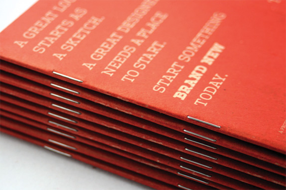
Sturdy chipboard cover
32 pages of 70 lb. text white paper
3.5 in. × 5 in.
30 quotes in tiny 5 pt. type
Printed by Pinball Publishing

A small sampling of the quotes in the sketchbook:
If you can’t see the idea in a single colour, wobbly line, then there’s not enough idea there yet. Toby Stokes @ pretty.co.uk
Because command-z stops the creative process. The beauty of a sketch is the imperfection that leads you to your next, even more brilliant, idea. Brian Lindstrom @ newbaric.com
Unfinished electronic designs look like clip art. Unfinished sketches look like an idea. Jonathan Gala @ jongala.com
Warning: include(/usr/www/users/shinymda/arm1n/underconsideration.com/brandnew/announcements.php): failed to open stream: No such file or directory in /usr/www/users/shinymda/arm1n/underconsideration.com/brandnew/sketchbook/index.php on line 827
Warning: include(): Failed opening '/usr/www/users/shinymda/arm1n/underconsideration.com/brandnew/announcements.php' for inclusion (include_path='.:/usr/local/lib/php') in /usr/www/users/shinymda/arm1n/underconsideration.com/brandnew/sketchbook/index.php on line 827


