
A B-Side BY Armin
Ms. Foundation for Women
About: (Est. 1973) “The Ms. Foundation for Women fights to eliminate barriers for every woman in the U.S. For 40 years, we have worked tirelessly to secure women’s rights and freedoms with a special commitment to building the power of low-income, immigrant and women of color. At our core, we are advocates giving a voice to women to elevate their most pressing issues. We’re continually investing funds, time, expertise and training in more than 100 trailblazing organizations nationwide to secure a better future for ourselves, our families and our communities.”
Design by: Sullivan.
Ed.’s Notes: Nice double use of the “M” as “W”. Bigger view of the logo and sample applications below (or after the jump).
Relevant links: N/A.
Continue reading this entry

DATE: Feb.28.2013 POSTED BY: Armin
 CATEGORY: Non-Profit The B-Side
  COMMENTS:


A B-Side BY Armin
WSJ Magazine

About: (Est. 2008) “WSJ Magazine features the business of luxury and discerning lifestyle content. It is relevant to the [Wall Street] Journal’s readers, who are the world’s most powerful and influential consumers. It acts as an escape and inspiration for their diverse and sophisticated lives. Reaching the largest number of affluent consumers globally, WSJ. Magazine is the World’s Largest Luxury Magazine.”
Design by: In-house.
Ed.’s Notes: Not as famous as the recently B-Sided T magazine but in the same magazine-inside-a-newspaper realm, here is the Wall Street Journal’s own redesign. Magazine covers below (or after the jump).
Relevant links: News story about the new direction of the magazine under the direction of Kristina O’Neill.
Continue reading this entry

DATE: Feb.27.2013 POSTED BY: Armin
 CATEGORY: Publishing The B-Side
  COMMENTS:


A B-Side BY Armin
EVS
About: (Est. 1994) “EVS provides its customers with reliable and innovative technology to enable the production of live, enriched video programming, allowing them to work more efficiently and boost their revenue streams. Its industry-leading broadcast and media production systems are used by broadcasters, production companies, post-production facilities, film studios, content owners and archive libraries around the globe. It spans four key markets — Sports, Entertainment, News and Media. The company is headquartered in Belgium and has offices in Europe, the Middle East, Asia Pacific, and North and Latin America. Approximately 475 EVS professionals from 20 offices are selling its branded products in over 100 countries, and provide customer support globally.”
Design by: N/A.
Ed.’s Notes: Not terribly exciting but way better than the previous vampire logo. Bigger view and needlessly long video below (or after the jump).
Relevant links: Semi press release.
Continue reading this entry

DATE: Feb.26.2013 POSTED BY: Armin
 CATEGORY: Technology The B-Side
  COMMENTS:


A B-Side BY Armin
Paris Saint-Germain FC
About: (Est. 1986) “Paris Saint-Germain Football Club, also known simply as Paris Saint-Germain and familiarly as Paris SG or PSG, is a professional association football club based in Paris, France. The club was founded on 12 August 1970, thanks to the merger of Paris FC and Stade Saint-Germain. PSG has been playing in the Ligue 1 since 1974, the current championship record, and is one of the most prestigious outfits in French football having won two League titles, eight French Cups, three League Cups and two Trophées des Champions.” (Source: Wikipedia)
Design by: Dragon Rouge
Ed.’s Notes: Meh (expressed with a French accent).
Relevant links: Press release. Dragon Rouge news with video
Select quote: “The city of light, which is an undisputed icon throughout the world, represents unparalleled leverage to propel Paris Saint-Germain up among the greatest global sporting brands. The new logo thus has the name ‘Paris’ clearly brought to the fore, with the Eiffel Tower at the heart of the logo. The base of the logo has the name ‘Saint Germain’ which continues to be associated with the brand, along with the fleur de lys emblem. The logo has a greater synthesis of ideas and a more immediate impact, and is now ideally placed to capture the imagination of football and sports fans around the world.”
Thanks to Plamen Jordanov for first tip.

DATE: Feb.25.2013 POSTED BY: Armin
 CATEGORY: Sports The B-Side
  COMMENTS:


A B-Side BY Armin
Summit Brewing Company

About: (Est. 1986) “Summit Brewing Company has stayed close to its roots, serving the Upper Midwest and Great Lakes region. Summit’s beers are currently available in 17 states including Minnesota, Florida, Illinois, Indiana, Iowa, Kansas, Kentucky, Michigan, Missouri, Nebraska, New Jersey, North Dakota, Ohio, Pennsylvania, South Dakota, Texas and Wisconsin. Summit now produces 12 varieties of premium craft beer, including seven year-round, four seasonal beers, and the limited release Unchained Series. Since its inception, the brewery has been a consistent pioneer in the craft beer movement.”
Design by: Duffy & Partners.
Ed.’s Notes: Bigger view of the logo below (or after the jump).
Relevant links: Press release. Star Tribune story.
Provided quote: “Summit’s new look is an evolution of the brand’s past two logos, a brand expression that authentically reflects Summit’s unique craft. Duffy’s goal is to express the Summit name so that it punctuates the pictorial idea of an actual summit. This in-turn leverages the equity of the diamond shape that has been the hallmark of the Summit logo from the beginning. Summit Avenue, a vein running through the heart of St. Paul can be seen in the interpretation of a street sign which honors the local community and the heart of this hometown brand.”
Continue reading this entry

DATE: Feb.22.2013 POSTED BY: Armin
 CATEGORY: Consumer products The B-Side
  COMMENTS:

TAGS: angle, duffy and partners, green, sans serif,

A B-Side BY Armin
Ef-Sharp
About: F# (or Ef-Sharp) “connects brands to consumers through the power of music in purposeful ads on social media platforms such as Spotify and Facebook. F# has worked with leading Fortune 500 brands to deliver some of the highest engagement rates in the industry. Brands and agencies choose F# because we design ads differently. We think banner ads suck. And, that the consumer is entitled to rewarding, content-enriched experiences from brands. Our platform provides brand-supported experiences that reward consumers.”
Design by: SquatDesign.
Ed.’s Notes: Never thought I would see a ligature involving the # symbol, and I like it! Sample applications below (or after the jump) and more images at the link.
Relevant links: SquatDesign project page.
Continue reading this entry

DATE: Feb.21.2013 POSTED BY: Armin
 CATEGORY: Media The B-Side
  COMMENTS:


A B-Side BY Armin
T Magazine

About: (Est. 2004) “T: The New York Times Style Magazine is a perfect-bound magazine dedicated to fashion, living, beauty, holiday, travel and design coverage. The magazine was launched in August 2004. It is published 15 times a year and distributed within the Sunday edition of The New York Times newspaper. Since December 2007, an international edition has been distributed with the weekend edition of the International Herald Tribune. Stefano Tonchi was editor until 2010; his replacement was Sally Singer. Singer left in 2012 and was replaced by Deborah Needleman. T is not a supplement of The New York Times Magazine, but a distinct publication with its own staff.” (Source: Wikipedia)
Design by: In-house.
Ed.’s Notes: It’s sad to see the iconic, blackletter “T” go, but perhaps this will give the magazine its own wings to be considered separate of The New York Times. Before/After of the cover below (or after the jump).
Relevant links: Fishbowl mention.
Continue reading this entry

DATE: Feb.20.2013 POSTED BY: Armin
 CATEGORY: Publishing The B-Side
  COMMENTS:


A B-Side BY Armin
American Society of Furniture Designers

About: (Est. 1981) The American Society of Furniture Designers (ASFD) is “the only international non-profit professional organization dedicated to advancing, improving and supporting the profession of furniture design and its positive impact in the marketplace. Professional Members specialize in the design of both residential and contract furnishings and accessories. Membership includes both American and International professional designers, industry affiliates and associates, design schoolteachers and students. Corporate Members include suppliers of products and services to the industry and furniture manufacturing companies who wish to support the goals and objectives of the Society.”
Design by: The Daly Group.
Ed.’s Notes: Oh, dear god, why?
Relevant links: Furniture Today article.
Select quote: “We are very excited about the image the Daly Group has created with this new logo,” said John Conrad, ASFD president-elect. “The new positioning statement - touching lives by design - is perfectly in sync with our profession. The ASFD board believes that the young designers coming into our industry will easily relate and embrace the renewed ASFD.”
Thanks to Moises Kirsch for the tip.

DATE: Feb.19.2013 POSTED BY: Armin
 CATEGORY: Non-Profit The B-Side
  COMMENTS:

TAGS: abstract,

A B-Side BY Armin
Egon Zehnder
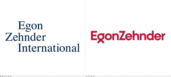
About: (Est. 1964) Egon Zehnder is a leading privately owned executive search and management consulting firm with over 420 consultants in 66 offices across 40 offices globally. Founded in 1964, Egon Zehnder consultants work as trusted advisors to the world’s foremost executives and organizations in solving their most complex leadership problems.”
Design by: Lippincott.
Ed.’s Notes: Nice typography and simple alteration to the “g” to create an ownable wordmark. Bigger view of the logo below (or after the jump).
Relevant links: Lippincott case study.
Continue reading this entry

DATE: Feb.15.2013 POSTED BY: Armin
 CATEGORY: Corporate The B-Side
  COMMENTS:

TAGS: custom, sans serif,

A B-Side BY Armin
Wiley

About: (Est. 1807) John Wiley & Sons, Inc. “is a global provider of content and content-enabled workflow solutions in areas of scientific, technical, medical, and scholarly research; professional development; and education. Our core businesses produce scientific, technical, medical, and scholarly journals, reference works, books, database services, and advertising; professional books, subscription products, certification and training services and online applications; and education content and services including integrated online teaching and learning resources for undergraduate and graduate students and lifelong learners. Wiley’s global headquarters are located in Hoboken, New Jersey, with operations in the U.S., Europe, Asia, Canada, and Australia.”
Design by: N/A.
Ed.’s Notes: Nice update, wish there was more to this story. Bigger view of the logo below (or after the jump).
Relevant links: N/A.
Continue reading this entry

DATE: Feb.14.2013 POSTED BY: Armin
 CATEGORY: Publishing The B-Side
  COMMENTS:

TAGS: black, serif, small caps,


