
Opinion BY Armin
Mmm… Twisted Plastic
The first time I noticed the Movistar logo was on a trip back to Mexico City a few years ago. After a long plane ride, arriving at smoggy, traffic-laden Mexico City can be almost hallucinogenic, and not in a good way. Printed massively on a billboard I just couldn’t understand what that thing was. Sure, it was an “M” but why was it contorted like that and rendered in what looks like the kind of stuff aliens implant on the people they abduct? Never mind that, who chopped off the top of the “t”? Little did I realize that Movistar is one of the largest mobile service providers in the world, with its strongest presence in Spain where it has over 20 million customers, and it is owned by the Spanish conglomerate Telefónica, which provides phone and mobile service, cable television, owns terra.com, and is the second largest corporation in Spain behind financial giant Grupo Santander. Still, weird.
Continue reading this entry

DATE: Dec.03.2009 POSTED BY: Armin
 CATEGORY: Telecom
  COMMENTS:

TAGS:

Opinion BY Armin
Talk to the Hand
(Third telecommunication post in seven days!). PT Telekomunikasi Indonesia, or Telkom for short, is the largest phone service provider in Indonesia with about 15 million land line customers and another 50 million cell phone users. Part of that success is that the majority government-owned corporation had a monopoly on the market until a few years ago and faces stiff competition from Indosat (which has a pretty groovy logo, by the way). Looking to not only stay ahead of its competitor but move into the information, media and edutainment categories Telkom has launched a new, much needed, identity designed by the Jakarta office of The Brand Union, who had been awarded this project more than a year ago.
Continue reading this entry

DATE: Oct.22.2009 POSTED BY: Armin
 CATEGORY: Telecom
  COMMENTS:

TAGS:

Opinion BY Armin
Sparkle, Sparkle, Little Scribble
Originally owned by the state when it launched in 1987, New Zealand’s Telecom became a private organization in 1990 and has grown to become the leading telecommunications provider in New Zealand and has made a strong move into the Australian market as well. With 7,000 employees in New Zealand and another 1,600 in Australia, Telecom operates five separate customer-facing businesses that handle everything from internet service to phone lines to corporate services and is looking to make a bigger impression on all of its customers’ with a new identity launched this past October 16 with a flashy light show at Auckland’s Ferry Building.
Continue reading this entry

DATE: Oct.20.2009 POSTED BY: Armin
 CATEGORY: Telecom
  COMMENTS:

TAGS:

Opinion BY Armin
New India Cellular Provider Goes Geometric
Earlier this year, Tata Group, one of the most prolific corporate groups in the world in categories like cars, telecommunications and steel among others, partnered with Japan’s NTT DOCOMO, a leading cellular service provider, to introduce a new cellular service in the overcrowded market — more than 350 million existing customers — in India, Tata DOCOMO. To break through the competition, Tata DOCOMO has some pricing tricks like charging per second, rather than per minute and rewarding minimalist text messagers, charging by the character, rather than per message. Built around the brand idea of “Do,” Tata DOCOMO comes in a colorful identity package designed by Wolff Olins.
Continue reading this entry

DATE: Oct.15.2009 POSTED BY: Armin
 CATEGORY: Telecom
  COMMENTS:

TAGS:

BY Armin
Visualizing the Link
Still waiting for federal regulatory approval on the transaction of the merger between CenturyTel and Embarq — two telecommunication companies that, together, will bring together more than two million broadband customers (you can learn more about what they each do here) — the combined entity has announced their new name, CenturyLink.
Continue reading this entry

DATE: Jun.08.2009 POSTED BY: Armin
 CATEGORY: Telecom
  COMMENTS:

TAGS:

BY Armin
April Fools: Verizon Turns to the Clouds

When it comes to cell phone providers I feel like you fall in one of two camps: iPhone users with AT&T (aka, the cool people) and Verizon users (aka, the lame people that will ask “Can you hear me now?” when they are not on their cell phone). Well, apologies for the perhaps offensive simplification of the matters but, let’s face it, Verizon has never had an ounce of cool to its name. Particularly among designers who, to my knowledge, all would rank the Verizon logo as one of the worst. And apparently Verizon has taken notice and is ready to make some identity and brand changes as it nears its first ten years in business.
Continue reading this entry

DATE: Apr.01.2009 POSTED BY: Armin
 CATEGORY: Telecom
  COMMENTS:

TAGS:

BY Armin
Here Fido, Good Fido
Fido, a Canadian cell phone provider, owned by giant Rogers Wireless, has recently launched a new identity. Surpassing the old child’s play logo of cut paper and mangled typography would not be hard, but this new playful logo is quite welcome. The name is pretty great and it was certainly underused in the previous version, and without being cloying or overly cute, this new logo is simple and friendly. I guess you could draw the little dog house a hundred different ways and many of them would be appropriate, but I do like the unfinished doodle they selected. And the typography isn’t bad although unlike other large corporations I think this would have benefitted from a more bubbly sans like Kodak or Xerox. But other than that, I put my paws together for this one. Apologies for the tiny logo, but it’s the only image available Thanks to Evan Cancelliere for pointing me to a bigger logo.
Thanks to Gray McCarty and Marko Savic for the tip.

DATE: Nov.07.2008 POSTED BY: Armin
 CATEGORY: Telecom
  COMMENTS:

TAGS:

BY Christian Palino
Putting the er in After
Let me preface by noting that I’m not Canadian. I have never lived in Canada. I’ve never seen a commercial with a pair of talking beavers named Frank and Gordon hocking telecommunications products and services. Nor have I seen a lot of the previous Bell Canada logos out there in my daily world. And the first instances of the new logo I saw were images of their teaser campaign with its ample negative space and stark typographic compositions — just the right kind of light-handed touch to peak the curiosity of the graphic designer in me.
Continue reading this entry

DATE: Aug.12.2008 POSTED BY: Christian Palino
 CATEGORY: Telecom
  COMMENTS:

TAGS:

BY Christian Palino
Do Co Mo, No Mo’
After establishing a Corporate Branding Division last year, Japan’s 53-million-customer NTT DoCoMo is undergoing a major re-branding that will be rolled out July 1st — the cornerstone of which is their new logo. DoCoMo’s company name, previously divided in three syllables and now united as one word, comes from the word dokomo, meaning “everywhere”, and is an abbreviation of the phrase, “Do Communications Over the Mobile Network.”
Continue reading this entry

DATE: May.12.2008 POSTED BY: Christian Palino
 CATEGORY: Telecom
  COMMENTS:

TAGS:

BY Armin
Boosting Boost
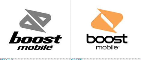
Boost Mobile, a “lifestyle-based telecommunications brand” and provider of mobile phones to the hip, the young and the restless has recently unveiled a new identity overhaul “engineered” by the equally hip Attik. The redesign includes the logo, of course, as well as a set of identity enhancements including new typefaces and colors in order to consistently brand the multitude of online and product offerings — from their online communities to the Boost Mobile Pro surfing competition. Boost Mobile is clearly targeted towards a young consumer — their web site touts 4.3 million customers with the majority under the age of 25 and their TV ads are nothing short of head-scratchers — so this redesign is spot on, especially in taking the original design and evolving it into a cleaner, bolder look. The icon feels a little more resolved to me, but I think the old one was pretty good too; and the typography is a definite improvement, as the old italicized version did not quite flow with the icon, and this one makes an interesting use of the letterfforms and creates with every character kissing each other — and, sure, it’s a little space agey, but it fits the brand and that’s what matters.
Thanks to Drew Dougherty for the tip.

DATE: Mar.10.2008 POSTED BY: Armin
 CATEGORY: Telecom
  COMMENTS:

TAGS:


