
Opinion BY Armin
X Marks the Port
Used as far back as the thirteenth century, the Port of Amsterdam is ranked as the number 4 port in Europe, handling almost 93 million metric tons of cargo annually, employing directly (and indirectly through port-related companies) 55,000 people. The Port’s main goal, besides moving stuff, is “stimulating economic activity and employment in the entire Amsterdam port region.” Previously owned and managed by the local government, this April the port was established as an independent, corporate entity with the City of Amsterdam as the main shareholder and a new logo was introduced, designed by Groningen, the Netherlands-based Hole in the Dyke.
Continue reading this entry

DATE: May.02.2013 POSTED BY: Armin
 CATEGORY: Logistics
  COMMENTS:


A B-Side BY Armin
StarTrack
About: “StarTrack is the product of the integration of the retail division of Australian air Express and Star Track Express. Backed by parent companies and strategic partners Australia Post and Qantas, the new StarTrack offers its customers the largest network in the country. With 57 branch facilities Australia-wide, StarTrack operates a fleet of more than 3,000 vehicles and transports more than one million parcels across the country for its customers every week.”
Design by: N/A.
Ed.’s Notes: OMG, that old logo. LOL. Bigger view of the logo, an ad, and a truck below (or after the jump).
Relevant links: StarTrack Media Centre (scroll to bottom for announcement and TV spot).
Continue reading this entry

DATE: Feb.05.2013 POSTED BY: Armin
 CATEGORY: Logistics The B-Side
  COMMENTS:


A B-Side BY Armin
Tucson Electric Power

About: (Est. 1892) “Tucson Electric Power provides the energy behind Tucson’s economy. We deliver safe, reliable power to more than 400,000 customers in the Tucson metropolitan area.”
Design by: N/A.
Ed.’s Notes: Love that old logo. It’s crazy. It’s also 33 years old.
Relevant links: Press release.
Select Quote: The new logo features a sunny-colored arc suggestive of Southern Arizona’s most prominent characteristic and was designed to resemble the recently introduced logo for UNS Energy. The blue lettering, the same color used in the previous TEP logo, is a tribute to the new logo’s predecessor.
Thanks to James I. Bowie for the tip.

DATE: Oct.12.2012 POSTED BY: Armin
 CATEGORY: Logistics The B-Side
  COMMENTS:


Opinion BY Armin
Energy-infused Logo
Established in 1995, TRUEnergy is one of Australia’s largest energy retailers, servicing over 2.7 million customers. In March of 2011 they announced that they would be purchasing the retail operation of EnergyAustralia, a state-owned company that manages the electricity network assets (poles, wires, and substations) which, in turn, have been transformed into a new company called Ausgrid. In August, EnergyAustralia unveiled a new logo that will serve to transition TRUenergy into the name — for now the only place showing the new logo is here with both companies still operating their own websites, probably doing a slow transition into the change. The logo and national advertising campaign were created by Leo Burnett Sydney.
Continue reading this entry

DATE: Sep.27.2012 POSTED BY: Armin
 CATEGORY: Logistics
  COMMENTS:


A B-Side BY Armin
Port of Tacoma
Established in 1918, the Port of Tacoma in Tacoma, WA is one of the largest container ports in North America and one of the top 50 in the world. A new logo designed by Seal Beach, CA-based brandstrata was introduced earlier this month. Story here. Explanation: “The arcs and connection points of our new logo symbolize our refocused mission to deliver prosperity by connecting customers, cargo and community with the world.”
Thanks to Roy Levitt for the tip.

DATE: May.18.2012 POSTED BY: Armin
 CATEGORY: Logistics The B-Side
  COMMENTS:


Opinion BY Armin
US Foods, Tighter than Ever

With a history that dates back to 1883, U.S. Foodservice was formed in 1992 after the merger of various companies. Today, it is one of the largest foodservice distributors to restaurants, healthcare and hospitality facilities, government operations and educational institutions. They offer more than 350,000 brand products, deployed by about 25,000 employees through a fleet of 4,949 tractors, 333 trucks and vans, and 6,333 trailers according to Transport Topics’ Top 100 Private Carrier report [PDF], which lists it at number 5. This past September U.S. Foodservice announced it would change its name to US Foods and introduced a new logo.
Continue reading this entry

DATE: Nov.18.2011 POSTED BY: Armin
 CATEGORY: Logistics
  COMMENTS:

TAGS: Sans Serif,

Opinion BY Armin
TNT Post Carries On by Itself

With roots as far back as 1752, chronologically, and Australia, geographically, TNT Post is the official mail carrier in The Netherlands, owned by TNT Group, who also operate TNT Express. Employing 77,000 people, TNT Post processes “8.8 billion addressed postal items (including 100 million parcels) each day and delivers to more than 88 million addresses in the Benelux, Germany, the UK and Italy.” Last week, TNT Group announced that TNT Post will begin to work as an independent company, starting on May 31, 2011 and will be renamed PostNL. The identity will be implemented first in The Netherlands, and later in the other countries it operates in.
Continue reading this entry

DATE: Apr.11.2011 POSTED BY: Armin
 CATEGORY: Logistics
  COMMENTS:

TAGS: orange, sans serif, the netherlands,

Opinion BY Armin
A Moving Ship
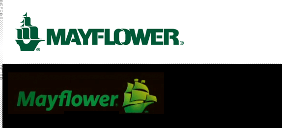
Established in 1927, Mayflower Transit is one the United States’ biggest moving companies and in corporate speak they claim to be “the most recognized name in moving.” Having used moving companies when we moved from Chicago to New York and then New York to Austin, the moving industry is one of the most annoying, frustrating and scam-prone I have experienced or researched. So saying they are the most recognized name in moving is basically bragging they are the most recognized name in “things I don’t want to deal with because they suck.” So, yes, that gives them an advantage point I guess. But that’s enough of my personal grievances. Back in May or perhaps earlier, Mayflower introduced a new logo and this week it launched a new national TV campaign with a rather creepy spot by Grey Advertising.
Continue reading this entry

DATE: Jul.16.2010 POSTED BY: Armin
 CATEGORY: Logistics
  COMMENTS:

TAGS: grey advertising, icon, italic, Lippincott, mayflower, sans serif,

Opinion BY Armin
Belgium’s Post Loses Horn, Caps
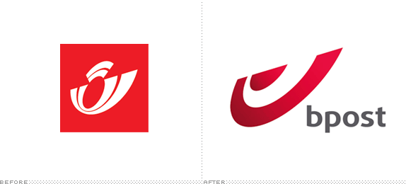
Originally established in 1830 as Les Postes, the postal service of Belgium has grown to be its second largest employer, and since 1992 it has been known as simply De Poste-La Poste (“The Post” in Dutch and French). In 2006, Post Danmark and CVC Capital Partners acquired a minority ownership (at 49.9%) from the state, and beginning in January 2011, the post service will become a private company and be released from control by the state. Last month a new name, the all lowercase bpost, and identity, designed by Interbrand, were introduced.
Continue reading this entry

DATE: Jul.15.2010 POSTED BY: Armin
 CATEGORY: Logistics
  COMMENTS:

TAGS: belgium, bpost, icon, interbrand,

Opinion BY Armin
I Yodel, You Yodel, We All Yodel for Yodel
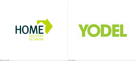
This past May, the UK’s largest home delivery service for packages, Home Delivery Network (HDN), purchased the UK domestic parcel delivery business of DHL Express, which focuses on business-to-business service, to become the second largest delivery service in the UK after the Royal Mail. HDN already has contracts to deliver products sold by Amazon as well as one of the most powerful catalog and online retailers in the UK, Argos. With the purchase of DHL Express, HDN announced that it will be changing its name to Yodel — derived from a few letters of its tagline “Your delivery, your call.” The naming and identity were created by London-based The Clearing.
Continue reading this entry

DATE: Jun.28.2010 POSTED BY: Armin
 CATEGORY: Logistics
  COMMENTS:

TAGS: sans serif, the clearing, uk, yodel,


