
In Brief BY Armin
In Brief: NYC Football Club Sparks Imagination
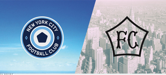
Late last month, Major League Soccer announced that a new expansion team will join the league in 2015: New York City Football Club (NYC FC). This will bring soccer to the New York metropolitan area and perhaps also ignite yet another “crosstown” rivalry — a la Yankees vs. Mets, Knicks vs. Nets — with the other MLS team, New York Red Bulls that play in the less glamorous suburb of Harrison, New Jersey. Less than a month after the announcement, two soccer and design aficionados have taken it upon themselves to design a proper identity for the new team.
Continue reading this entry

DATE: Jun.06.2013 POSTED BY: Armin
 CATEGORY: In Brief
  COMMENTS:


In Brief BY Armin
In Brief: May Miscellany
Haven’t done this round-up in a while and I could use a little break from all this heavy-duty identity critiquing. So here are some interesting stories.
Continue reading this entry

DATE: May.23.2013 POSTED BY: Armin
 CATEGORY: In Brief
  COMMENTS:

TAGS: chermayeff and geismar, icon, trends, university,

In Brief BY Armin
2013 April Fools, Explained
Last year we skipped April Fools as it landed on a Sunday and the four years before that we had done fake redesigns (Ford, Verizon, Dunkin Donuts, and Home Depot) so doing another one was simply not an option. Too repetitive and expected. What to do though? At least through the first couple of weeks of March I still had no idea. I had noticed Chrome’s broken image icon earlier in the year, I filed it on my brain, and as I was trying to think of ideas it hit me that it would be funny to do a full-on design justification/presentation of the icon as a corporate identity logo. The fact that the icon was a real thing provided a new twist on our April Fools, so I didn’t have to “prove” that it was real — the Quora question I referred to also helped cement this as fully plausible. Then it was just a matter of presenting it like any good brand consultancy would.
Other than the icon on a grid and the icon on the magazine I had no idea what I was going to do, but as soon as I started recreating the icon in Illustrator I started getting the ideas of doing the time-aware and location-aware versions. I’ve always loved the parallel between pixels and cross-stitch and that’s when I asked Bryony if she could do cross-stitch and she so crafty so she did. It now hangs in our kitchen. The image of the pins/badges came courtesy of Mike Rigby of Interbrand in Sydney, who always make some excellent pins for their own clients. The whole project took a good 16 to 20 hours — hey, you try making a convincing Christ the Redeemer statue in less than 8 pixels — but it was worth it, especially seeing tweets of people convinced this was real.
2014 seems daunting now.

DATE: Apr.02.2013 POSTED BY: Armin
 CATEGORY: In Brief
  COMMENTS:

TAGS: april fools,

In Brief BY Armin
In Brief: Hornall Anderson Monograph
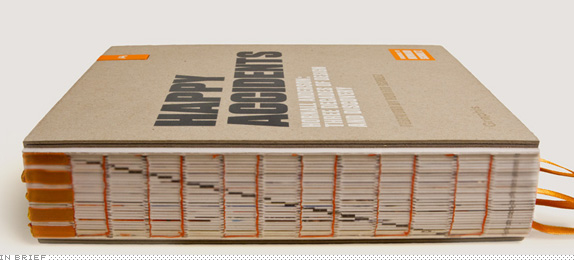
It’s not everyday that a brand consultancy publishes a 482-page book, but also not every brand consultancy has been around for 30 years. Happy Accidents, published by Graphis (although not available for purchase at their site or Amazon) chronicles “Three Decades of Design and Discovery” of the Seattle-based firm Hornall Anderson. Although there is emphasis on newer work, the book does include some great 1990s work — some of which was eye-opening for me at the time — including the Jamba Juice identity, Smith packaging (not a single annual then didn’t include this one), and the Seattle Supersonics identity. The book itself is a great piece of work, with exposed binding, multiple ribbon bookmarks, and a USB drive integrated into the cover. I’ll try to track down a way of ordering the book and update the post. A few more pictures of the book are available here.
Update: The book will be available on Graphis in a few weeks and will retail for $160. In the meantime, you may e-mail usinfo@hornallanderson.com if you are interested in obtaining a copy.

DATE: Mar.27.2013 POSTED BY: Armin
 CATEGORY: In Brief
  COMMENTS:

TAGS: book, hornall anderson,

In Brief BY Armin
Logo Reductions for Screen Use
Today we have a little diversion but one that I think has a lot of potential to demonstrate the need for logos to have a secondary (more like alternate) version for use in smaller screens and applications. Students at Oded Ezer’s Typography for Interaction Design class at H.I.T (Holon Institute of Technology), Visual Communication Dep., in Israel have been given the following brief: “Re-design a screen compatible version for a known print-based logo.(as App launcher icon, logo for splash screen, favicon, etc.) Define and keep in mind the core values of the brand, and the technical requirements for the adjustment to screen.” It’s important to understand that this is NOT a redesign exercise but a translation of logos to maintain their essence and perform better at small sizes with less elements and fuzziness. Also remember this is student work, not final deliverables for a client so constructive feedback is encouraged. Biggest polling system on Brand New available at the bottom.
(See also: Oded’s class’ efforts on translating Latin alphabet logos to Hebrew and Arabic).
Continue reading this entry

DATE: Feb.26.2013 POSTED BY: Armin
 CATEGORY: In Brief
  COMMENTS:

TAGS: assignment, screen,

In Brief BY Armin
In Brief: New York City Transit Authority Graphics Standards Manual
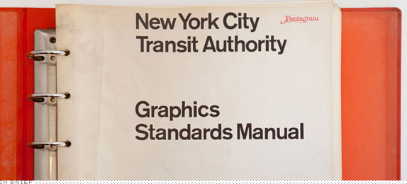
Inside a locker beneath old gym clothes at the New York office of Pentagram, someone found a copy of a first edition New York City Transit Authority Graphics Standards Manual designed by Massimo Vignelli and Bob Noorda of Unimark International in 1970. Design nerds and Pentagram employees Niko Skourtis, Jesse Reed, and Hamish Smyth have put together a minisite with photographs of all 182 pages of the document with extra juicy zoom-in capabilities. Breathe, relax, enjoy.

DATE: Feb.14.2013 POSTED BY: Armin
 CATEGORY: In Brief
  COMMENTS:

TAGS: guidelines, pentagram, unimark,

In Brief BY Armin
In Brief: Brooklyn Nets Open

By now pretty much everyone knows I’m not the biggest fan of the Brooklyn Nets logo. I’ll admit that, despite my regard for the execution of the logo(s), the approach and strategy are right on cue, if a little too hip-hop for its own good — feelings captured ever so by this “Open” that plays across the arena during player introductions at home games. Created by Los Angeles, CA-based TheFamousGroup with an original song, called “Brooklyn” (what else?), by ex-Fugee John Forté, “The film adheres to the Nets’ iconic black & white branding, shot entirely in b&w and featuring players dressed in white shirts and black suits and ties.” Kinda catchy and cool, although at points it’s hard to remember if you are watching an ad for an NBA team or a men’s fashion line. You can see a full-screen optimized version here.

DATE: Nov.08.2012 POSTED BY: Armin
 CATEGORY: In Brief
  COMMENTS:


In Brief BY Armin
In Brief: 2014 Winter Olympic Games Pictograms
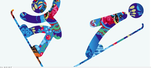
Last month the Sochi 2014 Organizing Committee unveiled the pictograms of the 2014 Winter Olympic Games. The pictograms are based on those of the 1980 Summer Olympic Games in Moscow and, as the press release states, “taking into account modern views.” The release does not mention if elementary school children were used as models for each pictogram, removing their lunchbox and backpack in post-production but it does continue, “The understated quality and visual simplicity, the combination of smooth and straight lines, the lack of sharp corners, all of this helped to give a sense of purpose and dynamism to the Sochi 2014 pictograms.” The pictograms come in two flavors: (1) the usual single-color application and (2) a quilted version based on the Look of the Sochi 2014 Games, the patchwork quilt of Russia (which we reviewed here). I wish the pictograms hadn’t turned out so “cute” and toddlerish because the versions with the patchwork look great. A few samples below (or after the jump) and you can see all pictograms here.
Continue reading this entry

DATE: Oct.24.2012 POSTED BY: Armin
 CATEGORY: In Brief
  COMMENTS:

TAGS: icons, olympics, pattern, pictograms,

In Brief BY Armin
In Brief: 2012 BNConf Opening Remarks + Brand New Summary

While we prepare the storefront for the 2012 Brand New Conference videos here are the opening remarks, which include my animated summary — me being the one animated, not the Keynote presentation itself, although it does contain moving pictures — of the happenings on Brand New in the last twelve months since the 2011 conference. The throwdown begins at the 5:25 mark. (Hi Jay-Z!). Some language NSFW.

DATE: Sep.10.2012 POSTED BY: Armin
 CATEGORY: In Brief
  COMMENTS:

TAGS: bnconf,

In Brief BY Armin
In Brief: New Domino’s Pizza Logo?
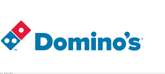
I am posting this somewhat hesitantly because there is just one isolated — yet very legit — mention of it and it’s also why I am only treating it as an In Brief and not a full, official redesign post. This could be big, but it could also just be a local upgrade. The meat of the story is that overnight, the Facebook page of Domino’s Pizza in New Zealand updated its status to announce a new logo that is “going to be integrated across all our promotions and stores in coming months.” There is no detail there or anywhere else about whether this applies globally to the 9,000-plus Domino’ses. My one-sentence, pre-emptive review, pending further details: I like its chunkiness and simplicity, but I miss the packaged-ness of the old one, which sat nicely in a diamond. Link to Google Image Search of the current logo, in case you need a reminder.
Update: Press release issued by Domino’s NZ.
Thanks to Kyle Wadsworth for the tip.

DATE: Aug.06.2012 POSTED BY: Armin
 CATEGORY: In Brief
  COMMENTS:

TAGS: pizza, restaurant,


