
A B-Side BY Armin
National Kidney Foundation
About: (Est. 1961) “The National Kidney Foundation is the leading organization in the U.S. dedicated to the awareness, prevention and treatment of kidney disease for hundreds of thousands of healthcare professionals, millions of patients and their families and tens of millions of Americans at risk.”
Design by: TIO Agency.
Ed.’s Notes: A cleaner update using a hard-to-work-with shape. Bigger view of the logo and a sample of some effective Skype-themed PSA TV spots below (or after the jump).
Relevant links: Press release. Public service announcement videos.
Select quote: “Inspired by the organization’s rich history, the new signature incorporates the symbols, font and colors — orange and black — associated with the National Kidney Foundation in a modern fashion. Instead of interlocking kidneys , the new logo features a single kidney bean shape along with the text.”
Continue reading this entry

DATE: Apr.23.2013 POSTED BY: Armin
 CATEGORY: The B-Side Health
  COMMENTS:

TAGS: orange, Sans Serif,

Opinion BY Armin
:idden H
Established in 1997 with the merger of three institutions, Novant Health is network of physician clinics, outpatient centers, and hospitals that serves the states of North Carolina, Virginia, South Carolina, and Georgia. Headquartered in Winston-Salem, NC, it consists of more than 1,100 physicians and 24,000 employees at more than 450 locations and is one of the top 25 integrated health systems in the United States. This month Novant Health introduced a new identity designed by New York, NY-based Prophet.
Continue reading this entry

DATE: Apr.22.2013 POSTED BY: Armin
 CATEGORY: Health
  COMMENTS:


Opinion BY Armin
Giving Cancer the Finger

Established in 2012, The Why? Foundation (W?F for short) was founded by cancer survivor Allison W. Gryphon, a novelist and filmmaker, with the goal to “help alleviate the fear and empower people to learn more and to fight” through a real and honest way to talking about cancer. It supports people “through their cancer fight on the ground level, day-to-day, hour-to-hour, minute-to-minute.” Allison is also working on the aptly titled documentary, What the F@#- is Cancer? And Why Does Everybody Have It?. A new identity for the foundation, introduced in February, was designed by New York, NY-based Safari Sundays.
Continue reading this entry

DATE: Apr.18.2013 POSTED BY: Armin
 CATEGORY: Health
  COMMENTS:

TAGS: black, brush stroke,

Opinion BY Armin
Activating Schools without Clichés

Launched at the end of February, Let’s Move! Active Schools is a new initiative that will provide “simple steps and tools to help schools create active environments where students get 60 minutes of physical activity before, during and after the school day.” Active Schools is part of Michelle Obama’s larger Let’s Move program and is being powered by Nike, which will invest over the course of five years “$50 million in the U.S. to increase the physical activity of kids in schools and communities as well as target advocacy efforts to inspire kids and draw additional resources to this important effort” as stated in this press release that lists the rest of the program’s partners. Nike worked with Wolff Olins to create a new brand for Let’s Move! Active Schools.
Update: The Nike team that worked with WO was Joe Stitzlein and Michael Malowanczyk. A few more images have been posted at the end, courtesy of Michael.
Continue reading this entry

DATE: Mar.20.2013 POSTED BY: Armin
 CATEGORY: Health
  COMMENTS:

TAGS: blue, flexible identity, government, nike, red, wolff olins,

A B-Side BY Armin
Allina Health
About: “Allina Health is dedicated to the prevention and treatment of illness and enhancing the greater health of individuals, families and communities throughout Minnesota and western Wisconsin. A not-for-profit health care system, Allina Health cares for patients from beginning to end-of-life through its 90+ clinics, 11 hospitals, 15 pharmacies, specialty medical services, including hospice care, oxygen and home medical equipment and emergency medical transportation.”
Design by: Campbell Ewald.
Ed.’s Notes: After preparing this post I realized the identity is from March of last year. So, yeah, this is old. Still, let’s pretend it happened today. Bigger view of the logo and ambulance livery below (or after the jump).
Relevant links: Campbell Ewald case study.
Continue reading this entry

DATE: Mar.01.2013 POSTED BY: Armin
 CATEGORY: Health The B-Side
  COMMENTS:

TAGS: hospital, icon, Sans Serif,

Opinion BY Armin
Ablixa: After You See This Logo, You’ll Need It
Entering the market this week is the newly Food-and-Drug-Administration-approved Alipazone — brand name: Ablixa — an antidepressant drug of the “selective serotonin reuptake inhibitor (SSRI) class” that has been produced to treat major depression, and is prescribed off-label for other conditions. The logo, packaging, and advertising have been designed by Pentagram partner Emily Oberman.
Continue reading this entry

DATE: Feb.05.2013 POSTED BY: Armin
 CATEGORY: Health
  COMMENTS:


Opinion BY Armin
If the Mountain won’t Come to Muhammad then it Must go to the Mount Sinai Logo
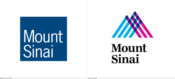
Established in 1852, the Mount Sinai Hospital is one of the most well-known hospitals in the United States, ranking continually as one of the top in U.S. News & World Report and countless other lists. Also one of the largest teaching hospitals, Mount Sinai saw nearly 60,000 inpatients and approximately 560,000 outpatient visits last year. Together with the Icahn School of Medicine at Mount Sinai, established in 1968 and one of the leading medical schools in the country, they form the Mount Sinai Medical Center. Last week, the Center introduced a new identity with a logo designed by Siegel+Gale and its implementation by Infinia Group.
Update May 8, 2013: This post has been updated with application images provided by Infinia Group.
Continue reading this entry

DATE: Dec.17.2012 POSTED BY: Armin
 CATEGORY: Health
  COMMENTS:

TAGS: hospital, New York, overlay, serif, siegel+gale,

Opinion BY Armin
Gradient Watchers
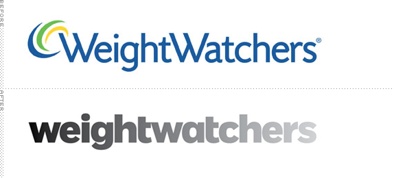
Established in 1963, Weight Watchers is the world’s leading provider of weight management services through a points system that assigns a number to each different food and caps your intake at a certain amount of points — so, say, you can eat 10 points a day, you can spend them on steamed chicken, broccoli, and wheat rice, or you could just eat a fucking doughnut. It’s more complex than that (and you can read a great article on Wired about how their point system has evolved). There are approximately 1.3 million members around the world who attend a whopping 45,000 combined meetings each week through a network of company-owned and franchise operations. Additionally, Weight Watchers produces its own branded food products, consumed at a rate of $5 billion last year. Earlier this month, Weight Watchers launched a new program called Weight Watchers 360° and with it came a new identity designed by Pentagram partner Paula Scher.
Continue reading this entry

DATE: Dec.06.2012 POSTED BY: Armin
 CATEGORY: Health
  COMMENTS:


Opinion BY Armin
Good Lookin’ Parasites, Bacteria, and Viruses
Established in 2011, The Bloomsbury Institute for Pathogen Research is a joint initiative between University College London and the London School of Hygiene and Tropical Medicine to “form a centre for excellence in experimental medicine” by bringing together cutting-edge pathogen research, experimental medicine and clinical development; translating research on bacteria, parasites and viruses into new modes of detection, treatment and control. A new identity was introduced earlier this month, designed by London-based Igloo.
Continue reading this entry

DATE: Nov.14.2012 POSTED BY: Armin
 CATEGORY: Health
  COMMENTS:

TAGS: circles, flexible identity, Sans Serif, uk, uppercase,

A B-Side BY Armin
Cancer Research UK
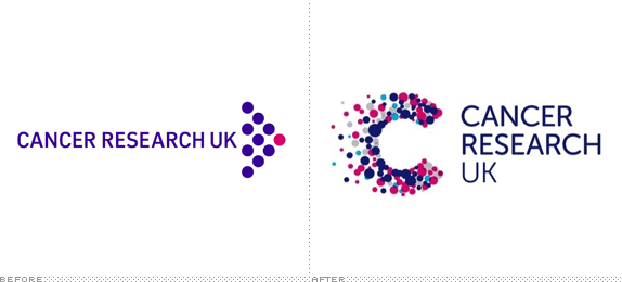
Established in 1902, Cancer Research UK is, as its name implies, a cancer research and awareness charity in the UK. A new identity has been designed by Interbrand, the new logo “and specifically the ‘C’ symbol embodies our role and ambition — lots of smaller parts that make up the bigger picture, all coming together to disintegrate cancer, and deliver a world where cancer is no longer feared.” Info on the redesign here. Story and a few application images here.
Thanks to Alice Ralph for the tip.

DATE: Sep.12.2012 POSTED BY: Armin
 CATEGORY: Health The B-Side
  COMMENTS:

TAGS: dots, interbrand,


