
A B-Side BY Armin
YEAH!
About: (Est. 2013) “YEAH! is a new online movie site that takes your favorite movies — movies you know and love — and dissects them in ridiculous detail, surrounded by factoids, secrets, brand new interviews, quizzes, polls, and much, much more.” YEAH! comes from the folks at AMC.
Design by: Trollbäck+Co.
Ed.’s Notes: It all kind of works and in terms of speech bubble logos this is one of the more attractive ones but, yeah, it’s still a speech bubble logo. Samples of the visual language below (or after the jump). A few motion samples at the case study link below.
Update: I’ve been informed by Trollbäck+Co that the speech bubble is not meant to be a speech bubble, but a “flag or pointer”.
Relevant links: Trollbäck+Co case study.
Continue reading this entry

DATE: May.29.2013 POSTED BY: Armin
 CATEGORY: The B-Side Entertainment
  COMMENTS:

TAGS: movies, speech bubble, trollback and company, yellow,

A B-Side BY Armin
Fusion (TV)

About: (Est. 2013) A new TV channel by ABC News and Univision News, “Fusion capitalizes on Univision’s news leadership and expertise in reaching U.S. Hispanics and ABC’s global news leadership to serve over 50 million Hispanics, the youngest and fastest-growing demographic in the U.S. Currently, Hispanics represent 16 percent of the total population in the United States, a number that is projected to double to 30 percent by 2050. Hispanics wield considerable spending power of over $1.2 trillion and have an increasing impact on social, economic and political trends.”
Design by: Logo: Caspar Nonner through Buster
Ed.’s Notes: Univision continues its streak of commissioning (and approving) unintelligible logos and watered-down versions of the parent brand wordmark. Bigger view of the logo below (or after the jump).
Relevant links: ABC press release.
Select quote: “‘The logo is a powerful representation of Fusion’s identity. Our brand will reflect the attitude of millennials — shaped by a sense of unity with a voice that’s fun, fresh and even irreverent,’ said Beau Ferrari, interim President for Fusion and Executive Vice President of Operations for Univision Networks. […] ‘This shape is bold, evolving and engaging. It is an iconic stamp that will be instantly recognizable,’ added Michael Berkman, VP and Creative Director, Fusion.”
Continue reading this entry

DATE: May.20.2013 POSTED BY: Armin
 CATEGORY: Entertainment The B-Side
  COMMENTS:


A B-Side BY Armin
Gala TV
About: (Est. 1968) “Gala TV is a Mexican television network owned by Televisa. Originating at XEQ-TV in Mexico City, the network is distributed throughout Mexico through affiliates. […] The Gala TV schedule features mainly reruns of major Mexican telenovelas, reruns of Televisa series, soccer and lucha libre.” It was formerly called Galavision. (Source: Wikipedia)
Design by: Logo: Ideograma. Motion: Troika
Ed.’s Notes: This is not to be confused with the U.S. version of Galavision, covered here. It is also not to be confused with a subtle, sophisticated logo. Bigger view of the logo below (or after the jump).
Relevant links: Televisa press release (in Spanish). Troika case study (only still frames).
Select quote: (translated with Google from Televisa press release) “This development will also be reflected in the new logo graphic image GalaTV that integrates three key areas: one stylized G comes from Galavision, its former name, a number 9 the channel in which currently airs in several cities, and range of colors representing the color bar television and dynamic and lively spirit of the new proposal, as well as a mosaic of colors that are a reflection of our spirit.”
Continue reading this entry

DATE: May.17.2013 POSTED BY: Armin
 CATEGORY: Entertainment The B-Side
  COMMENTS:


Opinion BY Armin
Mall of America Gets Wrapped Up
Opened to the public in 1992 in the suburb of Bloomington in Minneapolis near the Twin Cities, the Mall of America (MOA) is he United States’ largest retail and entertainment complex as a 4.87 million square foot structure sitting in a plot of land 78 acres big — either 7 baseball stadiums or 32 Boeing 747s would fit inside. Attracting 42 million visitors annually, MOA houses 520 shops, an indoor amusement park with 27 rides, an indoor aquarium, a 14-screen movie theater, and even a chapel that weds over 300 couples every year. In other words: it’s big, it’s bombastic, and, um, it’s big. Yesterday, MOA introduced its new identity designed by Minneapolis-based Duffy & Partners.
Continue reading this entry

DATE: May.16.2013 POSTED BY: Armin
 CATEGORY: Entertainment
  COMMENTS:

TAGS: duffy and partners, flexible identity, minnesota, ribbon, shopping, star,

Opinion BY Armin
Maha Music Festival Puts a Bird on it
First staged in 2009, the Maha Music Festival is a volunteer-run event in Omaha, Nebraska, featuring local, regional, and national indie and alternative rock artists that last attracted over 4,000 attendees — 2013 will be headlined by The Flaming Lips. Starting in 2012 the festival adopted a new identity by local firm Oxide Design. I realize this breaks my own criteria of the timeliness of work to be posted on Brand New and for all Omahans who consider this old news we deeply apologize (not too deeply) but, for some reason, today I struggled to find something interesting to post and this project had been piled on with other news since February and, well, it’s interesting.
Continue reading this entry

DATE: May.09.2013 POSTED BY: Armin
 CATEGORY: Entertainment
  COMMENTS:


A B-Side BY Armin
Shazam
About: (Est. 2002) “Shazam is a commercial mobile phone based music identification service, with its headquarters in London, England. […] Shazam uses a mobile phone’s built-in microphone to gather a brief sample of music being played. An acoustic fingerprint is created based on the sample, and is compared against a central database for a match. If a match is found, information such as the artist, song title, and album are relayed back to the user. Relevant links to services such as iTunes, YouTube, Spotify or Zune are incorporated into some implementations of Shazam.” (Source: Wikipedia)
Design by: The Brand Union.
Ed.’s Notes: Although I always hate the combination of upper and lowercase letters this ends up being a decent wordmark and the icon is much improved. A few more images of the icon and its construction below (or after the jump).
Relevant links: Press Release.
Provided quote: “We were thrilled to help Shazam transition from an app used to tag songs to a broader platform of discovery for TV, music, movies, live events and more. The new brand draws from the iconic loading disc that pops up when the app is listening. All of the new elements were derived from that expression, which we’ve enriched and made more responsive.”
Continue reading this entry

DATE: May.03.2013 POSTED BY: Armin
 CATEGORY: Entertainment The B-Side
  COMMENTS:

TAGS: app, blue, gradient, the brand union,

A B-Side BY Armin
FX (TV Channel)

About: (Est. 1994) “FX (standing for Fox extended, suggesting “effects”) is an American basic cable and satellite television channel that is owned by the Fox Entertainment Group division of News Corporation.” (Source: Wikipedia) Kick-ass shows include: Archer, The Shield, Nip/Tuck, Damages, Rescue Me, Sons of Anarchy, Justified, The Americans, American Horror Story, It’s Always Sunny in Philadelphia, Louie, The League, and Wilfred.
Design by: N/A.
Ed.’s Notes: In keeping with today’s barely-there changes, here is the radically new FX logo. Yeah, I don’t know what they achieved with this other than perhaps something more protectable by law as “FX” out of the box is probably not very distinctive.
Relevant links: N/A.

DATE: May.01.2013 POSTED BY: Armin
 CATEGORY: Entertainment The B-Side
  COMMENTS:

TAGS: black, Sans Serif, tv,

Opinion BY Armin
CNBC Prime goes After Dudes

Launched this past March, CNBC Prime is a new programming block — like, say, Cartoon Network’s Adult Swim or Cinemax’s Max After Dark — of both documentary and reality original shows to air during primetime (8:00 to 11:00 pm). During the day and early evening, CNBC continues its programming focusing on business news and providing real time market coverage and financial information, that has attracted an affluent, male following primed for the content and look and feel of CNBC Prime. The logo and on-air package that provide a clear contrast between day and night were designed by New York, NY-based Gretel.
Continue reading this entry

DATE: Apr.29.2013 POSTED BY: Armin
 CATEGORY: Entertainment
  COMMENTS:


A B-Side BY Armin
Lionsgate (Logo Intro)
About: (Est. 1995) “Lionsgate is a leading global entertainment company with a strong and diversified presence in motion picture production and distribution, television programming and syndication, home entertainment, family entertainment, digital distribution, new channel platforms and international distribution and sales. Led by THE HUNGER GAMES and THE TWILIGHT SAGA young adult franchises, the Company’s feature film slate generated more than $1.2 billion at the domestic box office and $2.5 billion worldwide in 2012. Lionsgate’s television business includes 28 shows on 20 different networks, including such iconic brands as MAD MEN, WEEDS, ANGER MANAGEMENT and NASHVILLE on ABC.”
Design by: Deva Studios.
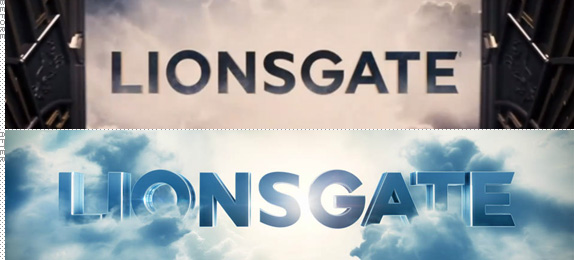
Ed.’s Notes: A little too close to Universal? Before and after intro movies below (or after the jump).
Relevant links: Deva Studios case study.
Select quote: “The new design features a light-speed journey through the galaxy, reflecting the vast universe of creativity that exists within Lionsgate. The animation is replete with visual reference to the branding heritage of the studio. Sharp eyed viewers will spot a lion constellation in the galaxy, and note that the logo resolves in a cloudscape that draws its visual DNA from the previous incarnation of the logo (also designed by Devastudios).”
Continue reading this entry

DATE: Apr.26.2013 POSTED BY: Armin
 CATEGORY: Entertainment The B-Side
  COMMENTS:


Opinion BY Armin
Not your Grandparents’ Korean Record Label

Established in 1996, YG Entertainment is a record label and talent agency based in Seoul, South Korea. It handles everything from casting and talent scouting, to recording and distribution, to artist management, to concert production, to online promotion. Specializing in hip-hop and the now popular K-pop, YG Entertainment represents dozens of artists, most notably due to recent popularity, PSY. Earlier this year YG introduced a revised logo and overhauled identity designed by Seoul-based Plus X. (Although there are plenty of images in this post, this is an edited version of the full range of images that can be seen here).
Continue reading this entry

DATE: Apr.24.2013 POSTED BY: Armin
 CATEGORY: Entertainment
  COMMENTS:

TAGS: black, comprehensive identity program, gray, korea,


