Announced Oct. 2, 2015 by Armin No Comments on 2015 Brand New Conference: Photos, Tweets, and Videos
Today I have a breakdown of the 16 sessions of the 2015 Brand New Conference that took place this past September 24 – 25 in New York, NY, and which was awesome. (If you are looking at this in an RSS reader head on over to the real thing, too much heavy formatting). This is a very long post with a photo of each speaker, very brief summaries from me and my partner in crime, collected tweets from the audience, and a preview of their video/session, so give it a good time to load. A few other things worth bullet-pointing:
• Videos for purchase are now available.
• A lot more photos from the event have been posted in this Flickr album.
• Additional videos from the conference not included in this post: Day one opening remarks and BNConf identity presentation / Day one closing summary / Day two opening remarks and Brand New summary / Day two closing summary.
• Registration is now open for the 2016 Brand New Conference in Nashville, TN, on September 15 – 16.
• In a couple of weeks I will post this year’s identity materials. Just have to photograph it after I come back from Oslo where I will be all of next week.
That’s it. Enjoy the post. There is a lot of great content from all the speakers.
Photos by Eric Ryan Anderson.
Jonathan Hoefler / Hoefler & Co. / New York, NY
Armin’s summary
An explanation on the importance of selecting robust type families for clients for the best and broadest brand implementation.
Bryony’s summary
Jonathan recommended we don’t choose and buy typography as we would would a t-shirt. Best to Involve all the parties, especially your design czar–perhaps yourself–to help demystify how fonts work and to make informed choices to develop the best brand outcome by clearly defining what is needed.In a nutshell, increase the dialogue and involve your local typographer.
Tweets
Good point: A logo is 1/2% of visual real estate in identity, compared with overall typography #bnconf @HoeflerCo pic.twitter.com/d2et7vOkCt
— Tamara Connolly (@we_are_how) September 24, 2015I'm realizing I need more tabular figure fonts #bnconf
— Jason McGuire (@design_tildeath) September 24, 2015Jonathan Hoefler: "demistify things, explain how fonts work." #bnconf @HoeflerCo pic.twitter.com/avGT9E4T0k
— graphéine (@grapheine) September 24, 2015One way @hoeflerco ensures brand rollouts go smoothly: designate a "font czar" within the company to be responsible @bnconf #bnconf
— Lauren Howell (@Lauren_Howell1) September 24, 2015"Too much planning often paralyzes the process" @HoeflerCo #BNConf pic.twitter.com/7HRQALiHSf
— Jan Šabach (@codeswitchtweet) September 24, 2015#bnconf @HoeflerCo Introduce yourself as a designer and the client to to the type foundry; include project goals.
— Cesar Rivera (@ecesarrivera) September 24, 2015If what we read most is text, then the text should be where the brand is most applied. @HoeflerCo #bnconf
— Brian Pennington (@bpenn1) September 24, 2015Photoshop mock ups of websites conceal problems that will bite you later. – @HoeflerCo #bnconf pic.twitter.com/i2eVDAcL8c
— Kobot (@wearekobot) September 24, 2015#typography slide that would make a handy poster for our office. #bnconf pic.twitter.com/ifPu4r3T4g
— Savage Solutions (@savagemarketing) September 24, 2015Video Preview
BUY VIDEO
Philippe Apeloig / Apeloig / Paris, New York
Armin’s summary
An exhaustive, entertaining, and admirable showcase of Philippe’s various logos and identities. Bonus: plenty of unselected logos shown.
Bryony’s summary
In listening to Philippe today I finally understand why I have been attracted to his work for so long. He is that kid at the candy store with a $5 dollar bill who will spend hours analyzing and studying his options until finding the perfect one. He is the doodling artist, the dancer exploring the white space, and the kid that finds awe and delight in letterforms. My lesson learned? Invite your inner kid to work with you every day. I bet you will be awed.
Tweets
Playful #typography #LOGOS by Philippe Apeloig #bnconf pic.twitter.com/cizomzCj4v
— Jan Šabach (@codeswitchtweet) September 24, 2015Philippe Apeloig talking about his myriad of design drafts not being "quite right." So on point. Love seeing his process. #bnconf
— Beth Blinebury (@bethblinebury) September 24, 2015Apeloig: I like to create a strong sense of emotion with #typography. #branding #designthinking #bnconf
— Melissa Robinson (@millyhr) September 24, 2015"I like when typography is playful. For me, using type is like having candies in my hands to play with." Philippe Apeloig @bnconf #bnconf
— Allison Rinaldi (@allison_rinaldi) September 24, 2015It's one thing to make great work. It's another to present it in a beautiful and compelling way. I'm blown away by Philippe Appeloig #bnconf
— Mavilya Chubarova (@Mavilya0584) September 24, 2015"It's often very easy to design something complex, and very hard to simplify an idea, to make it minimal." Philippe Apeloig @bnconf #bnconf
— Jonathan Ratcliff (@jonwratcliff) September 24, 2015Philippe Apeloig makes me want to quit my whole life & be a graphic designer. Or his intern. And his bff. @bnconf #bnconf
— SNB (@shazeedanadia) September 24, 2015Philippe Apeloig: manage ideas, not people. Re: small design firm #BNconf
— Maria Ramirez (@marytlicue) September 24, 2015You know you're in the right field you get goosebumps watching a logo animation. #BNConf
— Chelsie Wyse (@chelsiewyse) September 24, 2015Really enjoying the marriage of #branding and music in Philippe Apeloig's work #bnconf pic.twitter.com/QwNfj9JUdi
— Jan Šabach (@codeswitchtweet) September 24, 2015Video Preview
BUY VIDEO
Andrew Schapiro / Airbnb / San Francisco, CA
Armin’s summary
An inside look at the development and implementation of Airbnb’s 2014 redesign and the impact the community had in it.
Bryony’s summary
Andrew gave us a masterful example on how to expand a brand and create a passionate commitment to the brand by starting at the core. From the founders all the way to the lowest denominator. And he did this by embracing the value of community crated through fun and engaging channels. Good luck proposing this idea at your next client meeting. But you should still try.
Tweets
@airbnb want to build more than a brand. "Old logo/website was a little too transactional. Had no stories or that personal touch" #bnconf
— THEE BLOG (@TheeBlog) September 24, 2015"These are the people who are actually delivering the brand — the community."
@andrewschapiro at #bnconf pic.twitter.com/h71lKcKkP2
— Chris Brown (@browncd09) September 24, 2015Building community brands breed community-focused culture. #BNConf @Airbnb
— Chelsie Wyse (@chelsiewyse) September 24, 2015Capturing emotion through design and colours –@andrewschapiro @bnconf #bnconf pic.twitter.com/5m3pqAZErb
— Saman Sohail (@craponsale) September 24, 2015Letting your employees know they are your Brand Ambassadors, they will embrace it with passion and value #biggestasset #bnconf @Airbnb
— LiveLife.LoveDesign (@agodriguez) September 24, 2015Holy goosebumps, Batman. The @Airbnb Berlin short film beautifully encapsulates the community focus of this brand. #BNConf
— Chelsie Wyse (@chelsiewyse) September 24, 2015The power of listening to your community when creating a #brand #bnconf @Airbnb
— Jan Šabach (@codeswitchtweet) September 24, 2015Creating marketing messages 'inside out' @bnconf #bnconf @andrewschapiro pic.twitter.com/KXzfXtZFAB
— Saman Sohail (@craponsale) September 24, 2015#BNConf #MICAbranding15 @Airbnb really thought about who was using their brand with their redesign & made new ways to interact w/ the brand
— Skylar Hayden (@FeralLegacy) September 24, 2015Video Preview
BUY VIDEO
Tom Geismar, Ivan Chermayeff, Sagi Haviv / Chermayeff & Geismar & Haviv / New York, NY
Armin’s summary
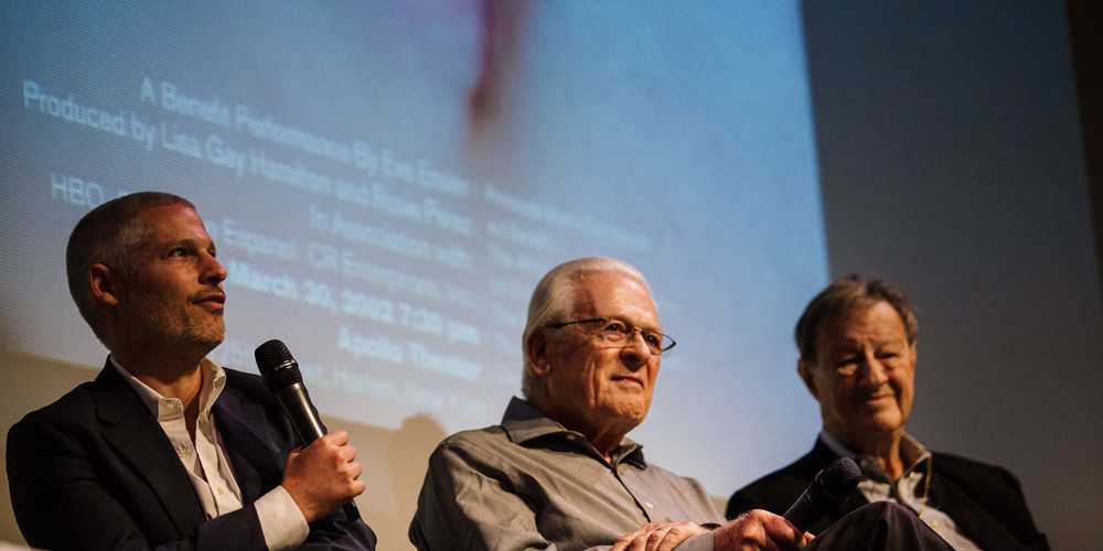
A spirited conversation between the three partners on collaboration and process with insight into some of their favorite projects.
Bryony’s summary
Tom, Ivan, and Sagi demonstrated chemistry like no other through their arguments, chiding, innocent bickering, and difference of opinions you can grasp s deep respect for each other–and their individual methodology. A respect you call all, respectfully, be jealous of. And their commitment to simplicity? They married this idea years ago and have, and will remain forever faithful.
Tweets
@CGHNYC on stage. LEGENDS. You're missing out if you're not here. Just saying. #bnconf #bnc2015 pic.twitter.com/vInuU7vQ6L
— THEE BLOG (@TheeBlog) September 24, 2015"Design is the best profession there could possibly be… You learn something new every day."
Ivan Chermayeff of @CGHNYC #bnconf
— Chris Brown (@browncd09) September 24, 2015"Our collaboration is a mystery to some extent- we're different people but we have shared values and taste." @CGHNYC @bnconf #bnconf
— Allison Rinaldi (@allison_rinaldi) September 24, 2015Don't show the client something you wouldn't be happy with them choosing. Wise words from wise men. #bnconf
— Jason McGuire (@design_tildeath) September 24, 2015Our safety value is only showing what we think is worthwhile. Designer/client words to live by. @bnconf #bnconf
— Michael Raisch (@RaischStudios) September 24, 2015"We try really hard not to be fashionable" – Geismar, Chermayeff & Haviv #bnconf #fhtakesnyc pic.twitter.com/y0YfvLGMGg
— Meredith Leigh Erwin (@meredith_erwin) September 24, 2015Chermayeff&Geismer&Haviv reminding us to have resilience when our design launches. #bnconf pic.twitter.com/XmzeBNVay0
— Candice Cheung (@tweetatcandice) September 24, 2015Ha! 'We made up a bunch of stories but really it was an abstract mark' – CGHNYC #bnconf pic.twitter.com/3slUqwVR9R
— Lance Craig (@designbylance) September 24, 2015"A logo is not the totality of communication for an organization. It is the identification." -Sagi Haviv #bnconf
— Andrew Beck (@AndrewBeckNYC) September 24, 2015Video Preview
BUY VIDEO
Paula Scher / Pentagram / New York, NY
Armin’s summary
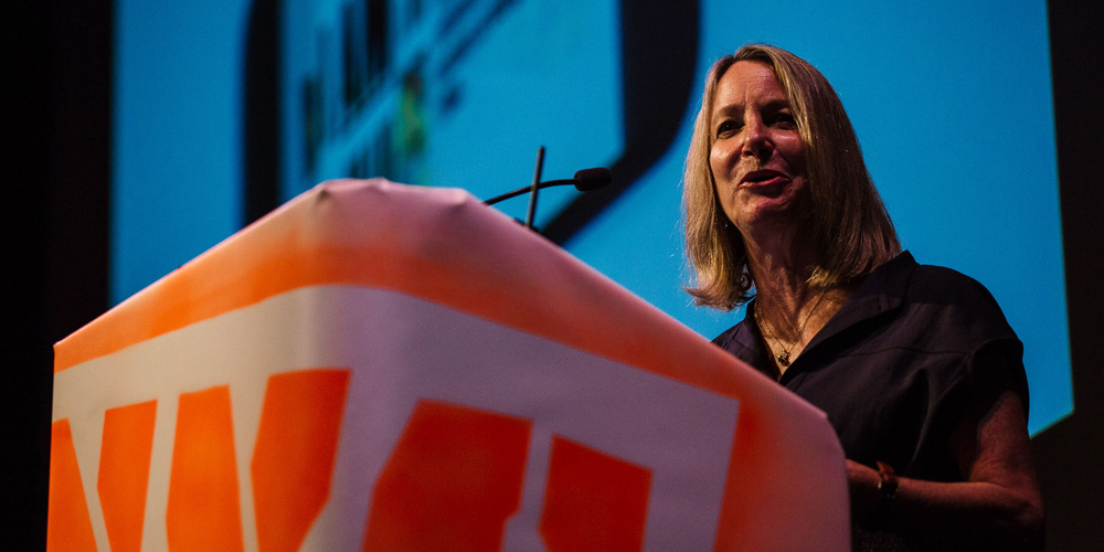
A resolute response to feedback on three poorly-received identities on Brand New and a call for better understanding of identity redesigns.
Bryony’s summary
Paula reminded us to not judge on day 1. we all belong to the same industry and we should be working together and not against each other. Through her case studies we were able to see how one mark, which you might or might not like, comes alive and becomes so much more than a group of letters or icon one. So can we, as individual designers.
Tweets
Paula Scher is punk rock. I love you, Paula. #bnconf
— Hoefler&Co. (@HoeflerCo) September 24, 2015The amazing Paula Scher's eloquent definition of #identity @ #bnconf https://t.co/vzckinqbzq pic.twitter.com/Ds41Ugygi6
— Melissa Matos Design (@MMatosGDesign) September 24, 2015Paula Scher – the job was removing the stink of Sylvester Stallone from the building @pentagram #BNConf
— TN Graphics In-House (@tn_graphics) September 24, 2015"With any identity, you must carefully consider what works in the context to determine the best solution." @pentagram @bnconf #bnconf
— Allison Rinaldi (@allison_rinaldi) September 24, 2015"I ask you to give [a new identity design] a little time before you trash it." Paula Scher @pentagram @bnconf #bnconf
— Allison Rinaldi (@allison_rinaldi) September 24, 2015"Reaction is very different than conversation."–Paula Scher #bnconf
— Flossitivity (@Flossitivity) September 24, 2015Paula Scher just took us all to school. And laid down the law. I'd high five her if she didn't scare the shit out of me. #bnconf
— Steve St. Pierre (@SteveStP) September 24, 2015Paula Scher: We are one profession and the whole goal is to make things better. We can't do that by attacking each other. #bnconf
— Duncan Robertson (@darwerk) September 24, 2015"This is an audience having an emotional response to design. This is the part we cannot measure–this is what takes time" Paula Scher #bnconf
— pale blue jen (@palebluejen) September 24, 2015Video Preview
BUY VIDEO
Hilary Greenbaum / Whitney Museum of American Art / New York, NY
Armin’s summary
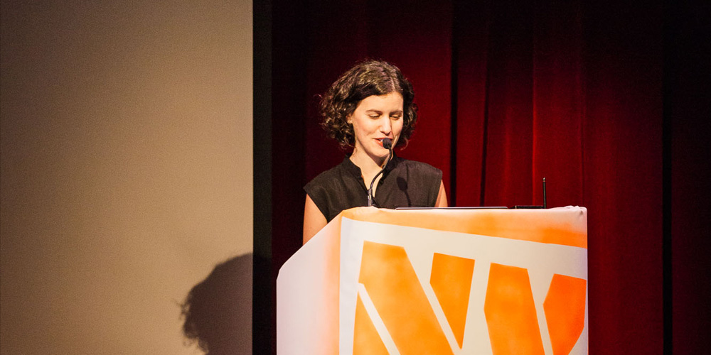
A fast-paced overview using only images available on social media of the materials created for the Whitney relocation.
Bryony’s summary
Hilary conveyed how working in house the project never ends, but the narrative keeps evolving.
Tweets
@HilaryGreenbaum cool design of a presentation deck- entirely made of crowd-sourced #Instagram images from @whitneymuseum. @bnconf #bnconf
— Allison Rinaldi (@allison_rinaldi) September 24, 2015I'm really into the idea of seeing how normal ppl would interact with the designs you make… even if it's not what you intended #bnconf
— Rachel D. (@moliione) September 24, 2015Love @HilaryGreenbaum's use of user generated imagery to showcase the new @whitneymuseum identity. #bnconf
— Chris Brown (@browncd09) September 24, 2015@whitneymuseum/@HilaryGreenbaum: Working in-house with one brand is a project that is never over. Each project builds upon the last. #bnconf
— Duncan Robertson (@darwerk) September 24, 2015Fantastic responsive evolution and application by @HilaryGreenbaum at the WHITNEY. #bnconf pic.twitter.com/G8QxbKrYaU
— Boon (@boondesign) September 24, 2015Video Preview
BUY VIDEO
Rodney Abbot / Lippincott / New York, NY
Armin’s summary
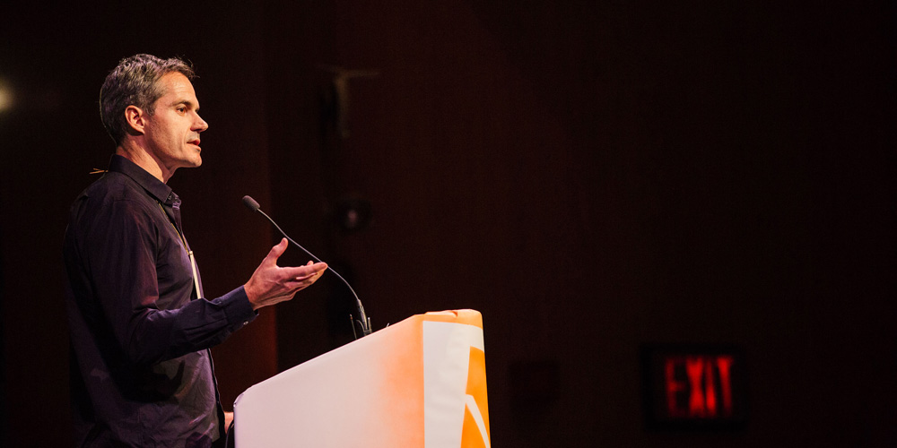
An in-depth overview of the strategy, thinking, and business-plus-culture considerations behind the Southwest identity redesign.
Bryony’s summary
From Rodney we heard that the purpose of the brand is to advance the business: look inside, look outside, embrace reality, and remember good design is making something intelligent and memorable.
Tweets
"Dont hurt the business." A good advice from @lippincottbrand Rodney Abbot @SouthwestAir #bnconf pic.twitter.com/Rm7mDyTGRV
— Jan Šabach (@codeswitchtweet) September 24, 2015People should think that you have their best interest at heart too not only business – Rodney Abbot #bnconf @bnconf @lippincottbrand
— Saman Sohail (@craponsale) September 24, 2015It's unreal to see how @SouthwestAir #brand was developed – this is the result when you design w/ purpose. #bnconf pic.twitter.com/ldvRY6Bq35
— Savage Solutions (@savagemarketing) September 24, 2015Video Preview
BUY VIDEO
Larry Pipitone, Eric Collins, Joey Ellis / Grand Army / New York, NY
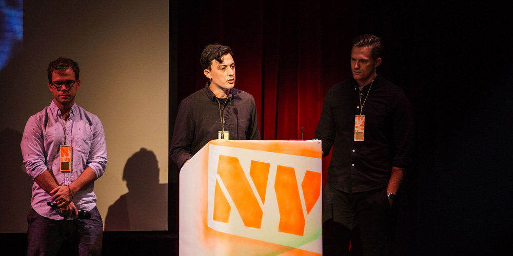
Armin’s summary
A reveal of how three twenty-one-year-olds started a business, landed large clients, and now run a successful design firm by “faking it”.
Bryony’s summary
Larry, Eric, and Joey gave us several, very tweet-able bits: Don’t be safe; Don’t fear fear, Do stuff you care about, for stuff you care about; Don’t have a style; Jump in the boat of the “I’ve never done that before” boat. It’s fun.
Tweets
Rules of Being Grand, courtesy of @grandarmy #bnconf https://t.co/3pNwCloz7s pic.twitter.com/q4hG3vdek2
— Melissa Matos Design (@MMatosGDesign) September 24, 2015"Fake it till you make it." We're right there with you @grandarmy #bnconf
— Jan Šabach (@codeswitchtweet) September 24, 2015"The contrast between confidence and fear defines our company's early days." @grandarmy @bnconf #bnconf
— Allison Rinaldi (@allison_rinaldi) September 24, 2015Grandarmy règle #3 "ne pas avoir un style unique" #bnconf pic.twitter.com/BrscwtEYp5
— graphéine (@grapheine) September 24, 2015Video Preview
BUY VIDEO
Christine Taylor / Hallmark / Kansas City, MO
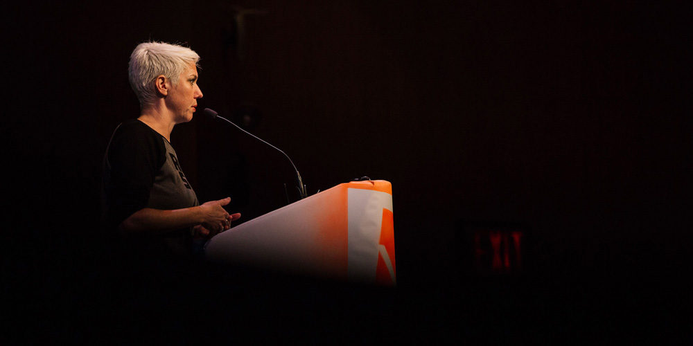
Armin’s summary
An entertaining look into an entertaining career that bridges iconic pop-culture brands like Star Wars with the Hallmark galaxy.
Bryony’s summary
Christine, even in what can be perceived as a highly corporate company with hundreds of employees, and teams, and product branches, showed that it is possible to find that sweet spot between a highly recognizable brand–like Star Wars– and your own voice. And while doing that you can live up your childhood dream. With fans and unexpected awards.
Tweets
Having fun with cool #brands while staying true to them. @twittliwinks #bnconf #unexpected @Hallmark pic.twitter.com/Q2Om7HOY6u
— Jan Šabach (@codeswitchtweet) September 24, 2015Having a #StarWars freak out & serious #careerenvy of @hallmark's @discognome #bnconf https://t.co/aQqjZKj6L2 pic.twitter.com/Ej40X6oHIN
— Melissa Matos Design (@MMatosGDesign) September 24, 2015It's a crowded marketplace — literally. You have to create something fans can come back for. #Hallmark #bnconf
— Candice Cheung (@tweetatcandice) September 24, 2015"I'm actually a professional translator of Yoda speak." @twittliwinks #bnconf #lol #StarWars #hallmark
— Melissa Robinson (@millyhr) September 24, 2015There's hope in these symbols. They are aspirational and inspirational. @twittliwinks @bnconf #bnconf pic.twitter.com/vu542Xm8KY
— Saman Sohail (@craponsale) September 24, 2015Pure joy of working with #brands Christine Taylor from @Hallmark makes the fun contagious. #bnconf @twittliwinks
— Jan Šabach (@codeswitchtweet) September 24, 2015How can we get into the fake nerd #brands #logo business?! So fun. #bnconf @twittliwinks pic.twitter.com/dl31JlBCMK
— Jan Šabach (@codeswitchtweet) September 24, 2015#KUDOS to @Hallmark for their #genderfluidity initiatives!! #bnconf #girlslikedarthvadertoo
— Melissa Matos Design (@MMatosGDesign) September 24, 2015Video Preview
BUY VIDEO
Fredrik Öst, Magnus Berg / Snask / Stockholm, Sweden
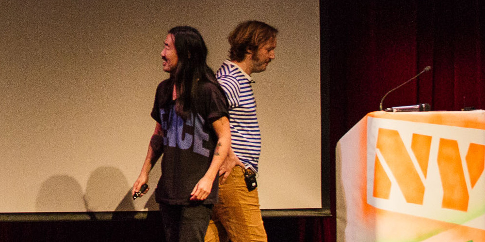
Armin’s summary
A rowdy description of the madness behind the team — from how to hire the best talent to getting banks to “be sexy”.
Bryony’s summary
Freddie and Magnus were full of advice: Drink a miniature beer, hop in the shower, and embrace the absurd. Aim to make things some will love and some will hate, make enemies and gain fans. Be professional or be fucking rock and roll, either way dance your way to the tattoo parlor. Manage your costs, build it, don’t fake it, get into it, fool your colleagues, and ask: Isn’t that the point?
Tweets
@SNASKsthlm ?Loving the energy and unapologetic attitude of your presentation. #bnconf pic.twitter.com/14W6BJc5jQ
— Candice Cheung (@tweetatcandice) September 24, 2015"When we have to be professional we're professional. When we have to be rock n roll, we're fuckin rock n roll!" @SNASKsthlm #bnconf #hellyea
— Melissa Matos Design (@MMatosGDesign) September 24, 2015@SNASKsthlm: If you make something no one hates, no one loves it. #bnconf
— Duncan Robertson (@darwerk) September 24, 2015These guys definitely stand out! ?????? @SNASKsthlm #bnc2015 #bnconf pic.twitter.com/Wp2jCKLiV3
— THEE BLOG (@TheeBlog) September 24, 2015The evolution of the boring icon by @SNASKsthlm brilliance #bnconf pic.twitter.com/HIIk5i1IRH
— Laura Powers (@LPPowers) September 24, 2015"We would love to rebrand North Korea" @SNASKsthlm #bnconf #bnc2015
— THEE BLOG (@TheeBlog) September 24, 2015Make enemies and gain fans @SNASKsthlm @bnconf #bnconf pic.twitter.com/ntMiCYdru2
— Lauren Howell (@Lauren_Howell1) September 24, 2015I wanna collab with these guys @SNASKsthlm! Fresh & epic approach to work/life balance @bnconf #bnconf #snask pic.twitter.com/526EIkZrZp
— Scott Lewallen (@ScottLewallen) September 24, 2015Video Preview
BUY VIDEO
Johnny Earle aka “Cupcakes” / Johnny Cupcakes / Boston, MA
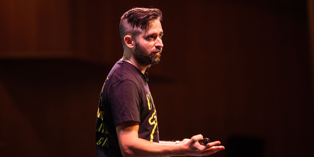
Armin’s summary
A high-energy narrative on the origins of the Johnny Cupcakes brand and the positive attitude that has fueled it all these years.
Bryony’s summary
Johnny urged us to do more of what makes you happy, and you can make others happy. Create pre-orders for calculated risk, sell on Fridays or holidays, and remember you are always representing yourself. Reinvest in yourself, and get hands-on experience. Think creatively, know that strange is good, leave your social circle, And finally have at least a dozen things that separate you from everyone else.
Tweets
@MVH_Designs fantastic speech from @JohnnyCupcakes at #bnconf I'm now even more inspired to start up some new creative businesses
— Michael van Ho (@vanhobanger) September 25, 2015Dan 2 at #bnconf with @JohnnyCupcakes makes me want to take on the world & silence haters with design super powers!! I also want a cupcake.
— Mavilya Chubarova (@Mavilya0584) September 25, 2015RT @bnconf .@JohnnyCupcakes personal branding advice. #bnconf pic.twitter.com/kSFpsFhOf1
— Jeff Fisher (@LogoMotives) September 25, 2015"People thrive off of new experiences." I'm very inspired by @JohnnyCupcakes' big entrepreneurial heart. #bnconf
— Brandon Jameson (@pbjameson) September 25, 2015'In every workforce, creative thinking should be applied' great words from Johnny cupcakes #bnconf
— The Partners (@the_partners) September 25, 2015@JohnnyCupcakes make the innovative packaging an integral part if this unprecedented #brand experience #bnconf pic.twitter.com/24iMvfxY4D
— Jan Šabach (@codeswitchtweet) September 25, 2015My concept is strange, but strange is good.@JohnnyCupcakes #bnconf
— NH1 Design (@NH1Design) September 25, 2015Learning to delegate. Great advice on letting others do things they love to help you. @JohnnyCupcakes #bnconf
— JamieSaunders (@JamieSaunders) September 25, 2015@JohnnyCupcakes: Some people aren't happy without something to complain about. You have to turn that into positivity. #bnconf
— Duncan Robertson (@darwerk) September 25, 2015"Always ask yourself – what are 12+things that make you unique?" #goodadvice from @JohnnyCupcakes @bnconf #bnconf
— Blueline by Domtar (@BluelineChat) September 25, 2015"Take a risk. If it works out great, if it doesn't you'll have a story to tell" @JohnnyCupcakes #bnconf #lifequotes #livelifelovedesign #fb
— LiveLife.LoveDesign (@agodriguez) September 25, 2015"The more weird it is, the more people are going to talk about it." @JohnnyCupcakes @bnconf #bnconf
— Allison Rinaldi (@allison_rinaldi) September 25, 2015Video Preview
BUY VIDEO
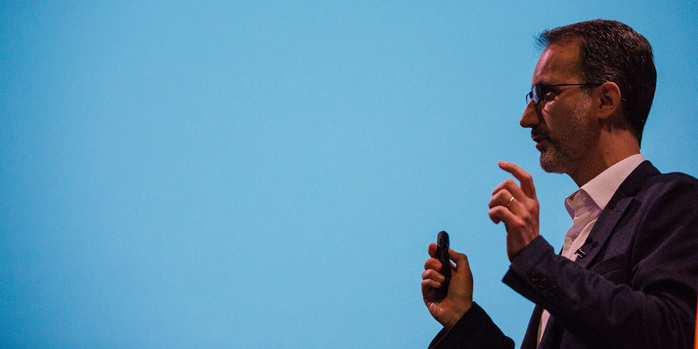
Gabor Schreier / Saffron Brand Consultants / Madrid, Spain
Armin’s summary
An insightful talk on why disruption equals relevance and what that means for a brand as explained through two case studies.
Bryony’s summary
Gabor said everything is disrupted or disruptive. Disruption is everywhere. We should disrupt the irrelevant and create relevance amongst change while creating meaning for people. Remember that what matters most is what the company does, not what the logo looks like. So let’s focus less on giving “thumbs up” and more on thinking. Do not conform. Find and create balance between charm and brutality, but most of all, rethink convention, even if it’s hard.
Tweets
Disruption needs to happen when a brand is no longer relevant to the target audience. @saffronbc #bnconf #branding pic.twitter.com/9Hri1IAaiu
— LiveLife.LoveDesign (@agodriguez) September 25, 2015Gabor Schreier of @saffronbc: Brand = symbol of trust. @bnconf #bnconf #branding #design
— Scott Lewallen (@ScottLewallen) September 25, 2015Less thumbs up or thumbs down,
more thinking. – Gabor Schreier @saffronbc @bnconf Brutally awesome talk. #bnconf
— Rodolfo Foitinho (@rfoitinho02) September 25, 2015Gabor Schreier from @saffronbc suggests less beauty contest judgement, more design thinking. #bnconf
— Brandon Jameson (@pbjameson) September 25, 2015"Disruption is everywhere" Gabor Schreier from @saffronbc #bnconf pic.twitter.com/VgqWHPxSDH
— graphéine (@grapheine) September 25, 2015Making the #brand personality tangible by #design @saffronbc #bnconf
— Jan Šabach (@codeswitchtweet) September 25, 2015#bnconf @saffronbc Design and branding are about maintaining authenticity, and finding relevance.
— Cesar Rivera (@ecesarrivera) September 25, 2015How @saffronbc translated a #brand of "extreme nonconformity" to visual ID for @Tuenti: backslant typeface #bnconf pic.twitter.com/4L07XI4CBU
— Grafik (@grafikdotcom) September 25, 2015Day 2 of @bnconf off to a great start with strong insights from Gabor Schreir of @saffronbc #bnconf
— IAN BECKMAN REAGAN (@IanReagan) September 25, 2015Great and thoughtful presentation about disruption in #branding by Gabor Schreier of @saffronbc #bnconf
— Jan Šabach (@codeswitchtweet) September 25, 2015Video Preview
BUY VIDEO
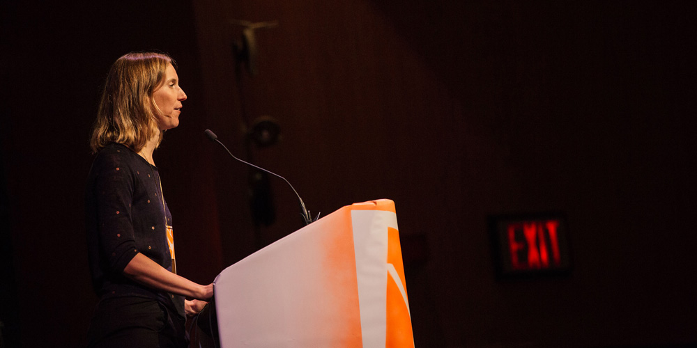
Julia Hoffman / Etsy / Berlin, Germany
Armin’s summary
A heartfelt presentation on the importance and influence that an in-house design team has for a brand — especially a community-driven one.
Bryony’s summary
The first lesson from Julia? Embrace the unknown and don’t be a control freak. It is important to understand and know that it is the culture, not the structure of the company that creates the brand. When the brand health is compromised you enter into damage control and maintenance mode–not a fun or creative place to be in. But when brand health is maintained then you have the freedom to experiment and play with the guidelines that keep you on track. Finally, she demonstrated by experience that the future of branding lies in a strong in-house team that knows how to collaborate and champion the brand.
Tweets
a brand lives through the team. "the guidelines are the people" – @juliahoffman #bnconf
— Alex Huang (@isoform_) September 25, 2015.@Etsy brand is a living thing – like a family. people come and go. the #brand needs to be adaptive and flexible. #bnconf
— Savage Solutions (@savagemarketing) September 25, 2015Julia Hoffman is killing it! She explains the process of in-house design beautifully. @bnconf @etsydesign #bnconf pic.twitter.com/uIyVE0GF1A
— Moving Brands® (@movingbrands) September 25, 2015We want our work to reflect our community. @Etsy @Juliahoffmann #bnconf
— Brand New Conference (@bnconf) September 25, 2015@juliahoffman from Etsy just got real deep "no guideline can replace the people". Amen. #spraycanmoment #bnconf
— C4Rlo (@C4Rlo) September 25, 2015@juliahoffmann speak about Etsy brand #bnconf pic.twitter.com/3U5C10IX23
— graphéine (@grapheine) September 25, 2015A brand is not living in in a vacuum, it's constantly evolving and developing and growing up. @juliahoffmann @bnconf #bnconf #etsy
— Saman Sohail (@craponsale) September 25, 2015@juliahoffmann The Etsy global brand team is doing an amazing job making your customer's brands a part of your brand. #bnconf
— Candice Cheung (@tweetatcandice) September 25, 2015BOOM "The guidelines are in the people" – Julia Hoffman, Etsy #bnconf
— Lance Craig (@designbylance) September 25, 2015"The future of branding lies in a strong in-house team that knows how to collaborate" —@juliahoffmann @Etsy #bnconf pic.twitter.com/tJ10KhV35f
— Alvin Martinez (@alvinmartinez) September 25, 2015Having fun is a great litmus test for the creative. @juliahoffmann @bnconf #bnconf
— Saman Sohail (@craponsale) September 25, 2015Video Preview
BUY VIDEO
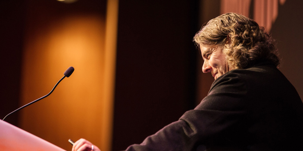
Brett Wickens / Ammunition / San Francisco, CA
Armin’s summary
A savvy recollection of his career path, from working with Peter Saville to working in Los Angeles to his current role creating products and brands.
Bryony’s summary
Brett has learned that everything eventually connects. People, ideas, objects. But it’s all about the quality of these connections. That even if you live in LA, the most risk-averse city in the world, as a designer you can play a bigger role in making things through partnerships where you assume both risk and rewards. Simply by investing your time and effort if not the contents of your wallet. Design is about ideas, design is not an event, it’s part of a process, design is the key distinguisher. If you try to make sense of many voices you won’t succeed, especially in making things that matter. And remember, everyone can complain about something. Usually everything.
Tweets
No caption needed. #bnconf pic.twitter.com/7nOAmalza7
— THEE BLOG (@TheeBlog) September 25, 2015People don't pay for features, they pay for mystique. @bwickens #bnconf @P_Saville_Assoc pic.twitter.com/arqFSR2RGH
— Jeremy Matthews (@miaandjem) September 25, 2015Design is not an event. It is an intrinsic part of developing a business's success @bwickens #bnconf
— Brian Pennington (@bpenn1) September 25, 2015Brett Wickens: "if you listen to what everyone says and try to make sense of it, you can't." #bnconf @bwickens pic.twitter.com/ZBRy4xIP6K
— Tamara Connolly (@we_are_how) September 25, 2015"People don't pay for features, they pay for mystique." @bwickens @ammunitiongroup @bnconf #bnconf
— Allison Rinaldi (@allison_rinaldi) September 25, 2015Ideas define designers. Technologies define generations #BNConf @ammunitiongroup
— Emmanuel Carrillo (@emancarrillo) September 25, 2015Features no longer set products apart – it's the brand, culture, and design that is unique and special. #bnconf pic.twitter.com/n7I3OJzoUG
— megan keiko (@megankeiko) September 25, 2015"Ideas define design" Very true words from @bwickens @bnconf #bnconf
— nativo creative (@hellonativo) September 25, 2015"Brands are connections and experiences…. A logo is an empty vessel." –@bwickens of @ammunitiongroup #bnconf
— Brandon Jameson (@pbjameson) September 25, 2015Video Preview
BUY VIDEO
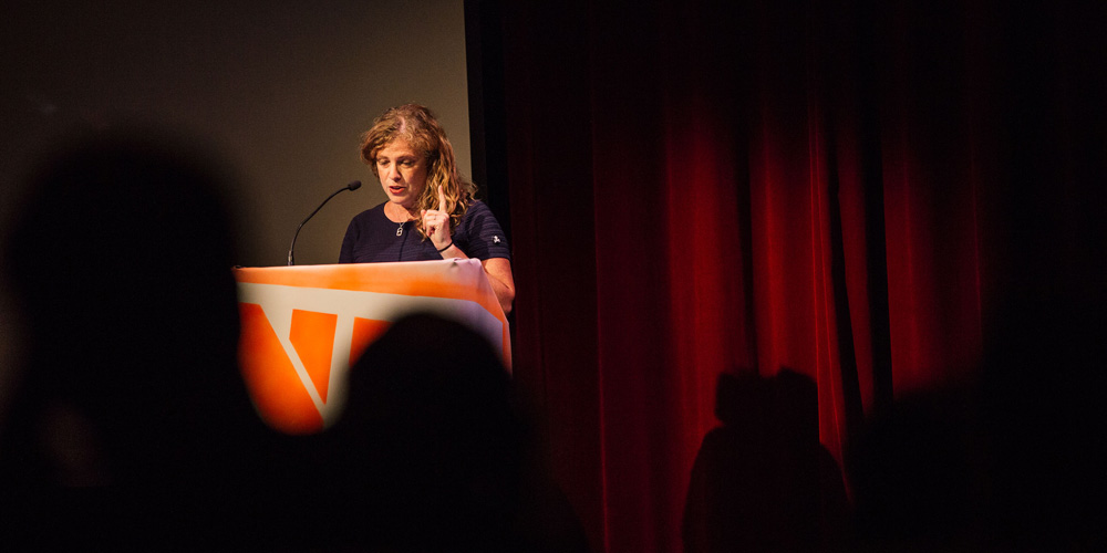
Emily Oberman / Pentagram / New York, NY
Armin’s summary
A comprehensive and witty overview of her work for Saturday Night Live since 1994 with some tangents on other entertainment industry projects.
Bryony’s summary
Emily showed how, if you think the TV and movie world is glamorous, know that it is not. Far from it. But it is a heck of a fun ride that is very rewarding. It’s a world wehre being funny is serious business, even if it’s sometimes creepy. When the client cares, it shows. And I am going to add that when the designer cares it also shows. As in the case of Emily, who believes hell is quite exciting. And she leads by example by always thanking her crew and given credit where credit is due.
Tweets
My design geek & comedy nerd sensibilities are all being tended to by the lovely @emilyoberman. Being funny is serious business. #BNCONF
— Sarah Armstrong (@OohSarahcuda) September 25, 2015"This is the job that I'm most qualified to do. I wish it was brain surgery, but instead it's SNL." @emilyoberman #bnconf
— Pentagram Design (@pentagram) September 25, 2015There's going to be a mug your desk for the rest of your life. Too funny! #bnconf @jimmyfallon pic.twitter.com/1BThBkieJS
— Michael Raisch (@RaischStudios) September 25, 2015Loved @emilyoberman's talk on designing for SNL. LOL'd from start to finish. Dream job megatron. #bnconf
— Becky Simpson (@beckymsimps) September 25, 2015Crazy amazing chart of the tonight shows landscape. @emilyoberman #bnconf @pentagram pic.twitter.com/lTSHrjfv7T
— Jan Šabach (@codeswitchtweet) September 25, 2015REALLY wish @emilyoberman had more time to present the 10 things she learned from SNL. Great talk! #bnconf
— Cameron Winchester (@sircamron) September 25, 2015@pentagramdesign's @emilyoberman learned everyone's a #critic! #bnconf #SNL https://t.co/P5Ggc7XsSP pic.twitter.com/o3tCq142v2
— Melissa Matos Design (@MMatosGDesign) September 25, 2015"Even when it's done, it's not necessarily done." @emilyoberman on designing in the improvised world of @nbcsnl #bnconf
— Pentagram Design (@pentagram) September 25, 2015I want to hear every story @emilyoberman has to tell. #bnconf #ontheedgeofmyseat
— ChristianaDelvecchio (@CaptnChristiana) September 25, 2015Video Preview
BUY VIDEO
Greg Hahn, Ryan Moore / Gretel / New York, NY
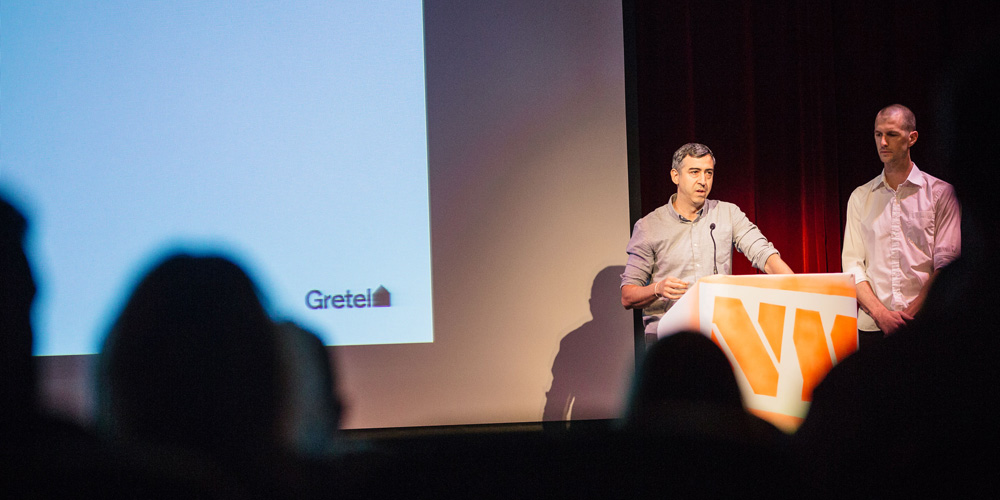
Armin’s summary
A brief insight into their process highlighted by three case studies of motion branding including a first-peek at work for Netflix.
Bryony’s summary
Greg and Ryan showed how by starting with ethos at the core, followed by voice, and wrapped by the visual identity as designers we need to solve branding challenges by revisiting our core elements. Type, color, image, composition, and movement. Ask, what can movement say about the brand?
Tweets
@GretelNYC's beautiful way of defining #black #women: you don't #bnconf https://t.co/5Wl8rosp8X pic.twitter.com/UrBOpp1s1P
— Melissa Matos Design (@MMatosGDesign) September 25, 2015@GretelNYC makes me 100x more excited about design. Their work on Centric has to be one of the best branding I've ever seen. #bnconf
— ChristianaDelvecchio (@CaptnChristiana) September 25, 2015All these network promos and energetic animations make me want to reignite my strained relationship with After Effects #bnconf
— melanie loff-bird (@meloffbird) September 25, 2015Some great examples of #motion #branding by the guys from Gretel. #bnconf
— Jan Šabach (@codeswitchtweet) September 25, 2015“Now that brands live on screens a static mark isn’t good enough. You have to design for motion at the same time.” @GretelNYC #bnconf
— pale blue jen (@palebluejen) September 25, 2015Greg Hahn & Ryan Moore of Gretel share how motion and movement can add meaning to a brand. #bnconf… https://t.co/u532zcLfhx
— Brand New Conference (@bnconf) September 25, 2015Striving for a 'signature behaviour' for brands. Not just movement for movements sake. #Gretel @bnconf #bnconf
— Saman Sohail (@craponsale) September 25, 2015@GretelNYC YES! Beautiful work #bnconf
— Cameron Winchester (@sircamron) September 25, 2015@debbiemillman: The really brilliant men at Gretel at @bnconf #bnconf pic.twitter.com/cpSi7NA3gZ
— debbie millman (@debbiemillman) September 25, 2015Motion is a signature behavior for brands moving forward #bnconf
— Laura Powers (@LPPowers) September 25, 2015Video Preview
BUY VIDEO
David Heasty, Stefanie Weigler / Triboro / Brooklyn, NY
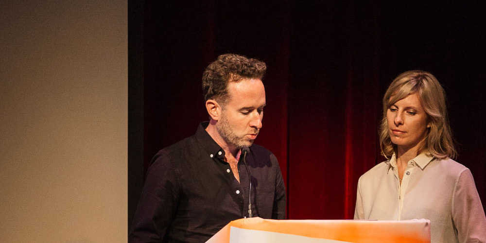
Armin’s summary
A detailed breakdown of four of the small studio’s big-time projects for the likes of Nike and The Standard.
Bryony’s summary
Stephanie and David showed us that there is always something hiding in the brief, and it’s up to us as designers to unearth the possibilities.
Tweets
Finding the #NYC in #NIKE with Triboro #bnconf https://t.co/jx6iTZPpCK pic.twitter.com/NWm06x7GNS
— Melissa Matos Design (@MMatosGDesign) September 25, 2015"Our job as designers is to unearth unexpected possibilities." – David Heasty / Triboro @bnconf #bnconf
— Jonathan Ratcliff (@jonwratcliff) September 25, 2015DIY @Nike NYC logo by http://t.co/bU13o9G8xV #bnconf pic.twitter.com/tSp660CTcW
— Brandon Jameson (@pbjameson) September 25, 2015Any #startup companies at #bnconf this year? Now is the time to work on your #brand identity.
— Jan Šabach (@codeswitchtweet) September 25, 2015Neon versions of #logos seems to be the thing at #bnconf this year. This one done by Triboro for @Nike pic.twitter.com/rFbvi4u72e
— Jan Šabach (@codeswitchtweet) September 25, 2015Such good work for @nike by Triboro Design at #bnconf
— Mads Jakob Poulsen (@Madsjpoulsen) September 25, 2015Video Preview
BUY VIDEO
Roberto de Vicq de Cumptich / de Vicq design / New York, NY
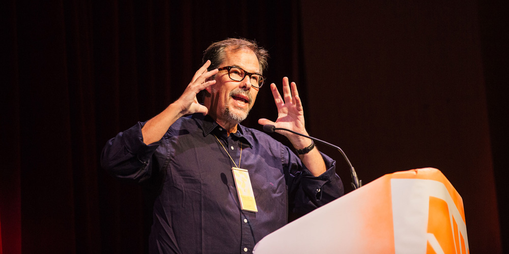
Armin’s summary
An unexpected history lesson on the relationship between hair styles and typography from the Middle Ages to today.
Bryony’s summary
Roberto blew my fucking mind! I wish we had given him four hours to take us down history as he juxtaposed hairstyles and evolving typography age by age. The unspoken bond between hair and type has been around for centuries, so we should be careful about what we do with our hair tomorrow, because it can lead to really horrible typography.
Tweets
Hair styles influencing typography through the ages @rdevicq Who knew? @bnconf #bnconf pic.twitter.com/SfYNjdKstb
— Scott Lewallen (@ScottLewallen) September 25, 2015"Greece and Rome…not much happened (especially if you only have 15 mins)." – Roberto de Vicq's awesome history of hair/typeface. #bnconf
— Jason Shough (@jpshough) September 25, 2015"Greece and Rome…not much happened (especially if you only have 15 mins)." – Roberto de Vicq's awesome history of hair/typeface. #bnconf
— Jason Shough (@jpshough) September 25, 2015The evolution of beard styles and typography, as explained by Roberto de Vicq #slabserif #bnconf https://t.co/5y3MbFKSiL
— Aaron Taylor-Waldman (@atw) September 25, 2015@rdevicq combining Type+Decades+Hair. Genius and unexpected! #bnconf
— THEE BLOG (@TheeBlog) September 25, 2015Hilarious & interesting juxtapositions of hairstyles & typography by @rdevicq #bnconf pic.twitter.com/fNOwd7xpw1
— Laura Powers (@LPPowers) September 25, 2015Feeling out of place but inspired by all these type geeks @bnconf #bnconf. Now it's @rdevicq giving history of hair & type (really)
— Emily Cohen (@EmilyRuthCohen) September 25, 2015I do miss my hair ! @rdevicq #bnconf pic.twitter.com/1wOWDtSv6e
— graphéine (@grapheine) September 25, 2015Minds are being blown at #bnconf
— TN Graphics In-House (@tn_graphics) September 25, 2015Video Preview
BUY VIDEO
Susan Skarsgard / General Motors / Warren, MI
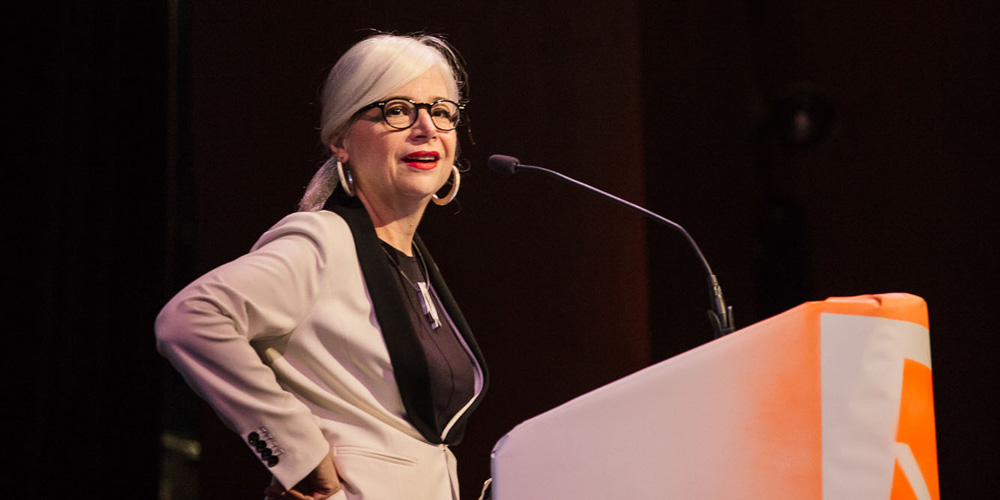
Armin’s summary
A sharp presentation on the legacy of General Motors lettering and logos and her role in it since 1994 as a designer and now master archiver.
Bryony’s summary
From Susan we learned that a love of letters and typography can lead to a lifelong career where you end up designing logos for cars and archiving the history of America as seen through cars and nameplates. How cool and geeky is that? The best part? Is that the archive is being created by someone that has a deep understanding of the material, which is more often not the case. My suggestion to all of you? Keep a sassy outlook in life and work.
Tweets
What a treat seeing @GM auto identity process evolve + documenting American design history via the eyes of Susan Skarsgard @bnconf #bnconf
— Scott Lewallen (@ScottLewallen) September 25, 2015Susan Skarsgard of @GM keeps the good design is good business mantra alive #bnconf #grateful pic.twitter.com/CAt73f5UZl
— Jan Šabach (@codeswitchtweet) September 25, 2015Drooling over Susan Skarsgard's automotive lettering for @GM #lettering #bnconf ?
— THEE BLOG (@TheeBlog) September 25, 2015Susan Skarsgard and Jerry Campbell on "Serif Patrol" at @GMCentre @bnconf #bnconf pic.twitter.com/9cOOz8Emmi
— debbie millman (@debbiemillman) September 25, 2015Car lettering is typically elongated so it remains legible when seen on edge — more from Susan Skarsgard #bnconf (!)
— Hoefler&Co. (@HoeflerCo) September 25, 2015"At GM, what we're doing is documenting American design" – Susan Skarsgard #bnconf #branding @GMCentre
— Grafik (@grafikdotcom) September 25, 2015Honored to be listening to Susan Skarsgard talk about her experiences at @gm over the years. #bnconf https://t.co/JYSOiWY4mL
— Brand New Conference (@bnconf) September 25, 2015I just fell madly in love with Susan Skarsgard #bnconf @GM We need to see more influential women like this beyond the same old you know who
— Emily Cohen (@EmilyRuthCohen) September 25, 2015Susan Skarsgard at #bnconf talking about the dimensional challenges of automotive lettering: pic.twitter.com/Al2sZFtRAm
— Hoefler&Co. (@HoeflerCo) September 25, 2015Video Preview
BUY VIDEO
Ty Mattson / Mattson Creative / Irvine, CA
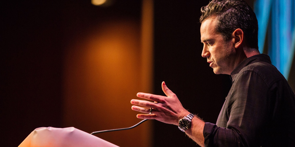
Armin’s summary
A highly amusing and insightful call for allowing our childhood objects to influence our work and the unexpected benefits of taking “creative initiative”.
Bryony’s summary
Ty encouraged us to look into our childhood and bring back the things that amazed us into our work today. Also to take creative initiative and pursue the things we love. Finally, set the stage for inspiration — there is an intrinsic connection between where we work and what we make — and consider the notion that design is more about recovery than discovery.
So now I ask you: what the hell are you doing with YOUR life?
Tweets
.@TyMattson talking about taking creative initiative with things that have always inspired you. And Lost. #bnconf pic.twitter.com/DdA2QrtXDD
— Matt Scribner (@scribner) September 25, 2015Amazing things can happen when you take creative initiative with self-initiated projects. @TyMattson #bnconf
— Brandon Jameson (@pbjameson) September 25, 2015"Do the things that you used to do, because you love them" — @TyMattson, #bnconf
— Hoefler&Co. (@HoeflerCo) September 25, 2015Don't let somebody else do your dream project. @TyMattson #bnconf
— Brian Pennington (@bpenn1) September 25, 2015If you do it, things will start happening. The power of self initiated projects. The charming @TyMattson at #bnconf pic.twitter.com/eoXA8Kd593
— Jan Šabach (@codeswitchtweet) September 25, 2015"It's easy to lose your sense of childlike wonder. It's easy to question if what we're doing matters." @TyMattson @bnconf #bnconf
— Allison Rinaldi (@allison_rinaldi) September 25, 2015"Creativity is more a process of recovery than discovery" thanks for the goosebumps @TyMattson! #timetravelexists #bnconf #inspiration
— Melissa Matos Design (@MMatosGDesign) September 25, 2015Absolutely brilliant and inspiring closing talk by @tymattson @bnconf #bnconf
— Saman Sohail (@craponsale) September 25, 2015"I graphic designed myself into my favorite tv shows." – @TyMattson #bnconf pic.twitter.com/dZeuVoUZLf
— Brand New Conference (@bnconf) September 25, 2015Video Preview
BUY VIDEO
Yay 2015! See you in 2016?
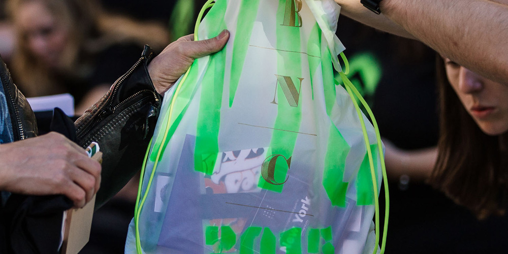
Armin & Bryony’s summary
Now in our sixth year you would think we have things figured out but this was possibly our most challenging conference yet. Logistics, timing, adversities… everything proved a little harder than usual so when we were done and people were overwhelmingly positive in their feedback we knew everything was worth it. We were both ecstatic with the conference: from speakers to attendees to volunteers to venue to weather. Everything worked out. Many thanks to all who came and we hope to see as many of you (and as many of you who didn’t come) in Nashville, TN, in 2016 for another 2-day event.
Tweets
Armin & Bryony outfits on point! From the dress to the shoe laces! Always "on brand". @bnconf #bnconf #bnc2015
— THEE BLOG (@TheeBlog) September 24, 2015No one puts more love and sweat into a conference than @ArminVit and @Bryonygp #bnconf
— Brandon Jameson (@pbjameson) September 24, 2015Gorgeous day for an outdoor break at #bnconf http://t.co/xRfBxjZULg pic.twitter.com/CqBdOmy9sS
— Prescott Perez-Fox (@scottperezfox) September 24, 2015It's nice outside, but I'd rather be right here. #bnconf pic.twitter.com/niuHjcccaK
— Becky Simpson (@beckymsimps) September 25, 2015This is what we call backpacking in style. #swagbag #bnconf pic.twitter.com/4V8xBATeys
— Brand New Conference (@bnconf) September 24, 2015Learned about so many great designers today at the #bnconf. (It also made me feel like I'm living under a rock) Loved day one!
— Jon Simons (@JonSimons) September 24, 2015How great that you get to listen to, hang out with and chat with some of the best #graphic designers working today. #bnconf #branding #lucky
— Jan Šabach (@codeswitchtweet) September 26, 2015The full crew of #bnconf volunteers. THANK YOU! pic.twitter.com/AYkBsrleHQ
— Brand New Conference (@bnconf) September 26, 2015This was my 3rd time attending the @bnconf + I think it was the best one yet. 2 days of inspiration + nerdily laughing about design. #bnconf
— Caroline Wurtzel (@carolinewurtzel) September 26, 2015One of the best group of speakers I've ever seen. Thanks #bnconf
— Ron Bloomingkemper (@ronbloomer) September 26, 2015Hey, thank YOU #bnconf 🙂 have learnt so much and it was well worth the trip from Australia! @bnconf pic.twitter.com/m98oXgc53T
— Zoe Jazz (@Zoe_Jazz) September 26, 2015Surprisingly widespread sentiment in the @bnconf talks this week: the current terrain of design criticism does more harm than good. #bnconf
— Jesse Ragan (@jesseragan) September 25, 2015I have #bnconf envy.
— Bill Dawson (@XK9) September 25, 2015Thank you @Bryonygp & @ArminVit for two very inspiring days @bnconf! Hope to attend again sometime! #bnconf
— Allison Rinaldi (@allison_rinaldi) September 26, 2015And that wraps up the 2015 #bnconf !! I'm about to explode from everything I learned these two days. pic.twitter.com/58ywpYDlme
— ChristianaDelvecchio (@CaptnChristiana) September 26, 2015Thanks for all your work @ArminVit and @Bryonygp . I bragged to my teammates about #bnconf '13 . You held up your end.
— John McGlasson (@jmcglasson) September 25, 2015Thank you Bryony and Armin for an extraordinary @bnconf. Another tour de force! #bnconf @ucllc pic.twitter.com/gqyWcnUwVb
— debbie millman (@debbiemillman) September 25, 2015I can categorically say that the last two days have been two of the best ever. Thanks Armin and Bryony and the entire @bnconf team. #bnconf
— Steve St. Pierre (@SteveStP) September 25, 2015Anyone else not want @bnconf to end?! It's gone by SOOO quickly. Looking forward to meeting and networking at MI-51 tonight! #bnconf
— Anna Affias (@Anna_Affias) September 25, 2015
Comments