Nov. 18, 2024
No Comments on 2024 Brand New Conference: Swag
Most Recently Announced

Wednesday November 20, 2024

Tuesday November 19, 2024
Monday November 18, 2024

Friday November 15, 2024

Thursday November 14, 2024

See more What’s the difference?
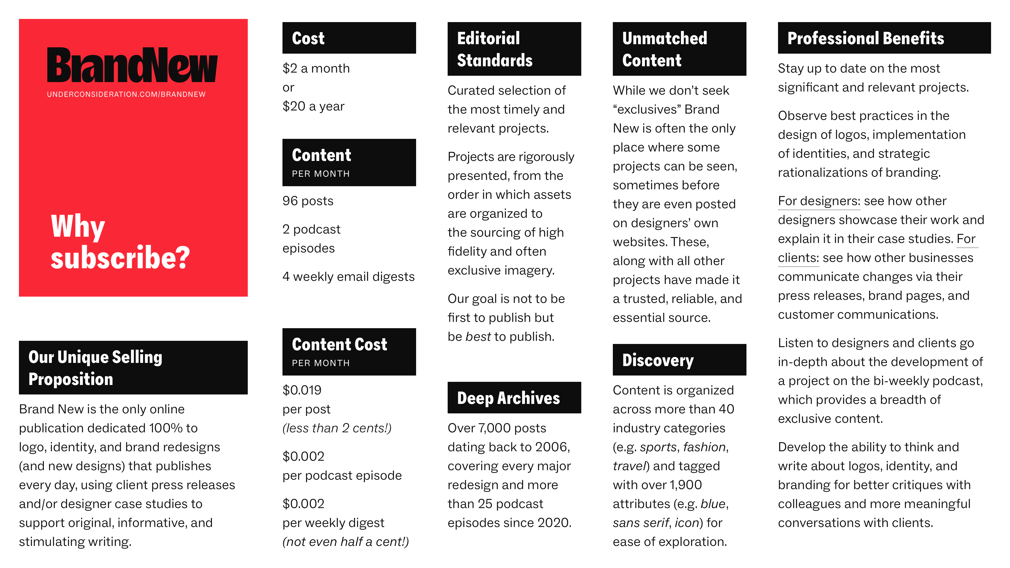
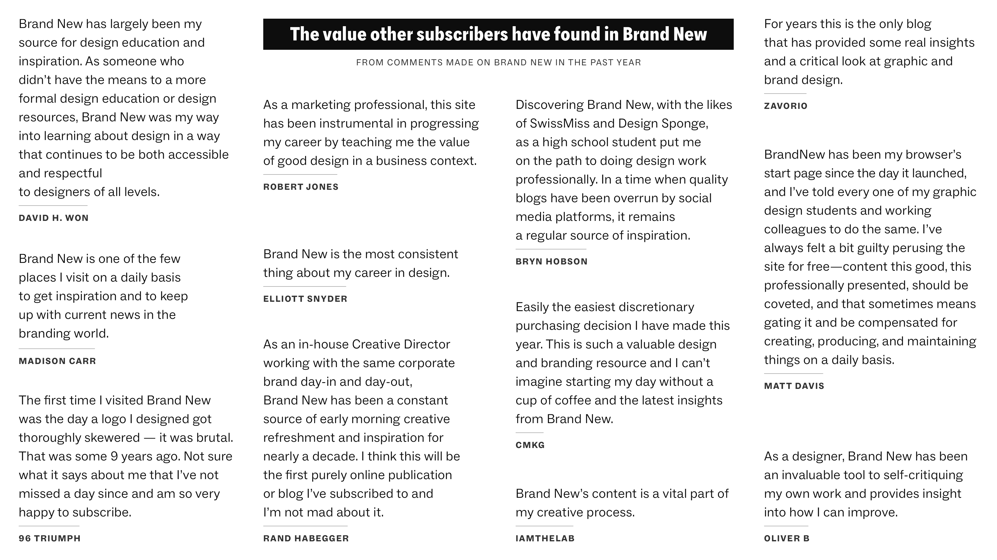
Why Subscribe?
A 2-page PDF with some objective reasons to the value of a Brand New subscription is available for download.
↓
The Follow-up

Announced


SUBSCRIBE